Skip to content
The Comm Spot The Comm Spot

It's All About Communication

  • HOME
  • ABOUT
    • Meet the Creator: Curtis Newbold, PhD
    • Hire Curtis
    • Publish with Us
    • Contact
    • Privacy Notice
  • COMM-BASICS
    • Glossary
    • Citation & Style Guides
      • AP Style (Journalism)
        • AP Style Overview
        • AP Style Guidelines
        • Media Ethics – SPJ Code of Ethics
        • Elements of Newsworthiness
      • APA Style
        • APA Format – Overview
        • APA - References Guidelines
        • APA - In-text Citations
        • APA - Citing Authors
        • APA - Audiovisual Media
        • APA - Books
        • APA - Digital Sources
        • APA - Events & Interactions
        • APA - Periodicals
        • APA - Print Sources (other than books)
      • Chicago Style
        • Chicago – Overview
        • Chicago - Author-Date System
        • Chicago - Notes-Bibliography System
        • Chicago - In-text Citations
        • Chicago Style - Citing Authors
        • Chicago - Audiovisual Media
        • Chicago - Books
        • Chicago - Digital Sources
        • Chicago - Events and Interactions
        • Chicago - Citing Periodicals
        • Chicago - Print Sources (other than books)
      • MLA Style
        • MLA Overview
        • MLA Works Cited Pages
        • MLA In-text Citations
        • MLA – Authors
        • MLA – Audiovisual Media
        • MLA – Books
        • MLA – Digital Sources
        • MLA – Events & Interactions
        • MLA – Periodicals
        • MLA – Print Sources (other than books)
    • Rhetoric
      • Overview of Rhetoric
      • Rhetorical Appeals (Rhetorical Triangle)
      • Branches of Oratory
      • Canons of Rhetoric
      • Rhetorical Devices
      • Kairos
      • Topos
      • Key Figures in Rhetoric
    • Research Methods
      • Case Studies
      • Competitor Analysis
      • Content Analysis
      • Discourse Analysis
      • Ethnography
      • Focus Groups
      • Observation Research
      • S.W.O.T. Analysis
      • Secondary Research
      • Surveys
      • Target Market Analysis
      • Usability Testing
      • Visual Analysis
    • Theories
    • Thinkers
  • COMM-SUBJECTS
    • Interpersonal Communication
      • Active Listening
      • Body Language
      • Conflict Management
      • Emotional Intelligence
        • Emotional Intelligence Overview
        • Self-Awareness
        • Self-Regulation
        • Motivation
        • Empathy
        • Social Skills
        • Emotional Intelligence Resources
      • Feedback
      • Negotiation
        • Overview of Negotiation
        • Negotiation Skills
        • Negotiation Strategies & Techniques
        • Stages of Negotiation
        • Common Negotiation Scenarios
        • Negotiation Case Studies & Examples
        • Negotiation Tools & Resources
        • Negotiation FAQ
    • Journalism
    • Public Speaking
      • General Guidelines
      • Overcoming Fear
      • Speech Writing and Organization
      • Delivery Techniques
      • Body Language
      • Audience Engagement
      • Storytelling
      • Designing Slides
      • P.O.W.E.R.F.U.L. Presentation Method
    • Strategic Communication
      • Business & Org Comm
        • Definition & History
        • Org Comm Theories
        • Business Documents
        • Change Management
        • Employee Relations
        • Employment Communication
        • Group & Team Communication
        • Leadership Communication
        • Power, Identity, & Ethics at Work
        • Project Management
      • Integrated Marketing Comm
        • Definition of IMC
        • Core Principles of IMC
        • IMC Planning
        • Audience Segmentation
        • Marketing Channels
        • Message Strategies
        • Campaign Measurement & Evaluation
        • Trends & Innovations in IMC
        • Challenges & Pitfalls in IMC
        • Careers & Roles in IMC
      • Public Relations
        • Foundations in PR
        • Strategic Practice
        • Tools & Tactics
        • Research & Analysis
        • Professional Development
      • Case Studies in Strat Comm
    • Technical & Scientific Communication
    • Visual Communication
      • Data Visualization
      • Information Design
      • Photography
      • Web Design
    • Written Communication
      • Writing Process
      • Organizational Methods
        • Five Paragraph Essay
        • Hourglass Method of Writing
        • IMRaD Format (Science)
        • Indirect Method (Bad News)
        • Inverted Pyramid (Journalism)
        • Martini Glass
        • Narrative Format
        • Proposal Format
        • Rogerian Method
        • Toulmin Method
      • Plain Language
        • Audience (Plain Language)
        • Organization (Plain Language)
        • Conversation (Plain Language)
        • Simplicity (Plain Language)
        • Word Choice (Plain Language)
        • Sentence Structure (Plain Language)
        • Design (Plain Language)
      • Punctuation
        • Apostrophes
        • Brackets
        • Colons
        • Commas
        • Ellipses
        • Em Dashes
        • En Dashes
        • Exclamation Marks
        • Hyphens
        • Parentheses
        • Periods
        • Question Marks
        • Quotation Marks
        • Semicolons
      • Style
        • Clarity
        • Conciseness
        • Consistency
        • Editing
        • Flow
        • Rhetorical Devices
        • Sentence Structure
        • Storytelling
        • Tone
        • Voice
        • Word Choice
  • RESOURCES
    • Teaching Resources
      • Assignments & Activities
      • Instructional Design
      • Pedagogies
  • BLOGS
    • The Spotlight Blog
    • Comm Sparks
  • SHOP
    • Cart
    • Checkout
0
The Comm Spot
The Comm Spot

It's All About Communication

Florence Nightingale Saved Thousands of Lives with an Infographic: A Lesson in the Power of Information Design

Posted on October 2, 2025October 3, 2025 By Curtis Newbold
  • Facebook
  • LinkedIn

The title of this post isn’t hyperbole. It’s a true story about the actual human impact of a data visualization in advocating for important change. As a person passionate about the power of information design, I also find it to be a fascinating story loaded with lessons about the role of visual communication in our lives.

It’s no secret that the way in which we communicate often matters more that what we communicate. “It’s not what you said,” we often chide. “It’s how you said it!” This is, after all, what media scholar Marshall McLuhan implied when he coined the phrase, “The medium is the massage.” In other words, the form in which a message is displayed is central to how people receive it—often significantly more so than the message itself.

When it comes to visualizing information, a quintessential example of this was when Florence Nightingale, the famed British nurse, used an infographic to convince Queen Victoria that wartime healthcare and sanitation were more serious problems than deaths caused by war wounds.

In 1954, at the peak of the Crimean War, Nightingale arrived at Scutari Hospital, where many soldiers were being treated. The scene was appalling. Maggots growing on flesh. Patients with fever and dysentery caked in blood and mud. Rats swarming about.

For months, Nightingale fought for more sanitary conditions. In an effort to find a solution, and using her remarkable skill in statistical analysis, she collected data about the cause of death for over 18,000 servicemen. Her findings revealed a horrifying truth: the war itself wasn’t killing most soldiers; hospitals were.

Yet despite sharing the results with Queen Victoria and writing a thorough report about the need for improved sanitary conditions, very little action was taken. The message simply wasn’t sticking enough to encourage change.

That’s when Nightingale reframed the message—visually. Creating what is recognized as the world’s first rose diagram, she designed this:

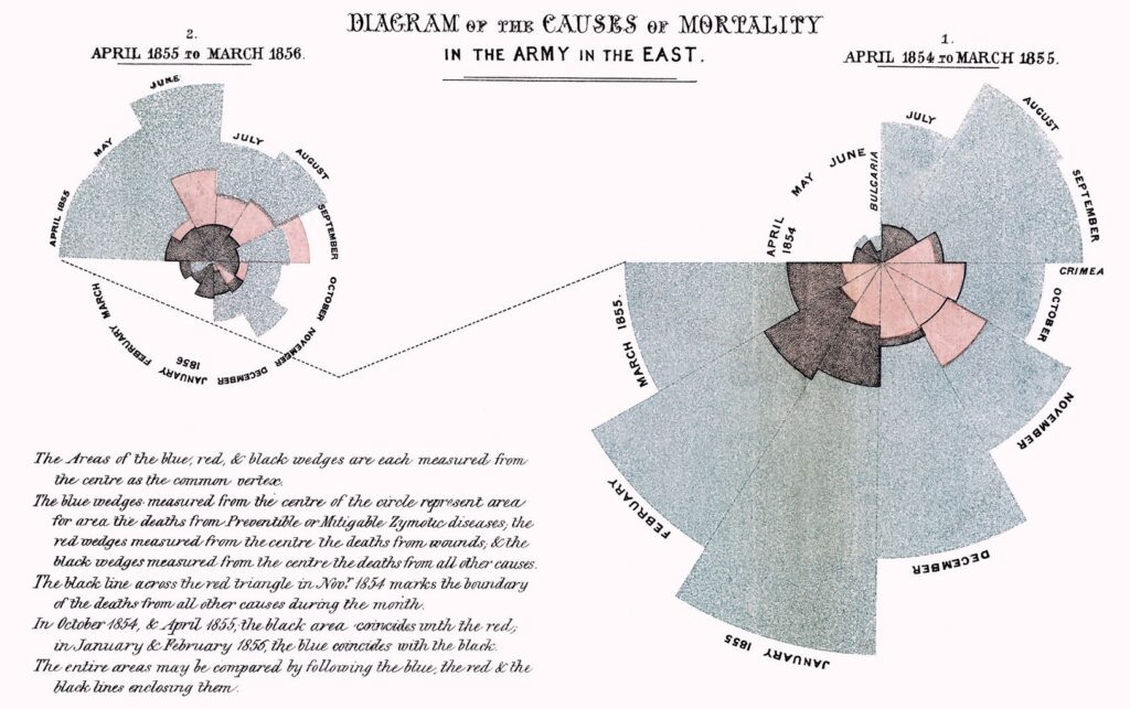
Organized by month and colored by cause of mortality, blue wedges represented number of deaths by preventable disease. In visual comparison to deaths by war wounds (pink) and all other causes (black), the message was both alarming and poignant. Suddenly, it was clear: if hospitals were given better resources—if sanitization, medicine, and healthcare were prioritized—literally thousands of lives could have been spared (an estimated 17,500 out of the roughly 22,000 deaths were caused by preventable disease).

Soon after Queen Victoria was presented with the diagram, extensive changes were made. Some have argued that this diagram may have saved tens of thousands of lives. Others have gone a step further and argued that millions were possibly saved since this diagram reshaped the way many future governments would think about and approach wartime medicine and healthcare.

There is a lot packed into this story and I’ve obviously left a lot out for brevity’s sake. But we can take away a lot in terms of the value and power of visualizing messages. Here are three:

Lesson #1: Data Doesn’t Speak for Itself

It can be easy to fall into the trap that our data is packed with clear and actionable next steps. When we become familiar with a dataset or body of information—when we intimiately understand the problem, the methods of collection, and the findings—we, the researchers and data curators, aquire a pretty clear sense for what should be done. But…pretty much everybody else doesn’t. And if we can’t get that message to them in a way that is clear, accurate, and personally meaningful, they’ll probably never use it.

If you want people to understand the data, don’t make it speak for itself. Visualize it. Be accurate. Be responsible. But make it simple, clear, and emotionally or intellectually compelling. Do this, and the data will really start to speak.

Lesson #2: Design Can Be a Tool for Change—If Done Right

We’re faced with a lot of challenges—at work, in life, and throughout the world. Working toward solutions becomes challenging when key messages get lost in the clutter. Humans today are inundated with an unceasing flow of messages—some which are true, some which are fake, and some which are bizzare. If we want people to engage with messages, making them visual and immediately understood can be the key to a shift in understanding.

Of course, that means we must be good designers. We need to know how information works; how people understand shapes and colors and lines; and how the framing of a visual story shapes understanding. We can’t be manipulative but we must be intentional. If we do it well, positive change is more likely than if the message is buried in words and numbers.

Lesson #3: Intentional Form Is Humanizing

Nightingale could have used a pie graph or stacked bar to show this data. And…those tools might have worked. But the use of a spiral graph did more than just relay a comparison of mortality numbers. It showed an added layer of depth that told a story: deaths by month. It was also a novel design that encouraged studying and learning. Using wedges in a clockwise diagram with meaningful, easy-to-understand colors was strategic and powerful. It was the intentional combination of simplicity, accuracy, depth, appeal, and storytelling that made the information compelling—which, in turn, made it humanizing.

Lost in many data visualizations that represent humans is the story. Powerfully, in the aristry of the diagram, we see death by time of year (see how many died in the winter in comparison to summer?), and we see unnecessary death and a government that could have easily intervened. There is more humanism to this repsentation than there is in a tabular set of numbers. Humanism isn’t just ethical; it’s emotional and it’s persuasive.

Conclusion

It’s been fascinating to me throughout my career to see, learn about, and experience the power of visualized information. Being a good designer isn’t just a creative ability to add visual flare and appeal to otherwise drab documents. It’s communication necessity in a world of information overload that, if done well, can shape our ability to lead, to make sense of complexity, to influence, to be seen and heard, and to make a more long-lasting impact. If Nightingale could save lifes with her visual communication, what can we do with ours?

The Spotlight Blog

Post navigation

Previous post
Next post

Related Posts

The Spotlight Blog

The 5 Best Books on Data Visualization (For Beginners and Professionals)

Posted on January 6, 2026January 6, 2026

Facebook LinkedIn This page contains Amazon affiliate links, which means we may earn a small commission at no additional cost to you if you make a purchase through those links. Okay, there’s an elephant in the room—you’ve been asked to share some data, but you’ve never really been trained how…

Read More
The Spotlight Blog

How We Are Visualized Shapes the Way We See Ourselves

Posted on February 23, 2026February 23, 2026

Facebook LinkedIn If someone were to ask you where you fit politically, would you be inclined to say something like, “I lean left” or “I’m far right”? If they asked you how you fit in where you live, is it possible you might say, “I’m definitely blue living in a…

Read More
The Spotlight Blog

Should I Use AI? A Visual Guide for the Appropriate Use of Artifical Intelligence

Posted on September 16, 2025September 25, 2025

Facebook LinkedIn Artificial intelligence tools like ChatGPT, Google Gemini, Microsoft Copilot and others have quickly and overwhelmingly infiltrated our jobs, life, and education. As it’s become a part of our everyday work, we’ve faced relentless new questions about its use. Will it kill creativity? Does it take the humanness out…

Read More

  • facebook
  • instagram
  • linkedin

DON'T MISS ANY SPOT-ON TIPS!

We don't spam! You'll only get emails when we post something awesome.
You can unsubscribe at any time.

Check your inbox or spam folder to confirm your subscription.

©2025 | The Comm Spot | By Newbold Communication & Design