
Waterfall Chart: How to Show Sequential Gains and Losses
A waterfall chart helps visualize how a starting value changes through a series of positive and negative steps. Use it to show how individual contributions add up to a final result, making it easier to understand where increases and decreases occur along the way.
Turn to a waterfall chart when the story involves progression. Instead of presenting totals alone, the chart highlights the journey from beginning to end. Each bar represents a change, allowing viewers to see exactly how intermediate steps influence the outcome.
Waterfall charts are especially effective when explaining financial performance, project results, or operational processes. By breaking change into stages, the visual clarifies how a total evolves rather than simply presenting the final number.
Related Charts and Graphs
Several visuals relate closely to waterfall charts and may be better choices depending on the goal.
- Stacked bar charts show composition but do not emphasize sequential change.
- Slope graphs highlight change between two points rather than multiple stages.
- Step line charts emphasize intervals of stability rather than cumulative impact.
- Gantt charts focus on timing and duration instead of value changes.
- Funnel charts illustrate reduction across stages rather than gains and losses.
Choosing between these options depends on whether the focus is cumulative progression, timing, or structural composition.
What a Waterfall Chart Is
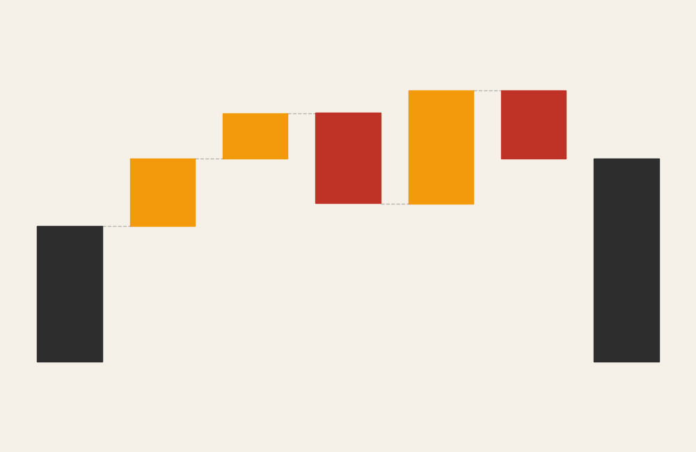
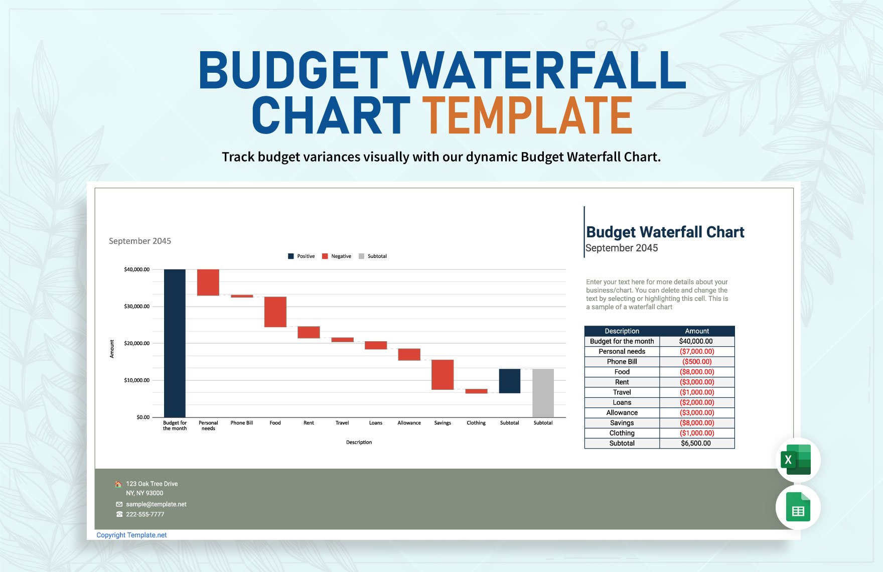
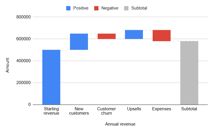
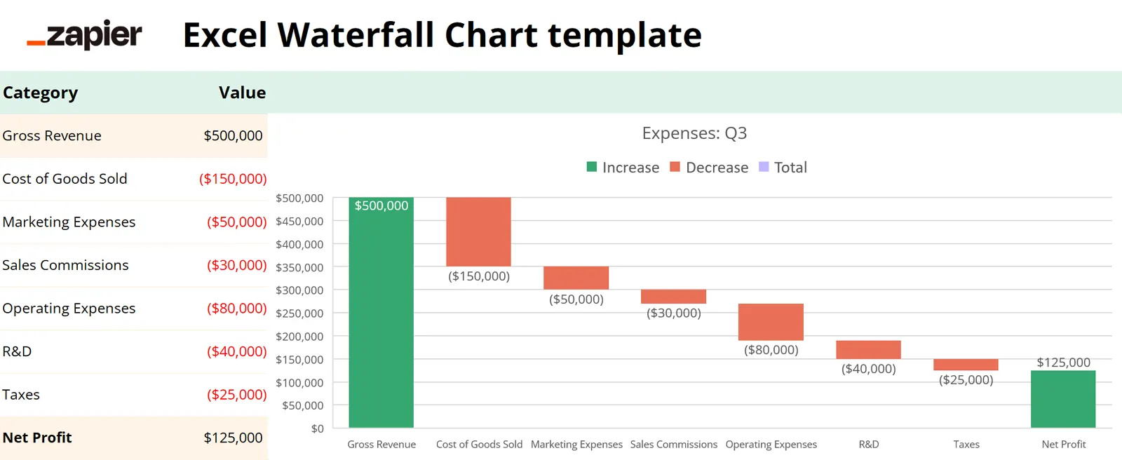
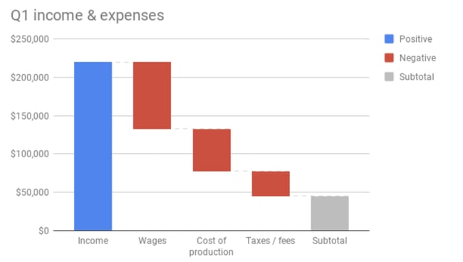
A waterfall chart displays a sequence of bars that rise or fall from a baseline, illustrating how incremental changes contribute to a total. Positive values typically extend upward, while negative values extend downward, creating a cascading visual effect.
Common elements include:
- A starting value
- Intermediate steps representing gains or losses
- Connecting lines or floating bars showing progression
- A final total summarizing the outcome
Unlike traditional bar charts, waterfall charts emphasize the relationship between steps. Each bar begins where the previous one ends, visually linking the sequence of change.
The format helps viewers understand both magnitude and direction. Instead of seeing isolated values, the chart presents a narrative of accumulation.
When to Use a Waterfall Chart
Use a waterfall chart when explaining how a total changes through multiple contributions.
This visual works especially well when the goal is to:
- Show profit and loss breakdowns
- Explain budget changes
- Visualize project stages or milestones
- Reveal drivers behind performance shifts
- Communicate operational or financial progression
Waterfall charts are particularly valuable in presentations where stakeholders need to understand why a result occurred. By isolating each contributing factor, the visual clarifies cause and effect.
Because the chart emphasizes sequence, it works best when steps follow a logical order.
Types of Data Sets That Work Best for a Waterfall Chart
Waterfall charts work best with data that represents incremental change.
Strong candidates include:
- Revenue and expense breakdowns
- Cost analysis across phases
- Inventory adjustments
- Marketing performance contributions
- Project progress metrics
- Energy production or resource flow adjustments
Each step should represent a meaningful addition or subtraction from the total. Data that lacks a clear starting point or final outcome may feel confusing in this format.
Consistency in labeling also helps viewers track progression from one stage to the next.
Real-World Examples of a Waterfall Chart
Waterfall charts appear frequently in business reporting, analytics dashboards, and financial storytelling where transparency about change matters.
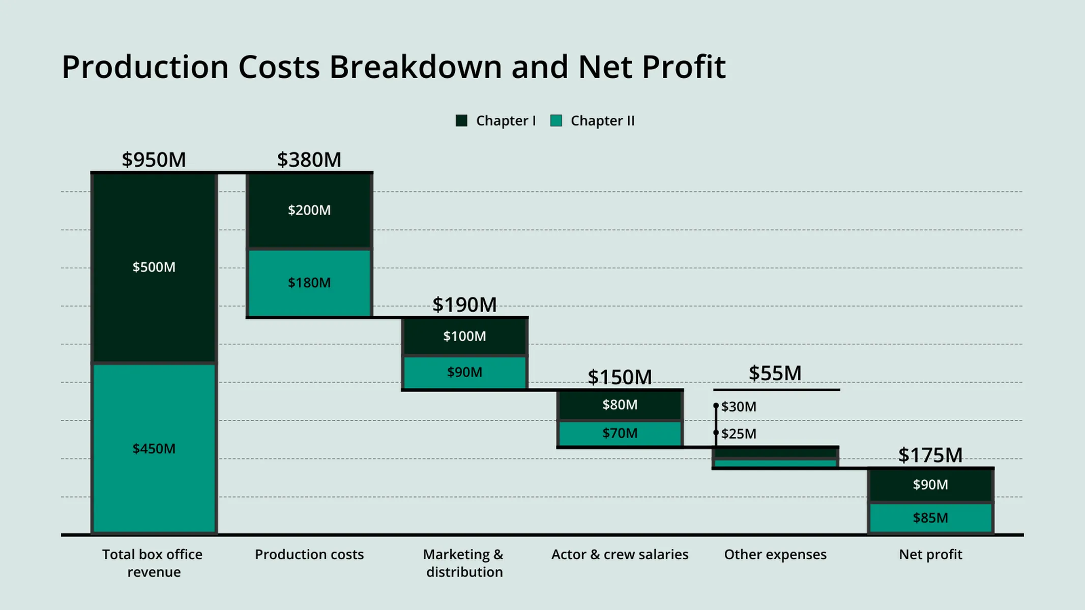
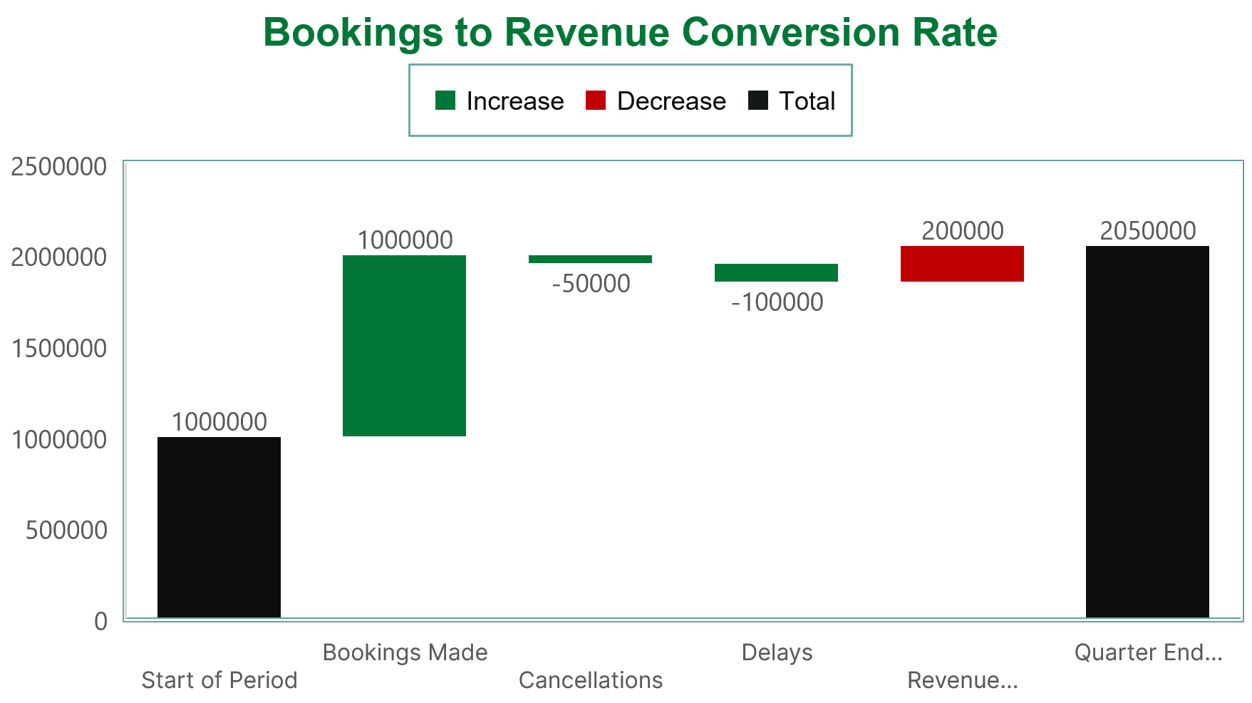
Financial Performance or Profit Analysis
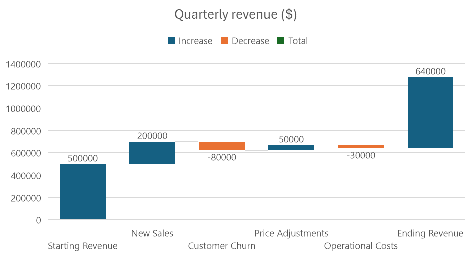

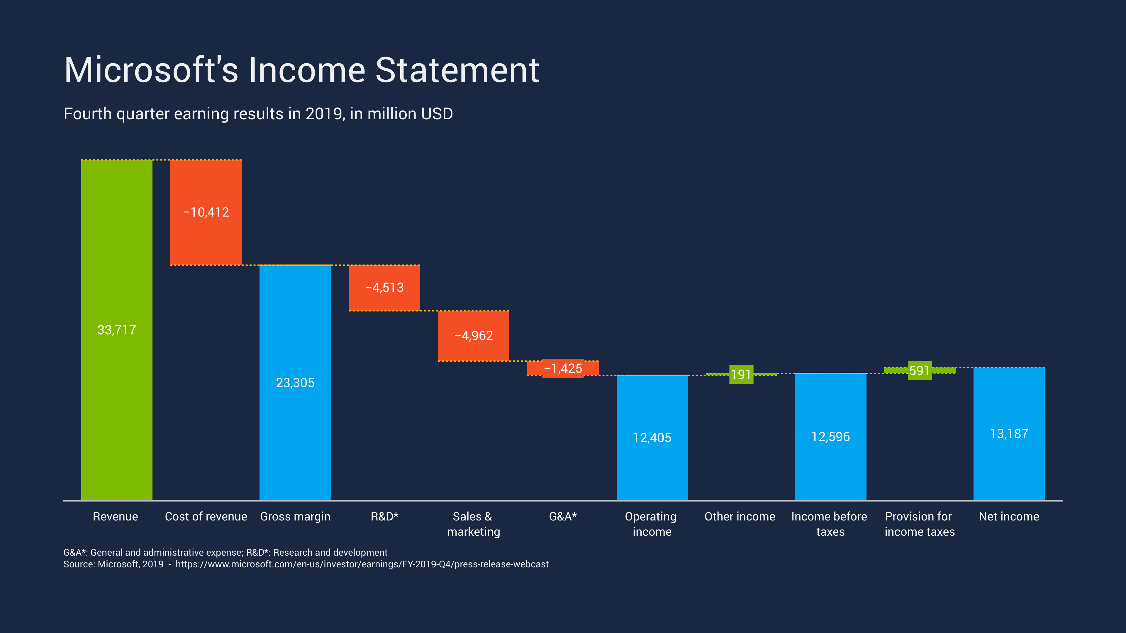
Show how revenue, expenses, and adjustments lead to a final profit or loss.
Budget or Cost Breakdown

Explain how different factors increase or reduce available funds.
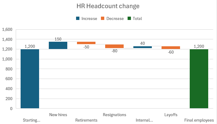
Project or Operational Milestones
4
Highlight how stages contribute to overall performance outcomes.
Marketing or Campaign Impact
Reveal how individual channels or initiatives influence total results.
Energy or Resource Flow Adjustments
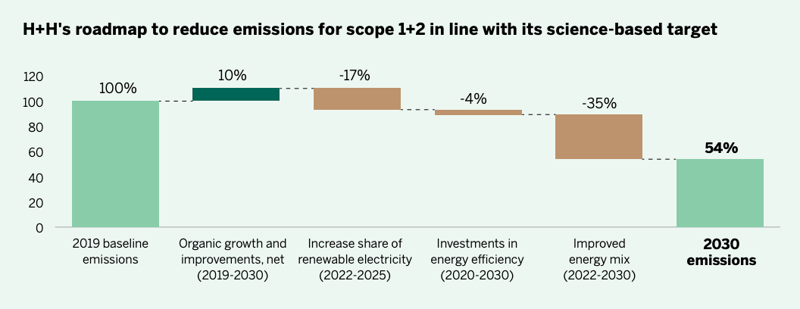
Show how gains and losses combine to affect overall output.
What to Avoid or Be Careful Of with a Waterfall Chart
❌ Don’t include too many steps
Excessive stages can make progression difficult to follow.
❌ Don’t omit clear starting and ending values
Viewers need anchors to understand the sequence.
❌ Don’t rely solely on color for meaning
Labels help distinguish gains from losses clearly.
❌ Don’t mix unrelated changes
Each step should logically connect to the overall progression.
❌ Don’t use it when categories are independent
Traditional bar charts may communicate isolated values more effectively.
*Content on this page was curated and edited by expert humans with the creative assistance of AI.