
Waffle Chart: How to Show Proportions Using a Grid
A waffle chart helps visualize proportions using a grid of equally sized squares or icons. Use it to show how parts contribute to a whole in a format that feels simple, structured, and easy to interpret. Each square typically represents a fixed percentage or count, allowing viewers to understand distribution at a glance.
Turn to a waffle chart when the goal is to make proportions tangible and approachable. Unlike pie charts, which rely on angles, waffle charts use discrete units that feel more concrete. This makes them especially effective for storytelling, education, and infographic-style design.
Waffle charts are often used when clarity and accessibility matter. By transforming percentages into a grid, the visual makes abstract numbers easier to grasp without sacrificing structure.
Related Charts and Graphs
Several visuals relate closely to waffle charts and may be better choices depending on the goal.
- Pie and donut charts show proportions through circular slices instead of grid units.
- 100% stacked bar charts emphasize proportional comparison across categories.
- Pictogram charts replace squares with icons to create a more illustrative style.
- Heatmap matrices encode value through color intensity rather than countable units.
- Treemaps display hierarchical proportions using nested rectangles instead of uniform squares.
Choosing between these options depends on whether the focus is accessibility, comparison, or hierarchical structure.
What a Waffle Chart Is
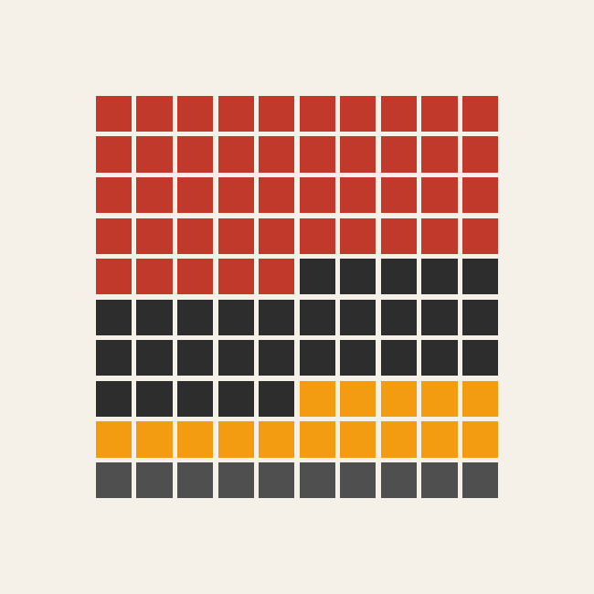
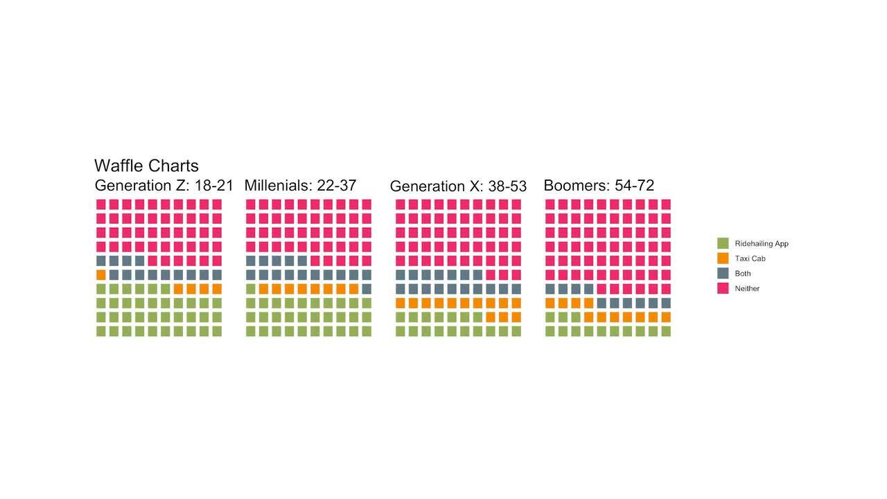
A waffle chart displays data using a grid, often arranged as a 10×10 layout representing 100 units. Each square corresponds to a specific value, such as one percent or one individual within a population.
Common elements include:
- A uniform grid of squares or icons
- Color-coded segments representing categories
- Labels explaining what each square represents
- A clear total that equals the full grid
Because the chart uses equal units, viewers can count squares directly to understand proportions. This approach reduces reliance on estimation, making the visual feel precise while remaining approachable.
Waffle charts can be arranged vertically, horizontally, or in more creative layouts depending on design goals. Some variations use icons instead of plain squares, blending infographic design with quantitative visualization.
When to Use a Waffle Chart
Use a waffle chart when the goal is to communicate proportions in a clear, human-centered way.
This visual works especially well when the goal is to:
- Show percentage breakdowns
- Present survey or poll results
- Communicate social or demographic statistics
- Add visual storytelling to reports or infographics
- Make data accessible to general audiences
Waffle charts work best when viewers benefit from seeing data as individual units rather than abstract shapes. The grid format helps bridge the gap between quantitative analysis and visual storytelling.
Because waffle charts emphasize parts of a whole, they are most effective when the total remains consistent across examples.
Types of Data Sets That Work Best for a Waffle Chart
Waffle charts work best with categorical data that represents proportions of a whole.
Strong candidates include:
- Survey responses or poll results
- Budget allocation percentages
- Demographic breakdowns
- Environmental impact statistics
- Market share comparisons
- Education or literacy metrics
Values should translate cleanly into percentages or counts. When data includes very small fractions, designers may need to adjust grid size to maintain clarity.
Waffle charts are especially effective when audiences benefit from seeing proportions as discrete units. For example, representing “25 out of 100” visually can feel more relatable than a percentage label alone.
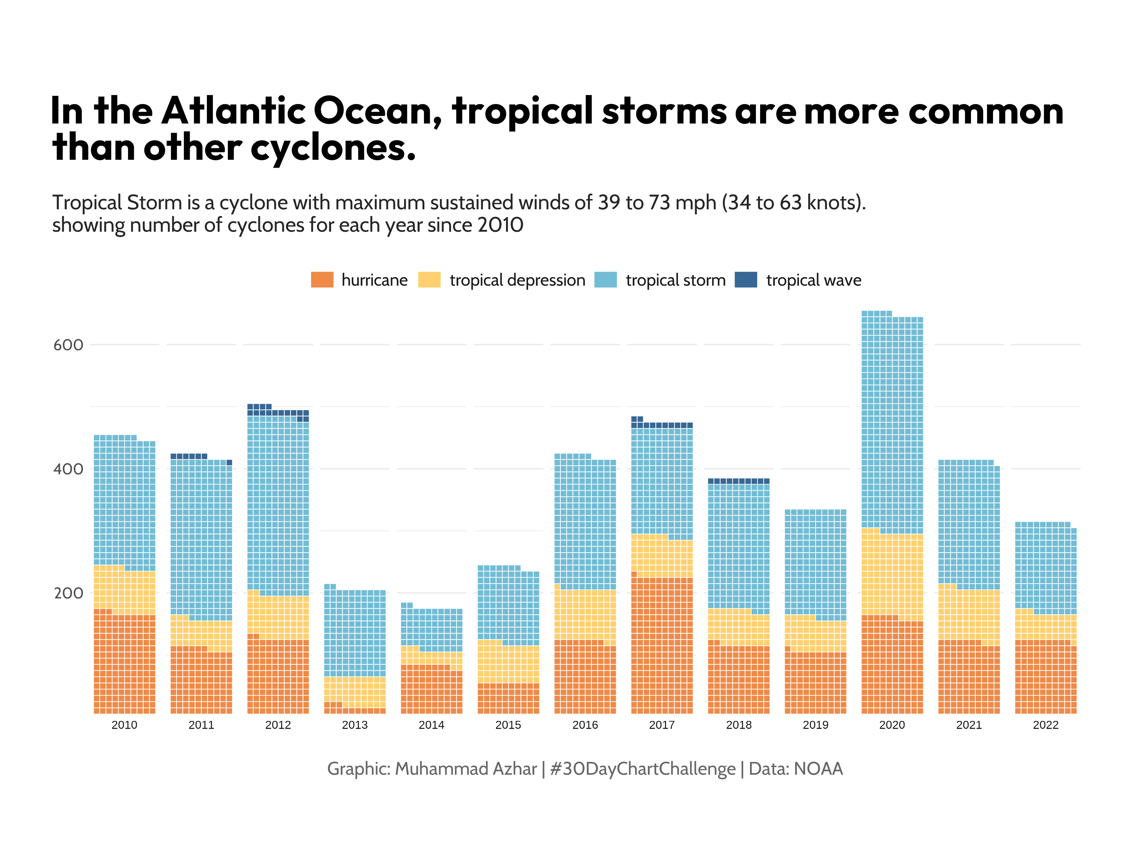
Real-World Examples of a Waffle Chart
Waffle charts appear frequently in journalism, nonprofit reporting, and educational materials where accessible storytelling matters.
Survey or Poll Results
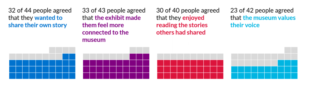

Show how respondents divide across answer choices using a clear visual grid.
Budget or Spending Breakdown

Present funding distribution in a format that feels structured and easy to compare.
Environmental or Sustainability Data
Translate environmental metrics into relatable visual units.
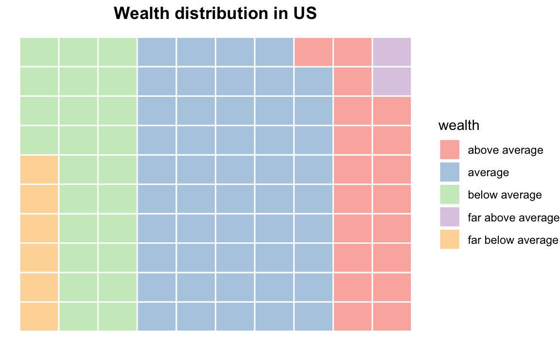
Demographic or Population Statistics
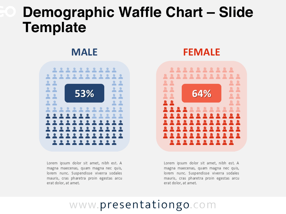
Show how populations divide across categories such as age, education, or income.
Education or Awareness Campaigns

Communicate statistics in a way that feels visual and approachable.
What to Avoid or Be Careful Of with a Waffle Chart
❌ Don’t use it for too many categories
Too many colors or segments can make the grid confusing.
❌ Don’t ignore clear labeling
Viewers need to know what each square represents.
❌ Don’t rely solely on decorative icons
Clarity should remain the priority over aesthetics.
❌ Don’t use it when precise comparison across many groups is required
Stacked bar charts or dot plots may communicate differences more clearly.
❌ Don’t distort the grid structure
Uneven spacing or inconsistent unit sizes can mislead viewers.
*Content on this page was curated and edited by expert humans with the creative assistance of AI.