Skip to content
The Comm Spot The Comm Spot

It's All About Communication

  • HOME
  • ABOUT
    • Meet the Creator: Curtis Newbold, PhD
    • Hire Curtis
    • Publish with Us
    • Contact
    • Privacy Notice
  • COMM-BASICS
    • Glossary
    • Citation & Style Guides
      • AP Style (Journalism)
        • AP Style Overview
        • AP Style Guidelines
        • Media Ethics – SPJ Code of Ethics
        • Elements of Newsworthiness
      • APA Style
        • APA Format – Overview
        • APA - References Guidelines
        • APA - In-text Citations
        • APA - Citing Authors
        • APA - Audiovisual Media
        • APA - Books
        • APA - Digital Sources
        • APA - Events & Interactions
        • APA - Periodicals
        • APA - Print Sources (other than books)
      • Chicago Style
        • Chicago – Overview
        • Chicago - Author-Date System
        • Chicago - Notes-Bibliography System
        • Chicago - In-text Citations
        • Chicago Style - Citing Authors
        • Chicago - Audiovisual Media
        • Chicago - Books
        • Chicago - Digital Sources
        • Chicago - Events and Interactions
        • Chicago - Citing Periodicals
        • Chicago - Print Sources (other than books)
      • MLA Style
        • MLA Overview
        • MLA Works Cited Pages
        • MLA In-text Citations
        • MLA – Authors
        • MLA – Audiovisual Media
        • MLA – Books
        • MLA – Digital Sources
        • MLA – Events & Interactions
        • MLA – Periodicals
        • MLA – Print Sources (other than books)
    • Rhetoric
      • Overview of Rhetoric
      • Rhetorical Appeals (Rhetorical Triangle)
      • Branches of Oratory
      • Canons of Rhetoric
      • Rhetorical Devices
      • Kairos
      • Topos
      • Key Figures in Rhetoric
    • Research Methods
      • Case Studies
      • Competitor Analysis
      • Content Analysis
      • Discourse Analysis
      • Ethnography
      • Focus Groups
      • Observation Research
      • S.W.O.T. Analysis
      • Secondary Research
      • Surveys
      • Target Market Analysis
      • Usability Testing
      • Visual Analysis
    • Theories
    • Thinkers
  • COMM-SUBJECTS
    • Interpersonal Communication
      • Active Listening
      • Body Language
      • Conflict Management
      • Emotional Intelligence
        • Emotional Intelligence Overview
        • Self-Awareness
        • Self-Regulation
        • Motivation
        • Empathy
        • Social Skills
        • Emotional Intelligence Resources
      • Feedback
      • Negotiation
        • Overview of Negotiation
        • Negotiation Skills
        • Negotiation Strategies & Techniques
        • Stages of Negotiation
        • Common Negotiation Scenarios
        • Negotiation Case Studies & Examples
        • Negotiation Tools & Resources
        • Negotiation FAQ
    • Journalism
    • Public Speaking
      • General Guidelines
      • Overcoming Fear
      • Speech Writing and Organization
      • Delivery Techniques
      • Body Language
      • Audience Engagement
      • Storytelling
      • Designing Slides
      • P.O.W.E.R.F.U.L. Presentation Method
    • Strategic Communication
      • Business & Org Comm
        • Definition & History
        • Org Comm Theories
        • Business Documents
        • Change Management
        • Employee Relations
        • Employment Communication
        • Group & Team Communication
        • Leadership Communication
        • Power, Identity, & Ethics at Work
        • Project Management
      • Integrated Marketing Comm
        • Definition of IMC
        • Core Principles of IMC
        • IMC Planning
        • Audience Segmentation
        • Marketing Channels
        • Message Strategies
        • Campaign Measurement & Evaluation
        • Trends & Innovations in IMC
        • Challenges & Pitfalls in IMC
        • Careers & Roles in IMC
      • Public Relations
        • Foundations in PR
        • Strategic Practice
        • Tools & Tactics
        • Research & Analysis
        • Professional Development
      • Case Studies in Strat Comm
    • Technical & Scientific Communication
    • Visual Communication
      • Data Visualization
      • Information Design
      • Photography
      • Web Design
    • Written Communication
      • Writing Process
      • Organizational Methods
        • Five Paragraph Essay
        • Hourglass Method of Writing
        • IMRaD Format (Science)
        • Indirect Method (Bad News)
        • Inverted Pyramid (Journalism)
        • Martini Glass
        • Narrative Format
        • Proposal Format
        • Rogerian Method
        • Toulmin Method
      • Plain Language
        • Audience (Plain Language)
        • Organization (Plain Language)
        • Conversation (Plain Language)
        • Simplicity (Plain Language)
        • Word Choice (Plain Language)
        • Sentence Structure (Plain Language)
        • Design (Plain Language)
      • Punctuation
        • Apostrophes
        • Brackets
        • Colons
        • Commas
        • Ellipses
        • Em Dashes
        • En Dashes
        • Exclamation Marks
        • Hyphens
        • Parentheses
        • Periods
        • Question Marks
        • Quotation Marks
        • Semicolons
      • Style
        • Clarity
        • Conciseness
        • Consistency
        • Editing
        • Flow
        • Rhetorical Devices
        • Sentence Structure
        • Storytelling
        • Tone
        • Voice
        • Word Choice
  • RESOURCES
    • Teaching Resources
      • Assignments & Activities
      • Instructional Design
      • Pedagogies
  • BLOGS
    • The Spotlight Blog
    • Comm Sparks
  • SHOP
    • Cart
    • Checkout
0
The Comm Spot
The Comm Spot

It's All About Communication

Violin Plot – Data Visualization

Home >COMM-Subjects >Visual Communication >Data Visualization >Types of Data Visualizations (Charts and Graphs) >Violin Plot – Data Visualization

Violin Plot: How to Show Distribution Shape and Data Spread

A violin plot helps visualize the distribution of data by combining elements of box plots and density plots into a single graphic. Use it to show not only the range and median of values, but also how data clusters, spreads, and forms patterns across categories.

Turn to a violin plot when understanding the shape of the data matters as much as the summary statistics. Instead of showing only quartiles or averages, the chart reveals where values concentrate and how the distribution expands or narrows across the scale.

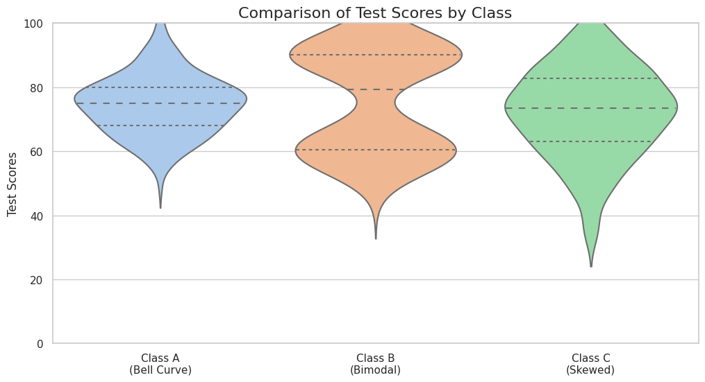
Violin plots are especially effective when comparing multiple groups side by side. The mirrored density shape allows viewers to quickly recognize whether data is symmetrical, skewed, or multimodal.


Related Charts and Graphs

Several visuals relate closely to violin plots and may be better choices depending on the goal.

  • Box-and-whisker plots summarize distribution using quartiles but hide detailed shape.
  • Strip plots display individual data points rather than smoothed density.
  • Histograms show distribution for a single group but may be harder to compare across categories.
  • Ridgeline plots stack multiple distributions vertically to emphasize patterns across groups.
  • Density plots visualize distribution shape for one dataset without categorical comparison.

Choosing between these options depends on whether the focus is detailed shape, summary statistics, or individual observations.


What a Violin Plot Is

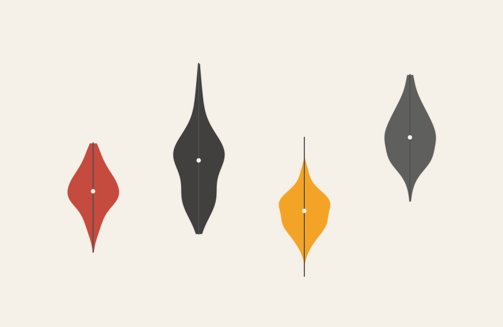
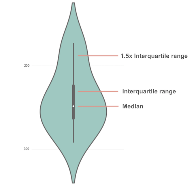
A violin plot displays a mirrored density curve that represents how values distribute across a numerical range. The wider sections of the shape indicate where data points are more concentrated, while narrow sections indicate fewer observations.

Common elements include:

  • A symmetrical, violin-shaped density curve
  • A central line or box representing median and quartiles
  • A numerical axis showing the scale of values
  • Multiple violins placed side by side for comparison

The visual combines the interpretability of a box plot with the richness of a density plot. Instead of reducing data to a few summary markers, the chart shows how the entire distribution behaves.

Because the shape reflects probability density rather than raw counts, smoothing techniques are often applied to create a continuous outline.


When to Use a Violin Plot

Use a violin plot when the goal is to compare distributions across categories while preserving detail about shape and spread.

This visual works especially well when the goal is to:

  • Compare variability across groups
  • Reveal skewness or asymmetry
  • Detect clusters or multiple peaks
  • Show differences in distribution shape
  • Present statistical analysis in a visual format

Violin plots are particularly valuable in research contexts where understanding distribution patterns matters. They help viewers move beyond averages and explore how values behave across the full range.

Because the shape conveys more nuance than a simple box plot, violin plots often provide deeper insight when communicating complex datasets.


Types of Data Sets That Work Best for a Violin Plot

Violin plots work best with continuous numerical data grouped by category.

Strong candidates include:

  • Test scores across different classes
  • Reaction times across experimental conditions
  • Customer ratings across product categories
  • Income distribution across regions
  • Health measurements across demographic groups
  • Performance metrics across teams or departments

Datasets with moderate to large sample sizes tend to produce clearer violin shapes. Very small datasets may create misleading density patterns, while extremely large datasets may require careful smoothing to maintain clarity.

Consistency in scale across categories helps viewers compare shapes accurately.


Real-World Examples of a Violin Plot

Violin plots appear frequently in academic research, analytics dashboards, and scientific communication where distribution shape is important.

Educational or Assessment Data

Sample Violin Plot
Sample Violin Plot

4

Show how score distributions vary across classes or instructional methods.


Health or Medical Research

Sample Violin Plot
Sample Violin Plot

Reveal differences in measurement distributions between treatment groups.


Marketing or Customer Analytics

Sample Violin Plot

Compare how engagement or satisfaction varies across segments.


Financial or Economic Analysis

Sample Violin Plot
Sample Violin Plot

Highlight differences in risk or return distributions.


Scientific or Experimental Data

Sample Violin Plot

Show how experimental conditions produce different patterns of results.


What to Avoid or Be Careful Of with a Violin Plot

❌ Don’t use it with very small datasets
Limited data may create misleading or exaggerated density shapes.

❌ Don’t ignore smoothing settings
Excessive smoothing can hide important patterns, while too little can make shapes noisy.

❌ Don’t assume viewers understand density plots
Brief explanations or labels help audiences interpret the shape correctly.

❌ Don’t rely solely on color to distinguish categories
Clear labeling and spacing improve readability.

❌ Don’t use it when exact values matter more than distribution
Box plots or dot plots may communicate precise comparison more effectively.


*Content on this page was curated and edited by expert humans with the creative assistance of AI.

  • facebook
  • instagram
  • linkedin

DON'T MISS ANY SPOT-ON TIPS!

We don't spam! You'll only get emails when we post something awesome.
You can unsubscribe at any time.

Check your inbox or spam folder to confirm your subscription.

©2025 | The Comm Spot | By Newbold Communication & Design