
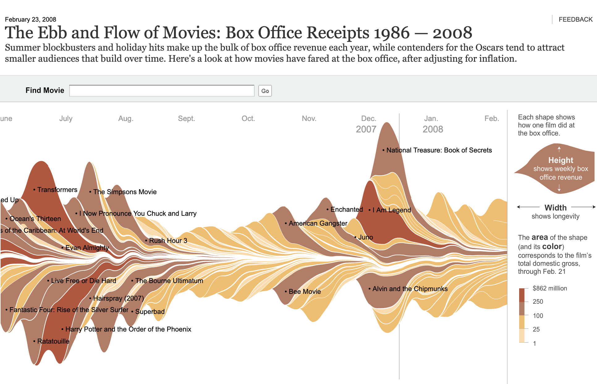
Streamgraph: How to Show Flowing Composition Over Time
A streamgraph helps visualize how multiple categories change over time while emphasizing flow and movement. Use it to show composition within a whole, but with a more organic and dynamic appearance than traditional stacked area charts.
Turn to a streamgraph when the goal is to highlight patterns, rhythms, or shifting contributions across a timeline. Instead of stacking layers on a fixed baseline, streamgraphs center the layers around a flowing axis, creating a shape that feels balanced and continuous.
Streamgraphs are especially effective when storytelling matters. Their fluid design draws attention to changes in prominence, growth, and decline, making them popular in data journalism and creative analytics.
Related Charts and Graphs
Several visuals relate closely to streamgraphs and may be better choices depending on the goal.
- Stacked area graphs show similar data but maintain a fixed baseline, making precise comparison easier.
- Multiline charts compare trends without emphasizing cumulative totals.
- 100% stacked area charts focus on proportion rather than absolute magnitude.
- ThemeRiver diagrams are an early form of streamgraph often used in temporal analysis.
- Ridgeline plots compare distributions across groups rather than layered composition.
Choosing between these options depends on whether the focus is precision, proportion, or visual storytelling.
What a Streamgraph Is
A streamgraph displays multiple time-series layers stacked around a central axis, creating a flowing shape that resembles waves or streams. Each layer represents a category, and the thickness of that layer reflects its value at a given point in time.
Common elements include:
- A continuous time-based horizontal axis
- Smooth, flowing layers representing categories
- A symmetrical or centered layout
- Color variations distinguishing streams
Unlike stacked area charts, streamgraphs minimize the visual dominance of a baseline. This makes the overall shape feel more balanced, but it can also make precise comparisons more difficult.
The visual emphasis lies in movement and pattern. Peaks and valleys form across the chart, helping viewers identify moments when categories rise, fall, or overlap.
When to Use a Streamgraph
Use a streamgraph when the goal is to communicate evolving composition with a strong visual narrative.
This visual works especially well when the goal is to:
- Show how contributions shift over time
- Highlight trends in cultural or media data
- Present creative or exploratory analytics
- Emphasize flow rather than exact values
- Tell a story about changing prominence across categories
Streamgraphs are often chosen when aesthetic appeal supports engagement. The flowing layers can make complex datasets feel more approachable and dynamic.
However, streamgraphs work best when viewers do not need to make precise numeric comparisons between layers. Their strength lies in revealing overall movement rather than exact measurement.
Types of Data Sets That Work Best for a Streamgraph
Streamgraphs work best with time-series data that contains multiple related categories contributing to a total.
Strong candidates include:
- Music genre popularity over time
- Social media or topic frequency trends
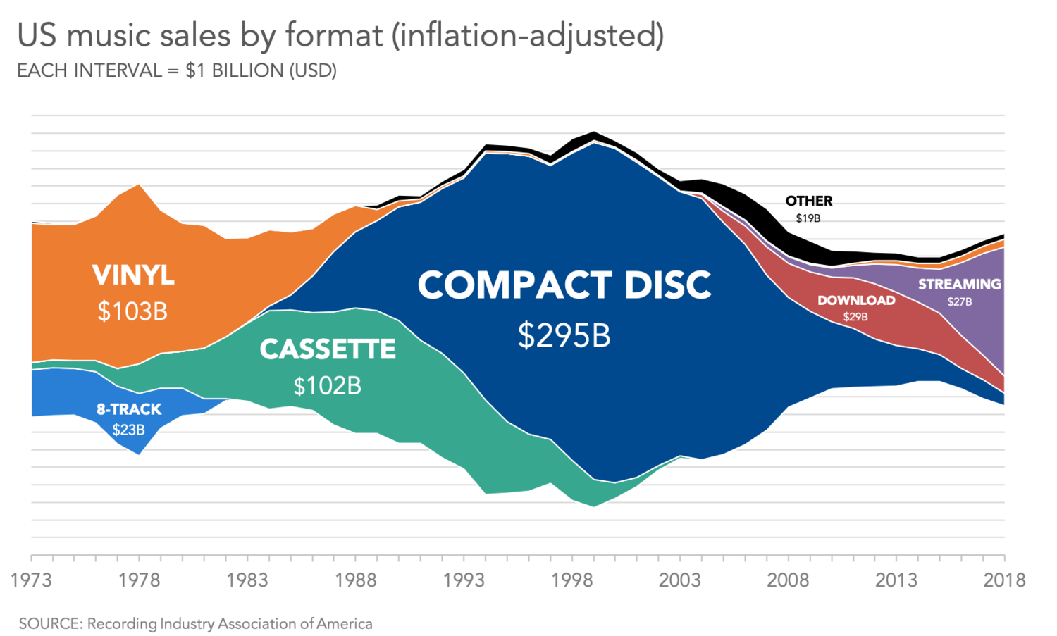
- Media consumption patterns
- Website traffic by category
- Cultural or linguistic trends
- Entertainment or streaming analytics
Data should be continuous and evenly spaced across the timeline. Sudden gaps or irregular intervals can disrupt the visual flow and make interpretation more difficult.
Because streamgraphs emphasize pattern, datasets with gradual change or cyclical behavior often produce the most compelling visuals.
Real-World Examples of a Streamgraph
Streamgraphs appear frequently in data journalism, cultural analytics, and creative dashboards where storytelling and pattern recognition are important.
Music Genre Popularity Over Time
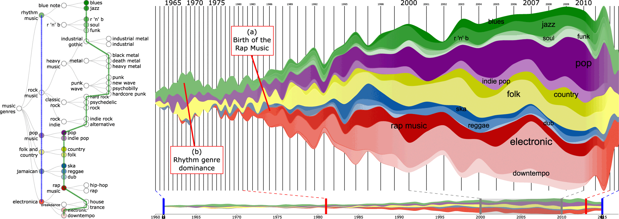
Show how different genres rise and fall in popularity across decades.
News or Media Coverage Patterns

Illustrate how attention to different subjects changes over time.
Website Traffic by Content Category

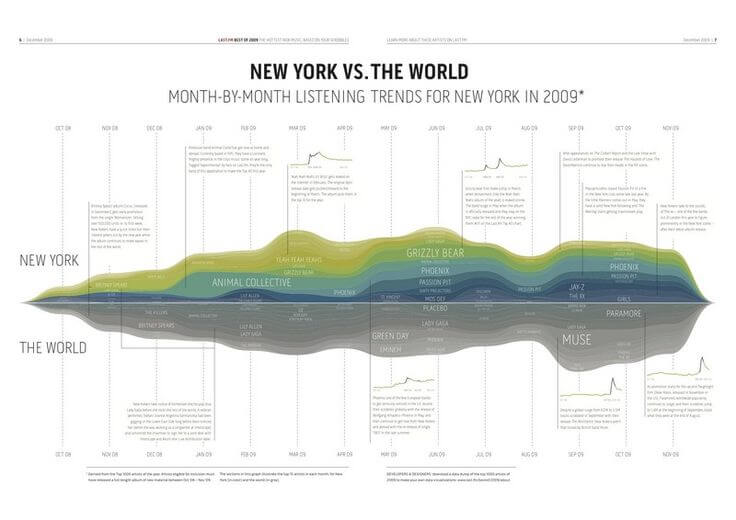
Highlight shifts in audience interest across sections or topics.
Cultural or Linguistic Trends
Show how themes or words fluctuate across long periods.
What to Avoid or Be Careful Of with a Streamgraph
❌ Don’t use it when precise comparison is required
The centered baseline makes it difficult to compare exact values between layers.
❌ Don’t include too many categories
Excessive layers create visual clutter and reduce readability.
❌ Don’t rely solely on color gradients
Clear labeling helps viewers follow individual streams.
❌ Don’t use uneven time intervals
Consistency across the timeline helps maintain visual flow.
❌ Don’t assume audiences are familiar with the format
Brief explanation or annotation can improve interpretation.
*Content on this page was curated and edited by expert humans with the creative assistance of AI.