Skip to content
The Comm Spot The Comm Spot

It's All About Communication

  • HOME
  • ABOUT
    • Meet the Creator: Curtis Newbold, PhD
    • Hire Curtis
    • Publish with Us
    • Contact
    • Privacy Notice
  • COMM-BASICS
    • Glossary
    • Citation & Style Guides
      • AP Style (Journalism)
        • AP Style Overview
        • AP Style Guidelines
        • Media Ethics – SPJ Code of Ethics
        • Elements of Newsworthiness
      • APA Style
        • APA Format – Overview
        • APA - References Guidelines
        • APA - In-text Citations
        • APA - Citing Authors
        • APA - Audiovisual Media
        • APA - Books
        • APA - Digital Sources
        • APA - Events & Interactions
        • APA - Periodicals
        • APA - Print Sources (other than books)
      • Chicago Style
        • Chicago – Overview
        • Chicago - Author-Date System
        • Chicago - Notes-Bibliography System
        • Chicago - In-text Citations
        • Chicago Style - Citing Authors
        • Chicago - Audiovisual Media
        • Chicago - Books
        • Chicago - Digital Sources
        • Chicago - Events and Interactions
        • Chicago - Citing Periodicals
        • Chicago - Print Sources (other than books)
      • MLA Style
        • MLA Overview
        • MLA Works Cited Pages
        • MLA In-text Citations
        • MLA – Authors
        • MLA – Audiovisual Media
        • MLA – Books
        • MLA – Digital Sources
        • MLA – Events & Interactions
        • MLA – Periodicals
        • MLA – Print Sources (other than books)
    • Rhetoric
      • Overview of Rhetoric
      • Rhetorical Appeals (Rhetorical Triangle)
      • Branches of Oratory
      • Canons of Rhetoric
      • Rhetorical Devices
      • Kairos
      • Topos
      • Key Figures in Rhetoric
    • Research Methods
      • Case Studies
      • Competitor Analysis
      • Content Analysis
      • Discourse Analysis
      • Ethnography
      • Focus Groups
      • Observation Research
      • S.W.O.T. Analysis
      • Secondary Research
      • Surveys
      • Target Market Analysis
      • Usability Testing
      • Visual Analysis
    • Theories
    • Thinkers
  • COMM-SUBJECTS
    • Interpersonal Communication
      • Active Listening
      • Body Language
      • Conflict Management
      • Emotional Intelligence
        • Emotional Intelligence Overview
        • Self-Awareness
        • Self-Regulation
        • Motivation
        • Empathy
        • Social Skills
        • Emotional Intelligence Resources
      • Feedback
      • Negotiation
        • Overview of Negotiation
        • Negotiation Skills
        • Negotiation Strategies & Techniques
        • Stages of Negotiation
        • Common Negotiation Scenarios
        • Negotiation Case Studies & Examples
        • Negotiation Tools & Resources
        • Negotiation FAQ
    • Journalism
    • Public Speaking
      • General Guidelines
      • Overcoming Fear
      • Speech Writing and Organization
      • Delivery Techniques
      • Body Language
      • Audience Engagement
      • Storytelling
      • Designing Slides
      • P.O.W.E.R.F.U.L. Presentation Method
    • Strategic Communication
      • Business & Org Comm
        • Definition & History
        • Org Comm Theories
        • Business Documents
        • Change Management
        • Employee Relations
        • Employment Communication
        • Group & Team Communication
        • Leadership Communication
        • Power, Identity, & Ethics at Work
        • Project Management
      • Integrated Marketing Comm
        • Definition of IMC
        • Core Principles of IMC
        • IMC Planning
        • Audience Segmentation
        • Marketing Channels
        • Message Strategies
        • Campaign Measurement & Evaluation
        • Trends & Innovations in IMC
        • Challenges & Pitfalls in IMC
        • Careers & Roles in IMC
      • Public Relations
        • Foundations in PR
        • Strategic Practice
        • Tools & Tactics
        • Research & Analysis
        • Professional Development
      • Case Studies in Strat Comm
    • Technical & Scientific Communication
    • Visual Communication
      • Data Visualization
      • Information Design
      • Photography
      • Web Design
    • Written Communication
      • Writing Process
      • Organizational Methods
        • Five Paragraph Essay
        • Hourglass Method of Writing
        • IMRaD Format (Science)
        • Indirect Method (Bad News)
        • Inverted Pyramid (Journalism)
        • Martini Glass
        • Narrative Format
        • Proposal Format
        • Rogerian Method
        • Toulmin Method
      • Plain Language
        • Audience (Plain Language)
        • Organization (Plain Language)
        • Conversation (Plain Language)
        • Simplicity (Plain Language)
        • Word Choice (Plain Language)
        • Sentence Structure (Plain Language)
        • Design (Plain Language)
      • Punctuation
        • Apostrophes
        • Brackets
        • Colons
        • Commas
        • Ellipses
        • Em Dashes
        • En Dashes
        • Exclamation Marks
        • Hyphens
        • Parentheses
        • Periods
        • Question Marks
        • Quotation Marks
        • Semicolons
      • Style
        • Clarity
        • Conciseness
        • Consistency
        • Editing
        • Flow
        • Rhetorical Devices
        • Sentence Structure
        • Storytelling
        • Tone
        • Voice
        • Word Choice
  • RESOURCES
    • Teaching Resources
      • Assignments & Activities
      • Instructional Design
      • Pedagogies
  • BLOGS
    • The Spotlight Blog
    • Comm Sparks
  • SHOP
    • Cart
    • Checkout
0
The Comm Spot
The Comm Spot

It's All About Communication

Stacked Bar Chart – Data Visualization

Home >COMM-Subjects >Visual Communication >Data Visualization >Types of Data Visualizations (Charts and Graphs) >Stacked Bar Chart – Data Visualization

Stacked Bar Chart: How to Show Parts of a Whole Across Categories

A stacked bar chart helps visualize how individual parts contribute to a total within each category. Use it to show both comparison and composition at the same time. Instead of presenting separate bars for every subgroup, the chart stacks segments together, creating a single bar that represents the full value.

Turn to a stacked bar chart when the goal is to explain how a whole breaks into pieces while still allowing comparison between categories. The layered structure makes it possible to see totals at a glance while also revealing how those totals are built from smaller components.

Stacked bar charts are especially effective when the story involves distribution or balance. Whether showing budget allocation, demographic composition, or survey responses, the stacked format keeps the relationship between parts and whole front and center.


Related Charts and Graphs

Several visuals relate closely to stacked bar charts and may be better choices depending on the goal.

  • Grouped bar charts compare subcategories side by side instead of stacking them into a single total.
  • 100% stacked bar charts emphasize proportions rather than absolute values.
  • Pie and donut charts show composition within a single category instead of across multiple categories.
  • Stacked area graphs highlight composition over time rather than across discrete groups.
  • Lollipop charts or dot plots provide cleaner comparisons when precise differences matter more than composition.

Choosing between these options depends on whether the focus is comparison, proportion, or cumulative structure.


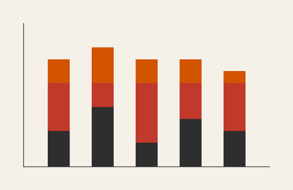
What a Stacked Bar Chart Is

A stacked bar chart displays bars divided into segments, where each segment represents a portion of the total value for that category. The total height or length of each bar reflects the overall value, while the stacked segments show how that total is distributed.

Common elements include:

  • Bars representing categories
  • Segments stacked vertically or horizontally
  • Color or shading distinguishing parts
  • Labels or legends identifying each segment

The visual structure emphasizes both total magnitude and internal composition. Viewers can quickly see which categories are largest overall and how each part contributes to that size.

Stacked bar charts can be oriented vertically or horizontally depending on layout needs. Horizontal versions often improve readability when labels are long, while vertical versions may feel more familiar in traditional dashboards.


When to Use a Stacked Bar Chart

Use a stacked bar chart when composition and comparison need to be shown together.

This visual works especially well when the goal is to:

  • Compare totals across categories
  • Show how parts contribute to a whole
  • Highlight shifts in distribution
  • Present survey or demographic breakdowns
  • Communicate budget or resource allocation

Stacked bar charts work best when categories share the same components. For example, comparing departments by budget categories or regions by product types allows viewers to interpret patterns consistently.

Because stacked bars combine multiple values into one structure, they help simplify complex data into a single visual narrative.


Types of Data Sets That Work Best for a Stacked Bar Chart

Stacked bar charts work best with categorical data that contains subcategories contributing to a total.

Strong candidates include:

  • Budget or spending breakdowns by department
  • Survey responses divided into categories
  • Sales by product type across regions
  • Population demographics across locations
  • Marketing performance by channel
  • Time allocation across activities

Each category should represent a meaningful whole, and each segment should represent a clearly defined part of that whole. Consistent ordering of segments across bars improves readability and helps viewers track patterns more easily.

Stacked bar charts also work well when totals vary between categories. The varying heights of the bars communicate overall magnitude while the segments reveal distribution.


Real-World Examples of a Stacked Bar Chart

Stacked bar charts appear frequently in journalism, analytics, and reporting when composition and comparison need to be shown simultaneously.


Survey or Poll Results

Sample Stacked Bar Chart

Present response distributions while allowing comparison between groups or questions.


Sales or Product Mix Across Regions

Sample Stacked Bar Chart

Highlight how different products contribute to total performance in each market.


Demographic or Population Composition

Sample Stacked Bar Chart

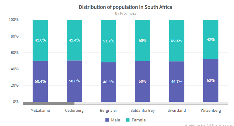
Show how populations divide across categories such as age, gender, or education.


Marketing or Channel Performance

Sample Stacked Bar Chart

Illustrate how multiple channels contribute to total engagement or conversion.


What to Avoid or Be Careful Of with a Stacked Bar Chart

❌ Don’t include too many segments
Too many layers make individual contributions hard to distinguish.

❌ Don’t assume viewers can compare middle segments easily
Only the baseline segments share a consistent starting point, making comparisons in the middle of the stack harder.

❌ Don’t rely on similar colors
Strong contrast helps viewers differentiate between parts.

❌ Don’t mix unrelated totals
Stacked bars work best when each category represents a comparable whole.

❌ Don’t use it when precise comparison between subcategories is essential
Grouped bar charts or dot plots often communicate those differences more clearly.


*Content on this page was curated and edited by expert humans with the creative assistance of AI.

  • facebook
  • instagram
  • linkedin

DON'T MISS ANY SPOT-ON TIPS!

We don't spam! You'll only get emails when we post something awesome.
You can unsubscribe at any time.

Check your inbox or spam folder to confirm your subscription.

©2025 | The Comm Spot | By Newbold Communication & Design