Skip to content
The Comm Spot The Comm Spot

It's All About Communication

  • HOME
  • ABOUT
    • Meet the Creator: Curtis Newbold, PhD
    • Hire Curtis
    • Publish with Us
    • Contact
    • Privacy Notice
  • COMM-BASICS
    • Glossary
    • Citation & Style Guides
      • AP Style (Journalism)
        • AP Style Overview
        • AP Style Guidelines
        • Media Ethics – SPJ Code of Ethics
        • Elements of Newsworthiness
      • APA Style
        • APA Format – Overview
        • APA - References Guidelines
        • APA - In-text Citations
        • APA - Citing Authors
        • APA - Audiovisual Media
        • APA - Books
        • APA - Digital Sources
        • APA - Events & Interactions
        • APA - Periodicals
        • APA - Print Sources (other than books)
      • Chicago Style
        • Chicago – Overview
        • Chicago - Author-Date System
        • Chicago - Notes-Bibliography System
        • Chicago - In-text Citations
        • Chicago Style - Citing Authors
        • Chicago - Audiovisual Media
        • Chicago - Books
        • Chicago - Digital Sources
        • Chicago - Events and Interactions
        • Chicago - Citing Periodicals
        • Chicago - Print Sources (other than books)
      • MLA Style
        • MLA Overview
        • MLA Works Cited Pages
        • MLA In-text Citations
        • MLA – Authors
        • MLA – Audiovisual Media
        • MLA – Books
        • MLA – Digital Sources
        • MLA – Events & Interactions
        • MLA – Periodicals
        • MLA – Print Sources (other than books)
    • Rhetoric
      • Overview of Rhetoric
      • Rhetorical Appeals (Rhetorical Triangle)
      • Branches of Oratory
      • Canons of Rhetoric
      • Rhetorical Devices
      • Kairos
      • Topos
      • Key Figures in Rhetoric
    • Research Methods
      • Case Studies
      • Competitor Analysis
      • Content Analysis
      • Discourse Analysis
      • Ethnography
      • Focus Groups
      • Observation Research
      • S.W.O.T. Analysis
      • Secondary Research
      • Surveys
      • Target Market Analysis
      • Usability Testing
      • Visual Analysis
    • Theories
    • Thinkers
  • COMM-SUBJECTS
    • Interpersonal Communication
      • Active Listening
      • Body Language
      • Conflict Management
      • Emotional Intelligence
        • Emotional Intelligence Overview
        • Self-Awareness
        • Self-Regulation
        • Motivation
        • Empathy
        • Social Skills
        • Emotional Intelligence Resources
      • Feedback
      • Negotiation
        • Overview of Negotiation
        • Negotiation Skills
        • Negotiation Strategies & Techniques
        • Stages of Negotiation
        • Common Negotiation Scenarios
        • Negotiation Case Studies & Examples
        • Negotiation Tools & Resources
        • Negotiation FAQ
    • Journalism
    • Public Speaking
      • General Guidelines
      • Overcoming Fear
      • Speech Writing and Organization
      • Delivery Techniques
      • Body Language
      • Audience Engagement
      • Storytelling
      • Designing Slides
      • P.O.W.E.R.F.U.L. Presentation Method
    • Strategic Communication
      • Business & Org Comm
        • Definition & History
        • Org Comm Theories
        • Business Documents
        • Change Management
        • Employee Relations
        • Employment Communication
        • Group & Team Communication
        • Leadership Communication
        • Power, Identity, & Ethics at Work
        • Project Management
      • Integrated Marketing Comm
        • Definition of IMC
        • Core Principles of IMC
        • IMC Planning
        • Audience Segmentation
        • Marketing Channels
        • Message Strategies
        • Campaign Measurement & Evaluation
        • Trends & Innovations in IMC
        • Challenges & Pitfalls in IMC
        • Careers & Roles in IMC
      • Public Relations
        • Foundations in PR
        • Strategic Practice
        • Tools & Tactics
        • Research & Analysis
        • Professional Development
      • Case Studies in Strat Comm
    • Technical & Scientific Communication
    • Visual Communication
      • Data Visualization
      • Information Design
      • Photography
      • Web Design
    • Written Communication
      • Writing Process
      • Organizational Methods
        • Five Paragraph Essay
        • Hourglass Method of Writing
        • IMRaD Format (Science)
        • Indirect Method (Bad News)
        • Inverted Pyramid (Journalism)
        • Martini Glass
        • Narrative Format
        • Proposal Format
        • Rogerian Method
        • Toulmin Method
      • Plain Language
        • Audience (Plain Language)
        • Organization (Plain Language)
        • Conversation (Plain Language)
        • Simplicity (Plain Language)
        • Word Choice (Plain Language)
        • Sentence Structure (Plain Language)
        • Design (Plain Language)
      • Punctuation
        • Apostrophes
        • Brackets
        • Colons
        • Commas
        • Ellipses
        • Em Dashes
        • En Dashes
        • Exclamation Marks
        • Hyphens
        • Parentheses
        • Periods
        • Question Marks
        • Quotation Marks
        • Semicolons
      • Style
        • Clarity
        • Conciseness
        • Consistency
        • Editing
        • Flow
        • Rhetorical Devices
        • Sentence Structure
        • Storytelling
        • Tone
        • Voice
        • Word Choice
  • RESOURCES
    • Teaching Resources
      • Assignments & Activities
      • Instructional Design
      • Pedagogies
  • BLOGS
    • The Spotlight Blog
    • Comm Sparks
  • SHOP
    • Cart
    • Checkout
0
The Comm Spot
The Comm Spot

It's All About Communication

Stacked Area Graph – Data Visualization

Home >COMM-Subjects >Visual Communication >Data Visualization >Types of Data Visualizations (Charts and Graphs) >Stacked Area Graph – Data Visualization

Stacked Area Graph: How to Show Change and Composition Over Time

A stacked area graph helps visualize how multiple categories contribute to a total over time. Use it to show both overall growth and how individual parts change within that total. The layered shapes make it possible to track trends while also understanding composition.

Turn to a stacked area graph when the goal is to combine two ideas in one view: change over time and parts of a whole. The flowing layers help viewers see how contributions expand, shrink, or shift relative to one another as the timeline progresses.

Stacked area graphs work especially well when storytelling focuses on cumulative patterns rather than precise comparisons between individual categories.


Related Charts and Graphs

Several visuals relate closely to stacked area graphs and may be better choices depending on the goal.

  • Area charts show change over time for a single category without layering multiple series.
  • Multiline charts compare trends across groups without emphasizing totals.
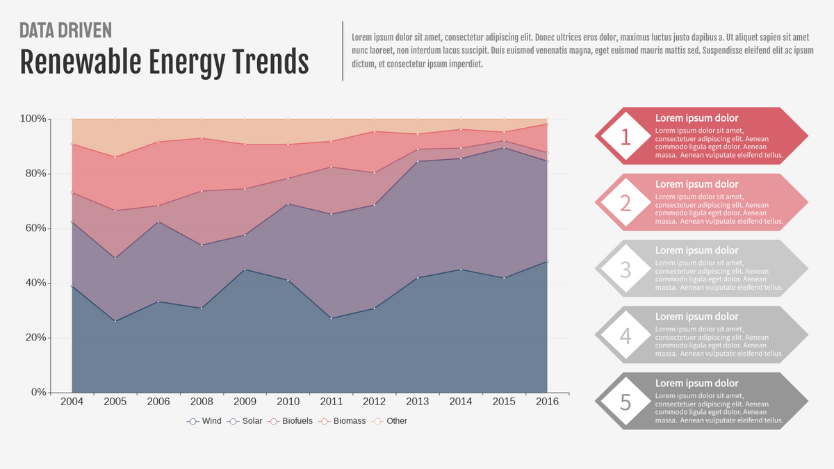
  • 100% stacked area charts highlight proportions rather than absolute values.
  • Stacked bar charts show composition across discrete categories rather than continuous time.
  • Line graphs provide clearer comparison when exact values or differences matter most.

Choosing between these options depends on whether the focus is cumulative totals, proportional change, or precise comparison.


What a Stacked Area Graph Is

A stacked area graph displays multiple series as filled areas layered on top of one another along a continuous axis, usually time. Each layer represents a category, and the combined height of all layers represents the overall total.

Common elements include:

  • A continuous horizontal axis
  • Layered areas stacked vertically
  • Color or shading distinguishing categories
  • A cumulative top line representing the total value

The visual emphasizes flow and movement, helping viewers see how categories interact within a growing or shrinking whole.

Unlike simple area charts, stacked versions highlight how individual contributions build upon one another, creating a layered narrative across time.


When to Use a Stacked Area Graph

Use a stacked area graph when both total change and category contribution are important to the story.

This visual works especially well when the goal is to:

  • Show cumulative growth or decline
  • Visualize how parts contribute to a whole over time
  • Highlight shifts in dominance between categories
  • Reveal long-term patterns in layered data
  • Present trends in a visually engaging way

Stacked area graphs are most effective when categories move together as part of a shared system, such as energy sources, revenue streams, or population segments.


Types of Data Sets That Work Best for a Stacked Area Graph

Stacked area graphs work best with time-series data that includes multiple related categories.

Strong candidates include:

  • Revenue streams by product line
  • Energy production by source
  • Website traffic by channel
  • Population demographics across years
  • Media consumption across platforms
  • Environmental measurements by category

Each category should represent a meaningful part of a combined total. Data should be continuous or sequential to preserve the sense of flow.

Consistency in ordering also matters. Keeping layers in a logical order helps viewers track patterns more easily across the chart.


Real-World Examples of a Stacked Area Graph

Stacked area graphs appear frequently in journalism, sustainability reporting, business analytics, and research when trends and composition need to be shown together.

Energy Production by Source Over Time

Sample Stacked Area Graph

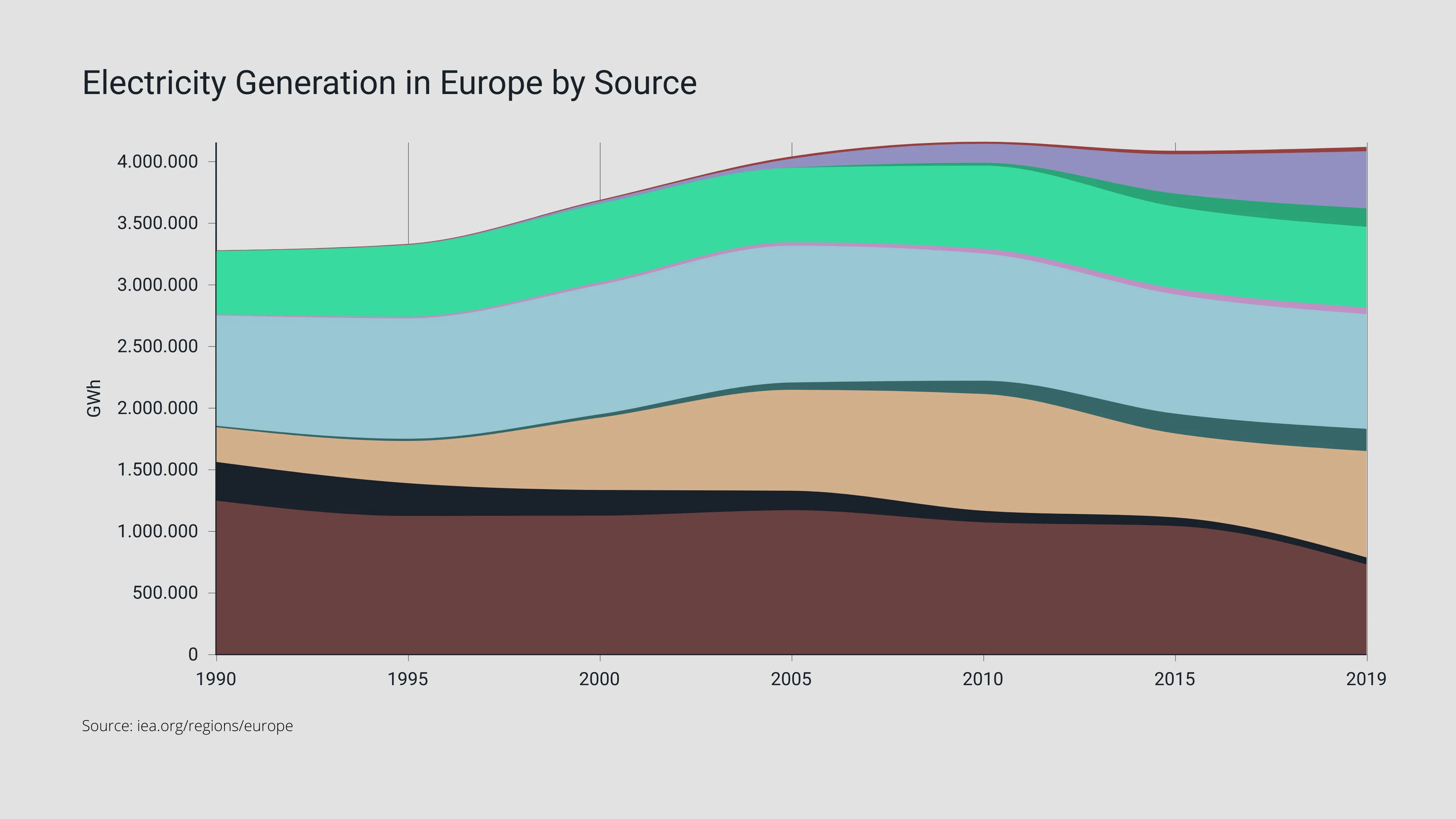
Show how contributions from different energy sources change while total production rises or falls.


Revenue or Sales by Product Category

Sample Stacked Area Graph

Highlight how different product lines contribute to overall performance.


Website Traffic by Channel

Sample Stacked Area Graph

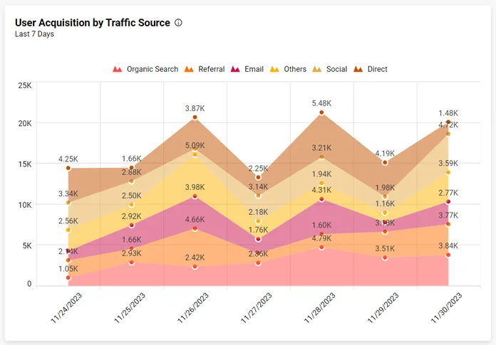
Reveal shifts between organic, paid, and social traffic over time.


Population or Demographic Trends

Sample Stacked Area Graph

Show how demographic groups evolve within a growing or shrinking population.


Media Consumption or Platform Usage

Sample Stacked Area Graph

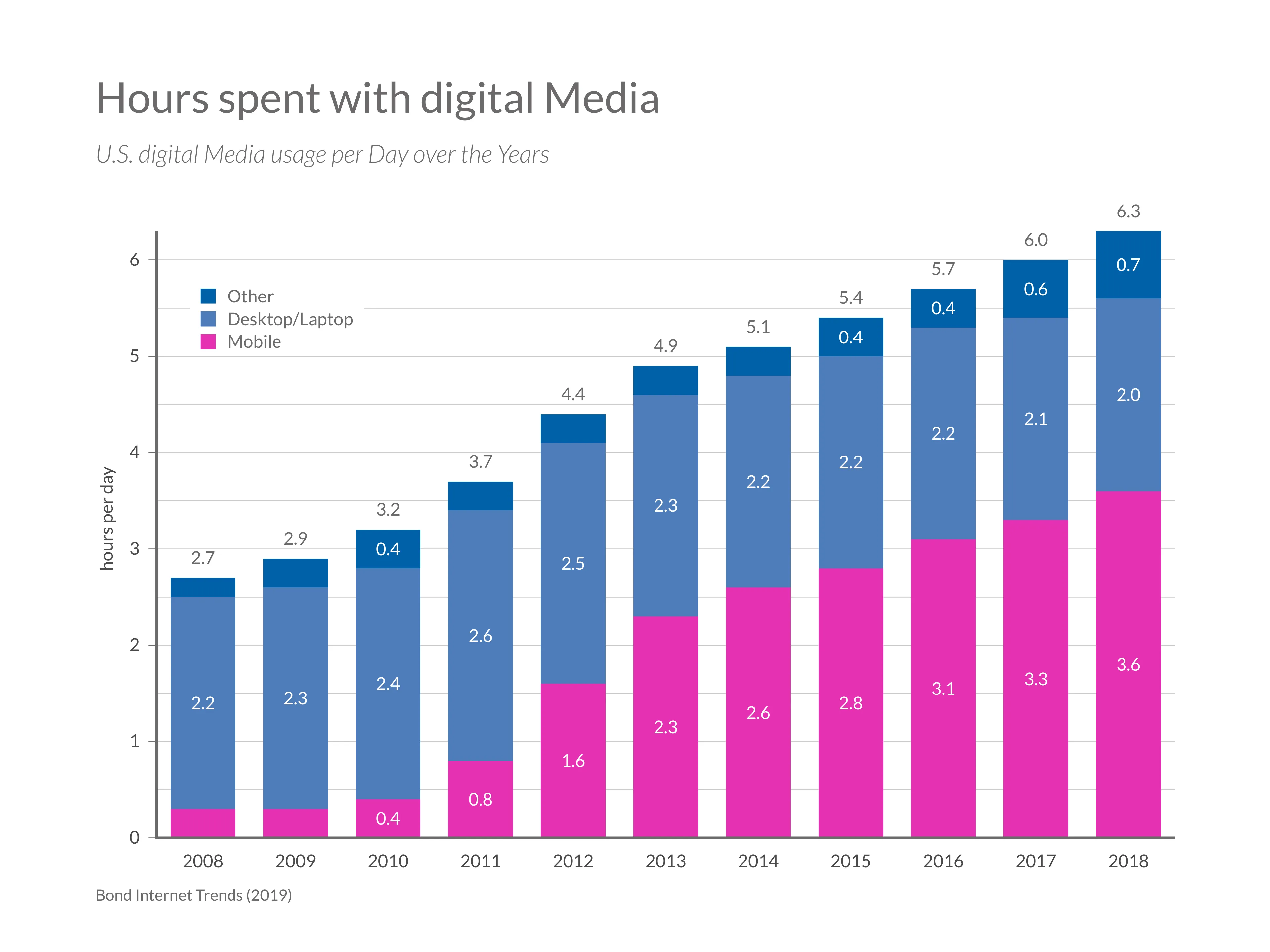
Illustrate how audience attention shifts across platforms over time.


What to Avoid or Be Careful Of with a Stacked Area Graph

❌ Don’t use too many layers
Too many categories make the chart difficult to read and compare.

❌ Don’t rely on similar colors
Clear visual separation between layers helps viewers distinguish contributions.

❌ Don’t expect precise comparison between middle layers
Only the top and bottom layers have consistent baselines, making intermediate comparisons harder.

❌ Don’t ignore ordering
Placing volatile categories near the baseline can improve readability.

❌ Don’t use it when totals are unrelated
Stacked area graphs assume categories combine into a meaningful whole.

Stacked area graphs provide a powerful way to tell stories about change and composition simultaneously. By blending flow, structure, and cumulative context, they help viewers understand not only how totals evolve, but also how individual contributions shape the overall trend.


*Content on this page was curated and edited by expert humans with the creative assistance of AI.

  • facebook
  • instagram
  • linkedin

DON'T MISS ANY SPOT-ON TIPS!

We don't spam! You'll only get emails when we post something awesome.
You can unsubscribe at any time.

Check your inbox or spam folder to confirm your subscription.

©2025 | The Comm Spot | By Newbold Communication & Design