
Sparkline Chart: How to Show Trends in a Compact Space
A sparkline chart helps visualize trends in a small, space-efficient format. Use it to show patterns over time without taking up the space of a full-sized graph. Often embedded within text, tables, or dashboards, sparklines provide quick visual context while keeping the design clean and minimal.
Turn to a sparkline chart when the goal is to communicate direction or movement at a glance rather than to provide detailed analysis. These tiny line charts strip away axes, labels, and heavy decoration, leaving only the essential shape of the data.
Sparklines work especially well when repeated across many rows, such as in reports or performance dashboards, where each small chart tells a miniature story about change.
Related Charts and Graphs
Several visuals relate closely to sparkline charts and may be better choices depending on the goal.
- Line graphs provide full context with axes, scales, and annotations for deeper analysis.
- Multiline charts compare several trends across a shared timeline rather than embedding many small charts.
- Area charts emphasize magnitude and accumulation rather than minimal trend lines.
- Bullet graphs combine sparklines with performance targets and benchmarks.
- Bar charts offer clearer comparison when precise values matter more than trend direction.
Choosing between these options depends on whether the focus is compact storytelling, detailed analysis, or comparative clarity.
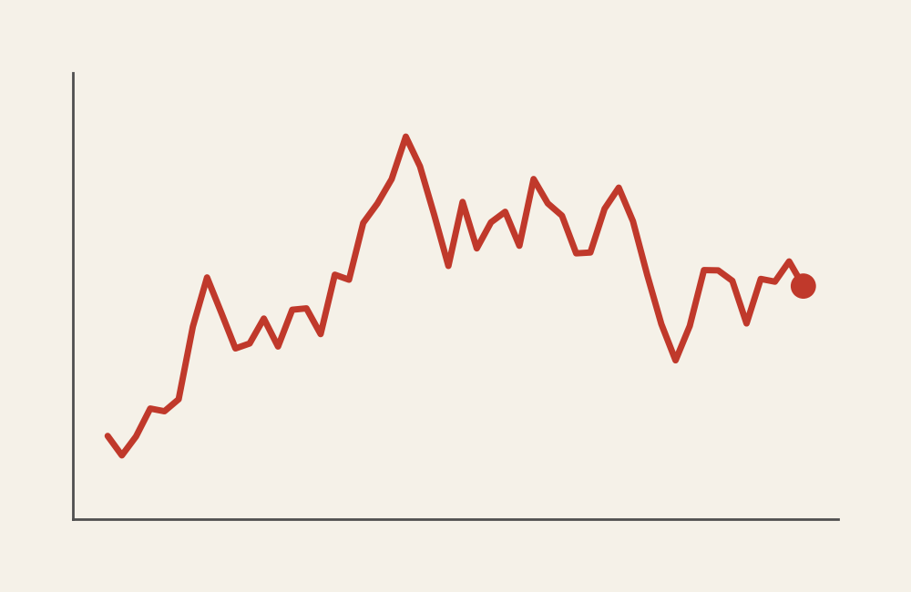
What a Sparkline Chart Is
A sparkline chart is a small, simplified line chart that shows a trend over time or sequence. It typically removes nonessential elements such as axes, gridlines, and labels to keep the focus on overall shape.
Common elements include:
- A single thin line representing change
- Minimal or no axes
- Compact size that fits within text or tables
- Occasional markers highlighting peaks or dips
Because sparklines rely on visual simplicity, they work best when viewers already understand the context of the data.
Rather than explaining everything within one chart, sparklines often rely on surrounding text or table headings to provide meaning.
When to Use a Sparkline Chart
Use a sparkline chart when the goal is to add visual context without interrupting layout or flow.
This visual works especially well when the goal is to:
- Show trends alongside numerical tables
- Add quick insight to dashboards
- Compare many small time series at once
- Highlight patterns without heavy annotation
- Provide visual summaries within reports
Sparkline charts are especially effective when space is limited. They allow trends to remain visible without requiring a full chart for every dataset.
Types of Data Sets That Work Best for a Sparkline Chart
Sparkline charts work best with sequential numerical data.
Strong candidates include:
- Sales performance by month
- Website traffic trends
- Stock price movement
- Temperature or environmental readings
- Student performance across assignments
- Operational metrics tracked daily or weekly
Each sparkline usually represents one category or entity, making them ideal for dashboards where many similar metrics appear together.
Consistency across sparklines matters. Using the same scale or context helps viewers compare trends accurately.
Real-World Examples of a Sparkline Chart
Sparkline charts appear frequently in dashboards, financial reports, and analytics platforms where compact visual storytelling is essential.
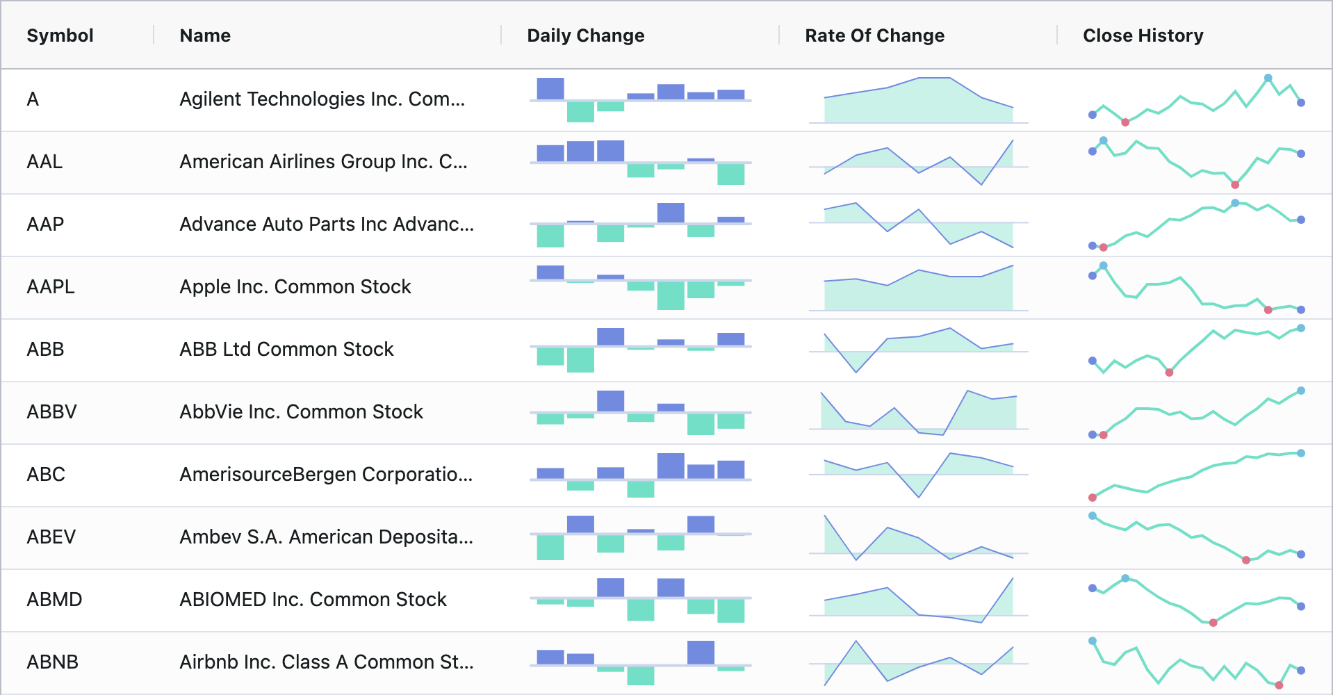
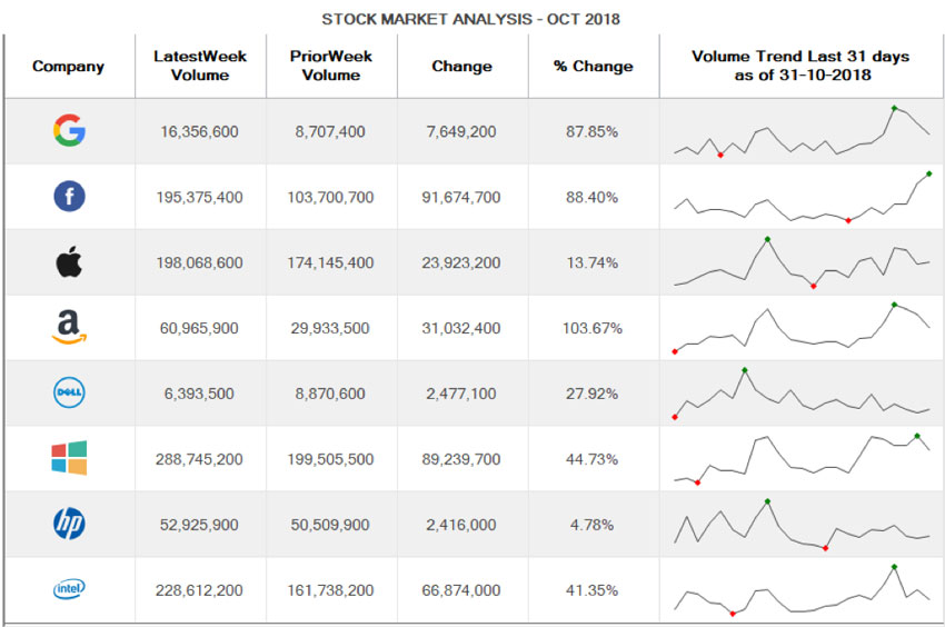
Financial or Stock Performance Tables
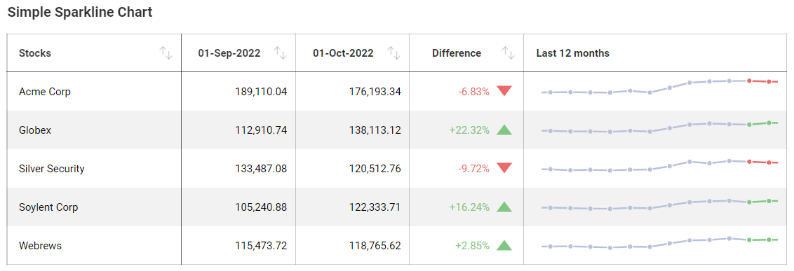
Embed trend lines within tables to show movement without expanding layout.
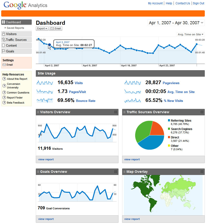
Website Analytics Dashboards
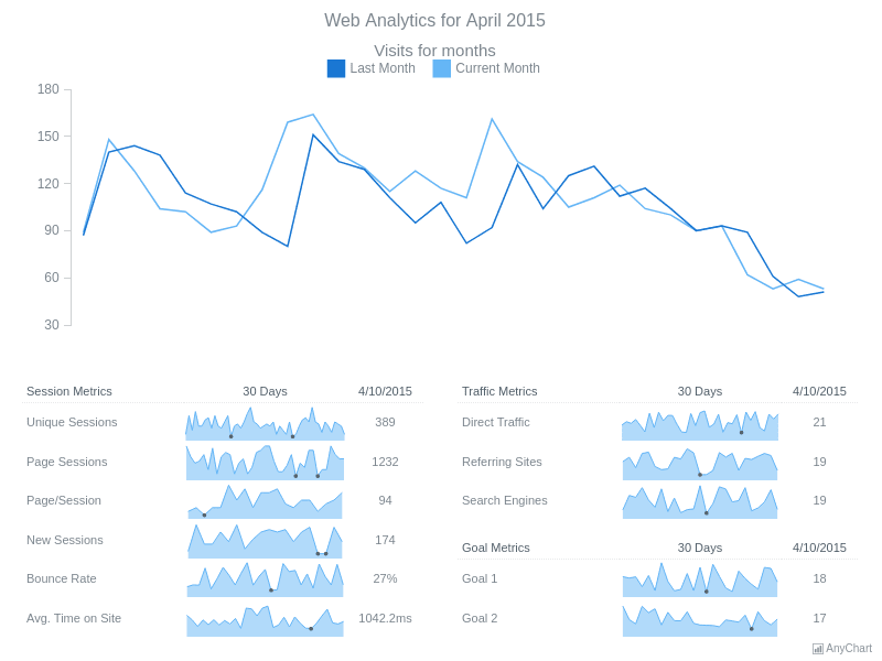
Provide quick visual cues about engagement patterns across pages or campaigns.
Sales or Performance Reporting

Show how performance evolves while keeping reports compact and readable.
Education or Assessment Tracking
Display progress across assignments or semesters in a small visual format.
Environmental or Sensor Monitoring
Highlight fluctuations in readings without requiring full charts.
What to Avoid or Be Careful Of with a Sparkline Chart
❌ Don’t remove too much context
Even minimal charts need enough labeling or surrounding information to be meaningful.
❌ Don’t mix inconsistent scales
Different ranges across sparklines can mislead viewers when comparing trends.
❌ Don’t use them for precise comparison
Sparklines emphasize pattern and direction rather than exact values.
❌ Don’t overcrowd with markers or decoration
Simplicity is essential for maintaining readability.
❌ Don’t rely on sparklines alone
They work best as supporting visuals alongside numbers or explanations.
Sparkline charts remain one of the most efficient ways to embed trends directly into content. By focusing on shape and direction rather than detail, they allow viewers to absorb information quickly while keeping the overall design clean and uncluttered.