
Radar (Spider) Chart: How to Compare Multidimensional Profiles
A radar chart, sometimes called a spider chart, helps compare multiple variables across the same scale. Use it to visualize strengths, weaknesses, or performance profiles in a way that emphasizes overall shape rather than individual values.
Turn to a radar chart when the goal is to compare patterns across several dimensions at once. The radial layout makes it easier to see balance, imbalance, and differences between profiles.
Related Charts and Graphs
Several visuals relate closely to radar charts and may be better choices depending on the goal.
- Multiline charts compare trends across time rather than across dimensions.
- Bar charts provide clearer comparisons when precision matters.
- Heatmap matrices show multidimensional data through color instead of shape.
- Parallel coordinates plots display multiple variables in a linear layout.
- Lollipop charts emphasize individual values without a radial structure.
Choosing between these options depends on whether the focus is shape, comparison, or analytical precision.
What a Radar (Spider) Chart Is
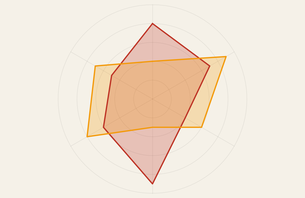
A radar chart displays variables along axes that radiate from a central point. Each axis represents a category or metric, and values are plotted outward from the center, forming a polygonal shape.
Common elements include:
- Radial axes representing variables
- A circular grid providing scale
- Connected lines forming a shape or profile
- Multiple overlapping shapes for comparison
The overall silhouette of the chart helps viewers see patterns and relative strengths across dimensions.
When to Use a Radar (Spider) Chart
Use a radar chart when comparing profiles across several variables that share the same scale.
This visual works especially well when the goal is to:
- Compare performance across dimensions
- Show strengths and weaknesses
- Evaluate skill sets or competencies
- Visualize product or service attributes
- Highlight balance or imbalance in profiles
A radar chart works best when the purpose is to compare multidimensional shapes rather than exact numbers.
Types of Data Sets That Work Best for a Radar (Spider) Chart
Radar charts work best with datasets that contain multiple comparable metrics.
Strong candidates include:
- Skill assessments or competency ratings
- Product feature comparisons
- Performance evaluations
- Customer satisfaction categories
- Sports analytics metrics
- Survey results using consistent scales
Each variable should share the same range or scoring system to keep comparisons meaningful.
Real-World Examples of a Radar (Spider) Chart
Radar charts appear frequently in performance reviews, product comparisons, and analytics dashboards where multidimensional comparison matters.
Skill or Competency Assessments
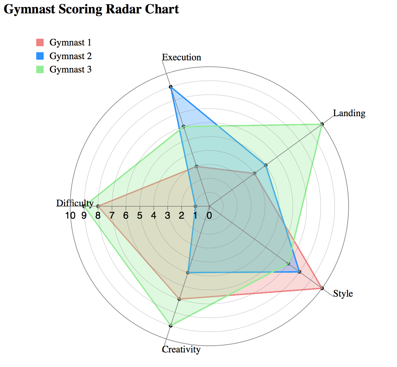
Show strengths and weaknesses across multiple skill categories.
Product or Service Comparisons
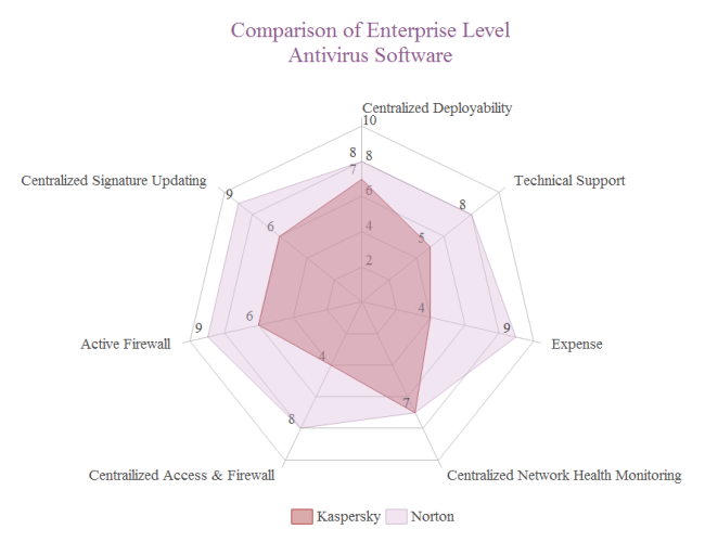
Compare attributes such as quality, price, durability, or usability.
Sports Performance Analysis


Display performance across multiple statistics in a single profile.
Customer Satisfaction or Survey Metrics

Show how perceptions vary across different dimensions of experience.
Business or Marketing Performance Profiles

Compare performance across strategic goals or key metrics.
What to Avoid or Be Careful Of with a Radar (Spider) Chart
❌ Don’t use too many variables
Too many axes make the chart difficult to read and interpret.
❌ Don’t mix different scales
All variables should share the same range to avoid misleading shapes.
❌ Don’t rely on overlapping colors alone
Transparency or labeling helps viewers distinguish between profiles.
❌ Don’t use it when precise comparison is required
Bar charts or tables often communicate exact differences more clearly.
❌ Don’t assume viewers understand radial layouts
Brief context or labeling can help audiences interpret the chart correctly.
*Content on this page was curated and edited by expert humans with the creative assistance of AI.