Skip to content
The Comm Spot The Comm Spot

It's All About Communication

  • HOME
  • ABOUT
    • Meet the Creator: Curtis Newbold, PhD
    • Hire Curtis
    • Publish with Us
    • Contact
    • Privacy Notice
  • COMM-BASICS
    • Glossary
    • Citation & Style Guides
      • AP Style (Journalism)
        • AP Style Overview
        • AP Style Guidelines
        • Media Ethics – SPJ Code of Ethics
        • Elements of Newsworthiness
      • APA Style
        • APA Format – Overview
        • APA - References Guidelines
        • APA - In-text Citations
        • APA - Citing Authors
        • APA - Audiovisual Media
        • APA - Books
        • APA - Digital Sources
        • APA - Events & Interactions
        • APA - Periodicals
        • APA - Print Sources (other than books)
      • Chicago Style
        • Chicago – Overview
        • Chicago - Author-Date System
        • Chicago - Notes-Bibliography System
        • Chicago - In-text Citations
        • Chicago Style - Citing Authors
        • Chicago - Audiovisual Media
        • Chicago - Books
        • Chicago - Digital Sources
        • Chicago - Events and Interactions
        • Chicago - Citing Periodicals
        • Chicago - Print Sources (other than books)
      • MLA Style
        • MLA Overview
        • MLA Works Cited Pages
        • MLA In-text Citations
        • MLA – Authors
        • MLA – Audiovisual Media
        • MLA – Books
        • MLA – Digital Sources
        • MLA – Events & Interactions
        • MLA – Periodicals
        • MLA – Print Sources (other than books)
    • Rhetoric
      • Overview of Rhetoric
      • Rhetorical Appeals (Rhetorical Triangle)
      • Branches of Oratory
      • Canons of Rhetoric
      • Rhetorical Devices
      • Kairos
      • Topos
      • Key Figures in Rhetoric
    • Research Methods
      • Case Studies
      • Competitor Analysis
      • Content Analysis
      • Discourse Analysis
      • Ethnography
      • Focus Groups
      • Observation Research
      • S.W.O.T. Analysis
      • Secondary Research
      • Surveys
      • Target Market Analysis
      • Usability Testing
      • Visual Analysis
    • Theories
    • Thinkers
  • COMM-SUBJECTS
    • Interpersonal Communication
      • Active Listening
      • Body Language
      • Conflict Management
      • Emotional Intelligence
        • Emotional Intelligence Overview
        • Self-Awareness
        • Self-Regulation
        • Motivation
        • Empathy
        • Social Skills
        • Emotional Intelligence Resources
      • Feedback
      • Negotiation
        • Overview of Negotiation
        • Negotiation Skills
        • Negotiation Strategies & Techniques
        • Stages of Negotiation
        • Common Negotiation Scenarios
        • Negotiation Case Studies & Examples
        • Negotiation Tools & Resources
        • Negotiation FAQ
    • Journalism
    • Public Speaking
      • General Guidelines
      • Overcoming Fear
      • Speech Writing and Organization
      • Delivery Techniques
      • Body Language
      • Audience Engagement
      • Storytelling
      • Designing Slides
      • P.O.W.E.R.F.U.L. Presentation Method
    • Strategic Communication
      • Business & Org Comm
        • Definition & History
        • Org Comm Theories
        • Business Documents
        • Change Management
        • Employee Relations
        • Employment Communication
        • Group & Team Communication
        • Leadership Communication
        • Power, Identity, & Ethics at Work
        • Project Management
      • Integrated Marketing Comm
        • Definition of IMC
        • Core Principles of IMC
        • IMC Planning
        • Audience Segmentation
        • Marketing Channels
        • Message Strategies
        • Campaign Measurement & Evaluation
        • Trends & Innovations in IMC
        • Challenges & Pitfalls in IMC
        • Careers & Roles in IMC
      • Public Relations
        • Foundations in PR
        • Strategic Practice
        • Tools & Tactics
        • Research & Analysis
        • Professional Development
      • Case Studies in Strat Comm
    • Technical & Scientific Communication
    • Visual Communication
      • Data Visualization
      • Information Design
      • Photography
      • Web Design
    • Written Communication
      • Writing Process
      • Organizational Methods
        • Five Paragraph Essay
        • Hourglass Method of Writing
        • IMRaD Format (Science)
        • Indirect Method (Bad News)
        • Inverted Pyramid (Journalism)
        • Martini Glass
        • Narrative Format
        • Proposal Format
        • Rogerian Method
        • Toulmin Method
      • Plain Language
        • Audience (Plain Language)
        • Organization (Plain Language)
        • Conversation (Plain Language)
        • Simplicity (Plain Language)
        • Word Choice (Plain Language)
        • Sentence Structure (Plain Language)
        • Design (Plain Language)
      • Punctuation
        • Apostrophes
        • Brackets
        • Colons
        • Commas
        • Ellipses
        • Em Dashes
        • En Dashes
        • Exclamation Marks
        • Hyphens
        • Parentheses
        • Periods
        • Question Marks
        • Quotation Marks
        • Semicolons
      • Style
        • Clarity
        • Conciseness
        • Consistency
        • Editing
        • Flow
        • Rhetorical Devices
        • Sentence Structure
        • Storytelling
        • Tone
        • Voice
        • Word Choice
  • RESOURCES
    • Teaching Resources
      • Assignments & Activities
      • Instructional Design
      • Pedagogies
  • BLOGS
    • The Spotlight Blog
    • Comm Sparks
  • SHOP
    • Cart
    • Checkout
0
The Comm Spot
The Comm Spot

It's All About Communication

Proportional Symbol Map – Data Visualization

Home >COMM-Subjects >Visual Communication >Data Visualization >Types of Data Visualizations (Charts and Graphs) >Proportional Symbol Map – Data Visualization

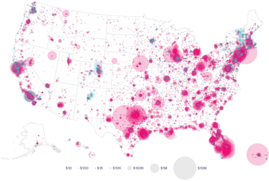
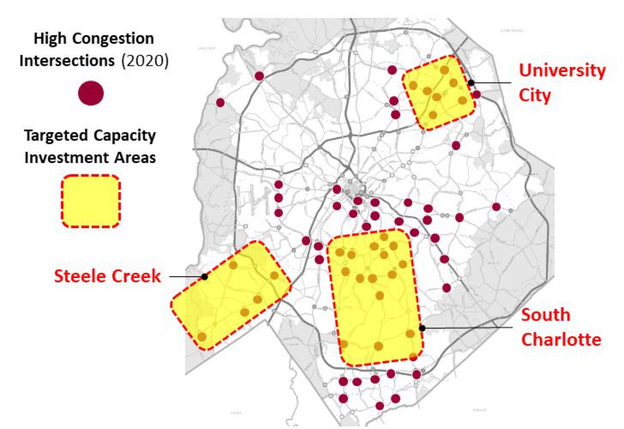
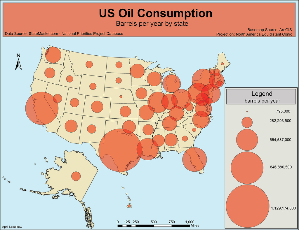
Proportional Symbol Map: How to Show Quantity Across Geographic Locations

A proportional symbol map helps visualize numerical values tied to specific places. Use it to show how quantities vary across locations while keeping geographic context visible.

Turn to a proportional symbol map when the goal is to compare magnitude between cities, regions, or points on a map. Symbols grow or shrink based on value, making differences easy to recognize without relying on color alone.


Related Charts and Graphs

Several visuals relate closely to proportional symbol maps and may be better choices depending on the goal.

  • Choropleth maps fill regions with color to show rates or averages rather than totals.
  • Dot density maps show distribution patterns using repeated dots instead of scaled symbols.
  • Geographic heat maps highlight intensity or hotspots through gradients.
  • Flow maps emphasize movement between locations rather than quantity at a single place.
  • Bubble charts display proportional size without geographic context.

Choosing between these options depends on whether the focus is magnitude, density, or movement.


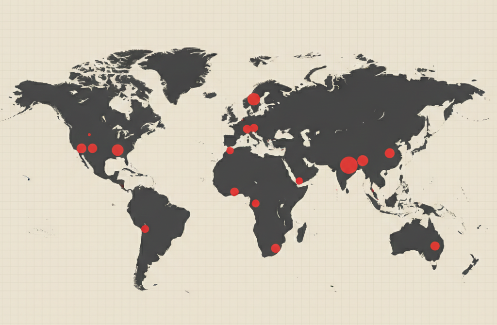
What a Proportional Symbol Map Is

A proportional symbol map displays data using symbols placed at geographic locations. The size of each symbol represents the magnitude of a value, allowing viewers to compare quantities visually across space.

Common elements include:

  • A basemap providing geographic context
  • Circles or shapes scaled according to value
  • Consistent sizing rules for accurate comparison
  • Labels or legends explaining symbol meaning

The symbols usually remain centered on locations such as cities or regions, making the map feel precise and location-focused.


When to Use a Proportional Symbol Map

Use a proportional symbol map when showing how quantities vary across geographic points.

This visual works especially well when the goal is to:

  • Compare totals across locations
  • Highlight geographic variation in magnitude
  • Show counts rather than rates
  • Reveal regional concentration without hiding boundaries
  • Combine geography with quantitative comparison

A proportional symbol map works best when the purpose is to show “how much” at each place.


Types of Data Sets That Work Best for a Proportional Symbol Map

Proportional symbol maps work best with numerical values tied to specific geographic coordinates.

Strong candidates include:

  • Population counts by city
  • Sales or revenue by location
  • Event counts or incident totals
  • Resource distribution
  • Infrastructure capacity
  • Economic output by region

Values should represent totals or magnitude rather than percentages or averages.


Real-World Examples of a Proportional Symbol Map

Proportional symbol maps appear frequently in journalism, geography, business analytics, and public policy reporting.

Population or Demographic Distribution

https://cdn.prod.website-files.com/63483ad423421bd16e7a7ae7/63a167721b0e90b96ec98cc2_header.png

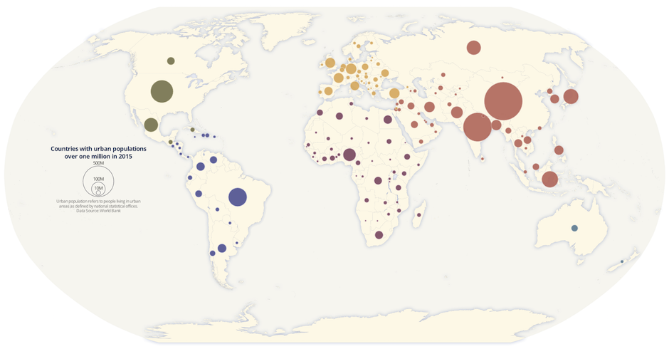
Show how population size varies across cities or regions.


Sales or Economic Activity by Location

https://www.tableau.com/sites/default/files/2021-08/Symbol%20Map%20-%20Good%20-%20900x650.png
https://www.espatial.com/hubfs/gdp-european-countries.webp

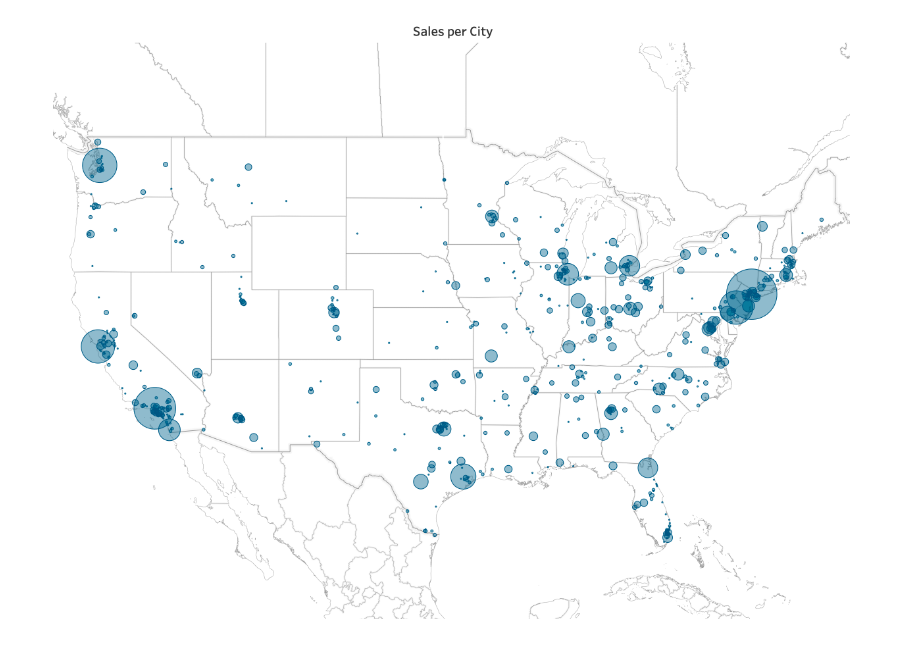
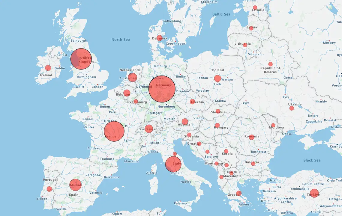
Highlight geographic differences in revenue or performance.


Public Health or Incident Counts

https://stpltrsrcscmnprdwus001.blob.core.windows.net/rsrcs/srm/images/proportional-symbol-map/10.4135_9781529776560-fig1.jpg

Display case counts while preserving location accuracy.


Transportation or Infrastructure Capacity

https://substackcdn.com/image/fetch/%24s_%21Hb2f%21%2Cf_auto%2Cq_auto%3Agood%2Cfl_progressive%3Asteep/https%3A%2F%2Fbucketeer-e05bbc84-baa3-437e-9518-adb32be77984.s3.amazonaws.com%2Fpublic%2Fimages%2Fe4c12f7e-7bb5-413f-ab37-798e167455bc_1279x879.png

Show volume differences across hubs or networks.


Environmental or Resource Measurements

https://mappingignorance.org/app/uploads/2013/12/Figure-11.jpg

Compare magnitude of environmental or resource data across locations.


What to Avoid or Be Careful Of with a Proportional Symbol Map

❌ Don’t use symbol diameter instead of area scaling
Symbols should grow proportionally by area to avoid misleading viewers.

❌ Don’t overcrowd the map
Large symbols can overlap and obscure smaller locations.

❌ Don’t use it for rates or percentages
Choropleth maps usually communicate normalized values more clearly.

❌ Don’t rely on color alone
Size should remain the primary encoding for magnitude.

❌ Don’t ignore legend clarity
Clear scale references help viewers interpret symbol sizes accurately.


*Content on this page was curated and edited by expert humans with the creative assistance of AI.

  • facebook
  • instagram
  • linkedin

DON'T MISS ANY SPOT-ON TIPS!

We don't spam! You'll only get emails when we post something awesome.
You can unsubscribe at any time.

Check your inbox or spam folder to confirm your subscription.

©2025 | The Comm Spot | By Newbold Communication & Design