Skip to content
The Comm Spot The Comm Spot

It's All About Communication

  • HOME
  • ABOUT
    • Meet the Creator: Curtis Newbold, PhD
    • Hire Curtis
    • Publish with Us
    • Contact
    • Privacy Notice
  • COMM-BASICS
    • Glossary
    • Citation & Style Guides
      • AP Style (Journalism)
        • AP Style Overview
        • AP Style Guidelines
        • Media Ethics – SPJ Code of Ethics
        • Elements of Newsworthiness
      • APA Style
        • APA Format – Overview
        • APA - References Guidelines
        • APA - In-text Citations
        • APA - Citing Authors
        • APA - Audiovisual Media
        • APA - Books
        • APA - Digital Sources
        • APA - Events & Interactions
        • APA - Periodicals
        • APA - Print Sources (other than books)
      • Chicago Style
        • Chicago – Overview
        • Chicago - Author-Date System
        • Chicago - Notes-Bibliography System
        • Chicago - In-text Citations
        • Chicago Style - Citing Authors
        • Chicago - Audiovisual Media
        • Chicago - Books
        • Chicago - Digital Sources
        • Chicago - Events and Interactions
        • Chicago - Citing Periodicals
        • Chicago - Print Sources (other than books)
      • MLA Style
        • MLA Overview
        • MLA Works Cited Pages
        • MLA In-text Citations
        • MLA – Authors
        • MLA – Audiovisual Media
        • MLA – Books
        • MLA – Digital Sources
        • MLA – Events & Interactions
        • MLA – Periodicals
        • MLA – Print Sources (other than books)
    • Rhetoric
      • Overview of Rhetoric
      • Rhetorical Appeals (Rhetorical Triangle)
      • Branches of Oratory
      • Canons of Rhetoric
      • Rhetorical Devices
      • Kairos
      • Topos
      • Key Figures in Rhetoric
    • Research Methods
      • Case Studies
      • Competitor Analysis
      • Content Analysis
      • Discourse Analysis
      • Ethnography
      • Focus Groups
      • Observation Research
      • S.W.O.T. Analysis
      • Secondary Research
      • Surveys
      • Target Market Analysis
      • Usability Testing
      • Visual Analysis
    • Theories
    • Thinkers
  • COMM-SUBJECTS
    • Interpersonal Communication
      • Active Listening
      • Body Language
      • Conflict Management
      • Emotional Intelligence
        • Emotional Intelligence Overview
        • Self-Awareness
        • Self-Regulation
        • Motivation
        • Empathy
        • Social Skills
        • Emotional Intelligence Resources
      • Feedback
      • Negotiation
        • Overview of Negotiation
        • Negotiation Skills
        • Negotiation Strategies & Techniques
        • Stages of Negotiation
        • Common Negotiation Scenarios
        • Negotiation Case Studies & Examples
        • Negotiation Tools & Resources
        • Negotiation FAQ
    • Journalism
    • Public Speaking
      • General Guidelines
      • Overcoming Fear
      • Speech Writing and Organization
      • Delivery Techniques
      • Body Language
      • Audience Engagement
      • Storytelling
      • Designing Slides
      • P.O.W.E.R.F.U.L. Presentation Method
    • Strategic Communication
      • Business & Org Comm
        • Definition & History
        • Org Comm Theories
        • Business Documents
        • Change Management
        • Employee Relations
        • Employment Communication
        • Group & Team Communication
        • Leadership Communication
        • Power, Identity, & Ethics at Work
        • Project Management
      • Integrated Marketing Comm
        • Definition of IMC
        • Core Principles of IMC
        • IMC Planning
        • Audience Segmentation
        • Marketing Channels
        • Message Strategies
        • Campaign Measurement & Evaluation
        • Trends & Innovations in IMC
        • Challenges & Pitfalls in IMC
        • Careers & Roles in IMC
      • Public Relations
        • Foundations in PR
        • Strategic Practice
        • Tools & Tactics
        • Research & Analysis
        • Professional Development
      • Case Studies in Strat Comm
    • Technical & Scientific Communication
    • Visual Communication
      • Data Visualization
      • Information Design
      • Photography
      • Web Design
    • Written Communication
      • Writing Process
      • Organizational Methods
        • Five Paragraph Essay
        • Hourglass Method of Writing
        • IMRaD Format (Science)
        • Indirect Method (Bad News)
        • Inverted Pyramid (Journalism)
        • Martini Glass
        • Narrative Format
        • Proposal Format
        • Rogerian Method
        • Toulmin Method
      • Plain Language
        • Audience (Plain Language)
        • Organization (Plain Language)
        • Conversation (Plain Language)
        • Simplicity (Plain Language)
        • Word Choice (Plain Language)
        • Sentence Structure (Plain Language)
        • Design (Plain Language)
      • Punctuation
        • Apostrophes
        • Brackets
        • Colons
        • Commas
        • Ellipses
        • Em Dashes
        • En Dashes
        • Exclamation Marks
        • Hyphens
        • Parentheses
        • Periods
        • Question Marks
        • Quotation Marks
        • Semicolons
      • Style
        • Clarity
        • Conciseness
        • Consistency
        • Editing
        • Flow
        • Rhetorical Devices
        • Sentence Structure
        • Storytelling
        • Tone
        • Voice
        • Word Choice
  • RESOURCES
    • Teaching Resources
      • Assignments & Activities
      • Instructional Design
      • Pedagogies
  • BLOGS
    • The Spotlight Blog
    • Comm Sparks
  • SHOP
    • Cart
    • Checkout
0
The Comm Spot
The Comm Spot

It's All About Communication

Pie Chart – Data Visualization

Home >COMM-Subjects >Visual Communication >Data Visualization >Types of Data Visualizations (Charts and Graphs) >Pie Chart – Data Visualization

Pie Chart: How to Show Parts of a Whole

A pie chart helps visualize how categories contribute to a total. Use it to present proportions in a simple, familiar format that allows viewers to see how a whole is divided at a glance.

Turn to a pie chart when the goal is to communicate composition clearly and quickly. This visual works best when categories are limited and differences between slices are easy to recognize.


Related Charts and Graphs

Several visuals relate closely to pie charts and may be better choices depending on the goal.

  • Donut charts present proportions in a similar format while leaving space in the center for labels or totals.
  • 100% stacked bar charts allow easier comparison across multiple groups.
  • Bar charts provide more precise comparisons between categories.
  • Treemaps display hierarchical proportions in a rectangular layout.
  • Pictogram charts emphasize storytelling through repeated symbols rather than angles.

Choosing between these options depends on whether the goal is simplicity, comparison, or structural detail.


What a Pie Chart Is

A pie chart represents data as slices of a circle, where each slice corresponds to a proportion of the whole. The size of each slice reflects its percentage or value relative to the total.

Common elements include:

  • A circular layout divided into segments
  • Slices sized according to value
  • Labels or percentages identifying each category
  • Color variations distinguishing segments

Pie charts emphasize relative size and composition rather than precise numerical comparison.


When to Use a Pie Chart

Use a pie chart when the focus is on showing how a whole breaks into parts.

This visual works especially well when the goal is to:

  • Communicate proportions quickly
  • Present high-level summaries
  • Show a small number of categories
  • Support simple dashboards or presentations
  • Introduce audiences to data concepts visually

A pie chart works best when the purpose is to make composition immediately recognizable.


Types of Data Sets That Work Best for a Pie Chart

Pie charts work best with simple categorical data that sums to a meaningful total.

Strong candidates include:

  • Budget allocations
  • Market share snapshots
  • Survey response proportions
  • Resource or time distribution
  • Status breakdowns
  • Population segments

The number of categories should remain limited so slices remain easy to distinguish.


Real-World Examples of a Pie Chart

Pie charts appear frequently in journalism, business reporting, and presentations because they communicate proportions quickly.

Budget or Spending Breakdown

https://images.surferseo.art/035fa172-2083-4c13-9485-a5f4bfa28340.png

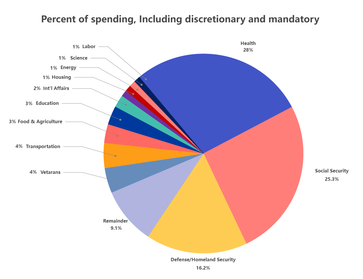
Show how total funds divide across major spending categories.


Market Share or Competitive Analysis

https://images.openai.com/static-rsc-3/kk2w4zTQd-xsownzdR2nFt72pZWrjtGxCKMTx_J-lEeisbL9nR1952K-u0CP_SECFW_rODDEiJ0kxJMvBYC6-JnT2iVdZ43e-Qct2_IQP7w?purpose=fullsize&v=1

Highlight how competitors divide a market at a specific moment.


Survey or Poll Results

https://exceljet.net/sites/default/files/styles/original_with_watermark/public/images/chart/survey%20results%20favorite%20ice%20cream%20flavor.png

Present response proportions in an accessible visual format.


Time or Resource Allocation

https://factsandfunny.com/data/photos/image_61711444116.jpg
https://www.researchgate.net/publication/388193669/figure/fig5/AS%3A11431281304546902%401737398680418/A-pie-chart-illustrating-the-distribution-of-resource-constraints-such-as-funding.png

Show how effort or resources divide across activities.


Demographic or Population Segments

https://images.openai.com/static-rsc-3/HRyddTryxmBeEQKEEh_TaYSKW88yFKaWNyRbK63DdVfWOI40RTz_KolF4nhw8wMZVjogaJf06VVRj7XBhmPf4CnV56pw2zqCYhbSq99LJtk?purpose=fullsize&v=1
https://assets.visme.co/templates/banners/thumbnails/i_Program-Participants-Age-Group-Pie-Chart_full.jpg

Display how populations split across categories.


What to Avoid or Be Careful Of with a Pie Chart

❌ Don’t include too many slices
Too many categories make comparisons difficult and reduce readability.

❌ Don’t use it for precise comparison
Angles and areas are harder to compare accurately than lengths.

❌ Don’t rely on similar colors
Low contrast between slices makes interpretation difficult.

❌ Don’t use it when trends over time matter
Line or bar charts communicate change more effectively.

❌ Don’t assume all proportions are meaningful
Very small slices can distract rather than inform.


*Content on this page was curated and edited by expert humans with the creative assistance of AI.

  • facebook
  • instagram
  • linkedin

DON'T MISS ANY SPOT-ON TIPS!

We don't spam! You'll only get emails when we post something awesome.
You can unsubscribe at any time.

Check your inbox or spam folder to confirm your subscription.

©2025 | The Comm Spot | By Newbold Communication & Design