
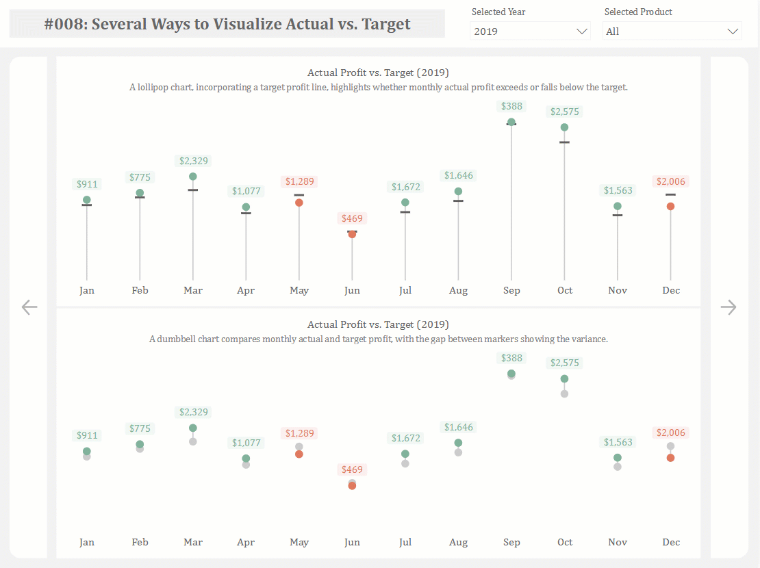
Lollipop Chart: How to Compare Values with a Clean, Minimal Style
A lollipop chart helps compare values across categories while reducing visual weight. Use it when a bar chart feels too heavy but clear comparison is still needed.
Turn to a lollipop chart when simplicity and readability matter. The thin line and dot combination keeps attention on the data without overwhelming the viewer.
What a Lollipop Chart Is
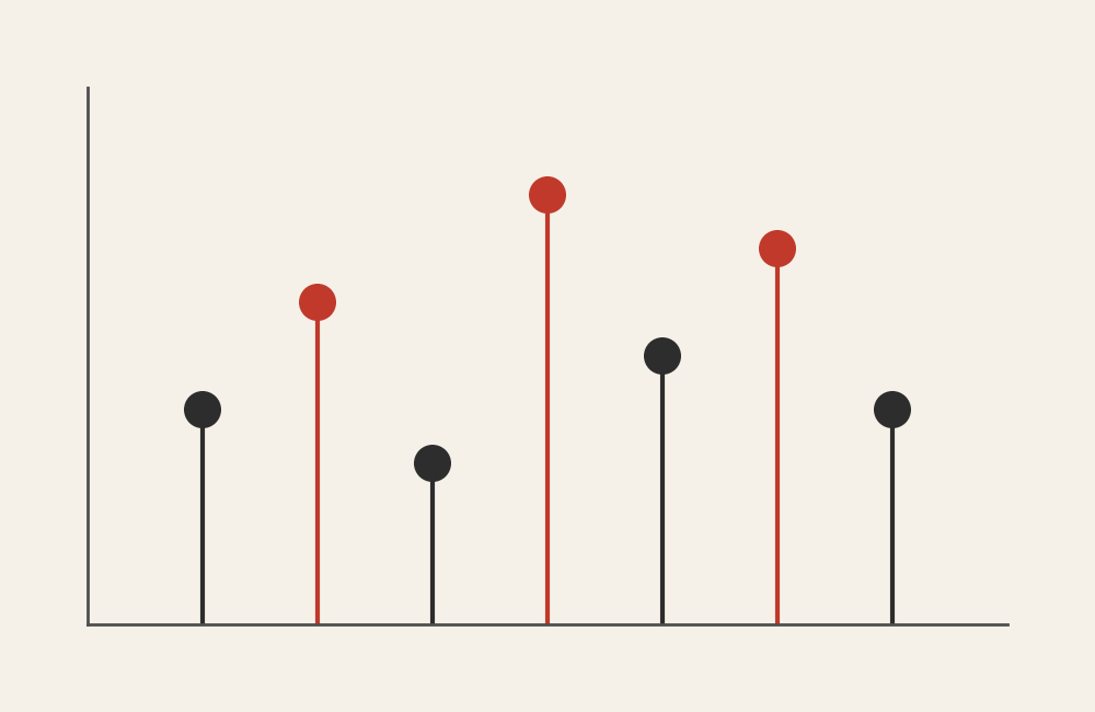
A lollipop chart displays values using a line that extends from a baseline to a circular marker. The line represents magnitude, and the dot highlights the exact value.
Common elements include:
- A baseline axis
- Thin lines extending toward values
- Circular markers at the end of each line
- Category labels aligned along one axis
This structure combines the clarity of a bar chart with the lightness of a dot plot.
When to Use a Lollipop Chart
Use a lollipop chart when comparison is important but visual clutter needs to be minimized.
This visual works especially well when the goal is to:
- Compare ranked values
- Highlight individual data points
- Present a clean, modern design
- Emphasize precision without heavy bars
- Improve readability in dense dashboards
A lollipop chart works best when the purpose is to make comparisons feel lighter and more focused.
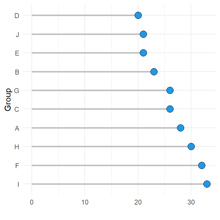
Types of Data Sets That Work Best for a Lollipop Chart
Lollipop charts work best with categorical data paired with numeric values.
Strong candidates include:
- Rankings or leaderboards
- Survey results by category
- Sales or performance comparisons
- Budget or resource allocations
- Demographic comparisons
- Frequency counts
They are especially effective when categories are numerous but differences between values are subtle.
Real-World Examples of a Lollipop Chart
Lollipop charts appear frequently in journalism, business analytics, and modern dashboards because they balance clarity with minimalism.
Rankings and Leaderboards
Display ordered lists while keeping attention on the endpoints of each value.
Sales or Performance Comparisons
Highlight differences between categories while maintaining a clean layout.
Budget or Resource Allocation

Compare spending levels across departments or initiatives.
Demographic or Audience Comparisons

Show differences across groups while keeping the design lightweight.
What to Avoid or Be Careful Of with a Lollipop Chart
❌ Don’t use it when values are extremely dense
Overlapping dots and lines can reduce clarity.
❌ Don’t remove the baseline
The baseline helps viewers understand magnitude and comparison.
❌ Don’t rely on small dots without labels
Clear labeling ensures values remain readable.
❌ Don’t treat it as purely decorative
Design should support interpretation rather than distract from it.
❌ Don’t use it when showing trends over time
Line graphs communicate temporal change more effectively.
*Content on this page was curated and edited by expert humans with the creative assistance of AI.