Skip to content
The Comm Spot The Comm Spot

It's All About Communication

  • HOME
  • ABOUT
    • Meet the Creator: Curtis Newbold, PhD
    • Hire Curtis
    • Publish with Us
    • Contact
    • Privacy Notice
  • COMM-BASICS
    • Glossary
    • Citation & Style Guides
      • AP Style (Journalism)
        • AP Style Overview
        • AP Style Guidelines
        • Media Ethics – SPJ Code of Ethics
        • Elements of Newsworthiness
      • APA Style
        • APA Format – Overview
        • APA - References Guidelines
        • APA - In-text Citations
        • APA - Citing Authors
        • APA - Audiovisual Media
        • APA - Books
        • APA - Digital Sources
        • APA - Events & Interactions
        • APA - Periodicals
        • APA - Print Sources (other than books)
      • Chicago Style
        • Chicago – Overview
        • Chicago - Author-Date System
        • Chicago - Notes-Bibliography System
        • Chicago - In-text Citations
        • Chicago Style - Citing Authors
        • Chicago - Audiovisual Media
        • Chicago - Books
        • Chicago - Digital Sources
        • Chicago - Events and Interactions
        • Chicago - Citing Periodicals
        • Chicago - Print Sources (other than books)
      • MLA Style
        • MLA Overview
        • MLA Works Cited Pages
        • MLA In-text Citations
        • MLA – Authors
        • MLA – Audiovisual Media
        • MLA – Books
        • MLA – Digital Sources
        • MLA – Events & Interactions
        • MLA – Periodicals
        • MLA – Print Sources (other than books)
    • Rhetoric
      • Overview of Rhetoric
      • Rhetorical Appeals (Rhetorical Triangle)
      • Branches of Oratory
      • Canons of Rhetoric
      • Rhetorical Devices
      • Kairos
      • Topos
      • Key Figures in Rhetoric
    • Research Methods
      • Case Studies
      • Competitor Analysis
      • Content Analysis
      • Discourse Analysis
      • Ethnography
      • Focus Groups
      • Observation Research
      • S.W.O.T. Analysis
      • Secondary Research
      • Surveys
      • Target Market Analysis
      • Usability Testing
      • Visual Analysis
    • Theories
    • Thinkers
  • COMM-SUBJECTS
    • Interpersonal Communication
      • Active Listening
      • Body Language
      • Conflict Management
      • Emotional Intelligence
        • Emotional Intelligence Overview
        • Self-Awareness
        • Self-Regulation
        • Motivation
        • Empathy
        • Social Skills
        • Emotional Intelligence Resources
      • Feedback
      • Negotiation
        • Overview of Negotiation
        • Negotiation Skills
        • Negotiation Strategies & Techniques
        • Stages of Negotiation
        • Common Negotiation Scenarios
        • Negotiation Case Studies & Examples
        • Negotiation Tools & Resources
        • Negotiation FAQ
    • Journalism
    • Public Speaking
      • General Guidelines
      • Overcoming Fear
      • Speech Writing and Organization
      • Delivery Techniques
      • Body Language
      • Audience Engagement
      • Storytelling
      • Designing Slides
      • P.O.W.E.R.F.U.L. Presentation Method
    • Strategic Communication
      • Business & Org Comm
        • Definition & History
        • Org Comm Theories
        • Business Documents
        • Change Management
        • Employee Relations
        • Employment Communication
        • Group & Team Communication
        • Leadership Communication
        • Power, Identity, & Ethics at Work
        • Project Management
      • Integrated Marketing Comm
        • Definition of IMC
        • Core Principles of IMC
        • IMC Planning
        • Audience Segmentation
        • Marketing Channels
        • Message Strategies
        • Campaign Measurement & Evaluation
        • Trends & Innovations in IMC
        • Challenges & Pitfalls in IMC
        • Careers & Roles in IMC
      • Public Relations
        • Foundations in PR
        • Strategic Practice
        • Tools & Tactics
        • Research & Analysis
        • Professional Development
      • Case Studies in Strat Comm
    • Technical & Scientific Communication
    • Visual Communication
      • Data Visualization
      • Information Design
      • Photography
      • Web Design
    • Written Communication
      • Writing Process
      • Organizational Methods
        • Five Paragraph Essay
        • Hourglass Method of Writing
        • IMRaD Format (Science)
        • Indirect Method (Bad News)
        • Inverted Pyramid (Journalism)
        • Martini Glass
        • Narrative Format
        • Proposal Format
        • Rogerian Method
        • Toulmin Method
      • Plain Language
        • Audience (Plain Language)
        • Organization (Plain Language)
        • Conversation (Plain Language)
        • Simplicity (Plain Language)
        • Word Choice (Plain Language)
        • Sentence Structure (Plain Language)
        • Design (Plain Language)
      • Punctuation
        • Apostrophes
        • Brackets
        • Colons
        • Commas
        • Ellipses
        • Em Dashes
        • En Dashes
        • Exclamation Marks
        • Hyphens
        • Parentheses
        • Periods
        • Question Marks
        • Quotation Marks
        • Semicolons
      • Style
        • Clarity
        • Conciseness
        • Consistency
        • Editing
        • Flow
        • Rhetorical Devices
        • Sentence Structure
        • Storytelling
        • Tone
        • Voice
        • Word Choice
  • RESOURCES
    • Teaching Resources
      • Assignments & Activities
      • Instructional Design
      • Pedagogies
  • BLOGS
    • The Spotlight Blog
    • Comm Sparks
  • SHOP
    • Cart
    • Checkout
0
The Comm Spot
The Comm Spot

It's All About Communication

Line Graph – Data Visualization

Home >COMM-Subjects >Visual Communication >Data Visualization >Types of Data Visualizations (Charts and Graphs) >Line Graph – Data Visualization

Line Graph: How to Show Change Over Time

A line graph helps visualize how values change across a continuous sequence, most often time. Use it to reveal trends, patterns, and direction, making it easier to see growth, decline, or stability at a glance.

Turn to a line graph when the goal is to show progression. The connected line guides the viewer through the data, emphasizing movement rather than isolated points.


What a Line Graph Is

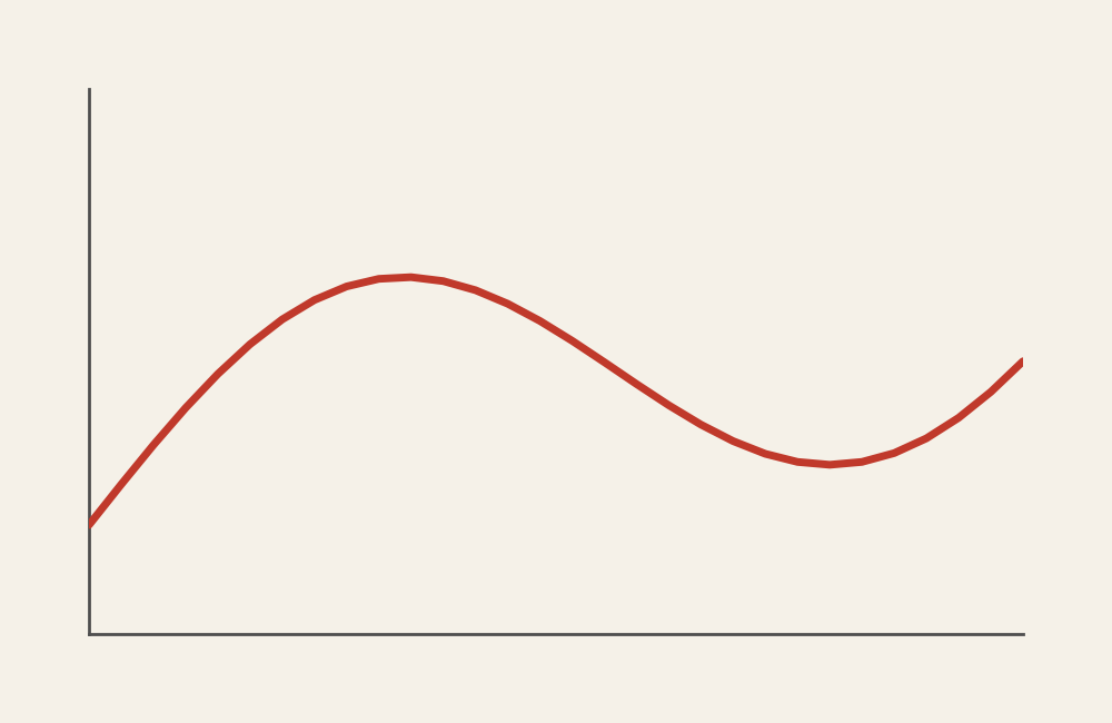
A line graph displays values as points connected by a continuous line. The horizontal axis typically represents time or another ordered variable, while the vertical axis shows numerical values.

Common elements include:

  • A continuous horizontal axis
  • A line connecting data points
  • Optional multiple lines for comparison
  • Markers or annotations highlighting key moments

The connected line communicates continuity, helping viewers understand how one point leads to the next.


When to Use a Line Graph

Use a line graph when the focus is on change, direction, or trends over an ordered sequence.

This visual works especially well when the goal is to:

  • Show growth or decline over time
  • Compare trends across multiple groups
  • Highlight peaks, dips, or turning points
  • Reveal patterns or cycles
  • Present time-based performance clearly

A line graph works best when the purpose is to show how something evolves across a continuous range.


Types of Data Sets That Work Best for a Line Graph

Line graphs work best with quantitative data measured across ordered intervals.

Strong candidates include:

  • Sales or revenue by month or year
  • Website traffic or engagement over time
  • Stock or financial performance
  • Population or enrollment trends
  • Environmental measurements
  • Experimental data tracked across stages

Each data point should follow a meaningful sequence so the connecting line represents real progression.


Real-World Examples of a Line Graph

Line graphs appear in dashboards, research reports, journalism, and analytics wherever trends need to be communicated clearly.

Sales or Revenue Trends

https://www-cms.pipedriveassets.com/cdn-cgi/image/quality%3D70%2Cformat%3Dauto/https%3A//www-cms.pipedriveassets.com/Sales-graph-Pipedrive-jagged-line-example.png
https://www.slideteam.net/media/catalog/product/cache/1280x720/a/n/annual_revenue_line_graph_for_different_brands_slide01.jpg

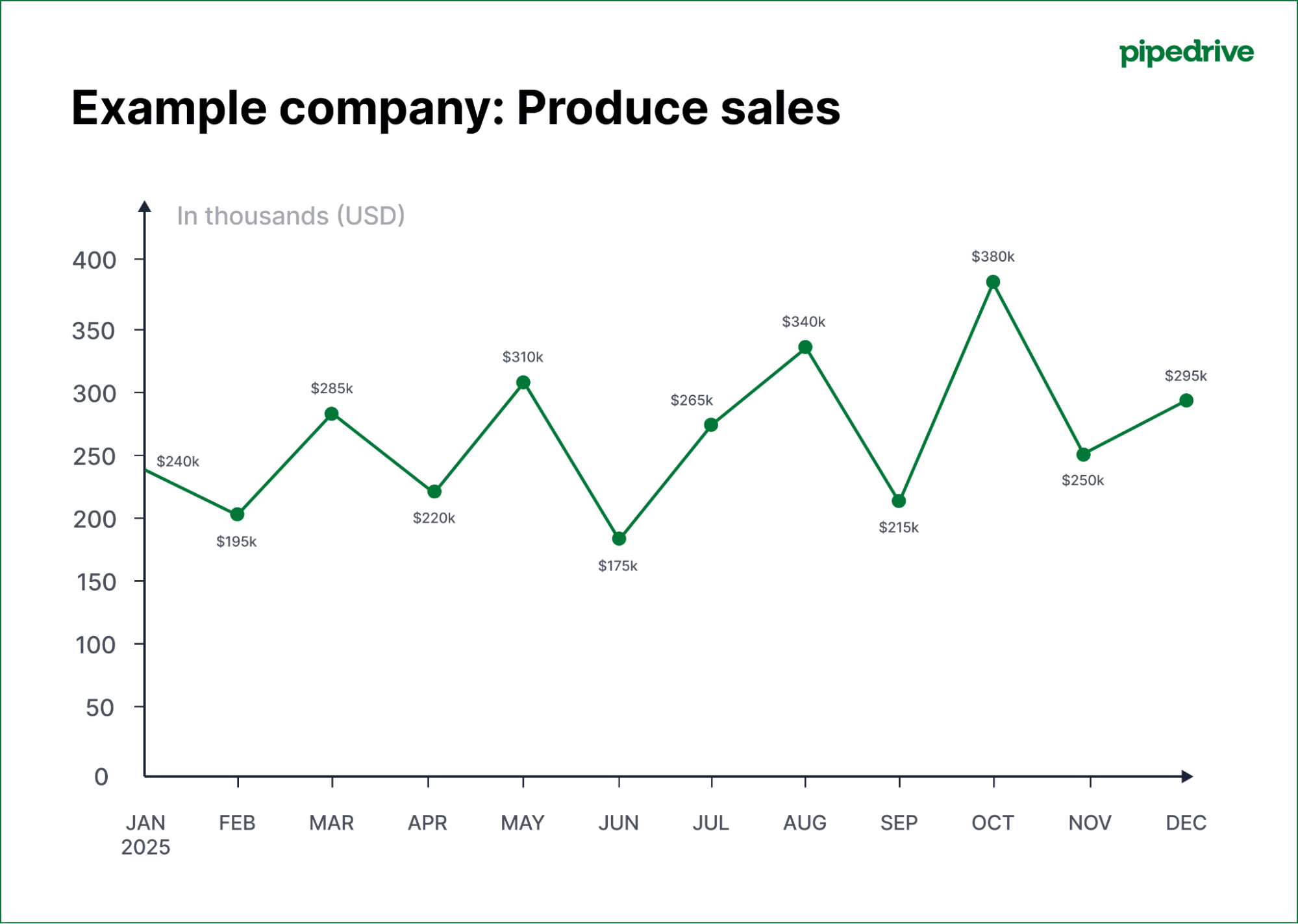
Show how performance changes across months or years and highlight growth patterns.


Website Traffic or Engagement

https://assets.visme.co/templates/banners/thumbnails/i_Site-Traffic-Line-Graph_full.jpg

Reveal peaks, seasonal patterns, and long-term engagement trends.


Environmental or Climate Data

https://www.weather.gov/images/bro/wxevents/2012/annual/brownsvilletempline.png

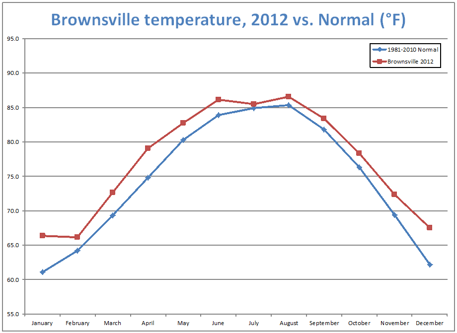
Display gradual changes and long-term trends in environmental measurements.


Financial Market Performance

https://images.openai.com/static-rsc-3/3yrXQzaV3aB8chhW6aqerQQ0Tzp6Yfs7RG-ZbCwmHPSx5JGTDkF0XYluDOGSrVFwNUDZAOKQO_CeCXp5O26BBckcSZ4uYmdJpcrHGVr8_uo?purpose=fullsize&v=1
https://images.openai.com/static-rsc-3/i09yVbfpTp7IpUFLeE3Cu7rFaGe36w-GS4kc0JOeCCX4UD1QiBEfYPmLWmOKML_6qCJWdPb6iF7FA39-xUC2HuQlIdpC9JLuqLtIrP9MkaM?purpose=fullsize&v=1
https://help.portfolio-performance.info/en/reference/view/reports/performance/images/performance-chart.png

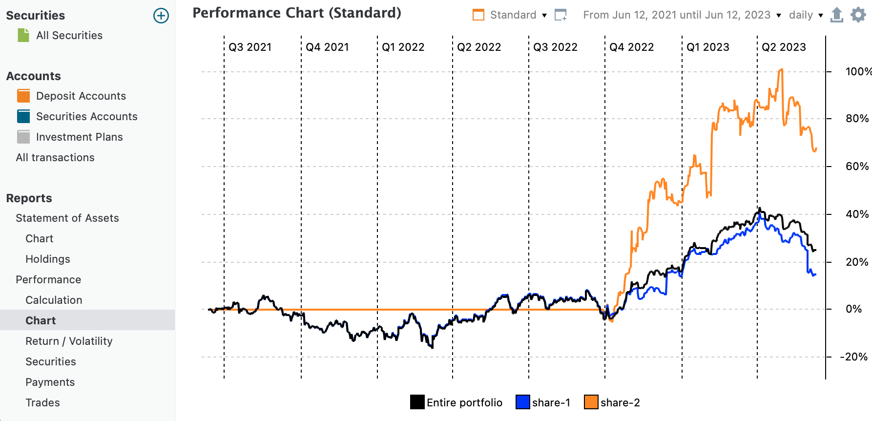
Track fluctuations and overall direction across time.


Academic or Research Measurements

https://stpltrsrcscmnprdwus001.blob.core.windows.net/rsrcs/srm/images/encyc-of-research-design/p719-1.jpg
https://www.researchgate.net/publication/331852394/figure/fig4/AS%3A738001743249408%401552964735144/Line-graph-of-experiment-data.ppm

Show how outcomes evolve during experiments or observational studies.


What to Avoid or Be Careful Of with a Line Graph

❌ Don’t use it for unordered categories
Line graphs imply continuity, so unrelated categories can create misleading connections.

❌ Don’t overload with too many lines
Too many series make trends hard to distinguish. Limit the number of lines or separate into multiple charts.

❌ Don’t ignore scale consistency
Changing axes or scales can distort the perception of change.

❌ Don’t skip labels or context
Annotations help viewers understand important moments or shifts.

❌ Don’t use it when exact comparisons between categories are the main goal
Bar charts or dot plots often communicate category comparisons more clearly.


*Content on this page was curated and edited by expert humans with the creative assistance of AI.

  • facebook
  • instagram
  • linkedin

DON'T MISS ANY SPOT-ON TIPS!

We don't spam! You'll only get emails when we post something awesome.
You can unsubscribe at any time.

Check your inbox or spam folder to confirm your subscription.

©2025 | The Comm Spot | By Newbold Communication & Design