
Icicle Chart: How to Show Hierarchies and Structure
An icicle chart helps visualize hierarchical data using stacked rectangles that extend in a single direction. Use it to show how categories break down into subcategories while preserving the overall structure of a system.
Turn to an icicle chart when hierarchy matters more than individual values. This layout makes it easier to see how parts connect within a larger framework, especially when multiple levels are involved.
What an Icicle Chart Is
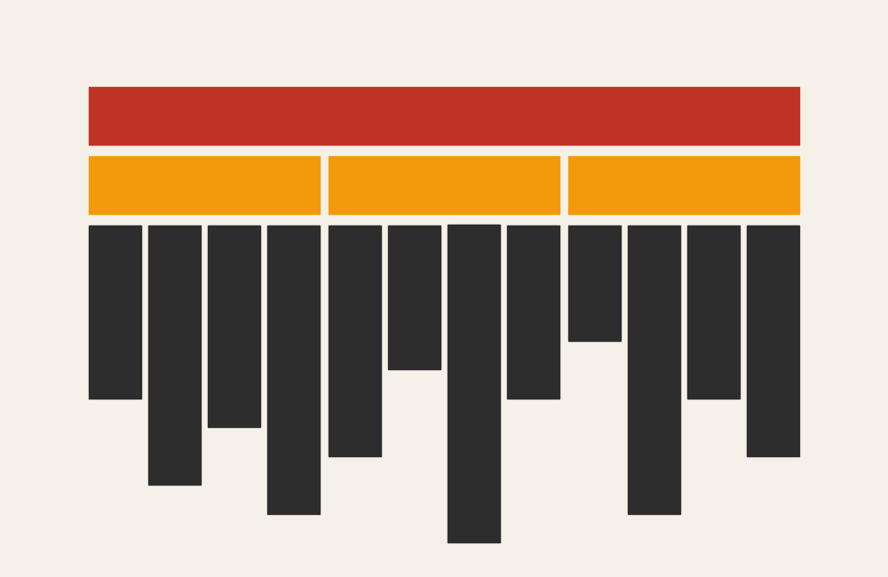
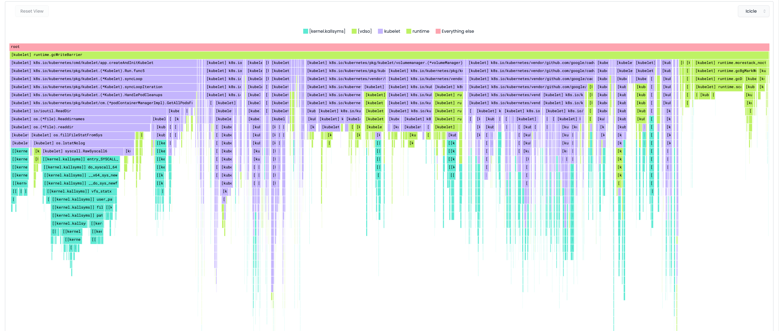
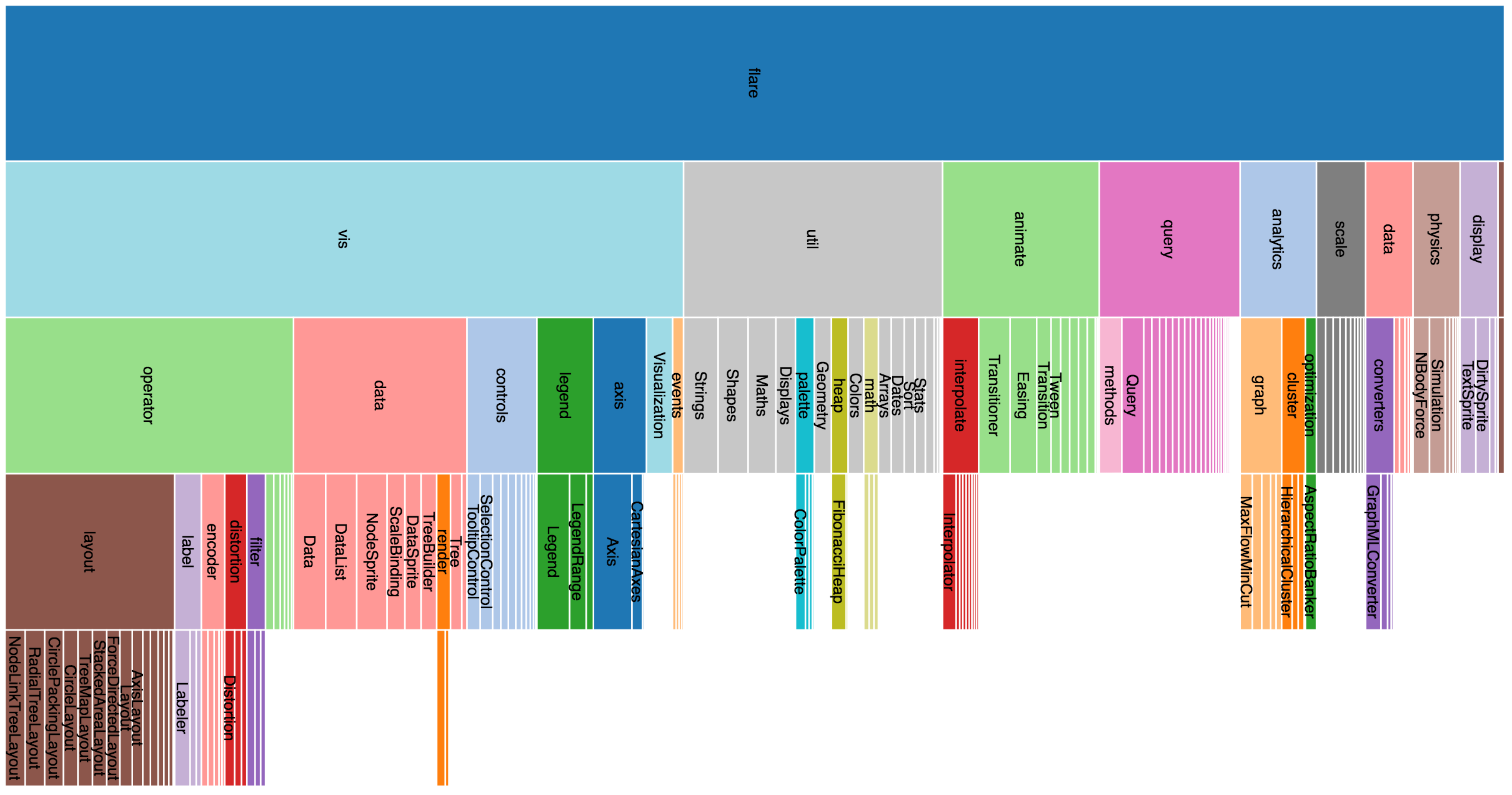
An icicle chart represents hierarchical relationships using layered rectangles arranged like descending blocks. Each level of the hierarchy forms a new row, and the width of each block typically represents value or proportion.
Common elements include:
- A root category at the top
- Successive levels branching downward
- Rectangles sized by magnitude
- Clear boundaries between hierarchical levels
Unlike a tree diagram, an icicle chart keeps everything aligned along a straight axis, making comparisons across levels more consistent.
When to Use an Icicle Chart
Use an icicle chart when the goal is to explore structure within hierarchical data.
This visual works especially well when the goal is to:
- Show parent–child relationships
- Break down totals into nested parts
- Explore categories within categories
- Reveal structure in large datasets
- Provide a linear alternative to radial hierarchy charts
An icicle chart works best when the purpose is to help viewers understand how pieces fit together within a hierarchy.
Types of Data Sets That Work Best for an Icicle Chart
Icicle charts work best with structured, nested data.
Strong candidates include:
- Organizational structures
- File systems or directory trees
- Taxonomies or classifications
- Website navigation hierarchies
- Budget categories with subcategories
- Product or service breakdowns
Each level should represent a clear layer in the hierarchy, building from general to specific.
Real-World Examples of an Icicle Chart
Icicle charts appear in data exploration, information architecture, and analytics where hierarchical relationships need to be visible.
Show how teams and roles connect within a larger organization.
Budget or Resource Breakdown
Show how spending categories divide into increasingly detailed levels.
Taxonomy or Classification Systems
Display structured classification systems from broad groups to specific categories.
What to Avoid or Be Careful Of with an Icicle Chart
❌ Don’t use it for non-hierarchical data
Without clear parent–child relationships, the structure becomes confusing.
❌ Don’t overload with too many levels
Deep hierarchies can become difficult to read without interaction or filtering.
❌ Don’t rely solely on color to show meaning
Clear labels help viewers understand structure beyond visual grouping.
❌ Don’t assume familiarity
Icicle charts are less common than treemaps or tree diagrams, so brief context helps.
❌ Don’t use it when comparisons between categories are the main goal
Bar charts or grouped visuals often communicate comparisons more clearly.
*Content on this page was curated and edited by expert humans with the creative assistance of AI.