
Horizontal Bar Chart: How to Compare Categories with Long Labels
A horizontal bar chart helps compare values across categories while keeping labels readable and easy to scan. Use it when category names are long, when ranking matters, or when vertical space is limited.
Turn to a horizontal layout when clarity improves by reading from left to right. This orientation often feels more natural for lists, making comparisons easier to follow.
What a Horizontal Bar Chart Is
A horizontal bar chart displays rectangular bars extending from a vertical axis. Categories appear along the vertical axis, while values extend horizontally.
Common elements include:
- Bars aligned horizontally
- Category labels listed vertically
- A numerical scale running left to right
- Consistent spacing between bars
The orientation doesn’t change the data itself, but it can greatly improve readability, especially when labels are detailed or numerous.
When to Use a Horizontal Bar Chart
Use a horizontal bar chart when comparison across categories is the primary goal and label readability matters.
This visual works especially well when the goal is to:
- Display rankings or ordered lists
- Compare many categories at once
- Present long or descriptive labels
- Emphasize differences between values
- Improve readability in dashboards or reports
A horizontal bar chart works best when the purpose is to make category comparisons clear and accessible.
Types of Data Sets That Work Best for a Horizontal Bar Chart
Horizontal bar charts work best with categorical data paired with numeric values.
Strong candidates include:
- Survey responses by category
- Sales or revenue by product
- Performance metrics by team or region
- Rankings or leaderboards
- Budget allocations by department
- Frequency counts across categories
They are especially effective when categories have lengthy names that would be difficult to display beneath vertical bars.
Real-World Examples of a Horizontal Bar Chart
Horizontal bar charts appear frequently in journalism, business reporting, and dashboards because they balance clarity with flexibility.
Rankings and Leaderboards


Display ranked categories in descending or ascending order for easy comparison.
Sales or Performance Comparisons
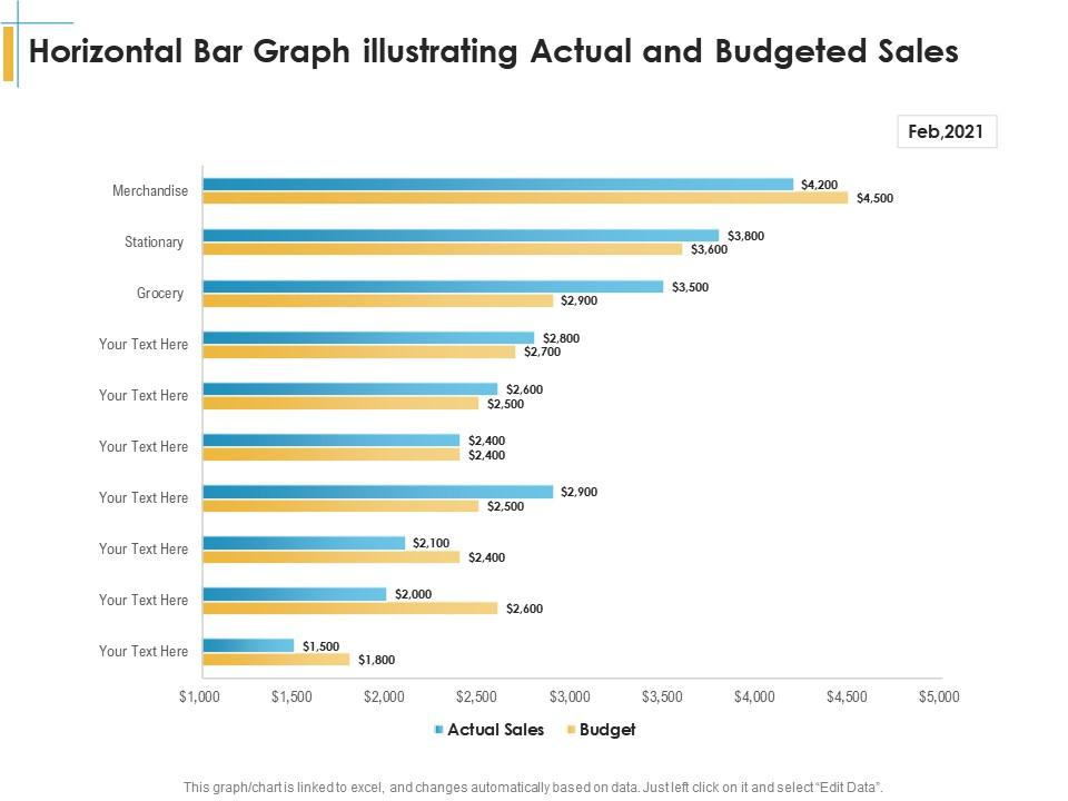
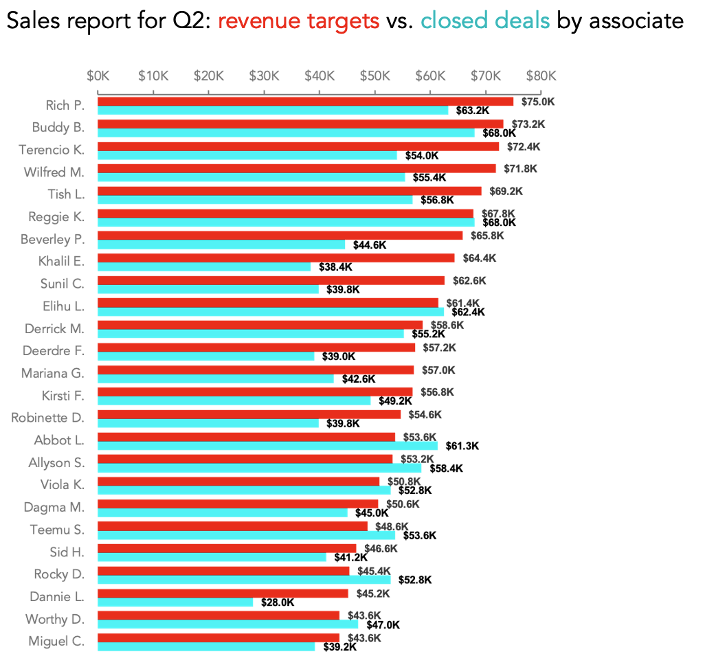
Highlight differences across products, regions, or teams.
Budget or Resource Allocation

Make comparisons clear while keeping category names fully visible.
Demographic or Audience Breakdown
Show how populations or audiences distribute across categories.
What to Avoid or Be Careful Of with a Horizontal Bar Chart
❌ Don’t overload the chart with too many categories
Even with horizontal space, too many bars reduce clarity.
❌ Don’t ignore ordering
Sorting bars meaningfully helps reveal patterns and improves readability.
❌ Don’t truncate the baseline
Bar charts rely on a consistent zero baseline to avoid misleading comparisons.
❌ Don’t use it when trends over time are the focus
Line or area charts communicate change over time more effectively.
❌ Don’t mix unrelated scales
All bars should share the same scale to maintain accurate comparison.
*Content on this page was curated and edited by expert humans with the creative assistance of AI.