
Grouped Bar Chart: How to Compare Categories Across Subgroups
A grouped bar chart is what you use when one comparison isn’t enough. It lets you compare values across categories and within subgroups at the same time, making side-by-side differences easy to spot.
Instead of asking, “Which category is larger?”
the question becomes, “How do these categories compare across different groups?”
What a Grouped Bar Chart Is
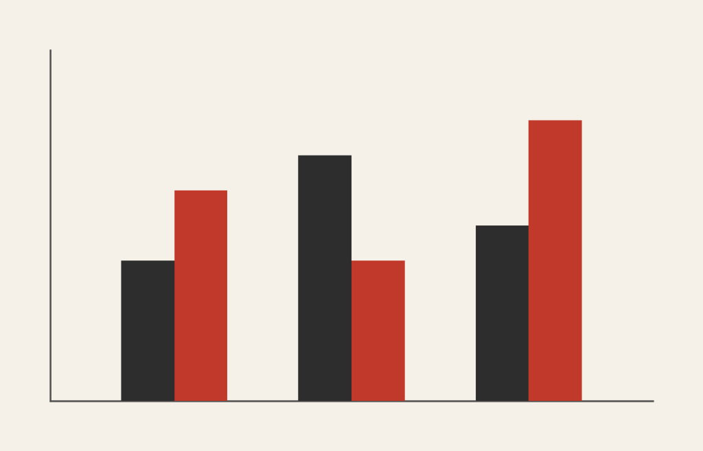
A grouped bar chart (sometimes called a clustered bar chart) places bars for related subcategories next to one another within each main category. Each group shares a common axis, and each bar within the group represents a different subgroup.
For example, one category might be years, and the grouped bars might represent regions or departments within each year.
The defining feature is proximity. Bars are placed side by side so viewers can quickly compare subgroup differences within the same category.
When to Use a Grouped Bar Chart
Use a grouped bar chart when you want to compare multiple related values across the same categories.
This chart works especially well when the goal is to:
- Compare subgroups within categories
- Show differences across conditions or groups
- Highlight contrasts side by side
- Support direct visual comparison
- Reveal interaction effects between variables
A grouped bar chart is most effective when the key question is:
“How do these groups differ within each category?”
Types of Data Sets That Work Best for a Grouped Bar Chart
Grouped bar charts work best with categorical data paired with numeric values, where each category contains multiple comparable subgroups.
Strong candidates include:
- Survey results broken out by demographic group
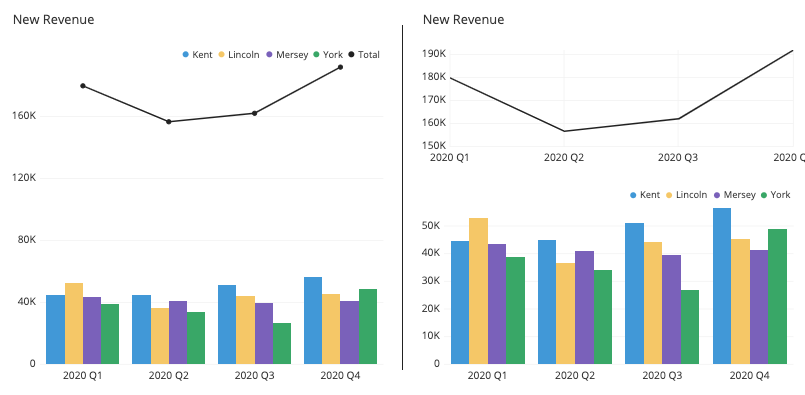
- Sales by product and region
- Performance metrics by team and period
- Budget comparisons by department and year
- Test scores by class and semester
- Experimental results across conditions
The subgroups must be directly comparable. If they aren’t, the visual comparison breaks down.
Real-World Examples of a Grouped Bar Chart
Grouped bar charts are common in research, business reporting, and journalism because they support clear comparison without overwhelming viewers.
Sales or Revenue by Category and Region


Show how regions or teams perform within the same product or time category.
Before-and-After or Condition Comparisons
Place bars side by side to highlight differences between conditions.
Education or Assessment Data


Compare outcomes across classes, schools, or time periods.
Budget or Resource Comparisons
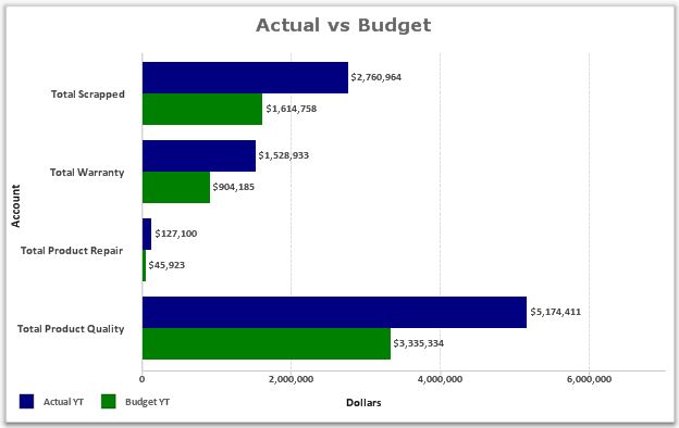

Show how spending differs across departments within the same timeframe.
What to Avoid or Be Careful Of with a Grouped Bar Chart
❌ Don’t include too many subgroups
Too many bars in each group make comparisons difficult. Limit the number of subgroups.
❌ Don’t ignore labeling and legends
Viewers need to quickly understand what each bar represents. Clear labels and consistent color coding matter.
❌ Don’t use it when composition is the goal
If the focus is on parts of a whole, a stacked or 100% stacked bar chart is usually a better choice.
❌ Don’t let bars overlap or crowd
Adequate spacing is essential. Crowded bars reduce readability and comparison accuracy.
❌ Don’t forget to sort or order meaningfully
Thoughtful ordering helps reveal patterns that random order hides.
*Content on this page was curated and edited by expert humans with the creative assistance of AI.