
Geographic Heat Map: How to Show Intensity and Concentration Across Space
A geographic heat map is what you use when the story is about intensity, concentration, or hotspots across a location. It shows where something is strongest, weakest, or most concentrated, rather than focusing on exact boundaries or counts.
Instead of asking, “How much is there?”
the question becomes, “Where is it most intense?”
What a Geographic Heat Map Is
A geographic heat map visualizes data across a map using color gradients. Areas with higher values are shown using warmer or darker colors, while lower values appear cooler or lighter.
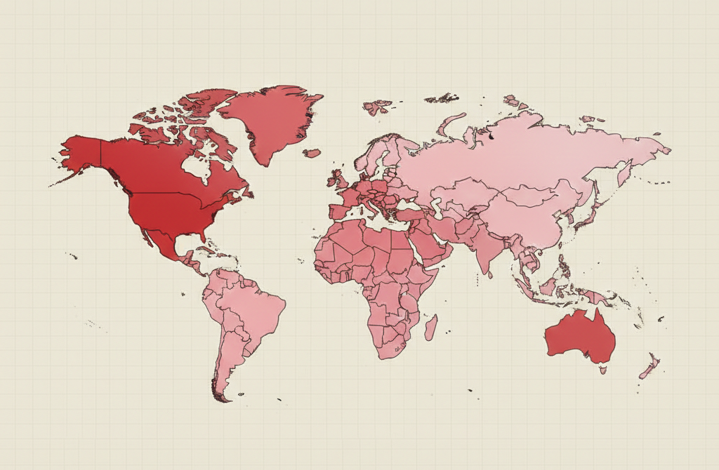
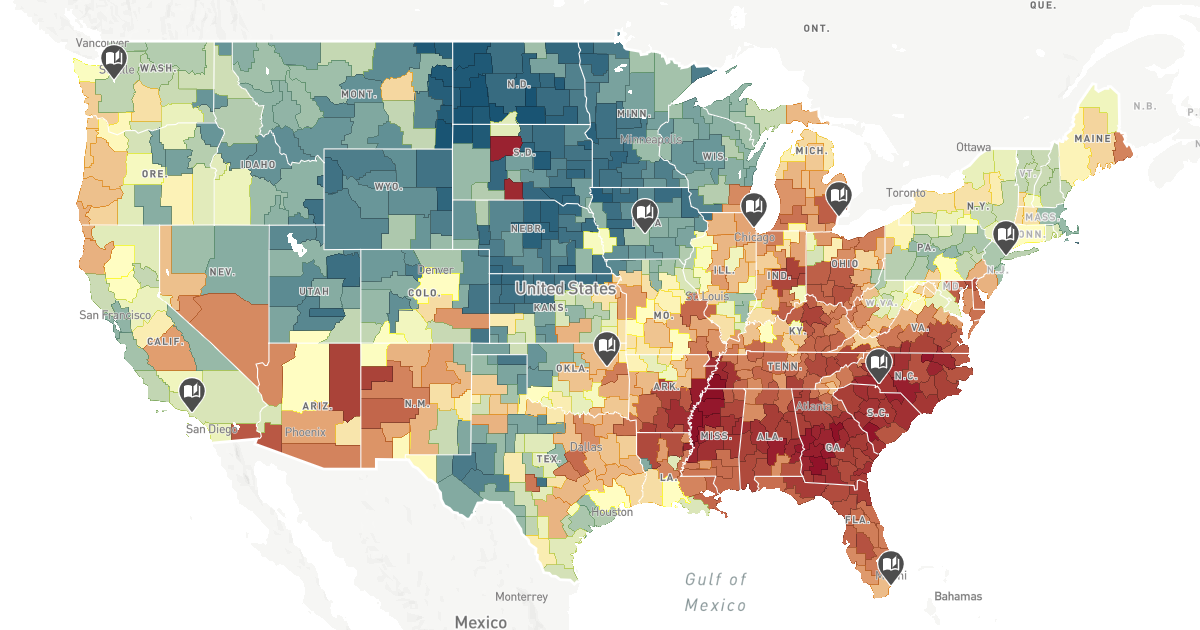
Unlike a choropleth map, which fills predefined regions, geographic heat maps often:
- Smooth values across space
- Emphasize gradients rather than borders
- Highlight clusters and hotspots
- De-emphasize exact administrative boundaries
The result is a map that feels continuous and pattern-focused rather than discrete.
When to Use a Geographic Heat Map
Use a geographic heat map when identifying spatial patterns is more important than reporting exact values.
This map works especially well when the goal is to:
- Reveal hotspots or cold spots
- Show intensity or frequency across space
- Identify clustering or dispersion
- Support exploratory spatial analysis
- Communicate risk, demand, or activity levels
- Help audiences quickly spot patterns
A geographic heat map is most effective when the key question is:
“Where is this most concentrated?”
Types of Data Sets That Work Best for a Geographic Heat Map
Geographic heat maps work best with spatial data that varies continuously or semi-continuously across an area.
Strong candidates include:
- Crime or incident reports
- Traffic congestion or movement
- Disease cases or outbreaks
- Environmental measurements
- Social media activity or check-ins
- Retail demand or service usage
The data should represent intensity, frequency, or likelihood rather than discrete totals per region.
Real-World Examples of a Geographic Heat Map
Geographic heat maps are widely used in journalism, public policy, urban planning, and analytics.
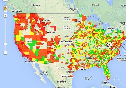
Crime or Incident Hotspots


Reveal areas with higher concentrations of incidents without focusing on exact addresses.
Public Health and Epidemiology

Show where cases cluster and how intensity changes across regions.
Traffic and Mobility Patterns
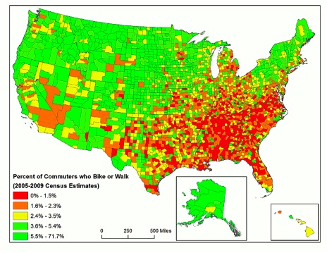
Highlight congestion, movement patterns, and high-traffic corridors.
Environmental and Climate Data
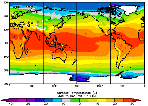
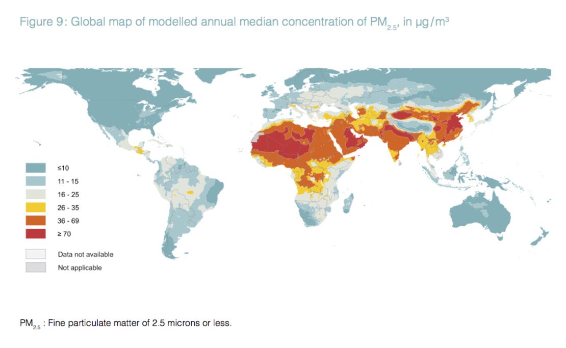
Visualize gradients in temperature, pollution, or environmental risk.
Consumer Behavior or Demand

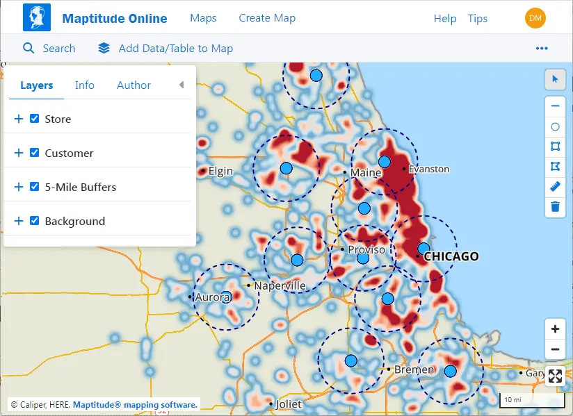
Show where demand, engagement, or activity is strongest across a region.
What to Avoid or Be Careful Of with a Geographic Heat Map
❌ Don’t treat it as precise
Heat maps show patterns, not exact counts or boundaries. Precision should come from supporting data.
❌ Don’t over-smooth the data
Too much smoothing can erase meaningful local variation and create misleading patterns.
❌ Don’t ignore the color scale
Color choices strongly influence interpretation. Scales should be intuitive and clearly labeled.
❌ Don’t hide context
Without basemaps, legends, or annotations, viewers may misinterpret what they’re seeing.
❌ Don’t use it when rates matter more than intensity
If per-capita comparisons are the goal, a choropleth map may be more appropriate.
*Content on this page was curated and edited by expert humans with the creative assistance of AI.