
Gauge Chart: How to Show Status, Performance, and Thresholds at a Glance
A gauge chart is what you use when the message is about current status. It’s designed to answer one quick question: are we below target, on track, or exceeding expectations?
Instead of asking, “What are all the values?”
the question becomes, “Where do we stand right now?”
What a Gauge Chart Is
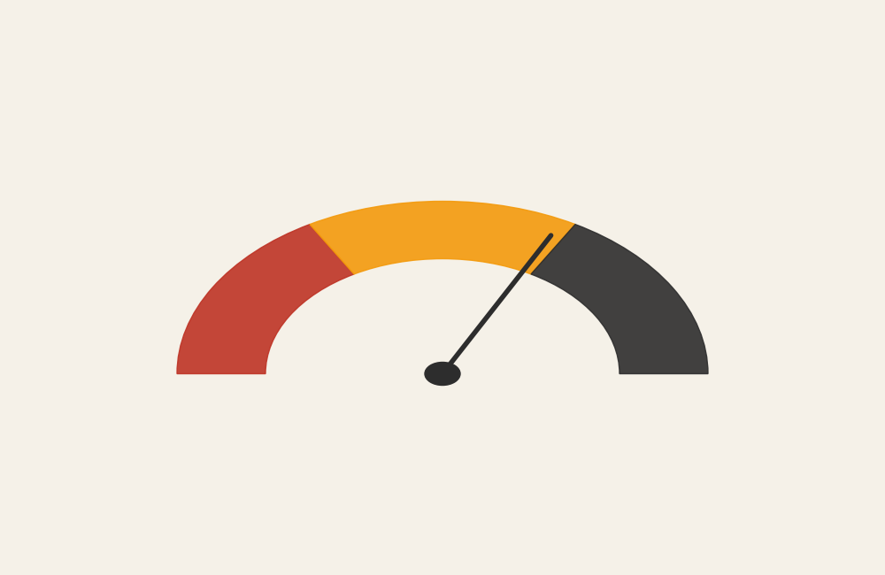
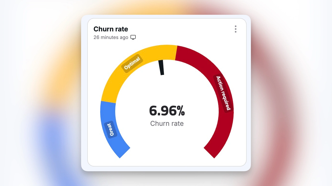
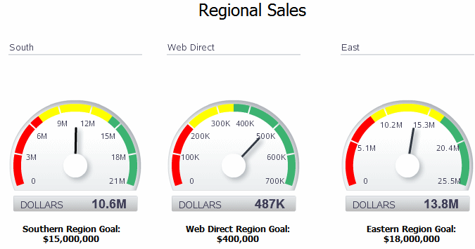
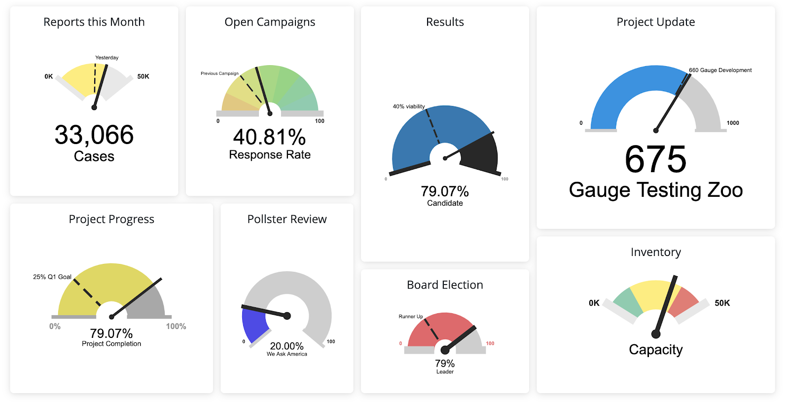
A gauge chart displays a single value within a fixed range, often using a dial, needle, or arc that resembles a speedometer. The chart typically includes reference zones that indicate performance thresholds such as low, acceptable, and high.
Most gauge charts include:
- A minimum and maximum value
- A current value indicator
- Color-coded ranges or bands
- One or more benchmarks or targets
The design prioritizes immediacy. A viewer should understand the status in seconds.
When to Use a Gauge Chart
Use a gauge chart when you want to communicate status quickly and clearly.
This chart works best when the goal is to:
- Show current performance against a target
- Monitor a key metric in real time
- Support dashboards or control panels
- Signal warning, caution, or success states
- Provide a quick visual check rather than detailed analysis
A gauge chart is most effective when the key question is:
“Are we where we need to be right now?”
Types of Data Sets That Work Best for a Gauge Chart
Gauge charts work best with single-value metrics tied to clear thresholds.
Strong candidates include:
- KPI or performance indicators
- Utilization or capacity metrics
- Completion or progress percentages
- Service-level or compliance metrics
- System health or operational status
- Quality or risk indicators
The metric must have a meaningful minimum, maximum, and target. Without context, the gauge loses clarity.
Real-World Examples of a Gauge Chart
System or Operational Monitoring
Show real-time status for capacity, load, or reliability metrics.
Budget or Resource Utilization


Communicate how much of a limit has been used and how close it is to a threshold.
Progress or Completion Tracking
Indicate how close a task, project, or initiative is to completion.
Risk or Safety Indicators
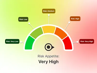
Signal risk levels clearly using color-coded zones.
What to Avoid or Be Careful Of with a Gauge Chart
❌ Don’t use it for comparison
Gauge charts show one value well, but comparing multiple gauges is difficult and inefficient.
❌ Don’t hide the scale
Without clear minimums, maximums, and labels, the gauge becomes decorative instead of informative.
❌ Don’t overload with color
Too many color bands reduce clarity. Keep ranges simple and meaningful.
❌ Don’t use it when precision matters
Gauges emphasize status, not exact values. If precision is important, pair the chart with a numeric label.
❌ Don’t default to a gauge when a bar would work better
In many cases, a bullet graph or simple bar communicates the same message more clearly and with less visual weight.
*Content on this page was curated and edited by expert humans with the creative assistance of AI.