
Funnel Chart: How to Show Drop-Off, Conversion, and Progression
A funnel chart is what you use when the story is about attrition—how many start, how many continue, and how many make it to the end.
What a Funnel Chart Is
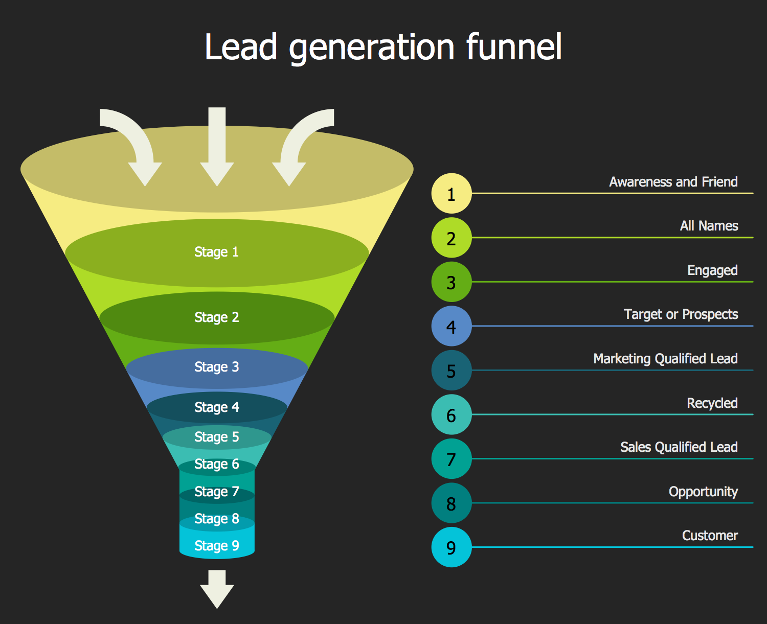
A funnel chart visualizes a process made up of sequential stages, where the number of items typically decreases at each step. Each stage is represented by a segment that narrows as values decline, creating the familiar funnel shape.
The width of each section represents quantity, and the visual tapering reinforces loss, filtering, or conversion as the process unfolds.
Funnel charts are not about comparison across categories. They are about movement through a system.
When to Use a Funnel Chart
Use a funnel chart when progression through stages is the core message.
This chart works especially well when the goal is to:
- Show conversion rates
- Highlight drop-off points
- Visualize pipelines or workflows
- Communicate filtering or screening processes
- Emphasize efficiency or leakage
- Tell a step-by-step story
A funnel chart is most effective when the key question is:
“How many make it from one stage to the next?”
Types of Data Sets That Work Best for a Funnel Chart
Funnel charts work best with ordered, stage-based count data.
Strong candidates include:
- Sales or marketing pipelines
- Website conversion paths
- Application or admissions processes
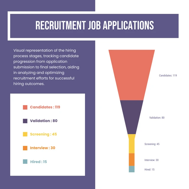
- Hiring and recruitment stages
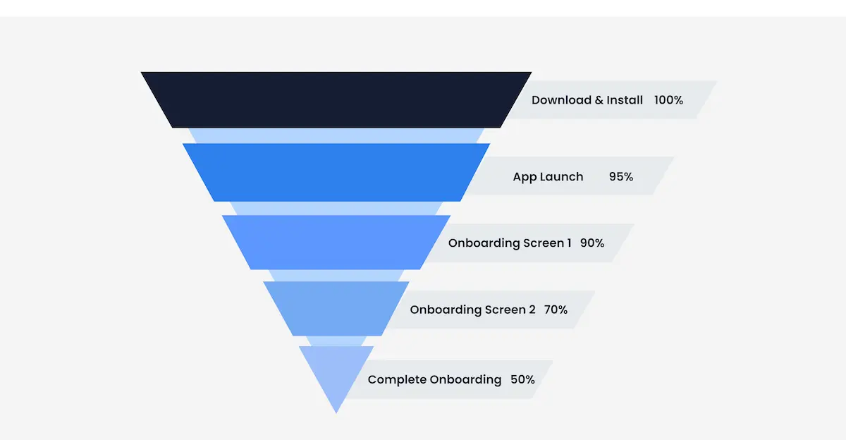
- Customer onboarding flows
- Manufacturing or quality screening steps
Each stage must follow logically from the previous one. If stages are independent, a funnel chart will mislead.
Real-World Examples of a Funnel Chart
Funnel charts are common in marketing, operations, product design, and analytics.
Website or App Conversion
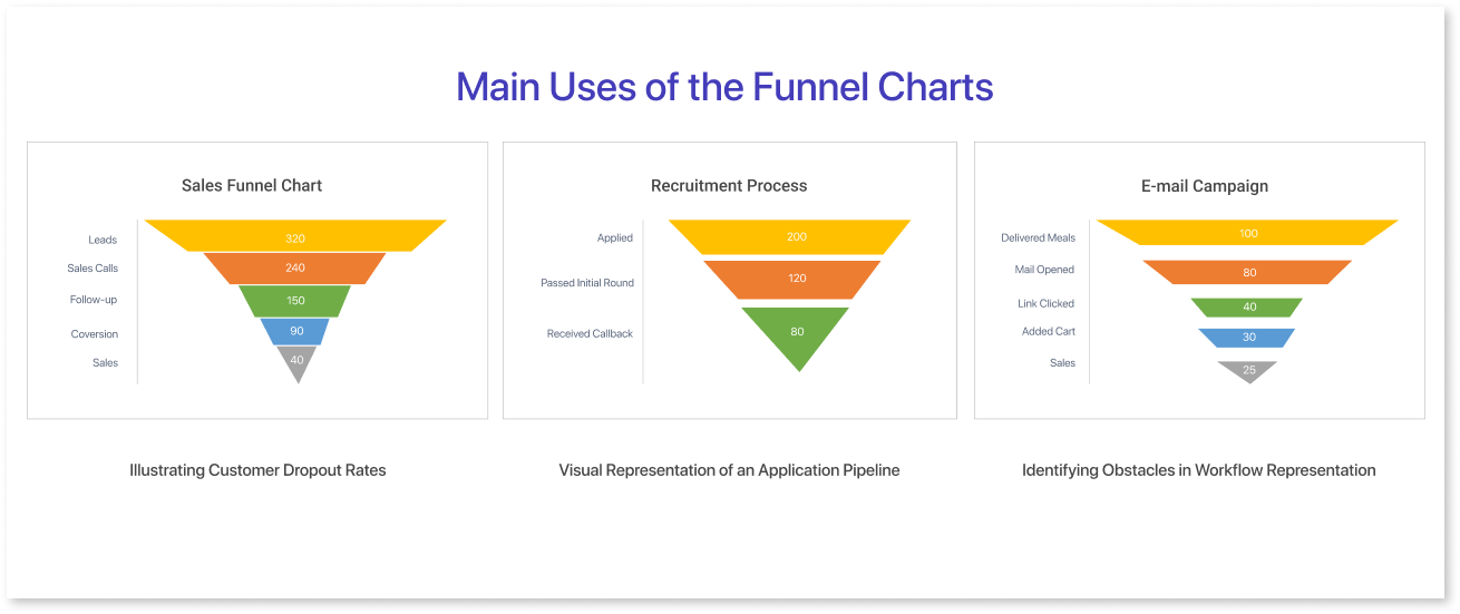
Track how users move from landing page to sign-up, purchase, or completion.
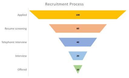
Hiring or Recruitment Process


Visualize how candidates are screened, interviewed, and selected.
Admissions or Application Review
Show how applicants progress from submission to acceptance to enrollment.
Manufacturing or Quality Control
Reveal how materials or products are filtered through inspection stages.
What to Avoid or Be Careful Of with a Funnel Chart
❌ Don’t use it when stages aren’t sequential
If steps don’t flow in order, the funnel shape creates a false narrative.
❌ Don’t compare unrelated funnels directly
Different funnels often start with different totals. Side-by-side comparison requires careful normalization.
❌ Don’t rely on shape alone
Labels and values are essential. Without them, the chart becomes decorative instead of informative.
❌ Don’t hide conversion rates
Percent drop-off between stages is often more meaningful than raw counts.
❌ Don’t force symmetry
Funnel charts don’t need to be perfectly centered or smooth. Accuracy matters more than aesthetics.
*Content on this page was curated and edited by expert humans with the creative assistance of AI.