
Flow Map: How to Show Movement and Connections Across Geography
A flow map helps visualize movement between locations. Use it to show how people, goods, information, or events travel from one place to another, making patterns of direction, volume, and connection easier to understand.
Turn to a flow map when movement itself is the story, such as migration patterns, transportation routes, or supply chains. Rather than focusing only on where something exists, this map reveals how places are linked through activity and exchange.
What a Flow Map Is
A flow map visualizes connections between geographic locations using lines or arrows drawn across a map. The thickness, color, or direction of each line typically represents magnitude or intensity.
Common elements include:
- Origin and destination points
- Lines or curves showing movement
- Directional cues such as arrows
- Variable line widths representing volume
Flow maps emphasize relationships between places rather than just characteristics within individual regions.
When to Use a Flow Map
Use a flow map when movement or exchange is central to the message.
This map works especially well when the goal is to:
- Show migration or travel patterns
- Visualize trade or transportation routes
- Reveal communication or data flows
- Map supply chains or logistics networks
- Illustrate commuting or mobility behavior
- Highlight directional relationships between locations
A flow map works best when the purpose is to explain how locations connect through movement.
Types of Data Sets That Work Best for a Flow Map
Flow maps work best with origin–destination data tied to geographic coordinates.
Strong candidates include:
- Migration or relocation data
- Airline or transportation routes
- Trade or shipping volumes
- Communication or network traffic
- Tourism flows
- Supply chain or distribution networks
Each record typically includes a starting location, an ending location, and a value representing how much movement occurs between them.
Real-World Examples of a Flow Map
Flow maps are widely used in geography, transportation planning, business analytics, and journalism.
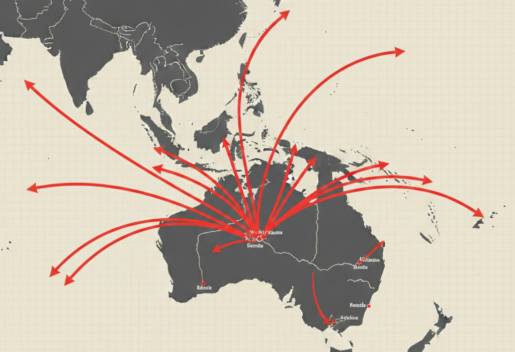
Migration or Population Movement

Show how populations move between regions, countries, or cities over time.
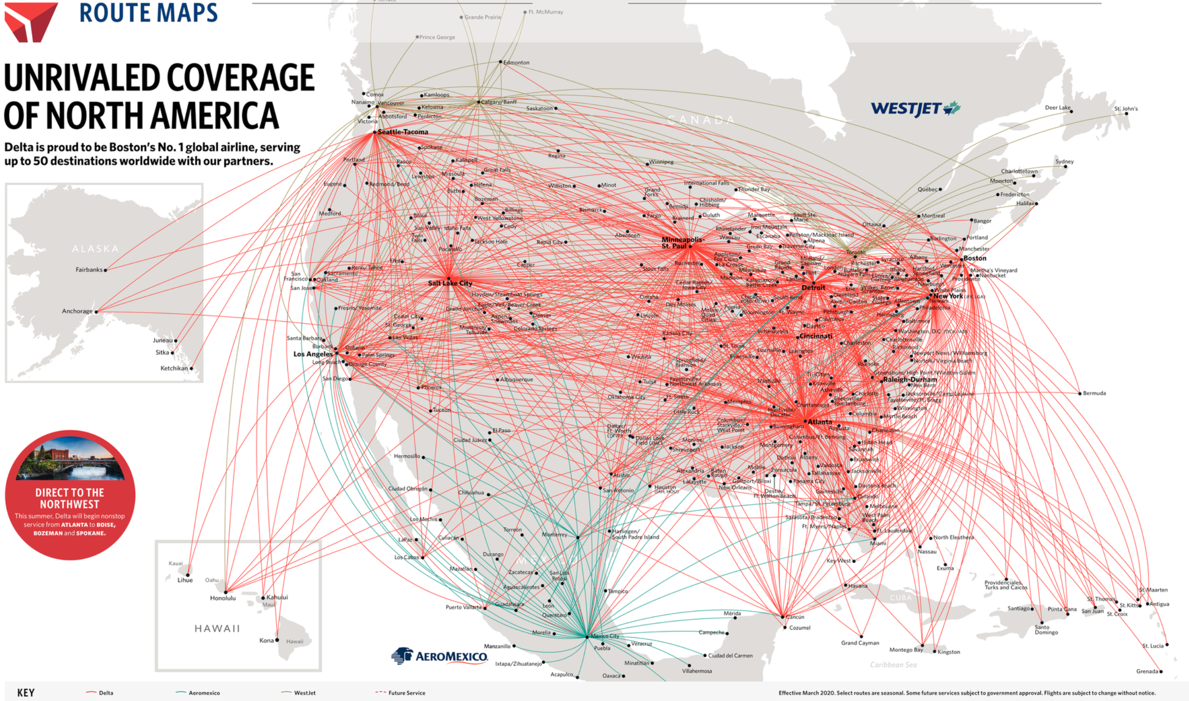
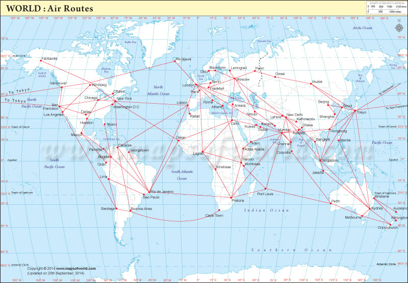
Airline or Transportation Routes
4
Visualize routes and traffic volume across transportation networks.
Trade and Shipping Networks

Illustrate how goods move between countries or regions and highlight major trade corridors.
Communication or Data Networks
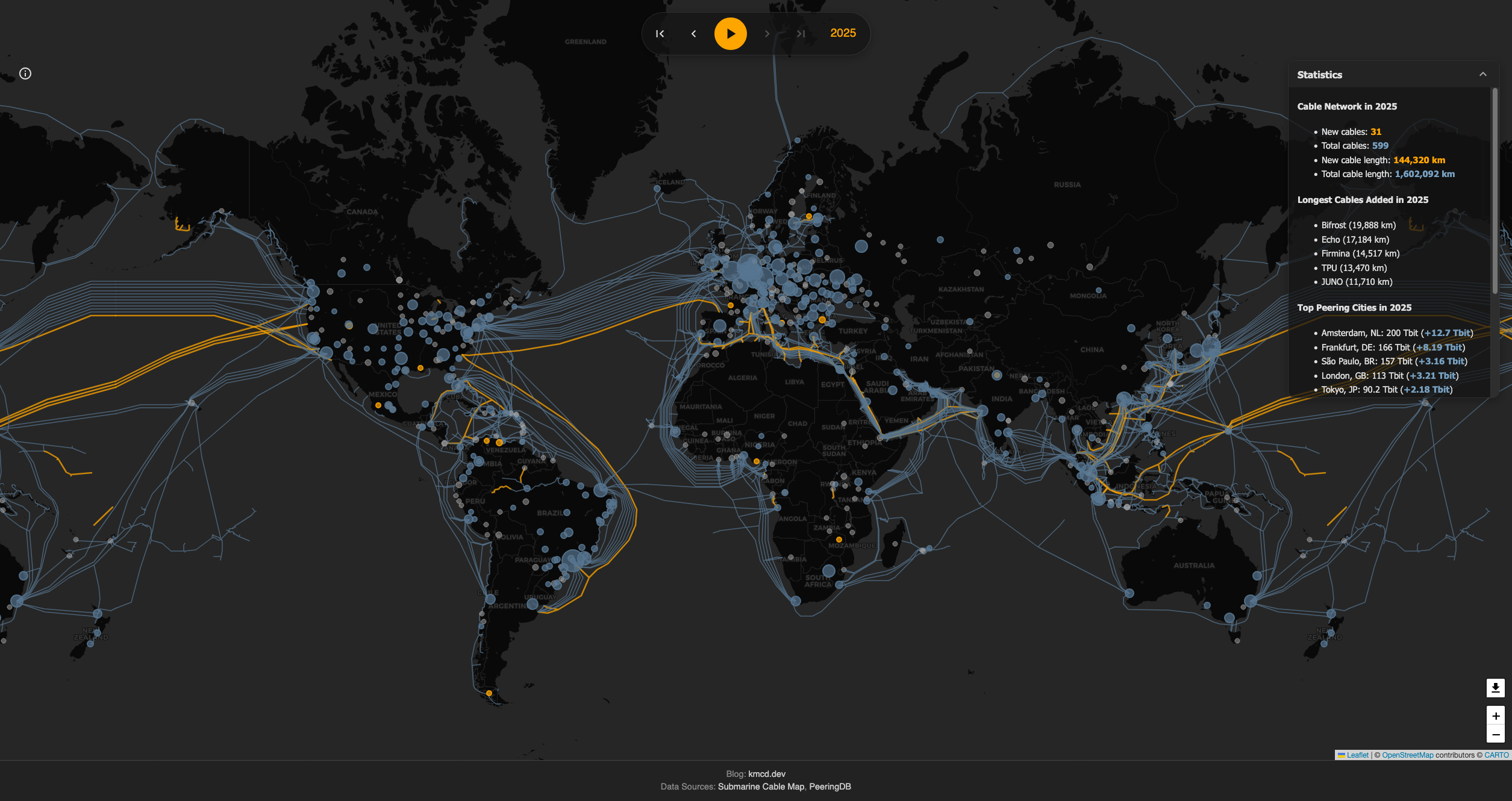
Show how information travels between systems, hubs, or geographic regions.
What to Avoid or Be Careful Of with a Flow Map
❌ Don’t overload the map with too many lines
Too many flows create visual clutter and make direction difficult to follow.
❌ Don’t ignore direction
Arrows, gradients, or annotations help clarify where movement starts and ends.
❌ Don’t let line thickness mislead
Scaling should be proportional and clearly explained so magnitude remains accurate.
❌ Don’t forget geographic context
Basemaps, labels, and landmarks help viewers orient themselves.
❌ Don’t use it when location alone is the story
If movement isn’t central, a choropleth or dot density map may communicate more clearly.
*Content on this page was curated and edited by expert humans with the creative assistance of AI.