
Dot Density Map: How to Show Distribution and Concentration Across Space
A dot density map is what you use when location matters and totals alone don’t tell the story. It shows where things are concentrated, spread out, or sparse across a geographic area.
Instead of asking, “How much is there?”
the question becomes, “Where is it happening?”
What a Dot Density Map Is
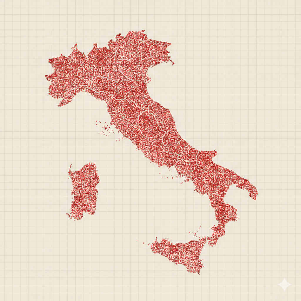
A dot density map represents data using dots placed within geographic boundaries. Each dot stands for a fixed quantity of something—people, events, cases, or objects—and the spatial pattern of dots reveals distribution.
The dots are usually placed randomly within each region, but the density of dots communicates meaning:
- More dots in an area signal higher concentration
- Fewer dots signal lower concentration
This type of map emphasizes spatial distribution, not precise location or exact counts.
If a choropleth map shows rates by region, a dot density map shows how data is spread across space.
When to Use a Dot Density Map
Use a dot density map when the goal is to show where something is concentrated rather than how regions compare numerically.
This map works especially well when you want to:
- Show population distribution
- Reveal clustering or dispersion
- Compare urban vs. rural patterns
- Emphasize spatial presence
- Humanize large numbers by breaking them into visible units
A dot density map is most effective when the key question is:
“Where are these things located across the landscape?”
Types of Data Sets That Work Best for a Dot Density Map
Dot density maps work best with count-based data tied to geographic areas.
Strong candidates include:
- Population counts
- Housing units
- Disease cases
- Incidents or events
- Resources or facilities
- Demographic characteristics distributed geographically
Each dot must represent a clear, consistent quantity. The data should describe things that plausibly exist throughout a region, not just at a single point.
Real-World Examples of a Dot Density Map
Dot density maps are commonly used in geography, public policy, journalism, and social science to make spatial patterns visible.
Population Distribution
Show how people are distributed across a country or region, revealing cities, corridors, and sparsely populated areas.
Public Health and Disease Cases


Reveal clustering of cases and highlight regional concentration without relying on administrative boundaries alone.
Housing or Urban Development

Show how housing spreads across metropolitan and rural areas.
Crime or Incident Reporting


Illustrate where incidents are more common without implying precise addresses.
Resource or Infrastructure Distribution


Show how resources such as schools, clinics, or utilities are distributed across space.
What to Avoid or Be Careful Of with a Dot Density Map
❌ Don’t use it for precise location
Dots are symbolic, not exact. This map shows distribution patterns, not specific addresses.
❌ Don’t choose an unclear dot value
If one dot represents too many or too few units, the map becomes misleading or unreadable.
❌ Don’t let dots overlap excessively
Extreme density can turn areas into solid blobs. Adjust dot value or size to preserve readability.
❌ Don’t ignore map scale
Patterns change depending on zoom level. A dot density map should be designed for a specific viewing scale.
❌ Don’t use it when rates matter more than counts
If the story is about per-capita differences, a choropleth map may be a better choice.
*Content on this page was curated and edited by expert humans with the creative assistance of AI.