
Donut Graph: How to Show Parts of a Whole with Emphasis
A donut graph is what you use when you want to show how categories make up a whole, while leaving room to emphasize a key value or message in the center. Donut graphs are like pie charts, though they are useful for highlighing a single, key data point.
Instead of simple asking, “How is this whole divided?,” you might ask, “What piece of the whole is the most interesting?”
What a Donut Graph Is
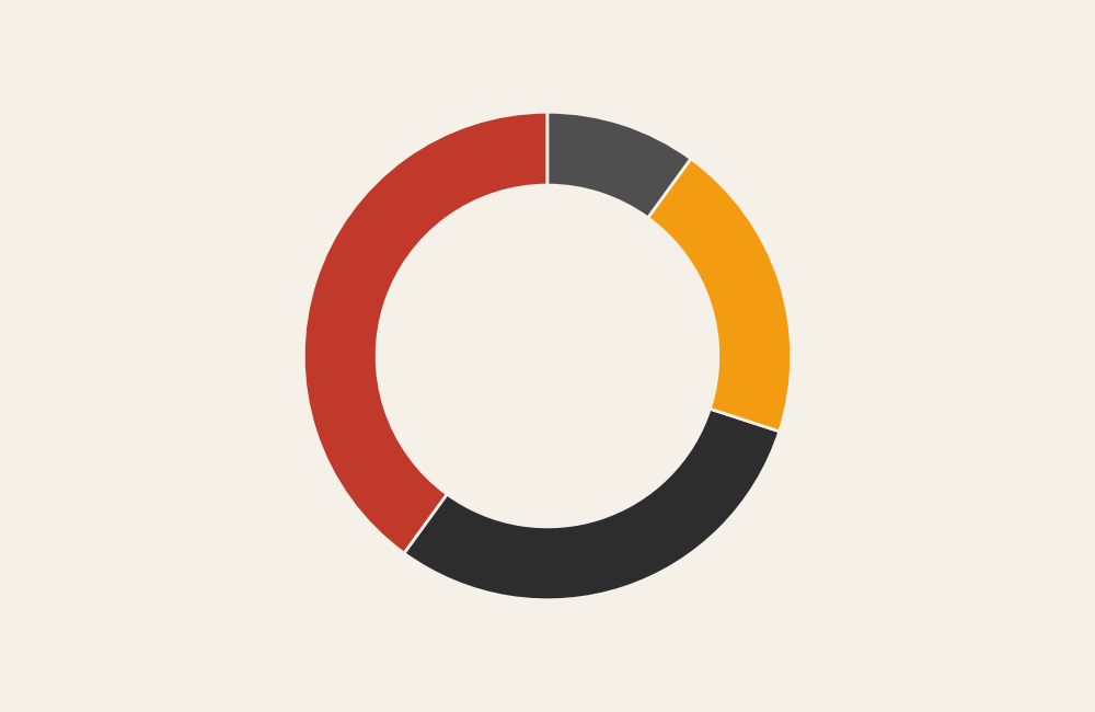
A donut graph is a variation of a pie chart with a hole in the center. Each slice represents a proportion of the total, and all slices together add up to 100%.
The defining feature is the empty center, which is often used to display:
- A total value
- A key metric
- A label or short message
Visually, donut graphs rely on angle and area to communicate proportion, just like pie charts, but the center space allows for additional context or emphasis.
When to Use a Donut Graph
Use a donut graph when the goal is to show composition while also highlighting a single takeaway.
This chart works best when you want to:
- Show how a whole is divided into parts
- Emphasize one category or total
- Keep the message simple and high-level
- Support dashboards or summary views
- Present proportions at a glance
A donut graph is most effective when the key question is:
“How is this total made up?”
Types of Data Sets That Work Best for a Donut Graph
Donut graphs work best with simple categorical data that sums to a meaningful whole.
Strong candidates include:
- Budget breakdowns
- Market share snapshots
- Survey response proportions
- Time allocation summaries
- Resource distribution
- Completion or status breakdowns
They work best when there are only a few categories and the proportions differ clearly.
Real-World Examples of a Donut Graph
Donut graphs are commonly used in dashboards, reports, and presentations where clarity and emphasis matter more than precision.
Market Share Snapshot

Compare how competitors divide a market at a single point in time.
Survey or Poll Results

Summarize response proportions without overwhelming viewers with detail.
Task or Time Allocation
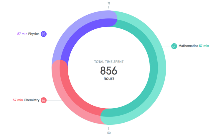
Show how time or effort is distributed across activities.
Progress or Status Breakdown

Display completion, in-progress, and remaining work in a compact, visual way.
What to Avoid or Be Careful Of with a Donut Graph
❌ Don’t use it for precise comparison
People struggle to compare angles and areas accurately. Donut graphs are for general proportions, not exact values.
❌ Don’t use too many slices
Too many segments reduce readability. Three to five categories is usually the upper limit.
❌ Don’t rely on similar colors
Low contrast makes slices hard to distinguish, especially smaller ones.
❌ Don’t hide labels
If viewers have to guess what slices represent, the chart fails. Clear labels or legends are essential.
❌ Don’t use it when trends matter
Donut graphs show a single snapshot. For change over time, choose a line, bar, or area chart instead.
*Content on this page was curated and edited by expert humans with the creative assistance of AI.