
Connected Scatter Plot: How to Show Change, Direction, and Trajectory
A connected scatter plot is what you use when time matters—but not in a straight line. It shows how two variables change in relation to each other, while the connecting lines reveal direction, sequence, and movement.
Instead of asking, “How does this change over time?”
the question becomes, “How does this move through space over time?”
What a Connected Scatter Plot Is
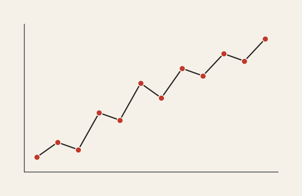
A connected scatter plot plots data points on two quantitative axes, like a standard scatterplot, but then connects the points in order—usually chronological order.
Each point represents a moment in time.
The connecting lines show the path the data takes as it evolves.
This allows you to see:
- Direction of change
- Loops, reversals, or cycles
- Acceleration or slowing
- Non-linear relationships
If a line chart shows change over time, a connected scatter plot shows how variables move together through time.
When to Use a Connected Scatter Plot
Use a connected scatter plot when the relationship between two variables changes over time and the path matters.
This chart is especially useful when you want to:
- Show trajectories rather than trends
- Reveal cyclical or looping behavior
- Highlight direction and momentum
- Compare phases or stages of movement
- Emphasize cause-and-effect over sequence
This chart works best when the key question is:
“What path did this system take?”
Types of Data Sets That Work Best for a Connected Scatter Plot
Connected scatter plots work best with paired quantitative variables tracked over time.
Strong candidates include:
- Economic indicators tracked over years
- Health or epidemiological metrics over time
- Climate or environmental measurements
- Sports or performance metrics across seasons
- Behavioral or engagement metrics over repeated intervals
- Any system where state matters as much as timing
The data must be ordered meaningfully. Without sequence, the connections add confusion instead of insight.
Real-World Examples of a Connected Scatter Plot
Product or User Behavior Metrics
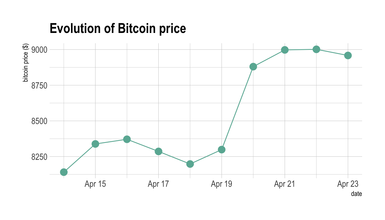

Show how engagement, retention, or usage metrics evolve together as products mature.
What to Avoid or Be Careful Of with a Connected Scatter Plot
❌ Don’t use it without clear ordering
If viewers can’t tell what comes first and last, the chart loses its meaning.
❌ Don’t skip directional cues
Arrows, numbering, or annotations often help clarify movement and flow.
❌ Don’t overload with too many points
Dense paths become unreadable quickly. Simplify or highlight key segments.
❌ Don’t assume familiarity
Many audiences aren’t used to reading connected scatter plots. A short explanation goes a long way.
❌ Don’t use it when time alone is the story
If the primary message is simply increase or decrease over time, a line chart is usually clearer.
*Content on this page was curated and edited by expert humans with the creative assistance of AI.