
Bump Chart: How to Show Rank Changes Over Time
A bump chart is what you use when the story isn’t about values—it’s about rank. It shows how categories move up and down relative to one another across time or ordered stages.
Instead of asking, “How much did this change?”
the question becomes, “Who rose, who fell, and who stayed dominant?”
What a Bump Chart Is
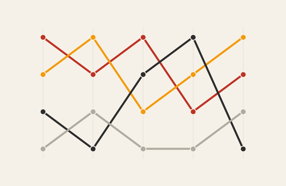
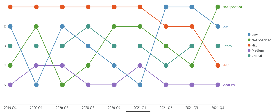
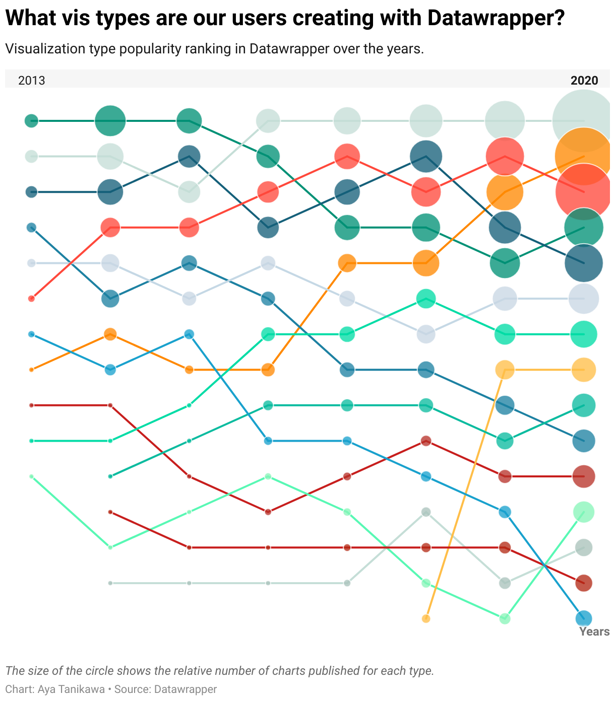
A bump chart visualizes rank order over time. Each line represents a category, and the vertical position of that line shows its rank at each point along the horizontal axis (usually time).
The most important thing to understand is this:
the y-axis does not represent magnitude—it represents position.
Rank 1 might be far ahead or barely ahead. A bump chart doesn’t show the gap; it shows the order.
If a line chart shows trends in value, a bump chart shows competition and movement.
When to Use a Bump Chart
Use a bump chart when relative position matters more than exact numbers.
A bump chart works best when the goal is to:
- Show changes in ranking over time
- Highlight volatility or stability in position
- Emphasize competition between categories
- Reveal dominant players and challengers
- Tell a story about movement, not scale
This chart is a strong choice when the key question is:
“How did the rankings change?”
Types of Data Sets That Work Best for a Bump Chart
Bump charts work best with ordinal data derived from quantitative measures.
Strong candidates include:
- Rankings over time (sports, sales, popularity)
- Market share rankings by year
- Search or social media trends by position
- Polling or approval rankings
- Performance rankings across periods
- Competitive standings
The data must be rankable at each time point, even if the underlying values are very close.
Real-World Examples of a Bump Chart
Bump charts are especially effective when competition, hierarchy, or dominance is the story.
Sports Rankings or League Standings

Tracks how teams move up and down the standings across a season or multiple seasons.
Search Trends or Popularity Rankings
Illustrates how topics, products, or names gain or lose relative attention over time.
What to Avoid or Be Careful Of with a Bump Chart
❌ Don’t use it when exact values matter
Bump charts intentionally hide magnitude. If the size of the difference matters, this is the wrong chart.
❌ Don’t use too many categories
Too many lines create visual clutter and make rank changes hard to follow.
❌ Don’t ignore labeling
Lines cross frequently. Clear labels at the start or end are essential for readability.
❌ Don’t use uneven or unclear time intervals
The horizontal axis must reflect a meaningful, consistent progression.
❌ Don’t assume rank is intuitive
Viewers may forget that the y-axis represents order, not value. A short explanation often helps.
*Content on this page was curated and edited by expert humans with the creative assistance of AI.