
Box-and-Whisker Plot: How to Show Distribution, Spread, and Outliers
A box-and-whisker plot (often called a box plot) is what you use when averages aren’t enough. It shows how data is distributed, not just where the middle falls.
Instead of asking, “What’s the typical value?”
you’re asking, “How spread out is this data—and where are the extremes?”
What a Box-and-Whisker Plot Is
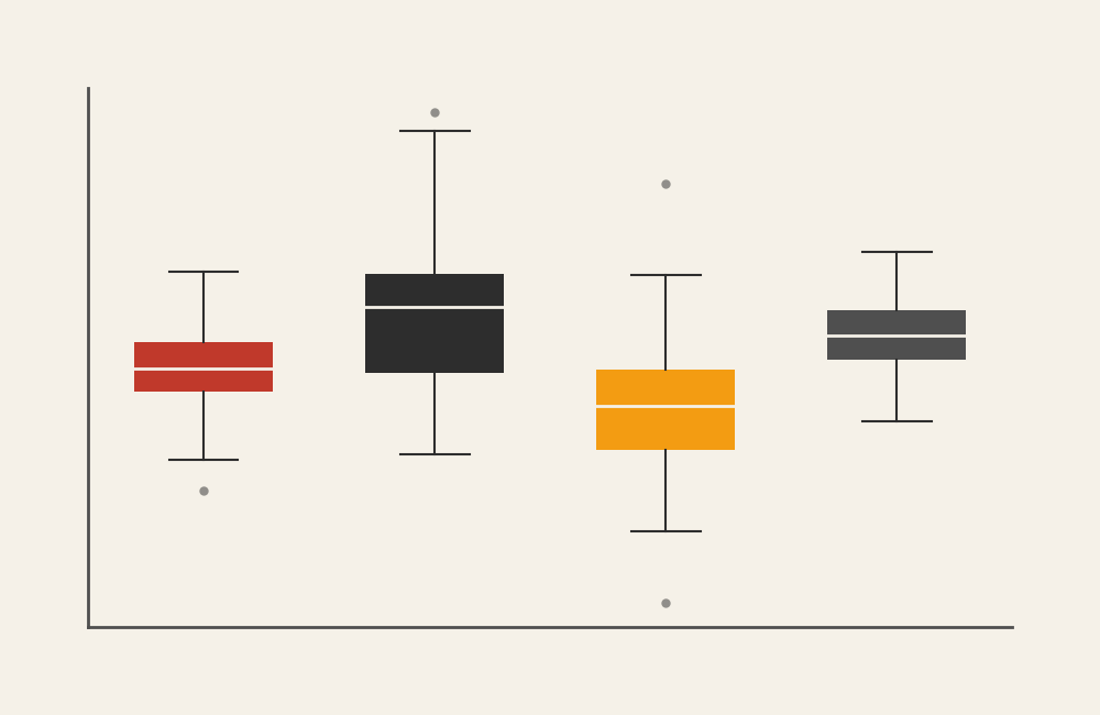
A box-and-whisker plot visualizes the distribution of a numerical dataset using five key values:
- Minimum
- First quartile (Q1)
- Median
- Third quartile (Q3)
- Maximum (or highest non-outlier)
The “box” shows the middle 50% of the data (the interquartile range), while the “whiskers” extend outward to show variability. Individual points beyond the whiskers are typically plotted as outliers.
This chart doesn’t hide variation—it highlights it.
If a bar chart summarizes, a box-and-whisker plot reveals structure.
When to Use a Box-and-Whisker Plot
Use a box-and-whisker plot when understanding spread, consistency, or anomalies matters more than exact totals.
This chart is especially useful when you want to:
- Compare distributions across groups
- Show variability and consistency
- Identify outliers
- Compare medians rather than means
- Reveal skewed or uneven data
- Summarize large datasets compactly
You choose a box-and-whisker plot when the key question is:
“How is this data distributed, and how does that distribution compare?”
Types of Data Sets That Work Best for a Box-and-Whisker Plot
Box-and-whisker plots work best with continuous numerical data, especially when you have many observations.
Strong candidates include:
- Test scores or grades
- Response times or durations
- Salaries or income ranges
- Prices or costs
- Measurements (height, weight, length)
- Performance metrics with variability
They’re particularly effective when comparing the same metric across multiple groups, conditions, or categories.
Real-World Examples of a Box-and-Whisker Plot
Box-and-whisker plots are common in research, quality control, and analytics—anywhere variability matters.
Salary or Income Comparisons
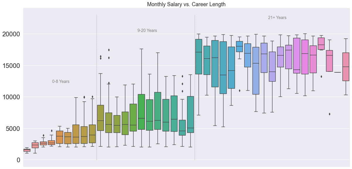

You reveal pay variability, typical ranges, and outliers that averages would completely hide.
Quality Control and Manufacturing

You monitor variation and detect anomalies that could signal problems.
What to Avoid or Be Careful Of with a Box-and-Whisker Plot
❌ Don’t use it with very small datasets
Quartiles lose meaning when there are only a handful of data points.
❌ Don’t expect it to show exact values
Box-and-whisker plots summarize distribution. If exact numbers matter, pair them with a table.
❌ Don’t assume everyone understands it
This chart is less intuitive for general audiences. Labels or brief explanations often help.
❌ Don’t hide important context
Outliers can look alarming without explanation. Make sure viewers understand what they represent.
❌ Don’t mix incompatible groups
Comparisons only work when groups are measured on the same scale and under similar conditions.
*Content on this page was curated and edited by expert humans with the creative assistance of AI.