
Alluvial Diagram: How to Show Change, Flow, and Shifting Composition
An alluvial diagram is what you reach for when your data isn’t static—when categories change, split, merge, or evolve over time or across stages. It’s built to show movement and flow, not just comparison.
Instead of asking, “How much is in each category?”
you’re asking, “Where does it go?”
What It Is
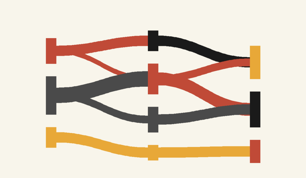
An alluvial diagram visualizes how values or categories flow between states. The vertical blocks represent categories at different stages (such as time periods, steps, or conditions), and the curved bands between them show how observations move from one category to another.
The width of each band represents magnitude.
Unlike a stacked bar or line chart, this diagram makes transitions visible. You don’t just see outcomes—you see how those outcomes came to be.
If a 100% stacked bar chart shows composition, an alluvial diagram shows composition plus movement.
When to Use It
Use an alluvial diagram when change itself is the story.
This chart is ideal when you want to show:
- How people move between categories over time
- How survey responses shift from pre-test to post-test
- How customer segments change across lifecycle stages
- How budget allocations reassign across periods
- How topics, classifications, or labels evolve
- How flows split, converge, or disappear
You choose an alluvial diagram when the key question is:
“How did we get from here to there?”
Related Charts and Graphs
Several visuals relate closely to an alluvial diagram and may be better choices depending on whether the focus is flow, hierarchy, or comparison across stages.
- Sankey diagrams also show flow between categories, but they typically emphasize quantity moving through a system rather than category transitions across multiple stages.
- Flowcharts illustrate processes and decision paths using structured shapes instead of weighted flows.
- Parallel sets diagrams present categorical relationships across dimensions in a more structured, grid-like format.
- Streamgraphs emphasize how categories evolve over time through layered areas rather than connected flows.
- Chord diagrams show relationships between groups in a circular layout, highlighting connections rather than progression.
- Network diagrams focus on relationships between nodes without emphasizing sequential stages.
- Stacked bar charts compare composition across categories but do not illustrate how elements move or change between stages.
Types of Data Sets That Work Best
Alluvial diagrams work best with categorical data tracked across multiple stages.
Strong candidates include:
- Longitudinal survey data
- Before-and-after comparisons
- Funnel or pipeline stages
- Classification changes over time
- Migration between groups, roles, or statuses
- Preference shifts across repeated measurements
The essential requirement is this: you must be able to trace the same entities across multiple points or conditions.
If categories are unrelated snapshots, this is not the right chart.
Real-World Examples of Alluvial Diagrams
Alluvial diagrams show up most often when researchers, analysts, and designers need to make complex transitions legible.
Survey Response Shifts Over Time

You survey the same group before and after an intervention. The diagram shows how respondents move between agreement levels, revealing patterns that averages would completely hide.
Budget or Resource Reallocation
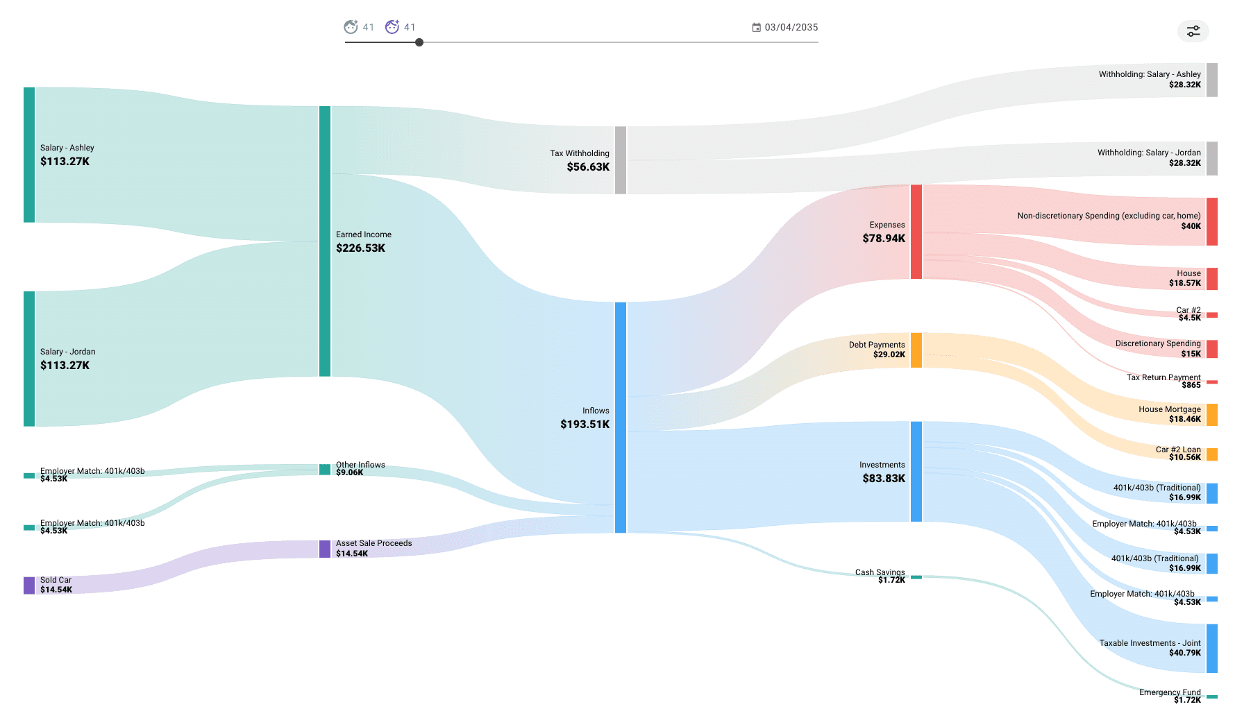
You compare how funding or resources shift across departments or priorities from one year to the next.
Topic or Classification Evolution


You show how categories split, merge, or reconfigure as systems evolve—common in research, policy, and information science.
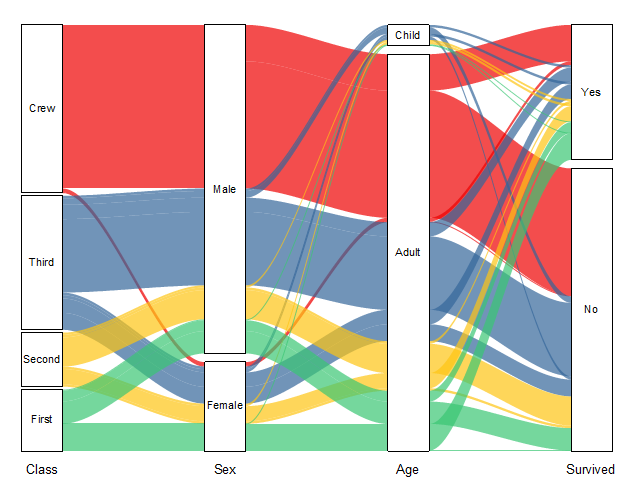
Demographic or Role Transitions
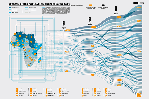
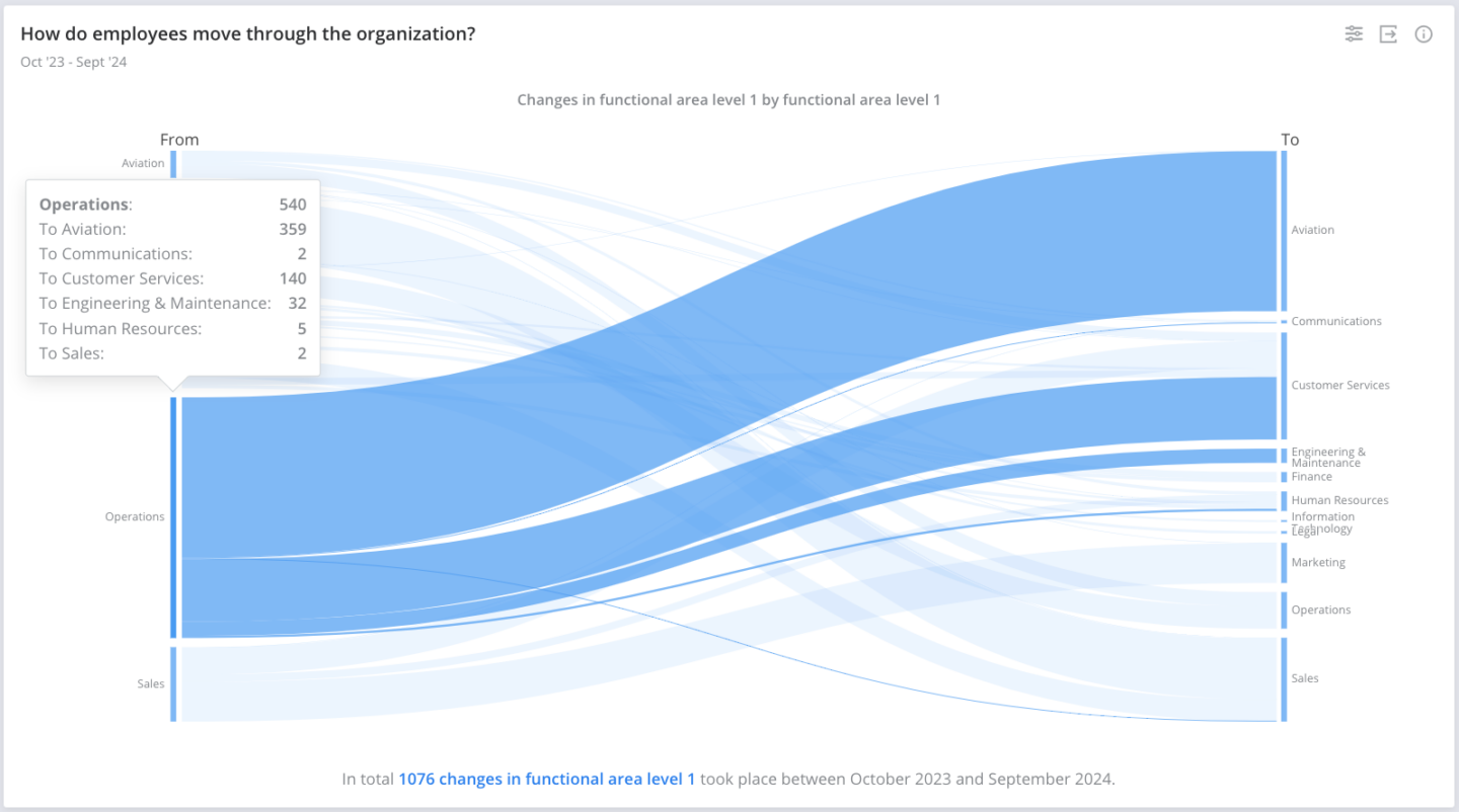

You visualize how individuals move between roles, statuses, or demographic categories over time.
What to Avoid or Be Careful Of
❌ Don’t use it for simple comparisons
If nothing is flowing or changing, an alluvial diagram adds unnecessary complexity.
❌ Don’t overload it with categories
Too many nodes or stages quickly create visual spaghetti. Limit categories and collapse minor ones when possible.
❌ Don’t ignore ordering
The vertical order of categories affects readability. Poor ordering can create excessive crossing and visual noise.
❌ Don’t rely on color alone
Flows overlap and weave. Use labels, spacing, and clear legends to support interpretation.
❌ Don’t expect precision
Alluvial diagrams are about patterns and pathways, not exact values. If exact numbers matter, pair them with annotations or tables.
*Content on this page was curated and edited by expert humans with the creative assistance of AI.