
100% Stacked Bar Chart: How to Show Proportions Across Categories
A 100% stacked bar chart is your go-to when you want people to see how parts make up a whole across different groups. It shifts attention away from totals and toward composition.
Instead of asking, “Which group is bigger?” you’re asking,
“How is each group built?”
Related Charts and Graphs
Several visuals relate closely to a 100% stacked bar chart and may be better choices depending on whether the focus is proportion, comparison, or overall totals.
- Stacked bar charts show absolute values instead of percentages. Use this version when both the total size and the internal breakdown matter.
- Grouped bar charts place categories side by side rather than stacking them. This layout makes it easier to compare exact values across subcategories.
- Pie and donut charts display proportions within a single category, offering a circular alternative when only one distribution needs to be shown.
- Waffle charts present proportions using a grid of units, making percentages feel more tangible and easier to count visually.
- Treemaps show hierarchical proportions using nested rectangles instead of bars, helping when multiple levels of structure exist.
- Stacked area graphs extend the idea across time, showing how proportional contributions change within a continuous timeline.
- Heatmap matrices use color intensity to compare proportional patterns across many categories at once.
What It Is
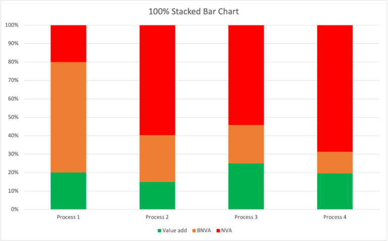
A 100% stacked bar chart is a stacked bar chart where every bar equals 100%. Each bar represents a category (a group), and the segments inside the bar represent percentages of sub-categories that add up to the whole.
You’re not comparing counts.
You’re comparing proportions.
If a regular stacked bar chart shows quantity, a 100% stacked bar chart shows makeup.
When to Use It
Use a 100% stacked bar chart when your goal is to compare how different categories are composed, not how large they are.
This chart shines when you want your audience to notice patterns like:
- How departments distribute time across tasks
- How age groups differ in media habits
- How customer segments vary in preferences
- How survey responses change by demographic group
- How budgets are divided across spending types over time
Choose this chart when the key question is:
“How does the internal makeup of each group compare to the others?”
Types of Data Sets That Work Best
This chart works best with categorical data that converts cleanly into percentages.
Great fits include:
- Survey responses (Likert scales, yes/no, multiple choice)
- Demographic breakdowns (age, region, role, experience)
- Budget or time allocation across categories
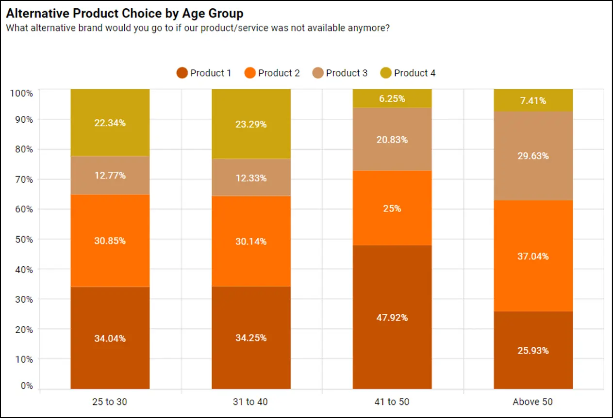
- Product preference by audience segment
- Behavioral distribution across groups
- Market share comparisons across regions
The common thread is simple: each group contains parts that meaningfully add up to 100%.
Real-World Examples of 100% Stacked Bar Charts
See some uses of real-world examples below:
Survey Results by Demographic Group
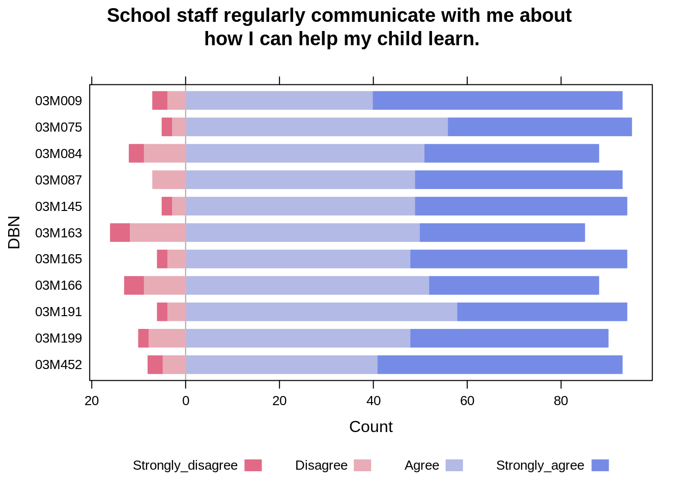

You survey people about agreement with a statement and break results out by age or gender. The goal isn’t to show how many responded—it’s to show how response patterns differ.
Budget Allocation Across Departments or Years

4
You want to show how spending priorities shift. Each bar is a year or department, and the slices show where the money goes.
Market Share by Region

4
Instead of showing how large each market is, you show how the competitive landscape differs from place to place.
Time Use or Task Distribution
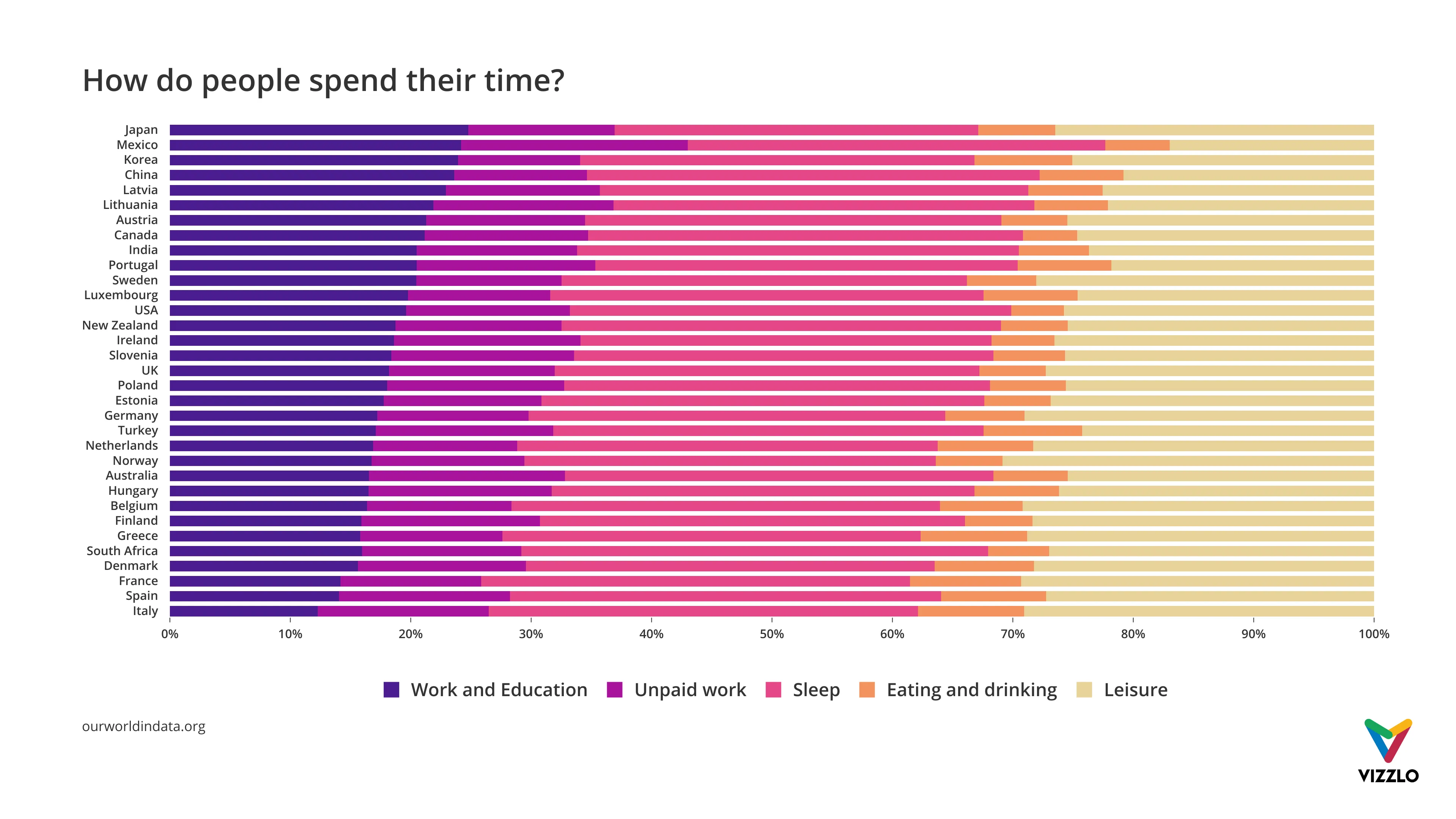

You compare how roles or teams spend their time. Each bar is a role; the segments show what fills their day.
Audience or Customer Preference Profiles


You’re comparing how different audience segments distribute across choices—revealing preference patterns, not totals.
What to Avoid or Be Careful Of
❌ Don’t use it when totals matter
Because every bar is the same length, you completely hide magnitude. A group of 50 people looks identical to a group of 5,000.
❌ Don’t overload it with segments
Too many slices make comparisons nearly impossible. Aim for 3–5 segments at most.
❌ Don’t change the segment order
If the order shifts across bars, viewers lose the ability to compare patterns.
❌ Don’t use weak color contrast
Thin slices require strong visual contrast to remain readable.
❌ Don’t expect precise comparison
This chart reveals patterns and distribution. If exact values matter, include labels or a table.
*Content on this page was curated and edited by expert humans with the creative assistance of AI.