

This page contains Amazon affiliate links, which means we may earn a small commission at no additional cost to you if you make a purchase through those links.
Data visualization is not just about presenting numbers—it’s about shaping meaning. Storytelling with data is the practice of structuring visuals so that audiences move from information to insight with clarity and purpose. Rather than showing everything at once, effective data storytelling guides viewers through context, comparison, explanation, and implication.
Much of the modern conversation around this practice has been shaped by leaders in the field, including Cole Nussbaumer Knaflic, author of Storytelling with Data, and Brent Dykes, author of Effective Data Storytelling. Their work emphasizes that data alone do not persuade—structure, focus, and communication do.
Storytelling with data does not mean manipulating emotion or exaggerating trends. It means designing visuals intentionally so your audience understands what matters, why it matters, and what should happen next.
You may also want to explore:
- Designing Data for Accuracy
- Simplification Techniques in Data Visualization
- Using Color to Communicate Data
- Organization and Layout in Data Visualization
- Choosing the Right Chart Type
Recommended Books on Storytelling with Data
By Brent Dykes
By Cole Nussbaumer Knaflic
By Scott Berinato
By Steve Wexler, Jeffrey Shaffer, and Andy Cotgreave
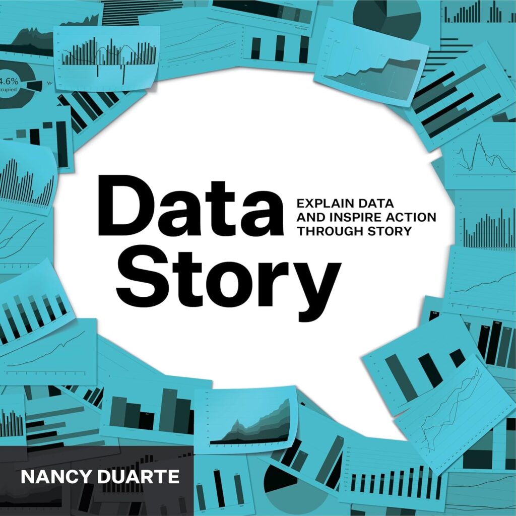
By Nancy Duarte
The Process of Storytelling with Data
Storytelling with data is not a single step. It is a deliberate process that moves from intention to insight to action.
1. Start With the Audience
Every good story begins with the audience in mind.
Ask:
- Who is this for?
- What do they already know?
- What decisions do they need to make?
- What biases or expectations might they bring?
An executive audience may need high-level summaries and implications. A technical audience may need methodological detail. A public audience may need more contextual framing.
Example:
If presenting quarterly revenue data to senior leadership, your focus should likely be on trends, risks, and opportunities—not granular daily fluctuations.
Storytelling begins with empathy.
2. Clarify the Core Message
Before building a chart, identify the single most important takeaway.
If you cannot state the insight in one sentence, the visualization may lack focus.
Strong message examples:
- “Customer churn is rising fastest among first-year subscribers.”
- “Operating costs increased primarily due to supply chain disruptions.”
- “The policy change reduced incidents by 22% within six months.”
This core message should shape:
- Chart type
- Emphasis
- Annotations
- Layout
- Headline
Without a clear message, charts become collections of data rather than stories.
3. Choose the Right Structure
Stories have structure. So do data narratives.
Common data storytelling structures include:
Overview → Detail
Start with a big-picture trend, then break it down into contributing factors.
Example:
Show overall revenue growth, then separate charts for product categories and regions.
Problem → Evidence → Implication
Present an issue, show supporting data, and conclude with consequences.
Example:
Headline: “Customer Satisfaction Is Declining.”
Followed by trend chart, segmentation breakdown, and service response time analysis.
Before → After
Highlight change across time.
Example:
Compare performance metrics before and after a new process implementation.
Structure reduces ambiguity and improves retention.
4. Guide Attention Deliberately
Storytelling requires direction. Viewers should not have to guess where to look.
Techniques:
- Use color sparingly to highlight key data.
- Add concise annotations explaining anomalies.
- Use bolded headlines that summarize insight.
- Place emphasis visually before supporting details.
Example:
Instead of labeling a chart “Sales by Region,” write:
“Western Region Surpasses All Others in Q4 Sales.”
The headline tells the story before the viewer reads the axes.
5. Remove Competing Information
Every extra element competes with your narrative.
Ask:
- Does this data point support the main message?
- Does this category distract from the core takeaway?
- Would removing this detail improve clarity?
Simplification strengthens storytelling.
Example:
If your message focuses on declining retention, remove unrelated engagement metrics from the same visual.
A strong story is selective.
6. Provide Context
Stories fail when numbers lack context.
Add:
- Benchmarks
- Comparisons
- Historical averages
- Industry standards
- Targets or goals
Example:
Instead of showing a 6% growth rate alone, compare it to:
- Last year’s 3%
- Industry average of 4%
- Company target of 5%
Context transforms data into meaning.
7. Use Annotation Strategically
Annotations can replace unnecessary additional charts.
Use them to:
- Explain spikes or dips
- Highlight turning points
- Clarify causation (when appropriate)
- Provide relevant narrative framing
Example:
A spike in website traffic is annotated:
“National media coverage published here.”
This eliminates speculation and strengthens understanding.
8. Sequence Visuals Intentionally
When multiple visuals are used, order matters.
Place charts in a logical progression:
- Overview
- Supporting breakdown
- Contributing factor
- Implication
Avoid scattering related visuals randomly.
In dashboards, use spatial flow (left-to-right, top-to-bottom) to guide interpretation.
9. Conclude With Implication or Action
A story that ends without implication is incomplete.
Consider:
- What decision should be made?
- What question remains?
- What action is recommended?
Data storytelling is often persuasive—but responsibly so. It should support informed decisions, not manipulate interpretation.
Example:
“Given rising churn among new subscribers, we recommend revising onboarding communication within the first 30 days.”
The data supports the recommendation.
10. Balance Emotion and Evidence
Effective storytelling engages attention without sacrificing accuracy.
Emotional framing should:
- Clarify impact
- Humanize outcomes
- Connect data to real-world consequences
But it should never:
- Exaggerate
- Omit contradictory evidence
- Overstate certainty
The strongest stories maintain credibility.
Putting It All Together: A Practical Example
Imagine you are presenting data about employee turnover.
Step 1: Audience
HR leadership.
Step 2: Core Message
“Turnover has increased primarily among employees with less than one year of tenure.”
Step 3: Structure
Overview turnover trend → Breakdown by tenure → Contributing factors → Recommendation.
Step 4: Emphasis
Highlight first-year employee line in bold color; mute others.
Step 5: Context
Compare current turnover to five-year average.
Step 6: Annotation
Mark implementation of remote policy changes.
Step 7: Conclusion
Recommend enhanced onboarding program.
The data remain accurate. The structure creates clarity. The insight becomes actionable.
Why Storytelling With Data Matters
Without narrative structure, data overwhelm. With structure, data persuade. Storytelling transforms:
- Numbers into understanding
- Trends into implications
- Metrics into decisions
- Information into action
As emphasized by leaders like Cole Nussbaumer Knaflic and Brent Dykes, storytelling is not about adding drama. It is about removing friction and aligning visuals with purpose.
When done well, storytelling with data helps audiences see not just what the numbers are—but what they mean, and what should happen next.
The goal is not to impress with complexity.
The goal is to illuminate with clarity.
*Content on this page was curated and edited by expert humans with the creative assistance of AI.