
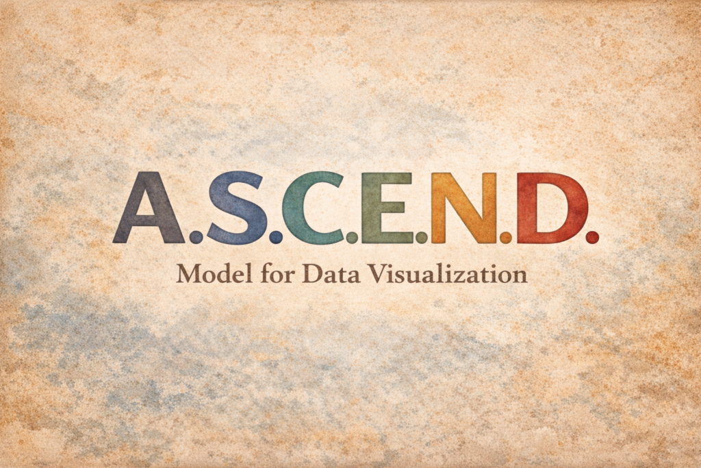
The A.S.C.E.N.D. model is a practical, ethics-aware framework developed by Curtis Newbold to help communicators move deliberately from raw data to meaningful visual insight. Rather than treating data visualization as a purely aesthetic exercise, ASCEND positions it as a strategic communication process—one that requires clarity of purpose, intentional design choices, and respect for audience understanding at every stage.
By guiding you through six deliberate steps—Analyze, State, Choose, Emphasize, Narrate, and Design—the ASCEND model helps you approach data visualization as a strategic communication process rather than a design shortcut. It prompts you to begin with careful analysis and message definition before selecting visual forms, shaping emphasis, and crafting narrative context. The result is data communication that is not only visually compelling, but also accurate, ethical, accessible, and trustworthy—helping your audience understand what the data truly shows and why it matters.
Analyze
Analyzing data is the foundation of effective data visualization. Before you think about charts, colors, or layouts, you need to understand what the data actually contains—and, more importantly, what within it is meaningful to your audience. Analysis at this stage is not about proving a point or decorating numbers; it is about identifying patterns, relationships, constraints, and signals that have communicative value.
When you analyze data with your audience in mind, you move beyond simply asking “What does the data show?” and begin asking “What does the data offer my audience?” This shift helps ensure that the visualizations you eventually design are relevant, ethical, and genuinely informative.
What Analyzing Means in the ASCEND Model
In the ASCEND model, Analyze means examining the data critically before assigning it any visual form. This includes understanding how the data was collected, what it measures, what it does not measure, and where its limitations lie. It also means looking for patterns, trends, outliers, and comparisons that could matter to the people you are communicating with.
At this stage, you are not deciding how the data will look—you are deciding whether the data is useful, credible, and communicatively meaningful at all.
Key Questions to Ask When Analyzing Data
As you analyze your dataset, use the following questions to guide your thinking:
- What does this dataset actually measure, and what does it leave out?
- Where did the data come from, and how was it collected?
- What variables are present, and how do they relate to one another?
- Are there clear patterns, trends, or changes over time?
- Where are the outliers, and are they meaningful or misleading?
- What comparisons are possible, and which are valid?
- What uncertainty, bias, or limitations exist in the data?
- Which findings are likely to matter to my audience’s goals, decisions, or understanding?
- What would be misleading or irresponsible to emphasize or ignore?
These questions help you distinguish between data that is merely available and data that is actually valuable.
Step-by-Step Process for Analyzing Data
1. Inventory the data
Begin by listing all variables, metrics, time ranges, and categories included in the dataset. Take note of data types (counts, percentages, rankings, continuous values) and any missing or incomplete entries.
2. Understand the source and method
Identify who collected the data, why it was collected, and how it was gathered. Look for documentation that explains sampling methods, definitions, and known limitations. This context is essential for determining credibility.
3. Explore the data without visuals
Before creating charts, examine the data in tables or summaries. Calculate basic statistics where appropriate, such as totals, averages, ranges, or rates of change. This prevents visual form from shaping interpretation too early.
4. Look for patterns and relationships
Identify trends over time, differences between groups, correlations, or anomalies. Ask whether these patterns are stable, emerging, or potentially misleading due to small sample sizes or outliers.
5. Identify what is relevant to your audience
Filter your findings through your audience’s needs. Consider what they are trying to understand, decide, or evaluate. A statistically interesting pattern may not be communicatively useful if it does not serve the audience’s context.
6. Note limitations and ethical concerns
Document uncertainty, potential bias, and areas where the data could be misinterpreted. This step prepares you to communicate responsibly and avoid overstating conclusions.
7. Articulate preliminary insights in plain language
Summarize what the data suggests using clear, non-visual language. If you cannot explain the insight in words, it is unlikely to be communicated clearly in a visualization.

State
In the ASCEND model, State means you take what you learned during analysis and express it as a clear, audience-centered main point. This is the moment where you decide what the data most importantly means for the people you’re communicating with—and you say it plainly before you design anything.
A strong statement does two things at once: it anchors your visualization in a single, defensible takeaway, and it prevents you from letting the chart “discover” the message after the fact. When you state the main point first, your design choices become purposeful rather than decorative.
What “State” Means in ASCEND
State is not “describe the dataset.” It is not “summarize all findings.” It is not a topic (“Sales by Region”) or a vague claim (“Sales are up”). Instead, it is a specific, accurate, and relevant point you want your audience to understand—supported by the data and framed in a way that matters to them.
Think of it as your visualization’s thesis: the one idea that should still be true if the chart disappeared and only your words remained.
Step-by-Step Process for Writing a Strong Statement
- Identify the single most valuable insight
Review your analysis and choose one insight that is most relevant to your audience’s goals, decisions, or concerns. If you have multiple insights, pick the one that best answers the implied question: “So what?” - Choose your audience lens
Decide what perspective your audience needs: risk, opportunity, performance, change, comparison, fairness, efficiency, or impact. The same data can support different lenses, but your statement should commit to one. - Make the point specific
Include concrete directionality and scope: who/what is changing, by how much, compared to what, and over what time period. You don’t always need all details in the statement, but you do need enough to prevent ambiguity. - Use plain language
Write it so a non-expert can understand it quickly. Avoid jargon, inflated phrasing, and statistical language that obscures meaning. Aim for clarity over cleverness. - Keep it defensible
Ensure the statement accurately reflects what the data supports. Avoid causal language unless you have evidence for causation. Avoid exaggeration. If the data is uncertain or limited, your statement should reflect that. - Test it with a “could I prove this?” check
Ask yourself: If someone challenged this statement, could you point directly to the data and show why it is true? If not, revise. - Tighten to one sentence
A good statement is usually one sentence. Two is fine if the second adds essential context, but if it turns into a paragraph, you’re likely trying to say too much.
Helpful Templates You Can Use
- Compared to [baseline], [metric] has [increased/decreased] by [amount] for [group] over [time period].
- The largest difference in [metric] occurs between [group A] and [group B], suggesting [implication].
- Most of the change in [metric] is driven by [factor/group], not [alternative].
- Despite [common assumption], the data shows [surprising pattern] for [group/time].
- Progress toward [goal] is [on track/off track], primarily due to [reason supported by data].
Examples of Strong Statements
Here are several examples across contexts. Notice how each one makes a clear point, stays grounded in evidence, and implies what the visualization should help the audience see.
Business / performance
- Customer churn increased 12% this quarter, driven primarily by new subscribers in their first 30 days.
- Although revenue rose 8% year-over-year, profit margins fell in the last two months due to increased fulfillment costs.
- Region West outperformed all other regions in Q3 sales growth, while Region South declined for the third straight quarter.
Education / student outcomes
- Course completion rates are highest for students who attend at least two tutoring sessions, regardless of prior GPA.
- First-year retention improved overall, but the gains are concentrated among commuter students—not residential students.
- The largest performance gap appears in the midterm exam, not the final, suggesting early support matters most.
Public-facing / policy and community
- Emergency response times decreased citywide, but remain consistently slower in the northwest corridor compared to other areas.
- Housing costs rose steadily over five years, but the sharpest increase occurred after 2021 in entry-level rentals.
- Reported incidents declined overall, but the decline is uneven across neighborhoods, indicating localized factors at play.
Marketing / communication
- Email open rates remained stable, but click-through rates dropped sharply after the subject-line change in October.
- Brand awareness increased most among 18–24 year-olds, while intent to purchase increased most among 35–44 year-olds.
- Most campaign engagement came from a small set of posts, suggesting content concentration rather than broad performance.
Research / survey data
- Respondents strongly support the policy in principle, but support drops when cost tradeoffs are introduced.
- Satisfaction is high overall, but the lowest scores consistently relate to wait time and follow-up communication.
- Differences between groups are small and may not be meaningful given the margin of error, but the direction is consistent.
A Quick Quality Check for Your Statement
A good State statement usually:
- Can be read in under 10 seconds
- Names what is happening and why it matters
- Implies what viewers should look for in the visualization
- Avoids vague claims like “increases significantly” without context
- Avoids causal language unless the data supports causation

Choose
In the ASCEND model, Choose is the step where you decide how the data should be visually structured so your audience can clearly see the point you have already stated. Choosing a chart is not about preference or visual novelty; it is about matching the form of the visualization to the nature of the data and the kind of understanding you want to support.
When charts are chosen well, they feel intuitive and almost invisible. When they are chosen poorly, they force audiences to work harder, draw incorrect conclusions, or focus on the wrong aspects of the data. This step ensures that your visual form serves the message rather than competing with it.
What “Choose” Means in ASCEND
Choose means narrowing your options intentionally. You are selecting a chart type that:
- Fits the structure of the data
- Supports the statement you want the audience to understand
- Minimizes cognitive effort
- Avoids distortion or overcomplication
At this stage, you are not refining aesthetics yet. You are making a structural decision about how relationships, differences, or patterns should be seen.
Step 1: Identify the Primary Data Structure
Begin by determining the basic structure of your data. Most datasets fall into one or more of the following categories.
Comparison between categories
Use these when your goal is to compare values across groups.
- Typical charts: bar charts, grouped bar charts, dot plots
- Best for: comparing amounts, frequencies, or rates across categories
Change over time
Use these when time is a meaningful dimension.
- Typical charts: line charts, area charts, slope graphs
- Best for: trends, growth, decline, and seasonality
Distribution
Use these when you want to show spread, variation, or typical values.
- Typical charts: histograms, box plots, density plots
- Best for: understanding range, clustering, and outliers
Relationship between variables
Use these when you want to examine association or correlation.
- Typical charts: scatterplots, bubble charts (with caution)
- Best for: showing how two variables move together
Part-to-whole
Use these when the audience needs to see how components contribute to a total.
- Typical charts: stacked bars, 100% stacked bars
- Best for: composition, not precise comparison
Geographic patterns
Use these when location itself carries meaning.
- Typical charts: choropleth maps, symbol maps
- Best for: spatial distribution, not exact comparison
Identifying the structure helps eliminate chart types that are incompatible from the start.
Step 2: Clarify the Communication Purpose
Next, return to the statement you wrote in the previous step and ask what kind of understanding the audience needs.
Ask yourself:
- Do I want the audience to compare values?
- Do I want them to see a trend or change?
- Do I want them to notice variation or consistency?
- Do I want them to identify relationships?
- Do I want them to see relative contribution to a whole?
Your answer narrows your chart options further. For example, if the purpose is comparison, a pie chart is immediately a poor choice, regardless of how common it is.
Step 3: Match Chart Types to Common Communication Goals
Use this practical matching guide to narrow your options.
To compare categories clearly
Choose bar charts or dot plots. These make differences easy to judge using position along a shared scale.
To show change across time
Choose line charts or slope graphs. These emphasize direction and rate of change rather than isolated values.
To show distributions and variability
Choose histograms or box plots. These reveal spread, skew, and outliers better than averages alone.
To show relationships without implying causation
Choose scatterplots with clearly labeled axes. Avoid trend lines unless they serve a specific analytical purpose.
To show composition without overstating precision
Choose stacked bars. Avoid pie charts unless there are very few categories and precision is not critical.
To show geographic patterns responsibly
Choose maps only when spatial location is central to interpretation, and avoid using them to compare precise values.
Step 4: Eliminate Charts That Conflict with the Message
A useful technique is to ask which chart types would actively work against your stated point.
Eliminate options that:
- Require decoding before meaning is clear
- Emphasize secondary details over the main point
- Distort magnitude or proportion
- Invite comparisons that are not meaningful
- Encourage causal interpretation when none is supported
For example, if your statement focuses on small but meaningful differences, avoid charts that exaggerate scale or use area to encode values.
Step 5: Choose the Simplest Chart That Works
Complexity should be earned, not assumed. If two chart types could communicate the same point, choose the one that requires less explanation.
Ask:
- Can this chart be understood in a few seconds?
- Would a non-expert reader interpret it correctly?
- Does it allow the audience to see the point without annotation?
Often, a straightforward bar or line chart will outperform more complex alternatives.
Step 6: Sanity-Check the Choice Against the Statement
Before moving on, test your chart choice by returning to your stated message.
Ask:
- Does this chart naturally direct attention to the stated point?
- Would a different chart type make the point clearer?
- Is anything about this form likely to distract or mislead?
If the answer is uncertain, reconsider. The goal is alignment between message and form.
A Simple Decision Shortcut
If you are unsure where to start, this shortcut can help:
- If you are comparing categories, start with bars.
- If time matters, start with lines.
- If spread or variation matters, start with distributions.
- If relationships matter, start with scatterplots.
- If location matters, consider maps carefully.
- If none of these fit, revisit your statement.
Learn Next: Types of Charts and Graphs
Emphasize
In the ASCEND model, Emphasize is the step where you intentionally guide attention so the audience clearly sees the point you stated and the chart was chosen to support. At this stage, the data is already correct and the chart form is already appropriate. Emphasis is about ensuring that what matters most is visually unmistakable.
Without emphasis, even well-chosen charts can feel flat or ambiguous. Audiences may notice the wrong pattern, fixate on secondary details, or miss the main takeaway entirely. Emphasis ensures that the key insight is not merely present in the visualization, but perceptually obvious.
What “Emphasize” Means in ASCEND
Emphasize means shaping visual hierarchy. You are deciding what should stand out first, what should recede, and what should serve as context. This can be accomplished through color, contrast, position, size, labeling, ordering, or simplification.
Emphasis does not mean exaggeration. The goal is not to distort the data or overstate differences, but to help the audience quickly orient themselves and understand why the visualization exists.
Common Ways to Create Visual Emphasis
There is no single method for emphasis. Instead, emphasis emerges from a combination of deliberate design choices.
Content organization
Placing the most important data where the eye naturally goes—often left-to-right or top-to-bottom—helps audiences find meaning quickly. Ordering categories from highest to lowest or grouping related items can make patterns immediately apparent.
Visual contrast
Contrast draws attention. Differences in color, brightness, weight, or saturation can signal importance without altering the data itself.
Labeling and annotation
Direct labels, brief callouts, or short annotations can highlight the key point more effectively than relying on legends alone.
Reduction and restraint
Removing unnecessary gridlines, ticks, colors, or labels allows the important elements to stand out by comparison.
Step-by-Step Process for Emphasizing the Key Point
- Identify the focal insight
Return to your stated message and ask what the audience must notice first in order to understand it. This element becomes your focal point. - Decide what should fade into the background
Not everything can be emphasized. Determine which elements provide context and should remain visible but subdued. - Use contrast intentionally
Apply stronger contrast to the focal elements and lower contrast to supporting elements. This might involve muted colors, thinner lines, or lighter text for context. - Organize data to support the message
Sort, group, or align data so the emphasized point appears naturally rather than through visual tricks. - Apply emphasis consistently
If one category or data point is emphasized, ensure that the method is applied consistently and meaningfully, not arbitrarily. - Check for unintended emphasis
Review the visualization to ensure nothing else competes for attention. If multiple elements stand out equally, emphasis is unclear.
Examples of Effective Emphasis
Highlighting a key category
A bar chart showing multiple departments uses a neutral color for most bars, while one department relevant to the message is highlighted in a darker tone with a direct label.
Clarifying a trend
A line chart showing multiple time series uses thin, light lines for context and a thicker, darker line for the primary trend being discussed.
Directing attention to change
A before-and-after comparison places the two key values side by side and annotates the difference, rather than forcing viewers to calculate it themselves.
Revealing contrast
A sorted bar chart makes disparities obvious by arranging categories from largest to smallest rather than alphabetical order.
What Emphasis Is Not
Emphasis should never:
- Distort scale to exaggerate differences
- Hide data that contradicts the message
- Use decorative effects that overwhelm meaning
- Rely solely on color when other cues are needed
If emphasis makes the visualization feel persuasive rather than informative, it is likely crossing into distortion.
A Quick Emphasis Check
Before moving on, ask:
- Can the main point be identified in under five seconds?
- Would two different viewers describe the same takeaway?
- Is attention drawn through clarity rather than exaggeration?
If the answer to any of these is no, emphasis needs refinement.
Why This Step Matters
Emphasis is where understanding becomes effortless. By thoughtfully directing attention, you reduce cognitive load and help your audience focus on what truly matters in the data. In the ASCEND model, Emphasize ensures that your visualization does not merely contain insight—it reveals it.

Narrate
In the ASCEND model, Narrate is the step where you make the story of the data explicit. While the chart and emphasis guide what the audience sees, narration ensures they understand what it means. Narration is not about adding opinion or overexplaining—it is about providing the context and framing necessary for accurate interpretation.
Good narration turns a visualization from a picture of data into a clear communication artifact. It helps the audience quickly grasp what is being shown, why it matters, and how to read it correctly, even when they encounter the visualization outside its original context.
What “Narrate” Means in ASCEND
Narrate means writing the supporting text that surrounds a visualization so the story is unmistakable. This includes titles, subtitles, captions, legends, annotations, source citations, and any explanatory notes required for responsible interpretation.
Narration answers the questions viewers naturally ask:
- What am I looking at?
- What should I notice?
- Why does this matter?
- How was this data created?
Without narration, audiences are left to infer meaning on their own, which increases the risk of misunderstanding or misuse.
Use Clear and Descriptive Titles
Titles are the most important narrative element in a visualization. A good title does more than name the chart—it communicates the main point.
What to do:
- Write titles that state the takeaway, not just the topic.
- Use plain language that reflects the stated message.
- Keep titles concise but informative.
Examples:
- Instead of “Monthly Sales,” use “Sales Have Declined for Three Consecutive Months”
- Instead of “Survey Results,” use “Most Respondents Support the Policy, but Cost Remains a Concern”
A reader should be able to understand the chart’s purpose by reading the title alone.
Use Subtitles to Add Essential Context
Subtitles support the title by providing clarifying details that do not belong in the main line.
Effective subtitles often include:
- Time ranges
- Geographic scope
- Units of measurement
- Population or sample description
- Key qualifiers or limitations
Examples:
- “Data from January 2021–December 2024, adjusted for inflation”
- “Responses from 1,200 full-time employees across four regions”
Subtitles prevent misinterpretation without cluttering the visual.
Write Captions and Annotations That Guide Interpretation
Captions and annotations help explain what viewers are seeing and why certain elements matter.
What to do:
- Use brief annotations to call out key changes, comparisons, or anomalies.
- Place text close to the relevant data when possible.
- Keep language factual and restrained.
Examples:
- “The sharp increase in 2022 coincides with the policy change”
- “Outlier values reflect one-time reporting adjustments”
Annotations should reduce cognitive effort, not add commentary.
Include Clear Legends and Labels
Legends and labels are part of narration, not decoration. If viewers struggle to decode the chart, the story breaks down.
What to do:
- Use clear, unambiguous legend labels.
- Label data directly when possible to reduce cross-referencing.
- Ensure symbols, colors, and line styles are explained.
Avoid:
- Overloaded legends with unclear categories
- Relying on color alone to convey meaning
- Using abbreviations without explanation
A well-narrated visualization minimizes guesswork.
Cite Data Sources and Methods
Source information is a critical narrative element, especially for credibility and ethical communication.
What to include:
- Data source name
- Date of publication or access
- Any major transformations or adjustments
- Notes about uncertainty or limitations when relevant
Examples:
- “Source: U.S. Census Bureau, American Community Survey (2023)”
- “Values represent rolling three-month averages”
Citations allow viewers to verify claims and understand the context of the data.
Add Supporting Text When Context Matters
Some visualizations require additional explanation beyond titles and annotations.
Use supporting text to:
- Explain methodology or sampling
- Clarify why certain data was excluded or aggregated
- Prevent common misinterpretations
- Provide ethical or privacy-related context
This text can appear below the chart or in an accompanying note, depending on format.
Step-by-Step Process for Effective Narration
- Write the title first
Ensure it clearly reflects the main point you want understood. - Add a subtitle for scope and clarity
Include time, population, and units as needed. - Identify where viewers might misinterpret
Add annotations or notes to address those points. - Ensure legends and labels are readable and complete
Remove ambiguity and unnecessary decoding. - Cite sources and note limitations
Provide transparency without overwhelming the viewer. - Review the visualization in isolation
Ask whether someone encountering it alone would understand the story.
Why This Step Matters
Narration protects meaning. In an environment where visualizations are often shared, cropped, and reposted, clear narrative framing ensures that your data is understood as intended. In the ASCEND model, Narrate is what transforms a chart into a story—one that is accurate, contextualized, and resilient to misinterpretation.

Design
In the ASCEND model, Design is the step where everything comes together. After analyzing the data, stating the message, choosing the chart, emphasizing what matters, and narrating the story, design ensures the visualization is usable, accessible, and appropriate for its context. This is not about decoration for its own sake—it is about shaping the final experience so the visualization communicates clearly, responsibly, and effectively to its intended audience.
Good design balances two essential priorities: accessibility and user experience. A visualization can be accurate and well-reasoned, but if it is difficult to read, inaccessible to some users, or poorly suited to its platform, it will fail to communicate.
What “Design” Means in ASCEND
Design means refining the visual system so it works in the real world. This includes layout, typography, color, spacing, hierarchy, interaction (when applicable), and overall presentation. It also means ensuring that accessibility best practices are respected while aligning the visualization with branding, tone, and communication goals.
At this stage, you are asking not just “Is this correct?” but “Is this usable, inclusive, and appropriate for where and how it will be seen?”
Design for Accessibility First
Accessibility is not a constraint on good design—it is a foundation of it.
Key accessibility considerations include:
- Sufficient color contrast between text, data, and background
- Color palettes that do not rely on color alone to convey meaning
- Legible typography at appropriate sizes
- Clear labels and readable legends
- Alternative text or descriptions for non-visual access
- Keyboard and assistive technology compatibility for interactive visuals
Designing with accessibility in mind improves clarity for all users, not just those with disabilities. When accessibility is prioritized early, it becomes an integrated feature rather than a retrofitted fix.
Design for User Experience and Readability
User experience in data visualization focuses on how easily viewers can understand and navigate the information.
Consider:
- Visual hierarchy: what the eye sees first, second, and last
- Layout and spacing that prevent clutter and crowding
- Consistent alignment and grouping
- Logical flow that matches reading patterns
A well-designed visualization minimizes friction. Viewers should not have to search for labels, decode legends repeatedly, or work to understand what they are seeing.
Align Design with Context and Purpose
Design choices should reflect where the visualization will live and how it will be used.
Ask:
- Is this for a report, a slide, a dashboard, a website, or social media?
- Will it be viewed quickly or studied carefully?
- Is it static or interactive?
- Will it be shared independently of surrounding text?
Designing for context may involve adjusting aspect ratios, simplifying detail, or strengthening narrative elements so the visualization holds up across platforms.
Incorporate Branding and Marketability Thoughtfully
Branding and visual identity matter, especially in professional, organizational, or public-facing contexts.
What to do:
- Use brand colors and fonts where appropriate, while maintaining accessibility
- Match tone and style to organizational identity
- Ensure consistency across related visuals
What to avoid:
- Forcing brand colors that reduce contrast or readability
- Letting decorative style override clarity
- Treating branding as more important than comprehension
Marketable design should attract attention without compromising trust. A visualization can be visually compelling and still restrained, clear, and honest.
Refine Without Distorting
The final design phase often involves polishing details. This is where ethical discipline matters most.
Ensure that:
- Design refinements do not exaggerate differences
- Spacing and alignment do not imply false relationships
- Aesthetic enhancements do not obscure data
- Visual consistency supports, rather than reshapes, interpretation
Every design decision should be defensible as serving understanding rather than persuasion.
Step-by-Step Process for Designing the Final Visualization
- Review accessibility requirements
Check contrast, legibility, and non-visual access needs. - Establish visual hierarchy
Ensure the main message is immediately visible. - Refine layout and spacing
Remove clutter and improve flow. - Apply color and typography intentionally
Balance brand alignment with readability. - Test across formats and devices
Confirm the visualization works in its intended environment. - Revisit earlier ASCEND steps
Confirm that design supports the stated message without altering it.
Why This Step Matters
Design is where your data visualization meets its audience. By prioritizing accessibility and user experience while remaining mindful of branding and presentation goals, you ensure that your visualization is not only correct, but effective and inclusive. In the ASCEND model, Design is the step that transforms insight into impact—without sacrificing clarity, ethics, or trust.
*Content on this page was curated and edited by expert humans with the creative assistance of AI.