
Overview
In 2009, Tropicana launched a major redesign of its packaging and logo for its Pure Premium orange juice line, replacing its classic orange-with-a-straw imagery with a minimalist, modern look. What was intended as a fresh, contemporary update quickly turned into a consumer revolt, as loyal customers complained the new design was confusing, generic, and disconnected from the brand’s heritage. Within weeks, Tropicana reversed course, scrapping the redesign entirely. The episode illustrates how brand equity resides in visual identity as much as in product quality and how customer attachment to familiar symbols can make or break corporate strategy.
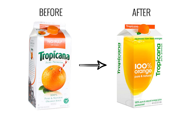
Context and Events
For decades, Tropicana’s packaging prominently featured the image of an orange with a straw inserted, symbolizing freshness and naturalness. In January 2009, PepsiCo introduced a new design as part of a broader corporate push toward sleek, modern branding. The redesign replaced the iconic orange-and-straw image with a simple glass of orange juice, used a generic sans-serif font for the logo, and shifted cap design to resemble an actual orange.
Almost immediately, consumers reacted negatively. Loyal customers complained that the new design made it difficult to distinguish between juice varieties on store shelves, weakened brand recognition, and stripped the product of its emotional connection. Social media, emails, and phone calls flooded Tropicana’s customer service lines with complaints, while brand loyalists accused the company of disregarding its heritage.
Communication Strategy
Tropicana’s communication strategy showed a mix of bold intent and quick reversal:
- Initial design rationale: Executives framed the redesign as a way to modernize the brand and appeal to younger, design-conscious consumers.
- Consumer backlash: As complaints mounted, PepsiCo monitored feedback but underestimated the scale of negative sentiment until it gained widespread media attention.
- Rapid reversal: Within two months, Tropicana announced it would revert to the old packaging, acknowledging consumer attachment to the original design.
- Public apology: Executives admitted they had underestimated customer loyalty to the original imagery, framing the reversal as a willingness to listen to consumers.
Outcomes
The redesign proved disastrous in both reputation and sales. In the two months the new packaging was on shelves, sales of Tropicana Pure Premium dropped by 20%, representing tens of millions in lost revenue. The backlash became a high-profile example of design failure, frequently cited in marketing and design courses as a cautionary tale about disregarding brand heritage.
While Tropicana’s quick reversal helped stabilize sales and avoid long-term damage, the episode underscored how even small changes in visual identity can trigger emotional responses from loyal consumers. For Tropicana, the crisis highlighted the importance of aligning brand innovation with consumer expectations.
Lessons Learned
- Brand identity is emotional – Logos, imagery, and packaging can carry deep symbolic value that customers resist changing.
- Research beyond aesthetics – Design testing must account for practical factors like shelf recognition and emotional attachment, not just visual appeal.
- Listen to customers early – Monitoring consumer feedback in real time can prevent crises from escalating.
- Reversals can rebuild trust – Admitting mistakes and restoring beloved elements can salvage reputation.
- Heritage is a strategic asset – For legacy brands, heritage symbols are as important to loyalty as the product itself.
*Content on this page was curated and edited by expert humans with the creative assistance of AI.