Skip to content
The Comm Spot The Comm Spot

It's All About Communication

  • HOME
  • ABOUT
    • Meet the Creator: Curtis Newbold, PhD
    • Hire Curtis
    • Publish with Us
    • Contact
    • Privacy Notice
  • COMM-BASICS
    • Glossary
    • Citation & Style Guides
      • AP Style (Journalism)
        • AP Style Overview
        • AP Style Guidelines
        • Media Ethics – SPJ Code of Ethics
        • Elements of Newsworthiness
      • APA Style
        • APA Format – Overview
        • APA - References Guidelines
        • APA - In-text Citations
        • APA - Citing Authors
        • APA - Audiovisual Media
        • APA - Books
        • APA - Digital Sources
        • APA - Events & Interactions
        • APA - Periodicals
        • APA - Print Sources (other than books)
      • Chicago Style
        • Chicago – Overview
        • Chicago - Author-Date System
        • Chicago - Notes-Bibliography System
        • Chicago - In-text Citations
        • Chicago Style - Citing Authors
        • Chicago - Audiovisual Media
        • Chicago - Books
        • Chicago - Digital Sources
        • Chicago - Events and Interactions
        • Chicago - Citing Periodicals
        • Chicago - Print Sources (other than books)
      • MLA Style
        • MLA Overview
        • MLA Works Cited Pages
        • MLA In-text Citations
        • MLA – Authors
        • MLA – Audiovisual Media
        • MLA – Books
        • MLA – Digital Sources
        • MLA – Events & Interactions
        • MLA – Periodicals
        • MLA – Print Sources (other than books)
    • Rhetoric
      • Overview of Rhetoric
      • Rhetorical Appeals (Rhetorical Triangle)
      • Branches of Oratory
      • Canons of Rhetoric
      • Rhetorical Devices
      • Kairos
      • Topos
      • Key Figures in Rhetoric
    • Research Methods
      • Case Studies
      • Competitor Analysis
      • Content Analysis
      • Discourse Analysis
      • Ethnography
      • Focus Groups
      • Observation Research
      • S.W.O.T. Analysis
      • Secondary Research
      • Surveys
      • Target Market Analysis
      • Usability Testing
      • Visual Analysis
    • Theories
    • Thinkers
  • COMM-SUBJECTS
    • Interpersonal Communication
      • Active Listening
      • Body Language
      • Conflict Management
      • Emotional Intelligence
        • Emotional Intelligence Overview
        • Self-Awareness
        • Self-Regulation
        • Motivation
        • Empathy
        • Social Skills
        • Emotional Intelligence Resources
      • Feedback
      • Negotiation
        • Overview of Negotiation
        • Negotiation Skills
        • Negotiation Strategies & Techniques
        • Stages of Negotiation
        • Common Negotiation Scenarios
        • Negotiation Case Studies & Examples
        • Negotiation Tools & Resources
        • Negotiation FAQ
    • Journalism
    • Public Speaking
      • General Guidelines
      • Overcoming Fear
      • Speech Writing and Organization
      • Delivery Techniques
      • Body Language
      • Audience Engagement
      • Storytelling
      • Designing Slides
      • P.O.W.E.R.F.U.L. Presentation Method
    • Strategic Communication
      • Business & Org Comm
        • Definition & History
        • Org Comm Theories
        • Business Documents
        • Change Management
        • Employee Relations
        • Employment Communication
        • Group & Team Communication
        • Leadership Communication
        • Power, Identity, & Ethics at Work
        • Project Management
      • Integrated Marketing Comm
        • Definition of IMC
        • Core Principles of IMC
        • IMC Planning
        • Audience Segmentation
        • Marketing Channels
        • Message Strategies
        • Campaign Measurement & Evaluation
        • Trends & Innovations in IMC
        • Challenges & Pitfalls in IMC
        • Careers & Roles in IMC
      • Public Relations
        • Foundations in PR
        • Strategic Practice
        • Tools & Tactics
        • Research & Analysis
        • Professional Development
      • Case Studies in Strat Comm
    • Technical & Scientific Communication
    • Visual Communication
      • Data Visualization
      • Information Design
      • Photography
      • Web Design
    • Written Communication
      • Writing Process
      • Organizational Methods
        • Five Paragraph Essay
        • Hourglass Method of Writing
        • IMRaD Format (Science)
        • Indirect Method (Bad News)
        • Inverted Pyramid (Journalism)
        • Martini Glass
        • Narrative Format
        • Proposal Format
        • Rogerian Method
        • Toulmin Method
      • Plain Language
        • Audience (Plain Language)
        • Organization (Plain Language)
        • Conversation (Plain Language)
        • Simplicity (Plain Language)
        • Word Choice (Plain Language)
        • Sentence Structure (Plain Language)
        • Design (Plain Language)
      • Punctuation
        • Apostrophes
        • Brackets
        • Colons
        • Commas
        • Ellipses
        • Em Dashes
        • En Dashes
        • Exclamation Marks
        • Hyphens
        • Parentheses
        • Periods
        • Question Marks
        • Quotation Marks
        • Semicolons
      • Style
        • Clarity
        • Conciseness
        • Consistency
        • Editing
        • Flow
        • Rhetorical Devices
        • Sentence Structure
        • Storytelling
        • Tone
        • Voice
        • Word Choice
  • RESOURCES
    • Teaching Resources
      • Assignments & Activities
      • Instructional Design
      • Pedagogies
  • BLOGS
    • The Spotlight Blog
    • Comm Sparks
  • SHOP
    • Cart
    • Checkout
0
The Comm Spot
The Comm Spot

It's All About Communication

How We Are Visualized Shapes the Way We See Ourselves

Posted on February 23, 2026February 23, 2026 By Curtis Newbold
  • Facebook
  • LinkedIn

If someone were to ask you where you fit politically, would you be inclined to say something like, “I lean left” or “I’m far right”? If they asked you how you fit in where you live, is it possible you might say, “I’m definitely blue living in a red state” (or vice versa)?

What does it mean, really, to live in a “red state” or a “blue county”? Are political and ideological beliefs—and by association, the people that carry those beliefs—really so distinct that they can be narrowed into one of two very distinct colors? If you don’t fit the perfect mold of republican red or democratic blue, do you inherently become purple, the only other logical color option, some blending of blue and red?

The idea seems silly, really, when we think of the the obvious complexity of the human mind amid the infiniate combinations of culture, ethnicity, upbringing, education, religion, and a host of other factors that actually shape individuals’ worldviews. The political spectrum—an imaginary line that places dark blue at the far left and dark red at the far right—is functionally useful for having conversations but also a fundamentally wrong (and increasingly dangerous) way to simplify the diversity of human thought into two polarized groups.

As absurd as the red-blue imagery seems for simplifying people and the regions in which they live, it has become an all-to-common metaphor for describing ourselves. The very simplicity of a linear spectrum and a polarized two-color model inherently limits a person to leaning red or blue, suggesting they can’t really have a complex, multifaced worldview that pulls from many diverse combinations of beliefs in economics, foreign policy, religion, immigration, healthcare, social issues, education, and so on.

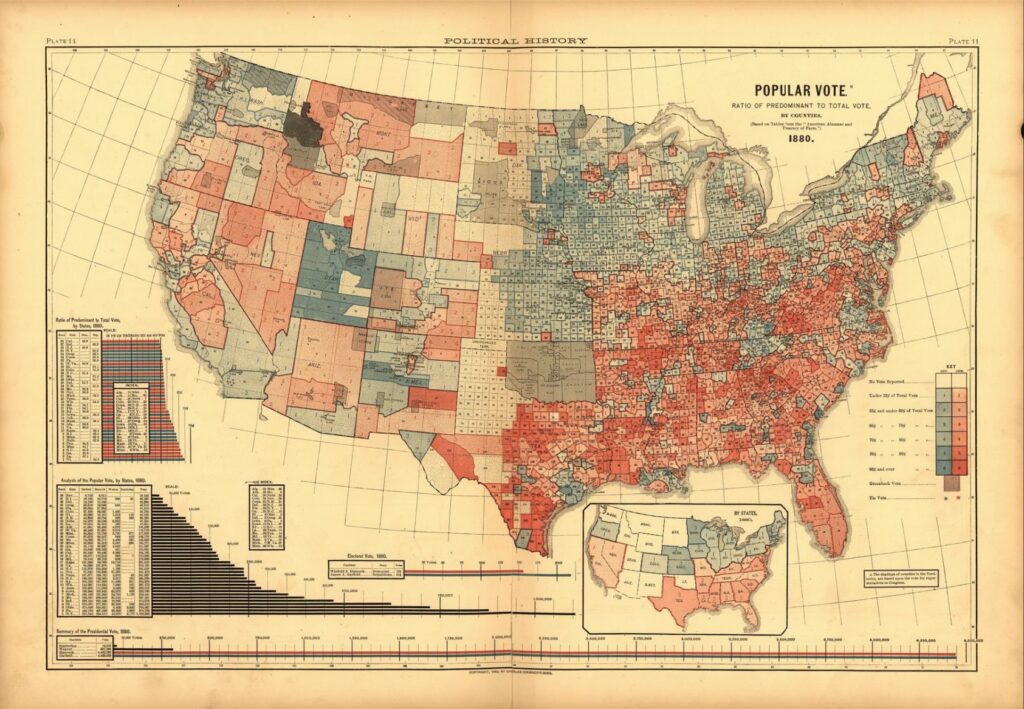
It’s hard to pinpoint a single event that has led U.S. citizens to talking about themselves in this way; it’s been a progressive evolution that has evolved as political parties rose and fell throughout the 19th and early 20th centuries. But we can look to the visualization of American votes in the 1880 election, depicted in the map above, as an early example for how visualizing America changed the conversation about how we see ourselves.

In the map, only two colors are presented (red is for democratic votes and blue is for republican, opposite of what we use today). While shades of colors represent higher or lower percentages of votes, there is a clear—and problematic—visual distinction. Even in counties that are a near even 50/50 split, they are represented as either red or blue. The hard lines between colors create an absurdly distinct separation, particularly visible in the borders btween Utah, Idaho, Arizona, and Nevada, suggesting an immediate and stark difference in political views for hundreds of miles along invisible borders.

Political maps like these have evolved over time. Prior to the 21st century, news outlets used many different colors, including organge and yellow, among other visual signifiers, to visualize each party. It wasn’t until the 2000 election, between Bush and Gore, that news outlets began harmonizing—and thus universally concretizing—the use of blue for democrat and red for republican.

Today, that distinct imagery is so fastened into the mind of most Americans that it’s hard not to define ourselves as either one or the other. Sadly, it’s a reductionist way of thinking about diversity of thought and the complex, richness of the people of our nation. Worse, the visualizations we see today, which perpetuate this bifurcation of people by political color, is only serving to assist in the polarization.

Are we not more diverse than two parties? Can we not be represented by more than two colors? Should we not stop thinking of ourselves, our counties, and our states, in only two divergent ideologies? Are we limiting our ability to think in third-, fourth-, and fifth- party views because only two seem possible?

Visual depictions like these matter. Sure, they’re easier to talk about and to post on social media or display on TV during election cycles, but are they also simplifying who we really are while also unnecessarily creating enemies, through visual separation, amongst ourselves?

The Spotlight Blog

Post navigation

Previous post

Related Posts

The Spotlight Blog

Florence Nightingale Saved Thousands of Lives with an Infographic: A Lesson in the Power of Information Design

Posted on October 2, 2025October 3, 2025

Facebook LinkedIn The title of this post isn’t hyperbole. It’s a true story about the actual human impact of a data visualization in advocating for important change. As a person passionate about the power of information design, I also find it to be a fascinating story loaded with lessons about…

Read More
The Spotlight Blog

Bridging Misunderstanding and Meaning: Why Schramm’s Model of Communication Still Matters in Today’s Digital World

Posted on October 30, 2025November 13, 2025

Facebook LinkedIn A 75-year-old woman walks into an Old Navy and asks a 17-year-old male employee where she can find the thongs. The teenager, laughing on the inside but professional and polite in his response says, “Sorry, ma’am, we don’t sell thongs here.” “But,” the woman protests, “I saw on…

Read More
The Spotlight Blog

The 5 Best Books on Data Visualization (For Beginners and Professionals)

Posted on January 6, 2026January 6, 2026

Facebook LinkedIn This page contains Amazon affiliate links, which means we may earn a small commission at no additional cost to you if you make a purchase through those links. Okay, there’s an elephant in the room—you’ve been asked to share some data, but you’ve never really been trained how…

Read More

Leave a Reply Cancel reply

Your email address will not be published. Required fields are marked *

  • facebook
  • instagram
  • linkedin

DON'T MISS ANY SPOT-ON TIPS!

We don't spam! You'll only get emails when we post something awesome.
You can unsubscribe at any time.

Check your inbox or spam folder to confirm your subscription.

©2025 | The Comm Spot | By Newbold Communication & Design