

Treemap: How to Show Hierarchical Proportions in a Compact Space
A treemap helps visualize hierarchical data using nested rectangles sized according to value. Use it to show how parts contribute to a whole while preserving structure within categories. Instead of relying on bars or circles, the chart fills space with blocks that reflect proportional relationships.
Turn to a treemap when the goal is to compare many categories at once without losing the sense of hierarchy. The layout allows large and small components to coexist within a single frame, making it easier to spot dominant categories, emerging segments, or imbalances within a system.
Treemaps are especially effective when screen space is limited. By packing data into a rectangular area, the chart communicates complex relationships efficiently while still emphasizing proportion.
Related Charts and Graphs
Several visuals relate closely to treemaps and may be better choices depending on the goal.
- Sunburst charts show hierarchy in a circular layout rather than a rectangular one.
- Stacked bar charts compare parts of a whole across categories but do not show nested hierarchy.
- Pie and donut charts focus on a single level of composition rather than multiple layers.
- Icicle charts display hierarchy in a linear structure instead of a packed layout.
- Heatmap matrices encode value through color intensity rather than area.
Choosing between these options depends on whether the focus is hierarchical structure, spatial efficiency, or precise comparison.
What a Treemap Is
A treemap displays data as nested rectangles, where each rectangle represents a category or subcategory. The size of each block reflects its value relative to the total, while grouping shows how items belong within larger structures.
Common elements include:
- Rectangular blocks sized by value
- Nested groupings that reveal hierarchy
- Color coding to distinguish categories or highlight performance
- Labels identifying major sections
The layout allows viewers to understand both structure and proportion simultaneously. Larger rectangles draw immediate attention, while smaller blocks reveal detail within the hierarchy.
Treemaps can vary in style. Some emphasize clean grids, while others use more organic layouts. Interactive treemaps often allow users to zoom into layers, making them powerful tools for exploration.
When to Use a Treemap
Use a treemap when hierarchical composition needs to be communicated clearly and efficiently.
This visual works especially well when the goal is to:
- Show how categories break into subcategories
- Compare relative size across many items
- Reveal dominance or imbalance within a system
- Present complex datasets in a compact layout
- Support interactive exploration of hierarchy
Treemaps are particularly useful when dealing with many categories that would overwhelm a traditional bar chart. By grouping related items together, the chart provides both overview and detail at once.
Because area represents value, treemaps help viewers quickly identify which parts of a system carry the most weight.
Types of Data Sets That Work Best for a Treemap
Treemaps work best with hierarchical data where values represent meaningful quantities.
Strong candidates include:
- Budget allocation across departments and programs
- Product categories and sales volume
- Website content organized by section
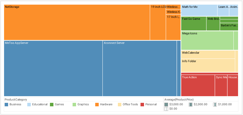
- File system storage usage
- Market share within industry segments
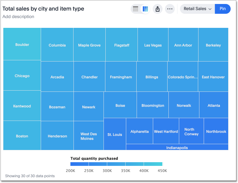
- Population or demographic breakdowns
Each level of the hierarchy should have clear parent-child relationships. Data that lacks structure may feel confusing when forced into a treemap layout.
Treemaps also benefit from thoughtful color choices. Colors may represent category grouping, performance metrics, or status indicators, adding another layer of meaning beyond size.
Real-World Examples of a Treemap
Treemaps appear frequently in dashboards, journalism, analytics platforms, and business reporting where space efficiency and hierarchical insight matter.
Budget or Financial Allocation
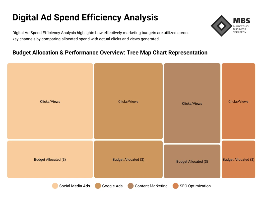

Show how funds distribute across departments, programs, and initiatives within a single view.
Product Categories and Sales Performance
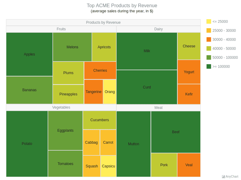
Highlight which products or categories contribute most to revenue.
Website Content Structure
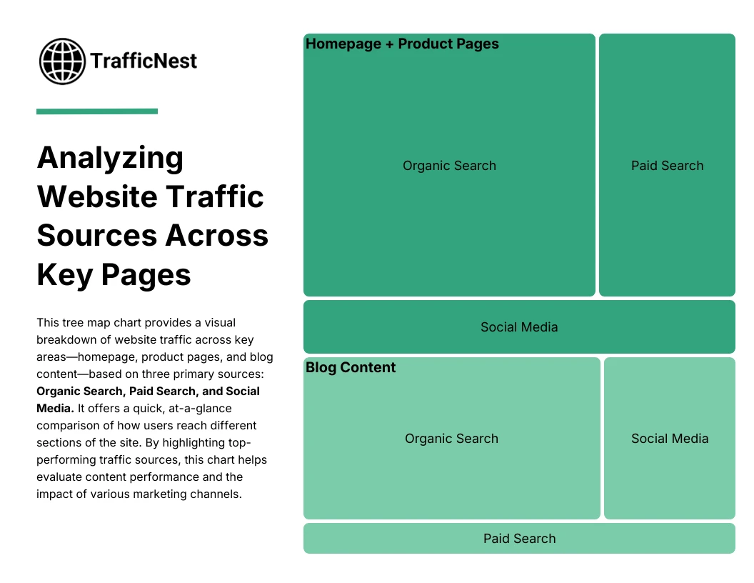
Reveal how traffic distributes across sections and pages.
File System or Storage Usage
Show how folders and files consume storage within a system.
Market Share or Industry Composition

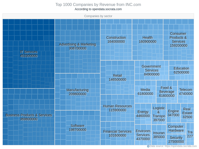
Compare how organizations contribute to an overall market.
What to Avoid or Be Careful Of with a Treemap
❌ Don’t rely on treemaps for precise comparison
Area is harder to compare accurately than length, making small differences less obvious.
❌ Don’t include too many tiny categories
Very small rectangles can become unreadable and reduce clarity.
❌ Don’t ignore hierarchy clarity
Clear grouping and labeling help viewers understand structure.
❌ Don’t overload with color variation
Too many hues can make the chart feel chaotic rather than organized.
❌ Don’t use it when hierarchy isn’t meaningful
If categories don’t have parent-child relationships, other visuals may communicate more clearly.
*Content on this page was curated and edited by expert humans with the creative assistance of AI.