
Timeline: How to Show Events and Change Across Time
A timeline helps visualize events in chronological order, making it easier to understand sequence, duration, and progression. Use it to show how moments connect, how stories unfold, or how processes evolve across a period.
Turn to a timeline when time itself is the organizing structure of the story. Instead of comparing categories or distributions, the visual emphasizes order and context. Each point or segment marks a moment, allowing viewers to see what happened first, what followed, and how events relate to one another.
Timelines are especially effective when storytelling involves milestones or turning points. Whether documenting historical events, project phases, or product development cycles, the linear structure makes progression easy to follow.
Related Charts and Graphs
Several visuals relate closely to timelines and may be better choices depending on the goal.
- Gantt charts focus on project tasks and durations rather than narrative events.
- Line graphs show trends in values over time instead of discrete moments.
- Flowcharts explain processes and decision paths rather than chronological sequences.
- Slope graphs highlight change between two points rather than across a full timeline.
- Step line charts emphasize interval-based change rather than storytelling.
Choosing between these options depends on whether the focus is narrative sequence, trend analysis, or operational planning.
What a Timeline Is
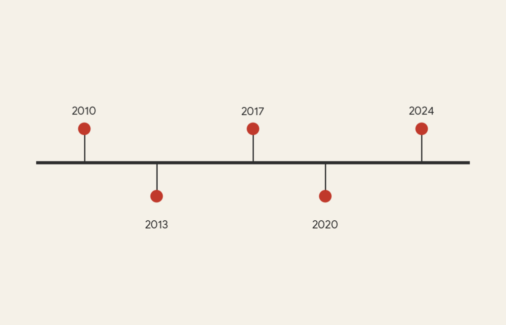
A timeline is a visual representation of events arranged along a linear axis that represents time. Events may appear as points, labels, icons, or blocks depending on whether they represent moments or durations.
Common elements include:
- A horizontal or vertical axis marking time
- Labels identifying events or milestones
- Icons or annotations providing context
- Consistent spacing based on chronological order
Some timelines focus on precise intervals, while others use approximate spacing to emphasize storytelling. Interactive timelines may allow viewers to explore deeper levels of detail, while static timelines often highlight key highlights or summaries.
Unlike charts that rely heavily on numeric values, timelines focus on narrative structure. The visual communicates not just what happened, but when and in what order.
When to Use a Timeline
Use a timeline when the goal is to communicate sequence, progression, or historical context.
This visual works especially well when the goal is to:
- Show historical events or milestones
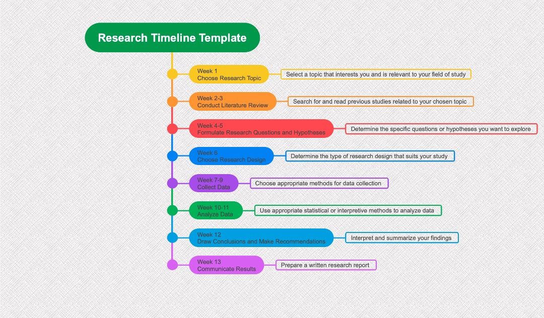
- Explain project phases or development cycles
- Highlight product evolution
- Document research or discovery processes
- Provide context for storytelling or education
Timelines are particularly effective when viewers need to understand cause-and-effect relationships across time. By presenting events in sequence, the visual helps establish context and continuity.
Timelines also work well for comparing parallel sequences. Multiple rows or lanes can show different groups or themes evolving simultaneously.
Types of Data Sets That Work Best for a Timeline
Timelines work best with chronological data tied to specific dates or periods.
Strong candidates include:
- Historical events
- Product releases or updates
- Academic or scientific discoveries
- Project milestones
- Organizational history
- Cultural or technological developments
Data does not always need to be numeric. Many timelines focus on qualitative information such as descriptions, images, or contextual notes.
Spacing and scale should match the nature of the story. Long periods of inactivity may require visual compression, while dense periods may need more space to avoid clutter.
Real-World Examples of a Timeline
Timelines appear frequently in education, journalism, business storytelling, and research communication.
Historical Events or Milestones


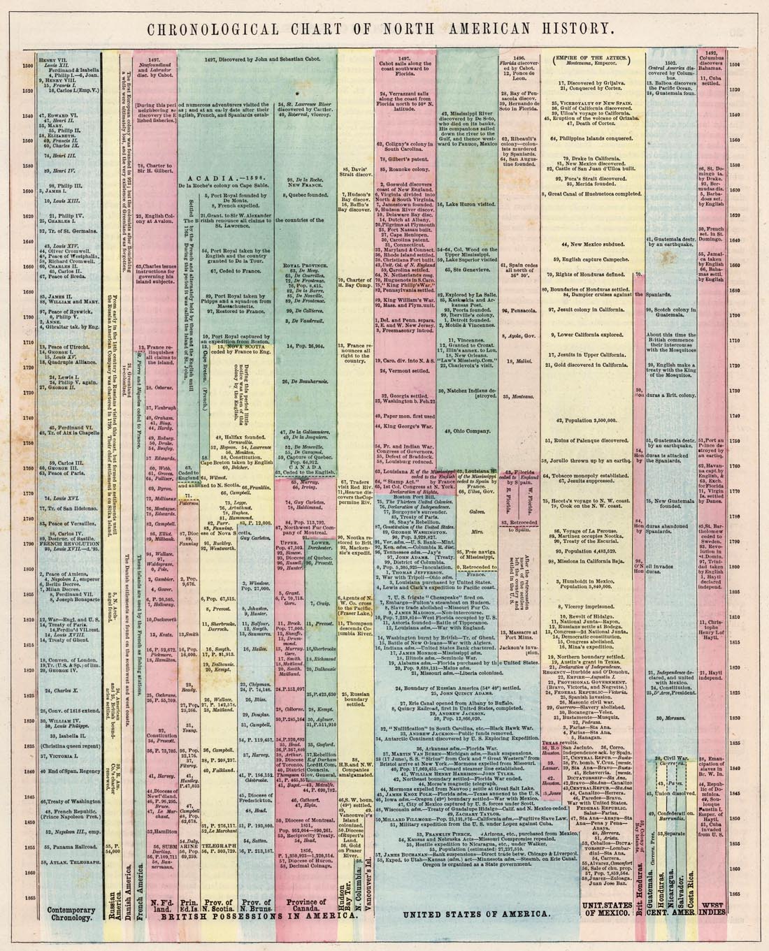
Show how major events unfold across decades or centuries.
Product Development or Release Cycles


Highlight how products evolve through iterations and updates.
Project or Organizational History


Present growth and transformation across years or decades.
Scientific Discoveries or Research Progression


Illustrate how breakthroughs build upon earlier work.
Cultural or Media Trends

Show how movements, genres, or themes evolve over time.
What to Avoid or Be Careful Of with a Timeline
❌ Don’t overcrowd with too many events
Too many labels can overwhelm viewers and reduce clarity.
❌ Don’t ignore proportional spacing
Uneven intervals may misrepresent how much time passed between events.
❌ Don’t rely solely on icons
Clear text labels help maintain meaning and accessibility.
❌ Don’t assume viewers know the context
Brief descriptions or annotations provide essential background.
❌ Don’t mix unrelated narratives
Separate timelines may be clearer when stories do not share a common thread.
*Content on this page was curated and edited by expert humans with the creative assistance of AI.