
Strip Plot: How to Show Individual Data Points Within Categories
A strip plot helps visualize individual data points across categories while keeping the distribution easy to see. Use it to display raw observations instead of aggregated summaries, making patterns, clusters, and variation more visible.
Turn to a strip plot when the goal is to highlight the presence of individual values rather than averages or totals. Each dot represents a single observation, allowing viewers to see how data spreads within a group. This approach helps maintain transparency and prevents important details from being hidden behind summary statistics.
Strip plots are especially useful when datasets are moderate in size and categories matter. The visual keeps structure simple while preserving the richness of the underlying data.
Related Charts and Graphs
Several visuals relate closely to strip plots and may be better choices depending on the goal.
- Dot plots organize points along a single axis for comparison but may emphasize ranking rather than distribution.
- Box-and-whisker plots summarize spread using quartiles instead of showing individual observations.
- Violin plots visualize density and shape but abstract away specific data points.
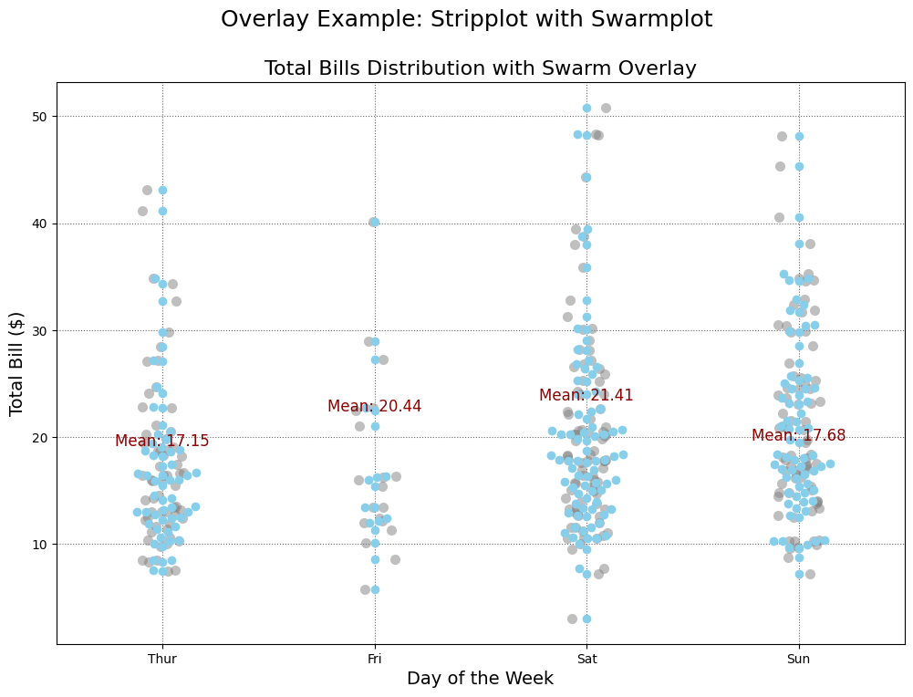
- Swarm plots reduce overlap by adjusting point placement while preserving distribution.
- Scatter plots compare relationships between two numerical variables rather than categories.
Choosing between these options depends on whether the focus is distribution detail, summary statistics, or relational analysis.
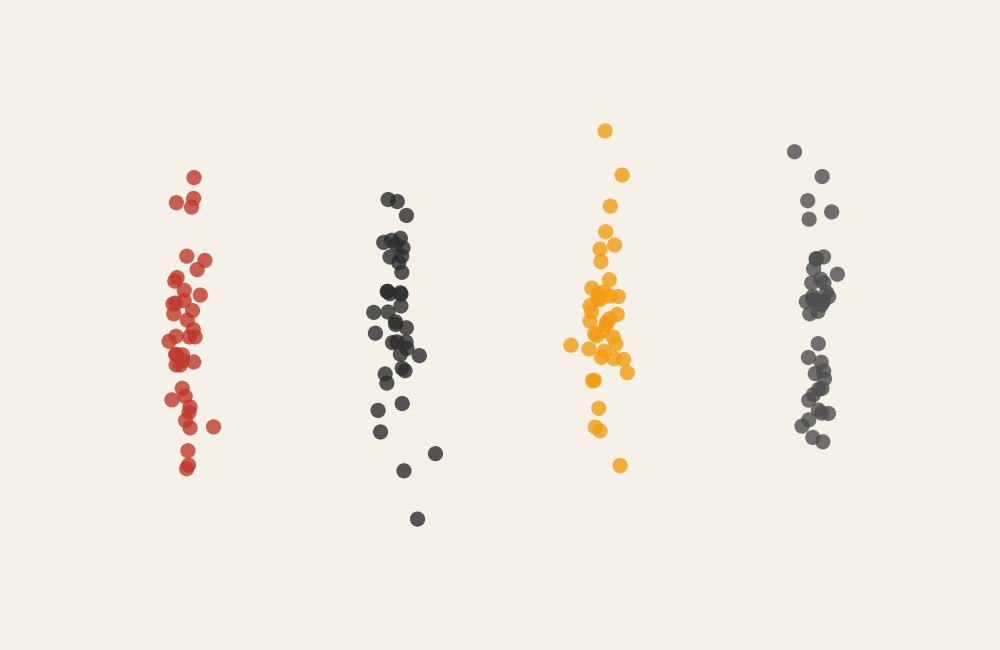
What a Strip Plot Is
A strip plot displays individual data points aligned along a categorical axis. Points are often jittered slightly to prevent overlap, making it easier to see how observations cluster or spread.
Common elements include:
- A categorical axis representing groups
- A numerical axis representing values
- Individual dots showing observations
- Slight horizontal or vertical offsets to reduce overlap
Unlike bar charts or box plots, strip plots retain the granularity of the data. Instead of summarizing values into averages or medians, the chart reveals the full range of observations.
This makes strip plots especially valuable when transparency and detail matter. Outliers, clusters, and gaps become immediately visible, allowing viewers to understand the true structure of the dataset.
When to Use a Strip Plot
Use a strip plot when individual data points tell an important part of the story.
This visual works especially well when the goal is to:
- Show variation within categories
- Reveal clusters or outliers
- Compare distributions across groups
- Provide context alongside summary visuals
- Maintain transparency in small-to-medium datasets
Strip plots are often used in research and analysis where raw data visibility is essential. Instead of hiding observations behind averages, the chart invites viewers to explore patterns directly.
They also work well as companion visuals. For example, placing a strip plot alongside a box plot allows viewers to see both summary statistics and individual observations.
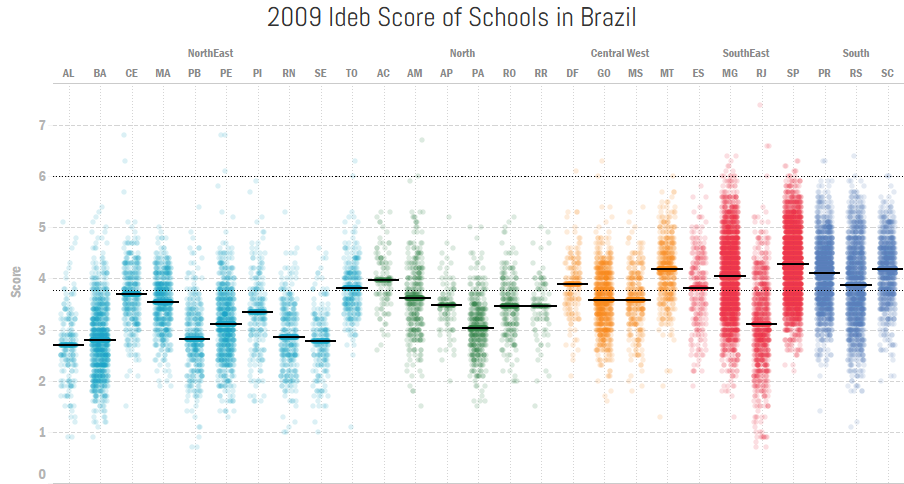
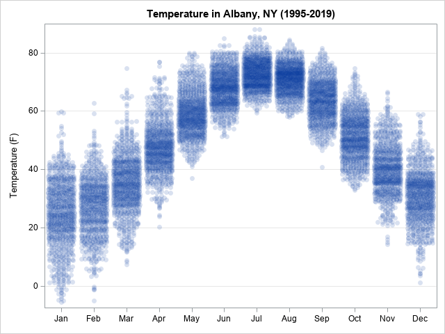
Types of Data Sets That Work Best for a Strip Plot
Strip plots work best with categorical data paired with numerical measurements.
Strong candidates include:
- Student scores across classes
- Product ratings across categories
- Reaction times across experimental groups
- Customer satisfaction ratings by region
- Health measurements across demographics
- Performance metrics across teams
Datasets with dozens or hundreds of points per category often produce meaningful strip plots. Too few points may not reveal patterns, while extremely large datasets may require alternative visuals to prevent overcrowding.
Consistent scaling and clear labeling help viewers interpret distributions accurately.
Real-World Examples of a Strip Plot
Strip plots appear frequently in research, analytics, and education when individual observations need to remain visible.
Customer Ratings or Product Feedback
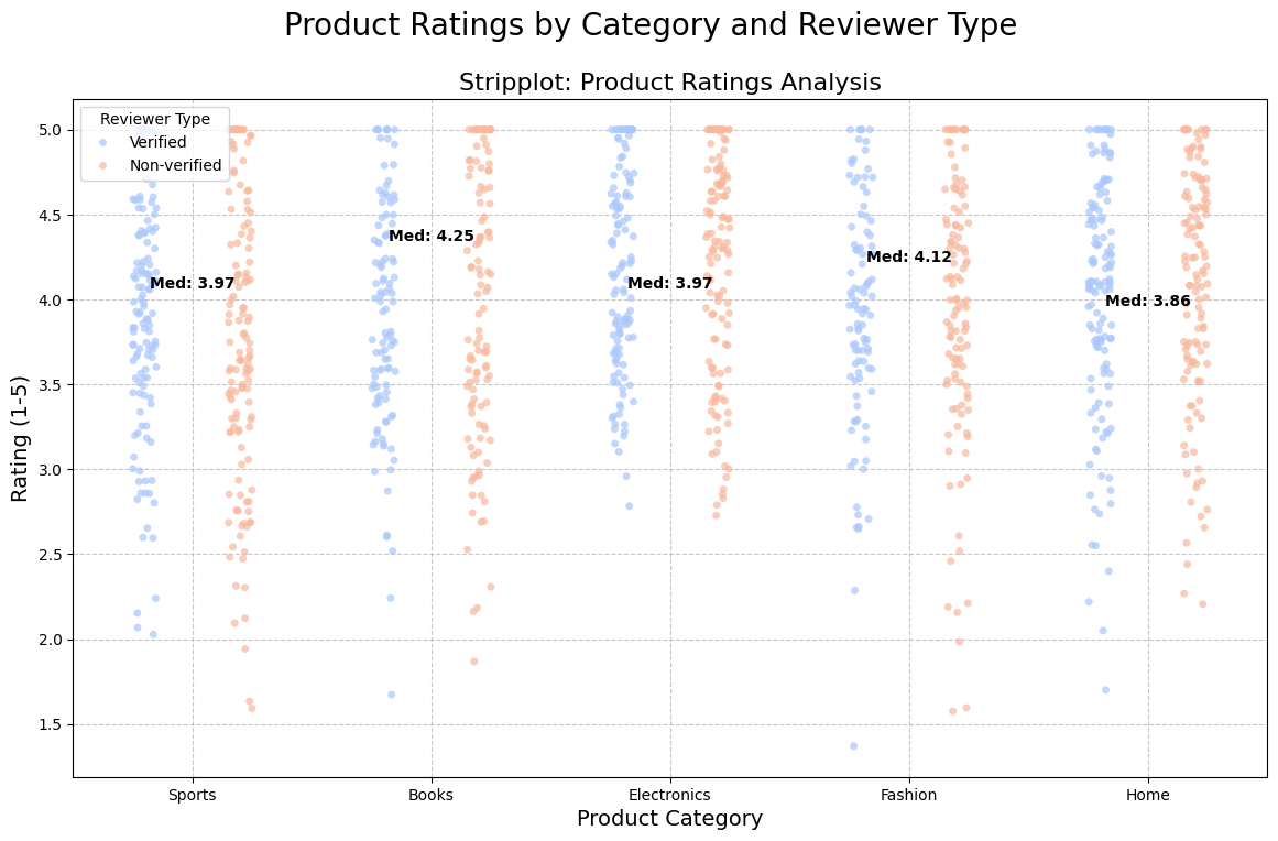
Reveal variation in ratings instead of relying solely on averages.
Science or Medical Research
Highlight differences in measurements across treatment groups.
Marketing or Behavioral Analytics
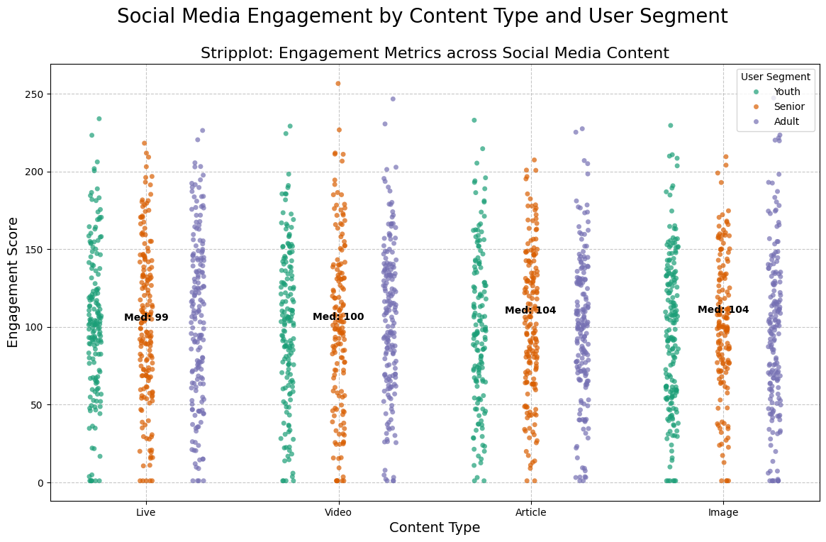
Display individual engagement metrics across channels or campaigns.
Sports or Performance Analysis

Compare individual player statistics across teams or seasons.
What to Avoid or Be Careful Of with a Strip Plot
❌ Don’t use it with extremely large datasets
Too many points can overlap and reduce clarity.
❌ Don’t skip jittering or spacing
Without slight offsets, points may stack on top of each other and hide patterns.
❌ Don’t rely solely on color to separate categories
Clear labels and grouping improve readability.
❌ Don’t use it when precise summary statistics are required
Box plots or violin plots may communicate distribution more efficiently.
❌ Don’t ignore ordering
Sorting categories meaningfully can make patterns easier to recognize.
*Content on this page was curated and edited by expert humans with the creative assistance of AI.