Skip to content
The Comm Spot The Comm Spot

It's All About Communication

  • HOME
  • ABOUT
    • Meet the Creator: Curtis Newbold, PhD
    • Hire Curtis
    • Publish with Us
    • Contact
    • Privacy Notice
  • COMM-BASICS
    • Glossary
    • Citation & Style Guides
      • AP Style (Journalism)
        • AP Style Overview
        • AP Style Guidelines
        • Media Ethics – SPJ Code of Ethics
        • Elements of Newsworthiness
      • APA Style
        • APA Format – Overview
        • APA - References Guidelines
        • APA - In-text Citations
        • APA - Citing Authors
        • APA - Audiovisual Media
        • APA - Books
        • APA - Digital Sources
        • APA - Events & Interactions
        • APA - Periodicals
        • APA - Print Sources (other than books)
      • Chicago Style
        • Chicago – Overview
        • Chicago - Author-Date System
        • Chicago - Notes-Bibliography System
        • Chicago - In-text Citations
        • Chicago Style - Citing Authors
        • Chicago - Audiovisual Media
        • Chicago - Books
        • Chicago - Digital Sources
        • Chicago - Events and Interactions
        • Chicago - Citing Periodicals
        • Chicago - Print Sources (other than books)
      • MLA Style
        • MLA Overview
        • MLA Works Cited Pages
        • MLA In-text Citations
        • MLA – Authors
        • MLA – Audiovisual Media
        • MLA – Books
        • MLA – Digital Sources
        • MLA – Events & Interactions
        • MLA – Periodicals
        • MLA – Print Sources (other than books)
    • Rhetoric
      • Overview of Rhetoric
      • Rhetorical Appeals (Rhetorical Triangle)
      • Branches of Oratory
      • Canons of Rhetoric
      • Rhetorical Devices
      • Kairos
      • Topos
      • Key Figures in Rhetoric
    • Research Methods
      • Case Studies
      • Competitor Analysis
      • Content Analysis
      • Discourse Analysis
      • Ethnography
      • Focus Groups
      • Observation Research
      • S.W.O.T. Analysis
      • Secondary Research
      • Surveys
      • Target Market Analysis
      • Usability Testing
      • Visual Analysis
    • Theories
    • Thinkers
  • COMM-SUBJECTS
    • Interpersonal Communication
      • Active Listening
      • Body Language
      • Conflict Management
      • Emotional Intelligence
        • Emotional Intelligence Overview
        • Self-Awareness
        • Self-Regulation
        • Motivation
        • Empathy
        • Social Skills
        • Emotional Intelligence Resources
      • Feedback
      • Negotiation
        • Overview of Negotiation
        • Negotiation Skills
        • Negotiation Strategies & Techniques
        • Stages of Negotiation
        • Common Negotiation Scenarios
        • Negotiation Case Studies & Examples
        • Negotiation Tools & Resources
        • Negotiation FAQ
    • Journalism
    • Public Speaking
      • General Guidelines
      • Overcoming Fear
      • Speech Writing and Organization
      • Delivery Techniques
      • Body Language
      • Audience Engagement
      • Storytelling
      • Designing Slides
      • P.O.W.E.R.F.U.L. Presentation Method
    • Strategic Communication
      • Business & Org Comm
        • Definition & History
        • Org Comm Theories
        • Business Documents
        • Change Management
        • Employee Relations
        • Employment Communication
        • Group & Team Communication
        • Leadership Communication
        • Power, Identity, & Ethics at Work
        • Project Management
      • Integrated Marketing Comm
        • Definition of IMC
        • Core Principles of IMC
        • IMC Planning
        • Audience Segmentation
        • Marketing Channels
        • Message Strategies
        • Campaign Measurement & Evaluation
        • Trends & Innovations in IMC
        • Challenges & Pitfalls in IMC
        • Careers & Roles in IMC
      • Public Relations
        • Foundations in PR
        • Strategic Practice
        • Tools & Tactics
        • Research & Analysis
        • Professional Development
      • Case Studies in Strat Comm
    • Technical & Scientific Communication
    • Visual Communication
      • Data Visualization
      • Information Design
      • Photography
      • Web Design
    • Written Communication
      • Writing Process
      • Organizational Methods
        • Five Paragraph Essay
        • Hourglass Method of Writing
        • IMRaD Format (Science)
        • Indirect Method (Bad News)
        • Inverted Pyramid (Journalism)
        • Martini Glass
        • Narrative Format
        • Proposal Format
        • Rogerian Method
        • Toulmin Method
      • Plain Language
        • Audience (Plain Language)
        • Organization (Plain Language)
        • Conversation (Plain Language)
        • Simplicity (Plain Language)
        • Word Choice (Plain Language)
        • Sentence Structure (Plain Language)
        • Design (Plain Language)
      • Punctuation
        • Apostrophes
        • Brackets
        • Colons
        • Commas
        • Ellipses
        • Em Dashes
        • En Dashes
        • Exclamation Marks
        • Hyphens
        • Parentheses
        • Periods
        • Question Marks
        • Quotation Marks
        • Semicolons
      • Style
        • Clarity
        • Conciseness
        • Consistency
        • Editing
        • Flow
        • Rhetorical Devices
        • Sentence Structure
        • Storytelling
        • Tone
        • Voice
        • Word Choice
  • RESOURCES
    • Teaching Resources
      • Assignments & Activities
      • Instructional Design
      • Pedagogies
  • BLOGS
    • The Spotlight Blog
    • Comm Sparks
  • SHOP
    • Cart
    • Checkout
0
The Comm Spot
The Comm Spot

It's All About Communication

Slope Graph – Data Visualization

Home >COMM-Subjects >Visual Communication >Data Visualization >Types of Data Visualizations (Charts and Graphs) >Slope Graph – Data Visualization

Slope Graph: How to Show Change Between Two Points

A slope graph helps visualize change between two values across categories. Use it to show increases, decreases, and relative shifts in a way that feels direct and easy to compare.

Turn to a slope graph when the goal is to highlight differences between two moments, conditions, or groups. Instead of presenting long timelines or complex comparisons, the chart focuses attention on how values move from one side to the other. The angle and direction of each line make change immediately visible.

Slope graphs work especially well when clarity and storytelling matter. They remove visual noise and emphasize only what is essential: where values started, where they ended, and how they changed.


Related Charts and Graphs

Several visuals relate closely to slope graphs and may be better choices depending on the goal.

  • Line graphs show continuous trends across many points rather than change between two moments.
  • Multiline charts compare several series across a full timeline instead of a simple before-and-after view.
  • Dumbbell charts use dots connected by lines to emphasize endpoints rather than slope.
  • Grouped bar charts provide clearer comparisons when precise values matter more than direction of change.
  • Connected scatter plots introduce sequencing or multiple dimensions rather than a single comparison.

Choosing between these options depends on whether the focus is long-term trends, precise comparison, or directional change.


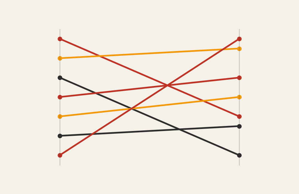
What a Slope Graph Is

A slope graph displays two vertical axes connected by lines that represent categories. Each line links a starting value to an ending value, allowing viewers to see change at a glance.

Common elements include:

  • Two columns representing points in time or conditions
  • Lines connecting values across the columns
  • Labels positioned near endpoints
  • Minimal visual decoration to keep focus on change

The slope itself becomes the key visual signal. Upward lines indicate growth, downward lines show decline, and flat lines suggest stability.

Unlike many charts, slope graphs often rely on direct labeling instead of legends, making them feel more like annotated comparisons than traditional graphs.


When to Use a Slope Graph

Use a slope graph when the message centers on change between two points.

This visual works especially well when the goal is to:

  • Show before-and-after comparisons
  • Highlight ranking shifts
  • Reveal gains or losses across categories
  • Compare performance across two periods
  • Emphasize direction and magnitude of change

Slope graphs are particularly effective when categories are numerous but the comparison remains simple. By reducing the number of data points to two per category, the chart keeps the focus on movement rather than complexity.


Types of Data Sets That Work Best for a Slope Graph

Slope graphs work best with categorical data paired with two numerical values.

Strong candidates include:

  • Rankings across two years
  • Survey responses before and after an intervention
  • Performance metrics across two time periods
  • Budget or spending comparisons between cycles
  • Population changes between census years
  • Sports statistics between seasons

Each category should have exactly two comparable values. Adding more points usually calls for a line graph instead.

Slope graphs also benefit from meaningful ordering. Sorting categories by value or change often reveals patterns that would otherwise remain hidden.


Real-World Examples of a Slope Graph

Slope graphs appear frequently in journalism, analytics, and academic reporting because they communicate change quickly and clearly.

Ranking Changes Over Time

Sample Slope Graph

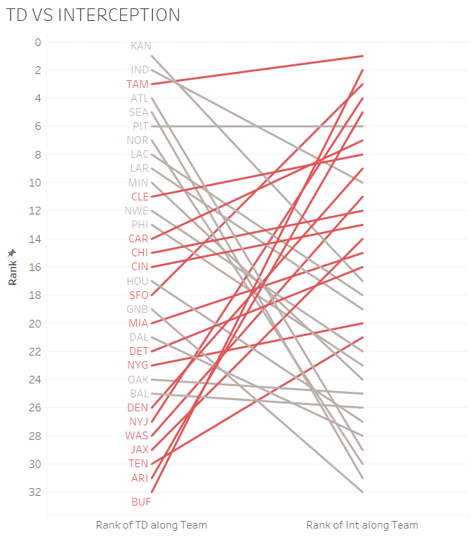
Show how positions shift between two moments, revealing gains and losses across categories.


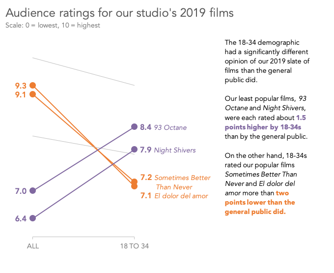
Before-and-After Performance Comparisons

https://cdn.kicksdigital.com/depictdatastudio.com/2018/09/present-as-is-or-tell-a-story-slope-chart.png
Sample Slope Graph

Highlight how outcomes change following an intervention or event.


Education or Assessment Results

https://images.squarespace-cdn.com/content/v1/55b6a6dce4b089e11621d3ed/1528724764791-YZQUV02TAJVUA56GFH75/image-asset.png

Compare outcomes across cohorts or instructional changes.


Demographic or Population Changes

Sample Slope Graph

Show how groups grow or decline between two measurement points.


What to Avoid or Be Careful Of with a Slope Graph

❌ Don’t include too many categories
Overlapping lines can quickly become cluttered and hard to follow.

❌ Don’t omit clear labeling
Direct labels at endpoints help viewers interpret changes without confusion.

❌ Don’t use inconsistent scales
A shared vertical scale is essential for accurate comparison.

❌ Don’t use it for more than two points
Adding additional stages often makes a multiline chart more appropriate.

❌ Don’t ignore ordering
Sorting categories by value or change improves readability and storytelling.

Slope graphs remain one of the most effective ways to communicate change in a simple, focused way. By stripping away unnecessary elements, they allow viewers to concentrate on direction, magnitude, and comparison—making them especially useful in storytelling, journalism, and analytical reporting.


*Content on this page was curated and edited by expert humans with the creative assistance of AI.

  • facebook
  • instagram
  • linkedin

DON'T MISS ANY SPOT-ON TIPS!

We don't spam! You'll only get emails when we post something awesome.
You can unsubscribe at any time.

Check your inbox or spam folder to confirm your subscription.

©2025 | The Comm Spot | By Newbold Communication & Design