Skip to content
The Comm Spot The Comm Spot

It's All About Communication

  • HOME
  • ABOUT
    • Meet the Creator: Curtis Newbold, PhD
    • Hire Curtis
    • Publish with Us
    • Contact
    • Privacy Notice
  • COMM-BASICS
    • Glossary
    • Citation & Style Guides
      • AP Style (Journalism)
        • AP Style Overview
        • AP Style Guidelines
        • Media Ethics – SPJ Code of Ethics
        • Elements of Newsworthiness
      • APA Style
        • APA Format – Overview
        • APA - References Guidelines
        • APA - In-text Citations
        • APA - Citing Authors
        • APA - Audiovisual Media
        • APA - Books
        • APA - Digital Sources
        • APA - Events & Interactions
        • APA - Periodicals
        • APA - Print Sources (other than books)
      • Chicago Style
        • Chicago – Overview
        • Chicago - Author-Date System
        • Chicago - Notes-Bibliography System
        • Chicago - In-text Citations
        • Chicago Style - Citing Authors
        • Chicago - Audiovisual Media
        • Chicago - Books
        • Chicago - Digital Sources
        • Chicago - Events and Interactions
        • Chicago - Citing Periodicals
        • Chicago - Print Sources (other than books)
      • MLA Style
        • MLA Overview
        • MLA Works Cited Pages
        • MLA In-text Citations
        • MLA – Authors
        • MLA – Audiovisual Media
        • MLA – Books
        • MLA – Digital Sources
        • MLA – Events & Interactions
        • MLA – Periodicals
        • MLA – Print Sources (other than books)
    • Rhetoric
      • Overview of Rhetoric
      • Rhetorical Appeals (Rhetorical Triangle)
      • Branches of Oratory
      • Canons of Rhetoric
      • Rhetorical Devices
      • Kairos
      • Topos
      • Key Figures in Rhetoric
    • Research Methods
      • Case Studies
      • Competitor Analysis
      • Content Analysis
      • Discourse Analysis
      • Ethnography
      • Focus Groups
      • Observation Research
      • S.W.O.T. Analysis
      • Secondary Research
      • Surveys
      • Target Market Analysis
      • Usability Testing
      • Visual Analysis
    • Theories
    • Thinkers
  • COMM-SUBJECTS
    • Interpersonal Communication
      • Active Listening
      • Body Language
      • Conflict Management
      • Emotional Intelligence
        • Emotional Intelligence Overview
        • Self-Awareness
        • Self-Regulation
        • Motivation
        • Empathy
        • Social Skills
        • Emotional Intelligence Resources
      • Feedback
      • Negotiation
        • Overview of Negotiation
        • Negotiation Skills
        • Negotiation Strategies & Techniques
        • Stages of Negotiation
        • Common Negotiation Scenarios
        • Negotiation Case Studies & Examples
        • Negotiation Tools & Resources
        • Negotiation FAQ
    • Journalism
    • Public Speaking
      • General Guidelines
      • Overcoming Fear
      • Speech Writing and Organization
      • Delivery Techniques
      • Body Language
      • Audience Engagement
      • Storytelling
      • Designing Slides
      • P.O.W.E.R.F.U.L. Presentation Method
    • Strategic Communication
      • Business & Org Comm
        • Definition & History
        • Org Comm Theories
        • Business Documents
        • Change Management
        • Employee Relations
        • Employment Communication
        • Group & Team Communication
        • Leadership Communication
        • Power, Identity, & Ethics at Work
        • Project Management
      • Integrated Marketing Comm
        • Definition of IMC
        • Core Principles of IMC
        • IMC Planning
        • Audience Segmentation
        • Marketing Channels
        • Message Strategies
        • Campaign Measurement & Evaluation
        • Trends & Innovations in IMC
        • Challenges & Pitfalls in IMC
        • Careers & Roles in IMC
      • Public Relations
        • Foundations in PR
        • Strategic Practice
        • Tools & Tactics
        • Research & Analysis
        • Professional Development
      • Case Studies in Strat Comm
    • Technical & Scientific Communication
    • Visual Communication
      • Data Visualization
      • Information Design
      • Photography
      • Web Design
    • Written Communication
      • Writing Process
      • Organizational Methods
        • Five Paragraph Essay
        • Hourglass Method of Writing
        • IMRaD Format (Science)
        • Indirect Method (Bad News)
        • Inverted Pyramid (Journalism)
        • Martini Glass
        • Narrative Format
        • Proposal Format
        • Rogerian Method
        • Toulmin Method
      • Plain Language
        • Audience (Plain Language)
        • Organization (Plain Language)
        • Conversation (Plain Language)
        • Simplicity (Plain Language)
        • Word Choice (Plain Language)
        • Sentence Structure (Plain Language)
        • Design (Plain Language)
      • Punctuation
        • Apostrophes
        • Brackets
        • Colons
        • Commas
        • Ellipses
        • Em Dashes
        • En Dashes
        • Exclamation Marks
        • Hyphens
        • Parentheses
        • Periods
        • Question Marks
        • Quotation Marks
        • Semicolons
      • Style
        • Clarity
        • Conciseness
        • Consistency
        • Editing
        • Flow
        • Rhetorical Devices
        • Sentence Structure
        • Storytelling
        • Tone
        • Voice
        • Word Choice
  • RESOURCES
    • Teaching Resources
      • Assignments & Activities
      • Instructional Design
      • Pedagogies
  • BLOGS
    • The Spotlight Blog
    • Comm Sparks
  • SHOP
    • Cart
    • Checkout
0
The Comm Spot
The Comm Spot

It's All About Communication

Scatter Plot – Data Visualization

Home >COMM-Subjects >Visual Communication >Data Visualization >Types of Data Visualizations (Charts and Graphs) >Scatter Plot – Data Visualization

Scatter Plot: How to Show Relationships Between Two Variables

A scatter plot helps reveal relationships between two numerical variables by placing individual observations on an x–y coordinate system. Use it to explore patterns, correlations, clusters, and outliers that might not be visible in tables or summary statistics.

Turn to a scatter plot when understanding how variables interact is more important than comparing totals or categories. The distribution of points often tells the story: tight clusters may suggest strong relationships, while wide dispersion may indicate variability or independence between variables.

Scatter plots are especially powerful because they preserve the raw structure of the data. Instead of aggregating values into bars or averages, each observation remains visible, allowing deeper exploration of trends and anomalies.


Related Charts and Graphs

Several visuals relate closely to scatter plots and may be better choices depending on the goal.

  • Line graphs emphasize trends over time rather than relationships between variables.
  • Hexbin plots reduce overplotting when datasets become extremely dense.
  • Bubble charts add a third variable using size encoding.
  • Pair plots expand scatterplots into a matrix for exploring many variables at once.
  • Connected scatter plots show progression or movement across points rather than independent observations.

Choosing between these options depends on whether the focus is density, comparison, or multidimensional exploration.


What a Scatter Plot Is

A scatter plot displays individual data points positioned according to two numerical variables. Each point A scatter plot displays individual data points positioned according to two quantitative variables. Each point represents a single observation, allowing viewers to see how values align or vary together.

Common elements include:

  • A horizontal axis representing one variable
  • A vertical axis representing a second variable
  • Markers that represent individual observations
  • Optional trend lines or regression curves
  • Labels or annotations highlighting key insights

Unlike charts that aggregate or summarize data, scatter plots preserve detail. This makes them ideal for exploratory analysis, hypothesis testing, and uncovering hidden patterns.

Patterns in a scatter plot can take many forms. Points may form an upward trend, suggesting a positive relationship, or a downward pattern indicating a negative relationship. In some cases, points may cluster into groups or form curved shapes that hint at more complex relationships.


When to Use a Scatter Plot

Use a scatter plot when the goal is to understand how two variables relate or influence one another.

This visual works especially well when the goal is to:

  • Identify positive or negative relationships
  • Explore correlations between measurements
  • Detect clusters or groupings
  • Spot anomalies or outliers
  • Support exploratory data analysis
  • Evaluate assumptions before modeling or forecasting

Scatter plots are especially valuable early in an analysis process. They help reveal structure before more complex visualizations or statistical techniques are applied.

Scatter plots also work well when communicating uncertainty. Instead of presenting a single summary number, the viewer sees the full spread of observations, which can help avoid oversimplification.


Types of Data Sets That Work Best for a Scatter Plot

Scatter plots work best with paired quantitative data, where each observation contains two measurable values.

Strong candidates include:

  • Height vs. weight measurements
  • Study time vs. exam performance
  • Price vs. demand or revenue
  • Temperature vs. humidity or rainfall
  • Risk vs. return in financial analysis
  • Engagement metrics such as impressions vs. conversions

Datasets that include dozens or hundreds of observations often produce the most meaningful scatter plots, since patterns become more visible with increased sample size.

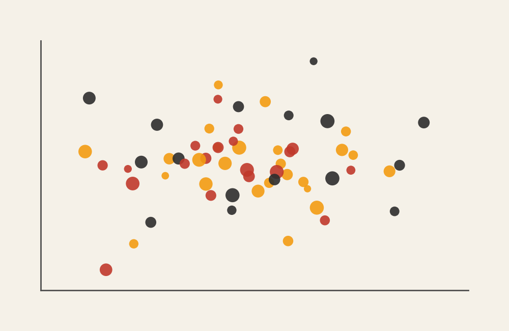
Scatter plots can also incorporate additional encodings. Color might distinguish groups, while marker size can represent a third variable. However, these enhancements should be used sparingly to maintain readability.


Real-World Examples of a Scatter Plot

Scatter plots appear frequently in research, analytics, and journalism whenever relationships between variables need to be explored.

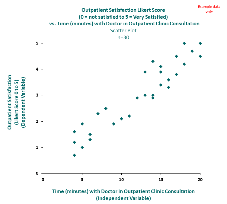
Academic or Educational Data

Sample Scatter Plot
Sample Scatter Plot

Show how study habits or participation relate to performance outcomes.


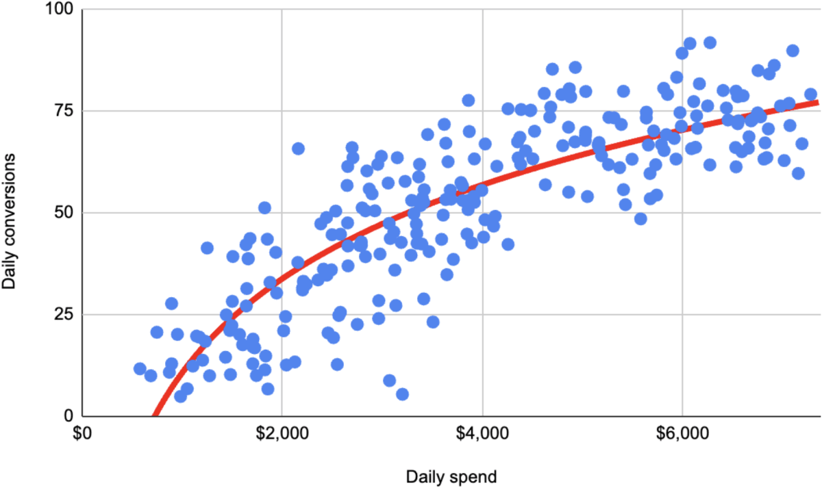
Financial or Economic Analysis

Sample Scatter Plot
Sample Scatter Plot

Reveal relationships between economic indicators or market variables.


Marketing or Customer Behavior Analysis

https://res.cloudinary.com/conversion-rate-experts/image/upload/w_1200%2Cdpr_auto%2Cc_scale%2Cf_auto%2Cq_auto/power-law-study-2

Analyze how engagement metrics relate to conversion or performance.


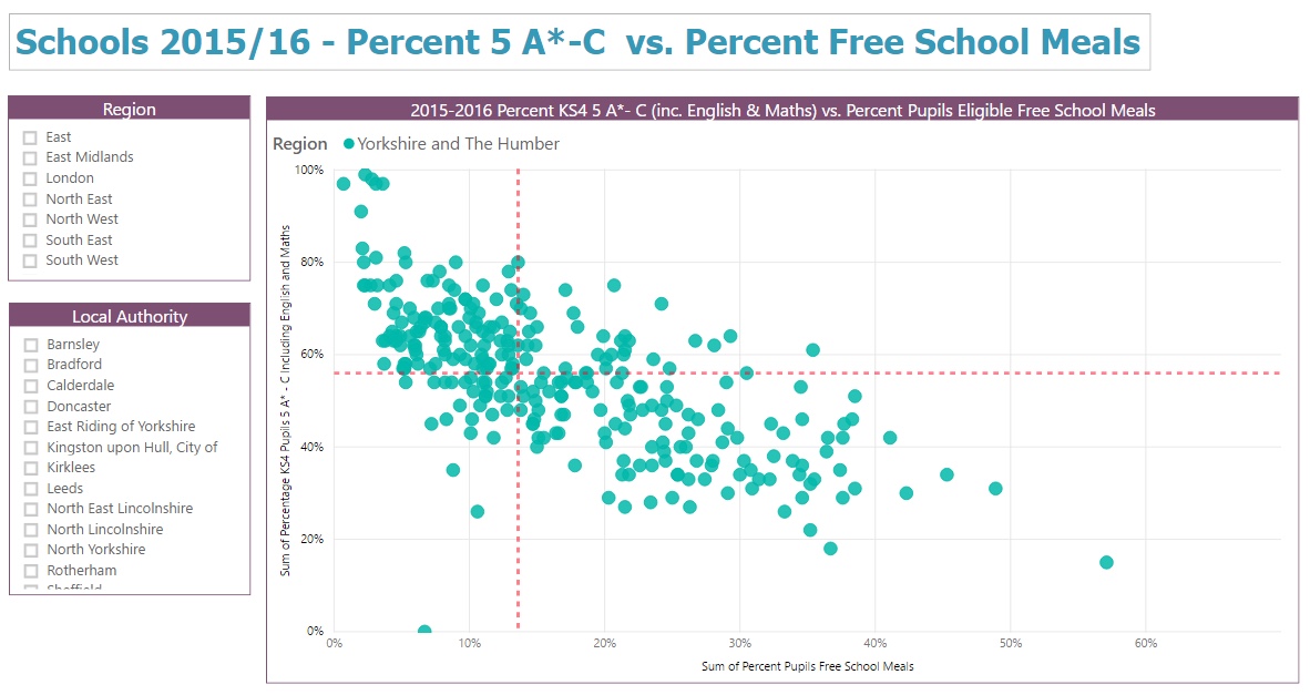
Health or Demographic Studies

Sample Scatter Plot
Sample Scatter Plot

Show relationships between health indicators or demographic factors.


What to Avoid or Be Careful Of with a Scatter Plot

❌ Don’t assume correlation equals causation
Patterns suggest relationships but do not prove cause.

❌ Don’t ignore overplotting
Large datasets may require transparency, jittering, or alternative visuals like hexbin plots.

❌ Don’t mix scales without context
Axes should be labeled clearly to avoid misinterpretation.

❌ Don’t overload with too many encodings
Color, size, and shape should be used sparingly to maintain clarity.

❌ Don’t use it when categories are the main focus
Bar charts or grouped visuals may communicate categorical comparisons more effectively.


*Content on this page was curated and edited by expert humans with the creative assistance of AI.

  • facebook
  • instagram
  • linkedin

DON'T MISS ANY SPOT-ON TIPS!

We don't spam! You'll only get emails when we post something awesome.
You can unsubscribe at any time.

Check your inbox or spam folder to confirm your subscription.

©2025 | The Comm Spot | By Newbold Communication & Design