

Sankey Diagram: How to Show Flow, Transfer, and Movement Between Categories
A Sankey diagram helps visualize how quantities move from one stage or category to another. Use it to show flows, transfers, or transformations, especially when understanding where something comes from and where it goes matters most.
Turn to a Sankey diagram when relationships between sources and destinations need to be clear. The width of each flow communicates magnitude, making it easier to see major pathways and smaller contributions within a system.
Related Charts and Graphs
Several visuals relate closely to Sankey diagrams and may be better choices depending on the goal.
- Flow maps show movement across geographic space rather than between abstract categories.
- Alluvial diagrams emphasize changes in grouping across multiple stages.
- Network diagrams highlight relationships without necessarily showing quantity.
- Funnel charts focus on sequential drop-off rather than branching flows.
- Chord diagrams display connections in a circular layout rather than a linear flow.
Choosing between these options depends on whether the focus is geographic movement, transformation across stages, or network structure.
What a Sankey Diagram Is
A Sankey diagram represents flows using bands that connect nodes. The width of each band corresponds to the quantity being transferred, allowing viewers to compare contributions visually.
Common elements include:
- Nodes representing stages or categories
- Flowing bands connecting sources to destinations
- Width encoding magnitude
- Directional movement across the diagram
The visual emphasizes continuity, helping viewers track how totals split, merge, or transform along a path.
When to Use a Sankey Diagram
Use a Sankey diagram when showing flow between categories is central to the message.
This visual works especially well when the goal is to:
- Show how resources move through a system
- Visualize energy or material transfer
- Map user journeys or pathways
- Explain budget allocation across stages
- Reveal major contributors and destinations
A Sankey diagram works best when the purpose is to show how quantities split or combine across multiple steps.
Types of Data Sets That Work Best for a Sankey Diagram
Sankey diagrams work best with data that includes sources, targets, and quantities.
Strong candidates include:
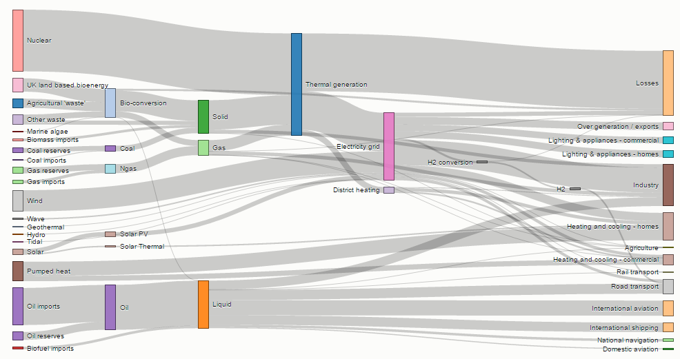
- Energy production and consumption flows
- Website navigation paths
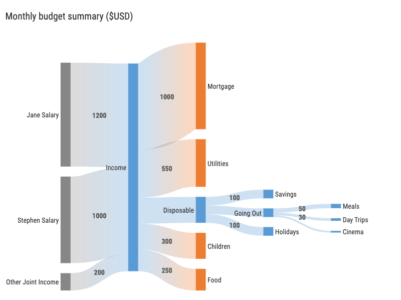
- Financial allocation or budgeting processes
- Supply chain or logistics networks
- Migration or movement between categories
- Customer journey analytics
Each connection should represent a measurable transfer from one category to another.
Real-World Examples of a Sankey Diagram
Sankey diagrams appear frequently in sustainability reporting, business analytics, and research when flow relationships need to be clear.
Energy or Resource Flow Analysis

Show how energy moves from sources through processes to end uses.
Website or User Journey Analysis
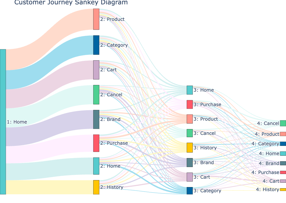
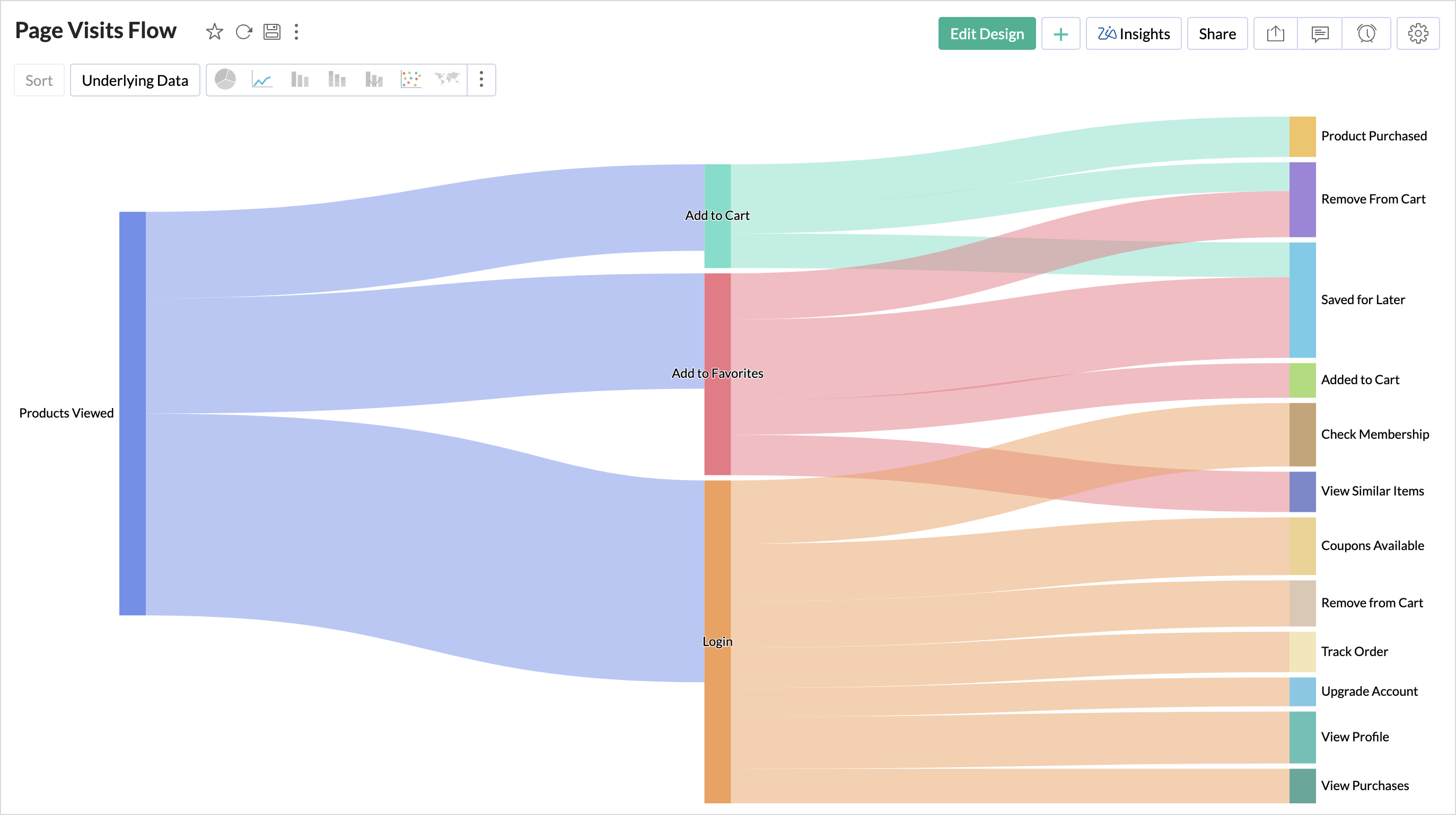

Reveal how users move between pages or stages in a digital experience.
Budget or Financial Allocation

Illustrate how funds distribute across departments or initiatives.
Supply Chain or Logistics Networks


Show how goods move from suppliers through production to delivery.
Academic or Research Data Flows

Visualize how data transforms across analytical steps.
What to Avoid or Be Careful Of with a Sankey Diagram
❌ Don’t include too many nodes or flows
Overly complex diagrams quickly become difficult to follow.
❌ Don’t ignore proportional accuracy
Flow widths should reflect real values to maintain trust.
❌ Don’t rely on color alone to differentiate flows
Labels and spacing help viewers track pathways more clearly.
❌ Don’t use it for simple comparisons
Bar charts or stacked charts may communicate basic differences more effectively.
❌ Don’t hide directionality
Clear alignment and layout help viewers understand where flows begin and end.
*Content on this page was curated and edited by expert humans with the creative assistance of AI.