Skip to content
The Comm Spot The Comm Spot

It's All About Communication

  • HOME
  • ABOUT
    • Meet the Creator: Curtis Newbold, PhD
    • Hire Curtis
    • Publish with Us
    • Contact
    • Privacy Notice
  • COMM-BASICS
    • Glossary
    • Citation & Style Guides
      • AP Style (Journalism)
        • AP Style Overview
        • AP Style Guidelines
        • Media Ethics – SPJ Code of Ethics
        • Elements of Newsworthiness
      • APA Style
        • APA Format – Overview
        • APA - References Guidelines
        • APA - In-text Citations
        • APA - Citing Authors
        • APA - Audiovisual Media
        • APA - Books
        • APA - Digital Sources
        • APA - Events & Interactions
        • APA - Periodicals
        • APA - Print Sources (other than books)
      • Chicago Style
        • Chicago – Overview
        • Chicago - Author-Date System
        • Chicago - Notes-Bibliography System
        • Chicago - In-text Citations
        • Chicago Style - Citing Authors
        • Chicago - Audiovisual Media
        • Chicago - Books
        • Chicago - Digital Sources
        • Chicago - Events and Interactions
        • Chicago - Citing Periodicals
        • Chicago - Print Sources (other than books)
      • MLA Style
        • MLA Overview
        • MLA Works Cited Pages
        • MLA In-text Citations
        • MLA – Authors
        • MLA – Audiovisual Media
        • MLA – Books
        • MLA – Digital Sources
        • MLA – Events & Interactions
        • MLA – Periodicals
        • MLA – Print Sources (other than books)
    • Rhetoric
      • Overview of Rhetoric
      • Rhetorical Appeals (Rhetorical Triangle)
      • Branches of Oratory
      • Canons of Rhetoric
      • Rhetorical Devices
      • Kairos
      • Topos
      • Key Figures in Rhetoric
    • Research Methods
      • Case Studies
      • Competitor Analysis
      • Content Analysis
      • Discourse Analysis
      • Ethnography
      • Focus Groups
      • Observation Research
      • S.W.O.T. Analysis
      • Secondary Research
      • Surveys
      • Target Market Analysis
      • Usability Testing
      • Visual Analysis
    • Theories
    • Thinkers
  • COMM-SUBJECTS
    • Interpersonal Communication
      • Active Listening
      • Body Language
      • Conflict Management
      • Emotional Intelligence
        • Emotional Intelligence Overview
        • Self-Awareness
        • Self-Regulation
        • Motivation
        • Empathy
        • Social Skills
        • Emotional Intelligence Resources
      • Feedback
      • Negotiation
        • Overview of Negotiation
        • Negotiation Skills
        • Negotiation Strategies & Techniques
        • Stages of Negotiation
        • Common Negotiation Scenarios
        • Negotiation Case Studies & Examples
        • Negotiation Tools & Resources
        • Negotiation FAQ
    • Journalism
    • Public Speaking
      • General Guidelines
      • Overcoming Fear
      • Speech Writing and Organization
      • Delivery Techniques
      • Body Language
      • Audience Engagement
      • Storytelling
      • Designing Slides
      • P.O.W.E.R.F.U.L. Presentation Method
    • Strategic Communication
      • Business & Org Comm
        • Definition & History
        • Org Comm Theories
        • Business Documents
        • Change Management
        • Employee Relations
        • Employment Communication
        • Group & Team Communication
        • Leadership Communication
        • Power, Identity, & Ethics at Work
        • Project Management
      • Integrated Marketing Comm
        • Definition of IMC
        • Core Principles of IMC
        • IMC Planning
        • Audience Segmentation
        • Marketing Channels
        • Message Strategies
        • Campaign Measurement & Evaluation
        • Trends & Innovations in IMC
        • Challenges & Pitfalls in IMC
        • Careers & Roles in IMC
      • Public Relations
        • Foundations in PR
        • Strategic Practice
        • Tools & Tactics
        • Research & Analysis
        • Professional Development
      • Case Studies in Strat Comm
    • Technical & Scientific Communication
    • Visual Communication
      • Data Visualization
      • Information Design
      • Photography
      • Web Design
    • Written Communication
      • Writing Process
      • Organizational Methods
        • Five Paragraph Essay
        • Hourglass Method of Writing
        • IMRaD Format (Science)
        • Indirect Method (Bad News)
        • Inverted Pyramid (Journalism)
        • Martini Glass
        • Narrative Format
        • Proposal Format
        • Rogerian Method
        • Toulmin Method
      • Plain Language
        • Audience (Plain Language)
        • Organization (Plain Language)
        • Conversation (Plain Language)
        • Simplicity (Plain Language)
        • Word Choice (Plain Language)
        • Sentence Structure (Plain Language)
        • Design (Plain Language)
      • Punctuation
        • Apostrophes
        • Brackets
        • Colons
        • Commas
        • Ellipses
        • Em Dashes
        • En Dashes
        • Exclamation Marks
        • Hyphens
        • Parentheses
        • Periods
        • Question Marks
        • Quotation Marks
        • Semicolons
      • Style
        • Clarity
        • Conciseness
        • Consistency
        • Editing
        • Flow
        • Rhetorical Devices
        • Sentence Structure
        • Storytelling
        • Tone
        • Voice
        • Word Choice
  • RESOURCES
    • Teaching Resources
      • Assignments & Activities
      • Instructional Design
      • Pedagogies
  • BLOGS
    • The Spotlight Blog
    • Comm Sparks
  • SHOP
    • Cart
    • Checkout
0
The Comm Spot
The Comm Spot

It's All About Communication

Ridgeline Plot – Data Visualization

Home >COMM-Subjects >Visual Communication >Data Visualization >Types of Data Visualizations (Charts and Graphs) >Ridgeline Plot – Data Visualization

Ridgeline Plot: How to Compare Distributions Across Groups

A ridgeline plot helps visualize how distributions change across multiple categories or time periods. Use it to compare patterns in shape, spread, and density while keeping each group easy to distinguish.

Turn to a ridgeline plot when a single histogram feels limiting but multiple overlapping distributions need to be compared clearly. The layered curves create a sense of progression while preserving individual detail.


Related Charts and Graphs

Several visuals relate closely to ridgeline plots and may be better choices depending on the goal.

  • Histograms show distribution for a single group at a time.
  • Box-and-whisker plots summarize spread using quartiles rather than density curves.
  • Violin plots combine distribution shape with summary statistics.
  • Density plots display a single distribution without stacking multiple groups.
  • Multiline charts compare trends over time rather than distribution shape.

Choosing between these options depends on whether the focus is distribution detail, summary statistics, or temporal trends.


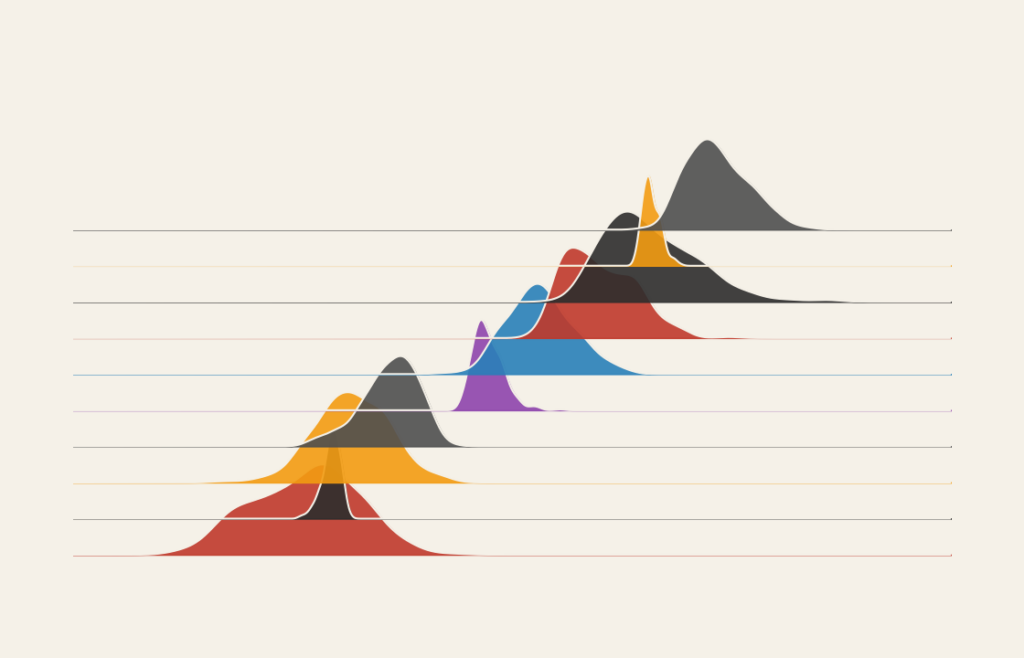
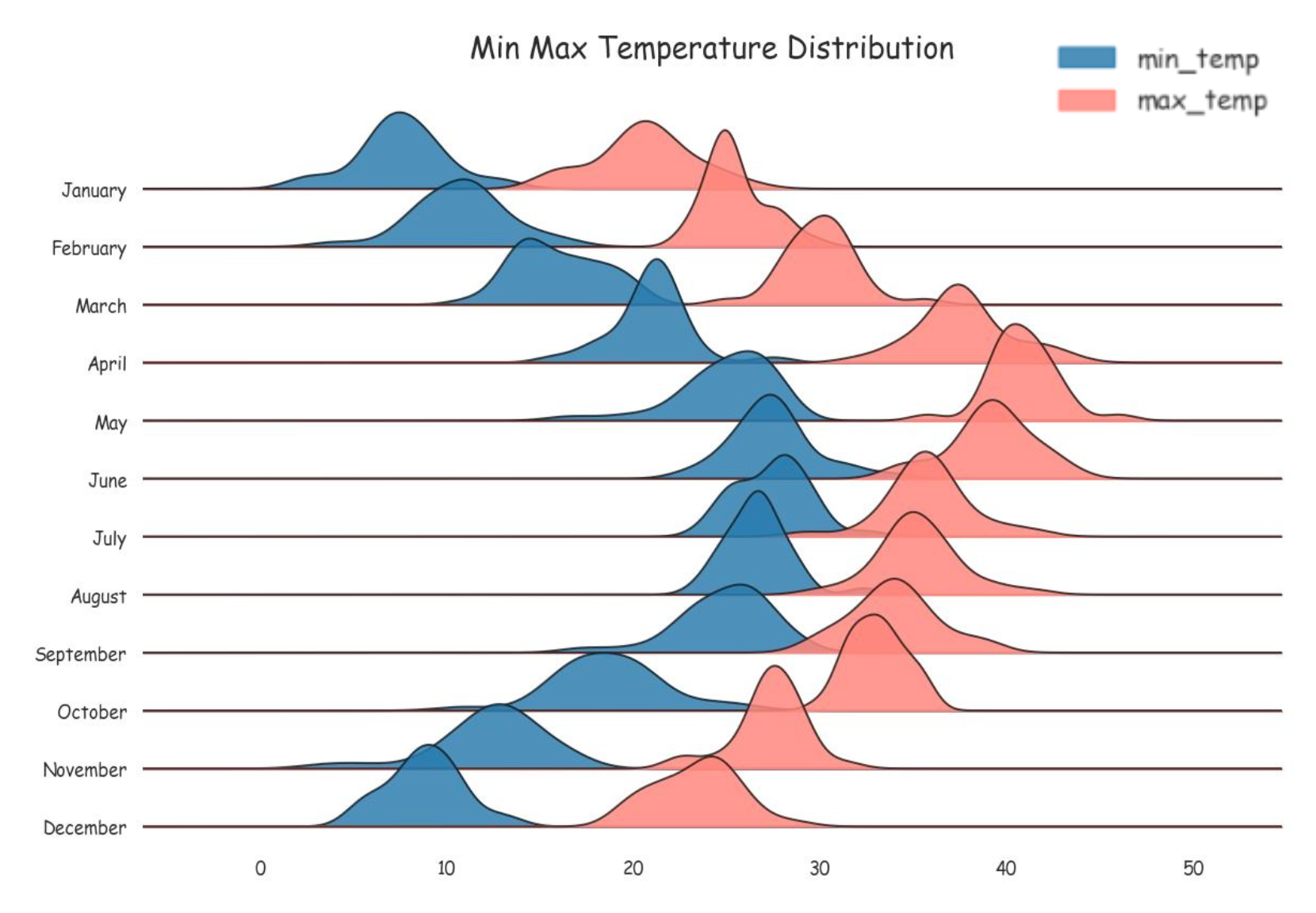
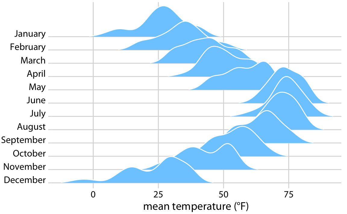
What a Ridgeline Plot Is

A ridgeline plot displays multiple density curves stacked vertically, each representing a different group or category. The curves often overlap slightly, creating a layered landscape that highlights variation across categories.

Common elements include:

  • Smooth density curves
  • Vertical stacking of distributions
  • A shared horizontal axis
  • Labels identifying each group or time period

The shape of each ridge communicates where values concentrate, helping viewers compare distribution patterns across groups.


When to Use a Ridgeline Plot

Use a ridgeline plot when comparing how distributions differ across categories or time.

This visual works especially well when the goal is to:

  • Show how distributions evolve over time
  • Compare variation across groups
  • Highlight peaks and clustering
  • Reveal shifts in spread or skewness
  • Present dense data in a visually engaging way

A ridgeline plot works best when the purpose is to compare distribution shapes rather than exact counts.


Types of Data Sets That Work Best for a Ridgeline Plot

Ridgeline plots work best with continuous numerical data grouped by category or sequence.

Strong candidates include:

  • Environmental measurements across years
  • Music or audio frequency analysis
  • Financial returns by period
  • Survey scores across demographics
  • Performance metrics across teams
  • Scientific measurements across experiments

Each group should contain enough data points to form a meaningful distribution.


Real-World Examples of a Ridgeline Plot

Ridgeline plots appear frequently in data journalism, research, and analytics where distribution patterns need to be compared visually.

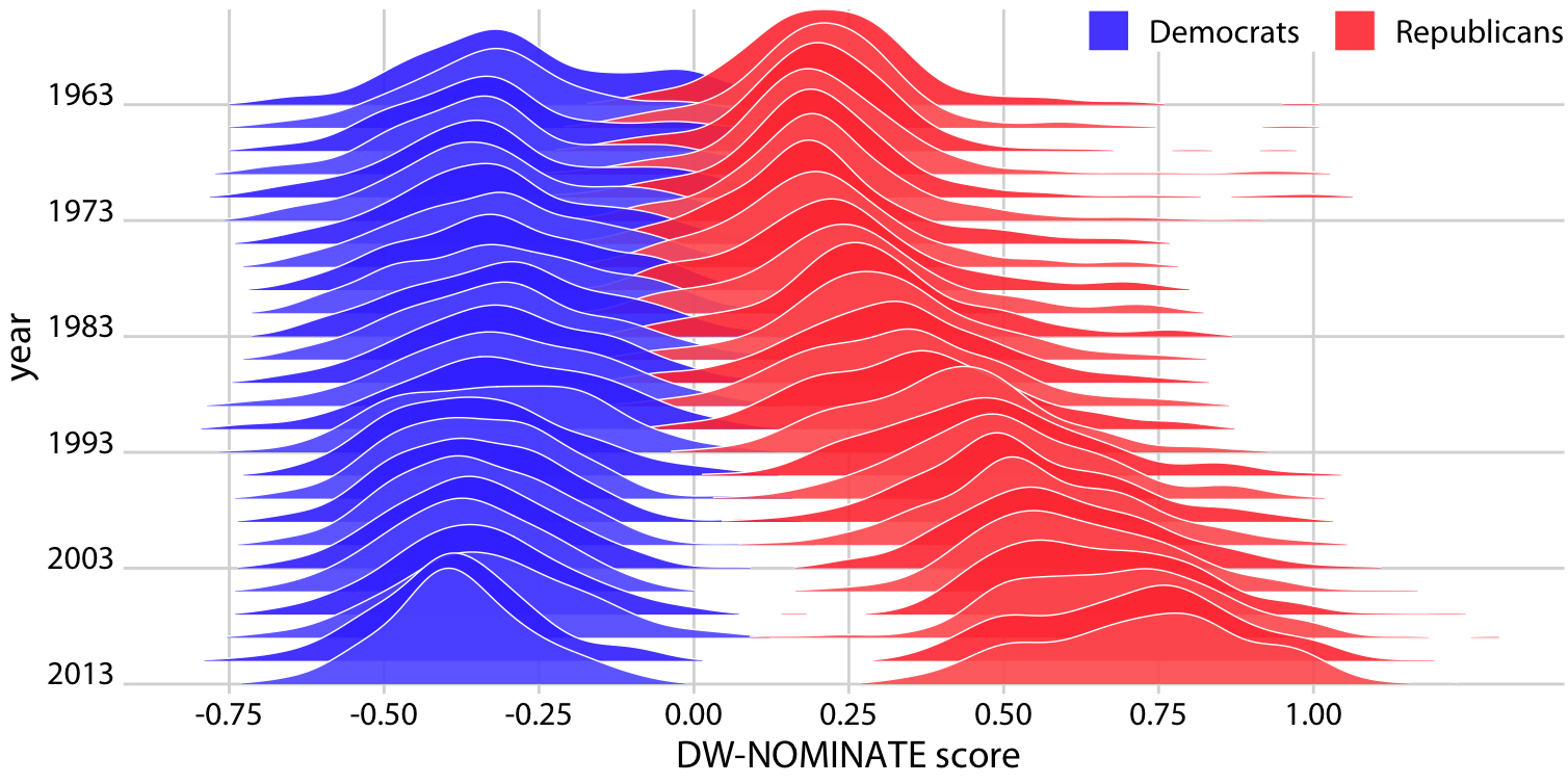
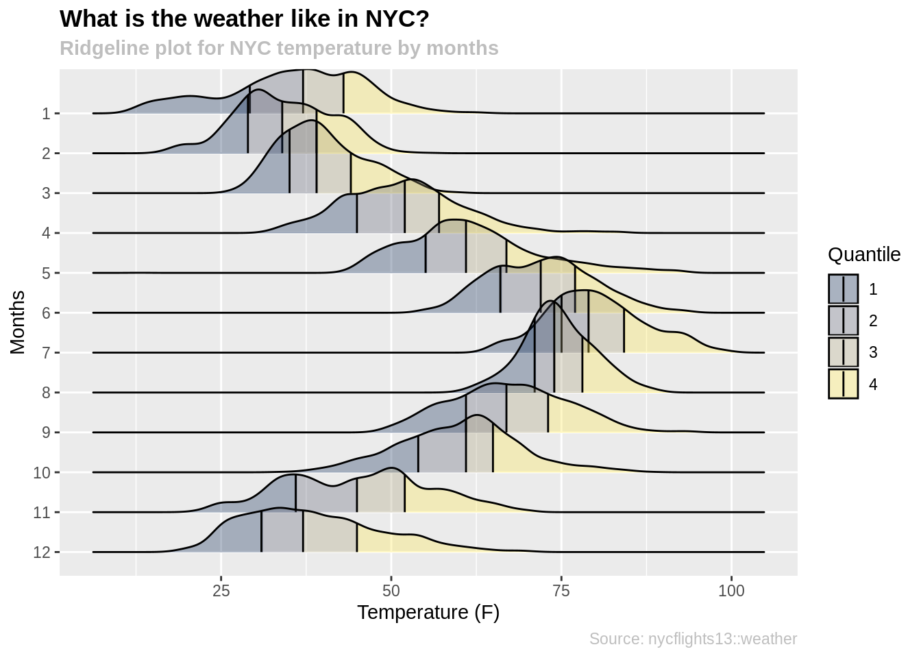
Environmental or Climate Trends

https://www.data-to-viz.com/graph/ridgeline_files/figure-html/unnamed-chunk-3-1.png
https://blogs.sas.com/content/graphicallyspeaking/files/2020/02/ridgeline_figure3.png
https://miro.medium.com/v2/resize%3Afit%3A1400/1%2A2xccITYf5ATNsN4vFi6ZOw.png

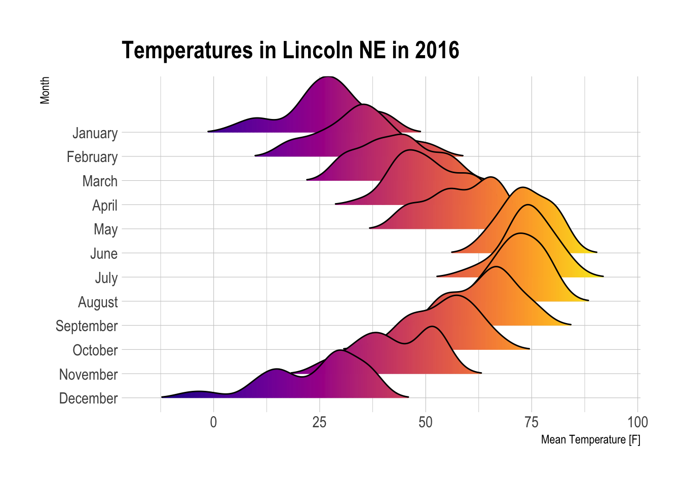
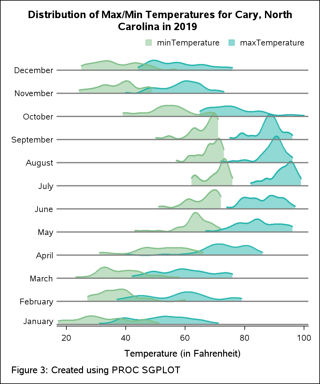
Show how temperature or environmental measurements shift across time periods.


Music or Audio Analysis

https://www.data-to-viz.com/graph/ridgeline_files/figure-html/unnamed-chunk-1-1.png

4

Compare frequency patterns or waveform characteristics across tracks.


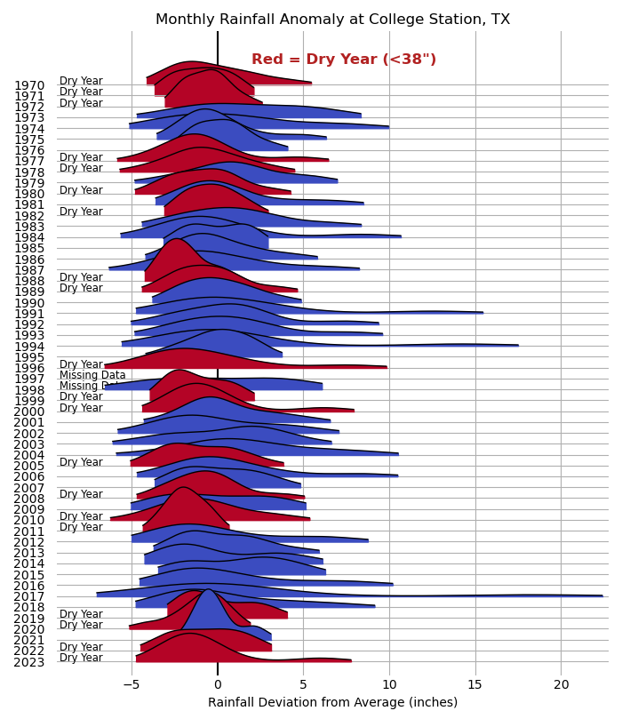
Financial or Market Data

https://clauswilke.com/dataviz/boxplots_violins_files/figure-html/dw-nominate-ridgeline-1.png

Display how return distributions change across years or market conditions.


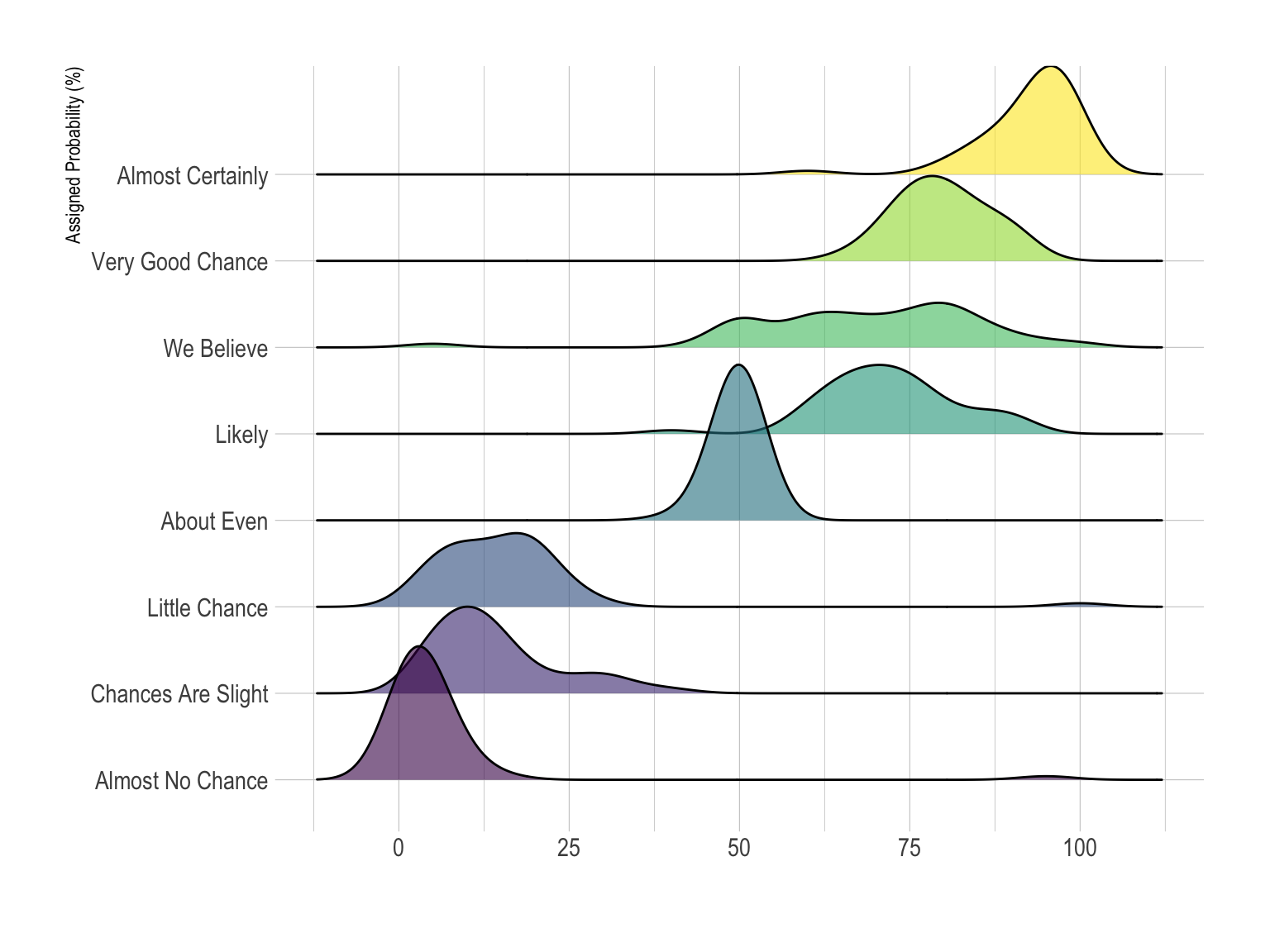
Survey or Demographic Distributions

https://jtr13.github.io/cc19/ridgeline_plot_files/figure-html/unnamed-chunk-2-1.png
https://www.data-to-viz.com/graph/ridgeline_files/figure-html/unnamed-chunk-1-1.png
https://miro.medium.com/1%2ACO7fW6agZxTIl5b4KVwzQw.png

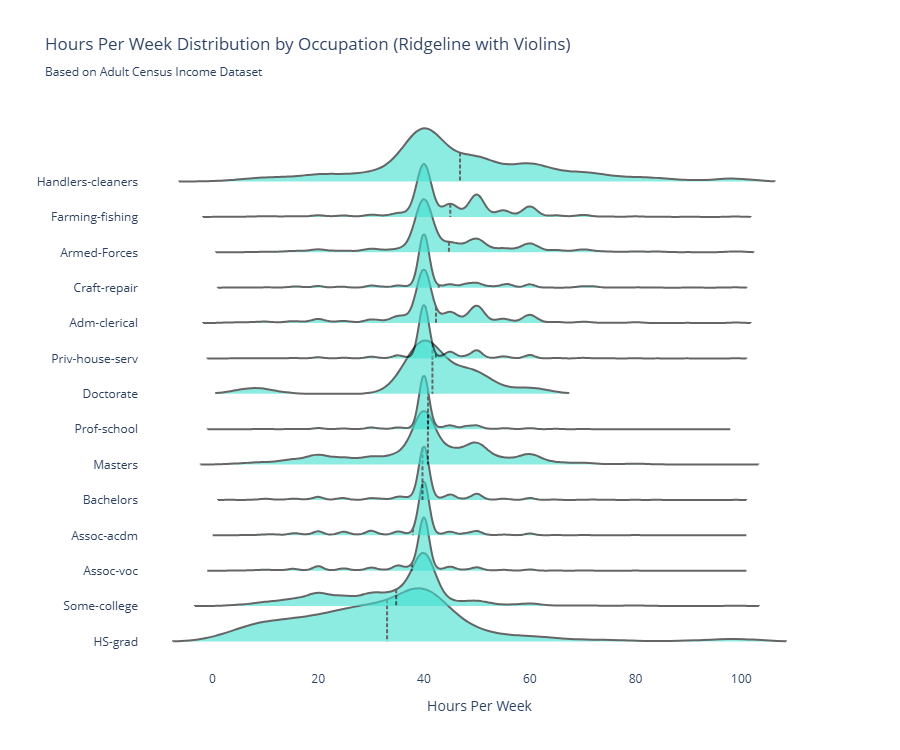
Show how responses or measurements vary across groups.


Scientific or Experimental Research

https://substackcdn.com/image/fetch/%24s_%21ZEbj%21%2Cf_auto%2Cq_auto%3Agood%2Cfl_progressive%3Asteep/https%3A%2F%2Fsubstack-post-media.s3.amazonaws.com%2Fpublic%2Fimages%2F84b6d6c3-d217-4e1e-b442-376139201d73_1660x1152.png
https://www.data-to-viz.com/graph/ridgeline_files/figure-html/unnamed-chunk-1-1.png
https://clauswilke.com/dataviz/boxplots_violins_files/figure-html/temp-ridgeline-1.png

Compare distributions across experimental conditions or datasets.


What to Avoid or Be Careful Of with a Ridgeline Plot

❌ Don’t use it with very small datasets
Sparse data makes density curves misleading or unstable.

❌ Don’t overlap ridges excessively
Too much overlap reduces readability and hides differences.

❌ Don’t hide the scale
Clear axes and labels help viewers interpret distribution accurately.

❌ Don’t rely on color alone to separate groups
Spacing and labeling improve clarity.

❌ Don’t use it when exact numeric comparison is required
Box plots or histograms may communicate precision more clearly.


*Content on this page was curated and edited by expert humans with the creative assistance of AI.

  • facebook
  • instagram
  • linkedin

DON'T MISS ANY SPOT-ON TIPS!

We don't spam! You'll only get emails when we post something awesome.
You can unsubscribe at any time.

Check your inbox or spam folder to confirm your subscription.

©2025 | The Comm Spot | By Newbold Communication & Design