
Pictogram Chart: How to Show Quantities Using Icons
A pictogram chart helps communicate quantities using repeated symbols or icons. Use it to make numbers feel more concrete and relatable, especially when presenting information to broad or non-technical audiences.
Turn to a pictogram chart when clarity and storytelling matter more than precise measurement. Icons make data approachable, helping viewers quickly grasp proportions or counts without needing to interpret complex scales.
Related Charts and Graphs
Several visuals relate closely to pictogram charts and may be better choices depending on the goal.
- Bar charts show precise comparisons across categories using length rather than symbols.
- Donut or pie charts emphasize proportions within a whole.
- Lollipop charts provide a lighter alternative to bars while keeping numeric precision.
- Icon arrays display proportions using grids instead of repeated symbols.
- Infographic-style visuals combine pictograms with narrative design.
Choosing between these options depends on whether the goal is precision, storytelling, or visual engagement.
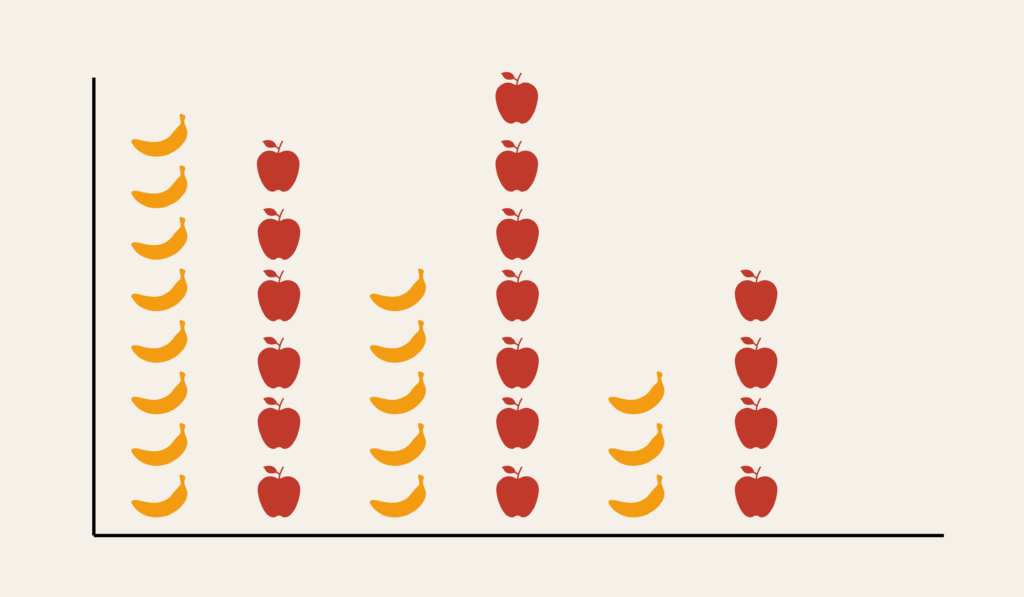
What a Pictogram Chart Is
A pictogram chart represents data by repeating icons or images, where each symbol stands for a specific quantity. The total number of icons corresponds to the overall value being shown.
Common elements include:
- Repeated symbols representing units
- Labels explaining what each icon equals
- Consistent spacing and alignment
- Visual emphasis on storytelling rather than exact measurement
Icons can represent people, objects, or abstract symbols, depending on the subject matter.
When to Use a Pictogram Chart
Use a pictogram chart when the goal is to make data accessible, memorable, or visually engaging.
This visual works especially well when the goal is to:
- Explain statistics to general audiences
- Add narrative context to numbers
- Present simple counts or proportions
- Support educational or awareness campaigns
- Enhance infographic-style storytelling
A pictogram chart works best when the purpose is to make data feel tangible rather than highly analytical.
Types of Data Sets That Work Best for a Pictogram Chart
Pictogram charts work best with simple categorical counts or proportions.
Strong candidates include:
- Population statistics
- Survey summaries
- Health or safety awareness data
- Education or literacy metrics
- Environmental impact statistics
- Social or public policy information
Values should be easy to translate into units that icons can represent consistently.
Real-World Examples of a Pictogram Chart
Pictogram charts appear frequently in education, journalism, marketing, and public communication because they combine clarity with visual storytelling.
Public Health or Awareness Campaigns


Show statistics about behaviors, risks, or outcomes using easily recognizable symbols.
Education and Classroom Materials

Help students understand counts and proportions through visual repetition.
Environmental or Sustainability Messaging

Translate environmental statistics into relatable visual units.
Social or Demographic Reporting

Show population breakdowns or social trends using repeated icons.
What to Avoid or Be Careful Of with a Pictogram Chart
❌ Don’t use inconsistent icon sizes
Scaling icons unevenly can distort meaning and confuse viewers.
❌ Don’t prioritize decoration over clarity
Icons should support understanding, not distract from the data.
❌ Don’t use it for precise comparisons
Pictogram charts emphasize storytelling rather than exact measurement.
❌ Don’t overcrowd the design
Too many icons reduce readability and impact.
❌ Don’t forget to explain the unit value
Viewers need to know what each symbol represents to interpret the chart correctly.
*Content on this page was curated and edited by expert humans with the creative assistance of AI.