
Pair Plot: How to Explore Relationships Across Multiple Variables
A pair plot helps reveal relationships between several variables at once. Use it to compare distributions, correlations, and patterns across many dimensions without creating dozens of separate charts.
Turn to a pair plot when exploring data rather than presenting a single conclusion. This visual makes it easier to spot trends, clusters, or unusual relationships across a dataset.
Related Charts and Graphs
Several visuals relate closely to pair plots and may be better choices depending on the goal.
- Scatterplots show relationships between two variables at a time.
- Multiline charts focus on trends across time rather than variable relationships.
- Heatmap matrices summarize correlations using color instead of points.
- Hexbin plots reduce overplotting when datasets become extremely dense.
- Box plots show distribution and spread but do not reveal pairwise relationships.
Choosing between these options depends on whether the goal is exploration, comparison, or summarization.
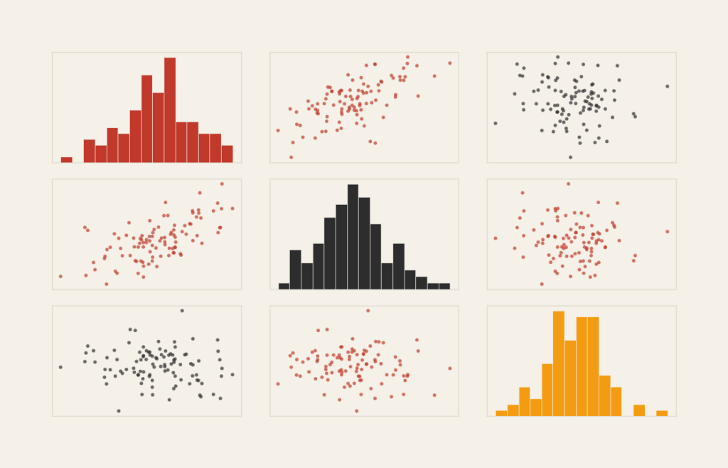
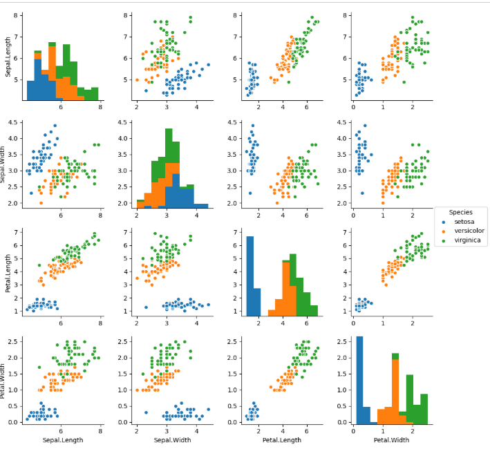
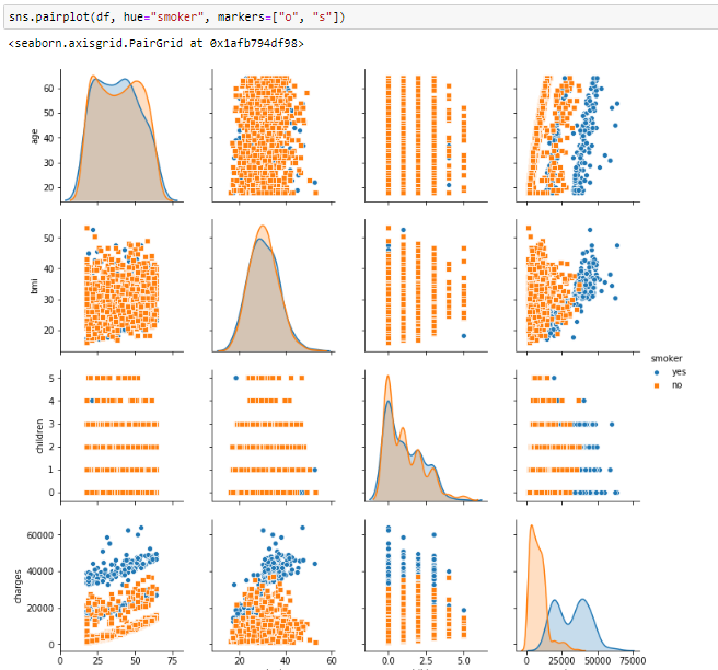
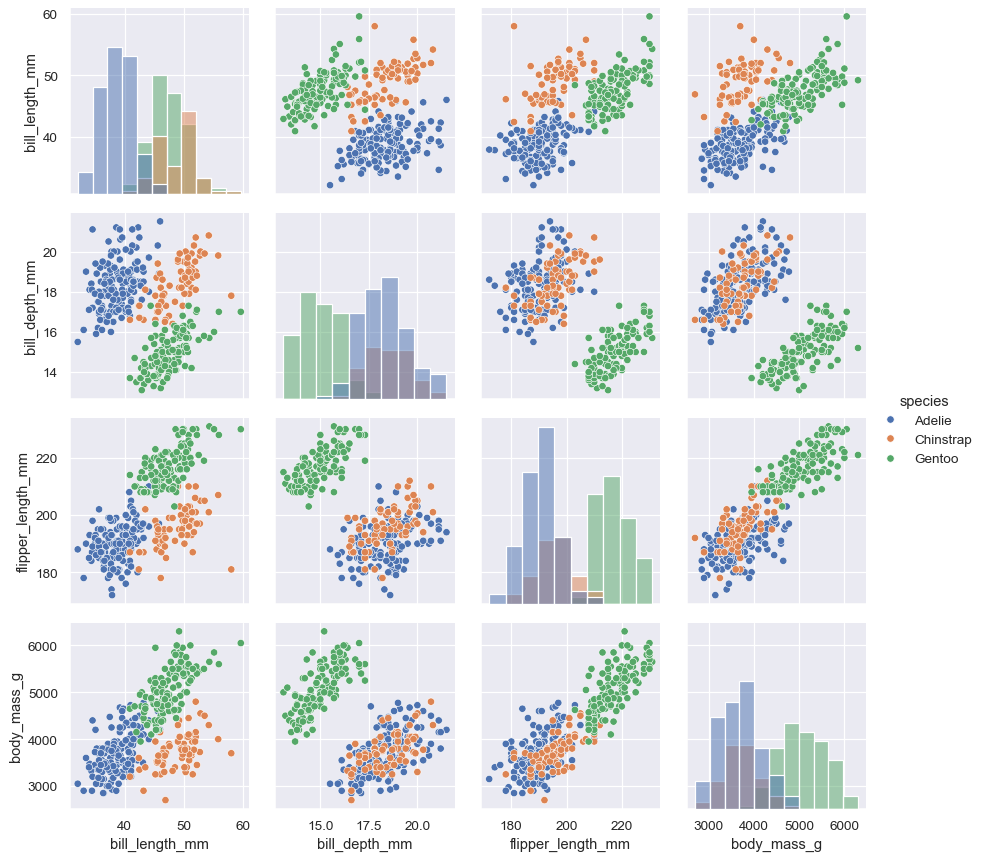
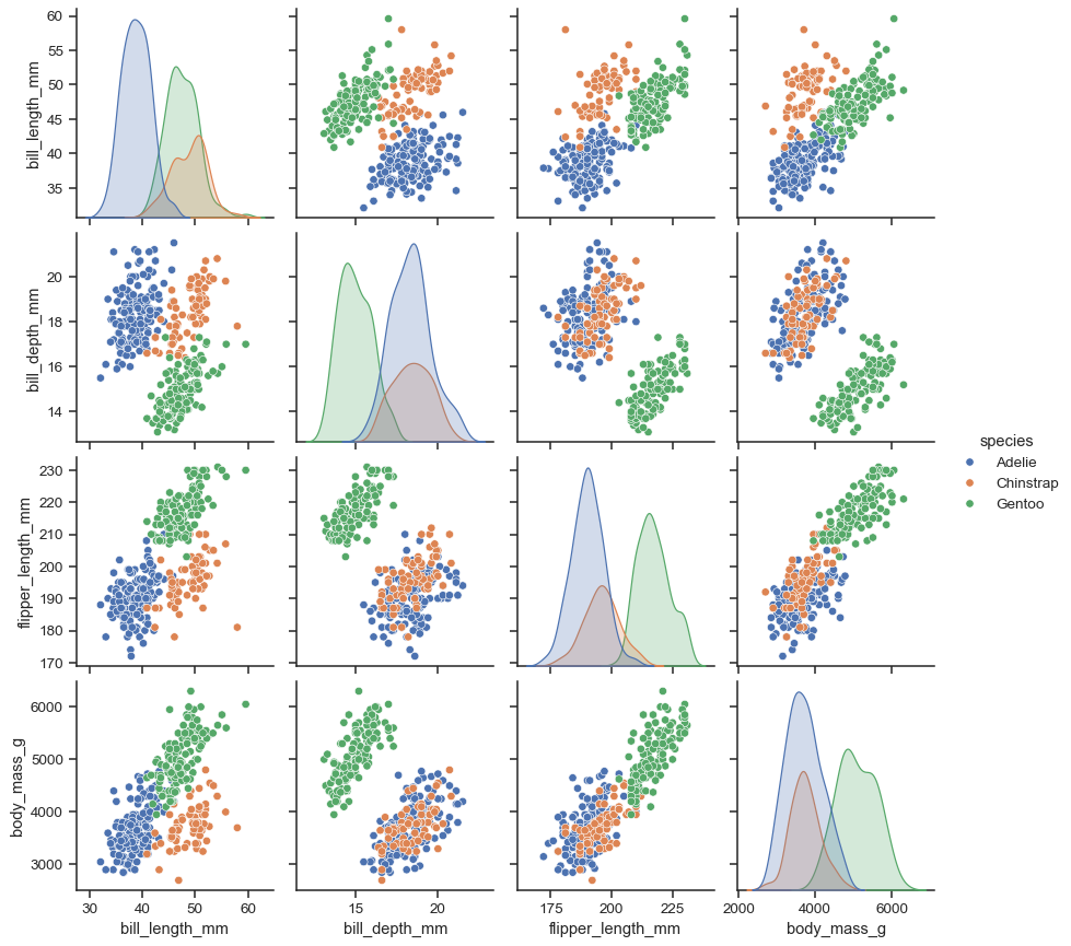
What a Pair Plot Is
A pair plot displays a grid of small charts that compare each variable against every other variable in a dataset. The diagonal often shows distributions for individual variables, while the off-diagonal panels display scatterplots.
Common elements include:
- A matrix layout of plots
- Scatterplots showing pairwise relationships
- Histograms or density plots along the diagonal
- Consistent axes across rows and columns
This structure allows patterns to emerge quickly, revealing correlations, clusters, or anomalies across multiple dimensions.
When to Use a Pair Plot
Use a pair plot when exploring relationships across several quantitative variables.
This visual works especially well when the goal is to:
- Identify correlations between variables
- Explore multivariate datasets
- Detect clusters or groupings
- Spot outliers or unusual patterns
- Support exploratory data analysis
A pair plot works best when the purpose is to understand how variables interact rather than to tell a single focused story.
Types of Data Sets That Work Best for a Pair Plot
Pair plots work best with datasets containing multiple numerical variables.
Strong candidates include:
- Scientific or experimental measurements
- Financial indicators
- Environmental or climate metrics
- Behavioral or engagement analytics
- Health or demographic datasets
- Machine learning feature exploration
Each variable should share a meaningful scale or relationship with others to produce useful comparisons.
Real-World Examples of a Pair Plot
Pair plots appear frequently in data science, research, and analytics when exploring complex datasets.
Scientific or Experimental Data Exploration

Explore relationships between multiple measurements to identify trends or correlations.
Financial and Economic Indicators

Compare variables such as growth, volatility, and returns across markets or assets.
Health or Demographic Analysis

Reveal patterns and clusters across multiple attributes within a population.
Environmental or Climate Research
Analyze how environmental variables interact with one another.
Machine Learning Feature Exploration
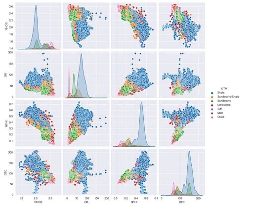
4=Examine relationships between features before building predictive models.
What to Avoid or Be Careful Of with a Pair Plot
❌ Don’t use it with too many variables
Large grids become overwhelming and difficult to interpret.
❌ Don’t include non-numeric variables without clear encoding
Pair plots rely on quantitative comparison to remain meaningful.
❌ Don’t treat it as a final presentation chart
Pair plots are best for exploration rather than polished storytelling.
❌ Don’t ignore labeling and scaling
Consistent axes and clear labels help viewers understand relationships.
❌ Don’t assume patterns imply causation
Visual relationships require statistical context and careful interpretation.
*Content on this page was curated and edited by expert humans with the creative assistance of AI.