
Organizational Chart: How to Show Roles, Structure, and Reporting Relationships
An organizational chart helps visualize how people, roles, or teams connect within a structured system. Use it to clarify hierarchy, reporting lines, and responsibility across an organization or project.
Turn to an organizational chart when structure matters more than numbers. This visual makes it easier to understand who reports to whom, how departments relate, and where leadership or coordination sits within a system.
Related Charts and Graphs
Several visuals relate closely to organizational charts and may be better choices depending on the goal.
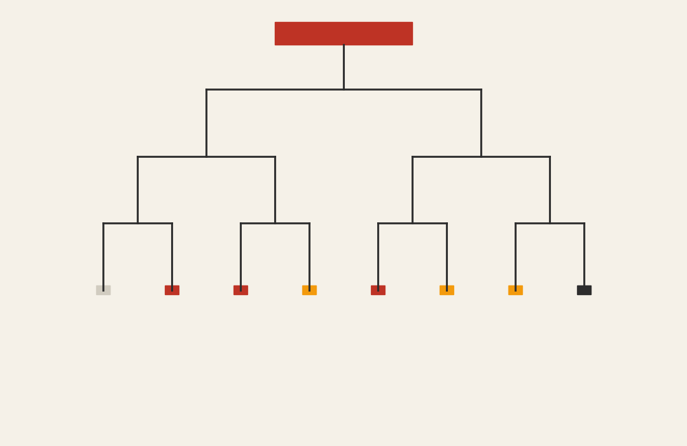
- Tree diagrams show hierarchical relationships in a more abstract structure.
- Icicle charts display hierarchy through stacked rectangles instead of branching lines.
- Flowcharts explain processes or decisions rather than reporting relationships.
- Network diagrams emphasize connections that are not strictly hierarchical.
- Mind maps explore ideas and relationships without formal structure.
Choosing between these options depends on whether the focus is hierarchy, process, or connection.
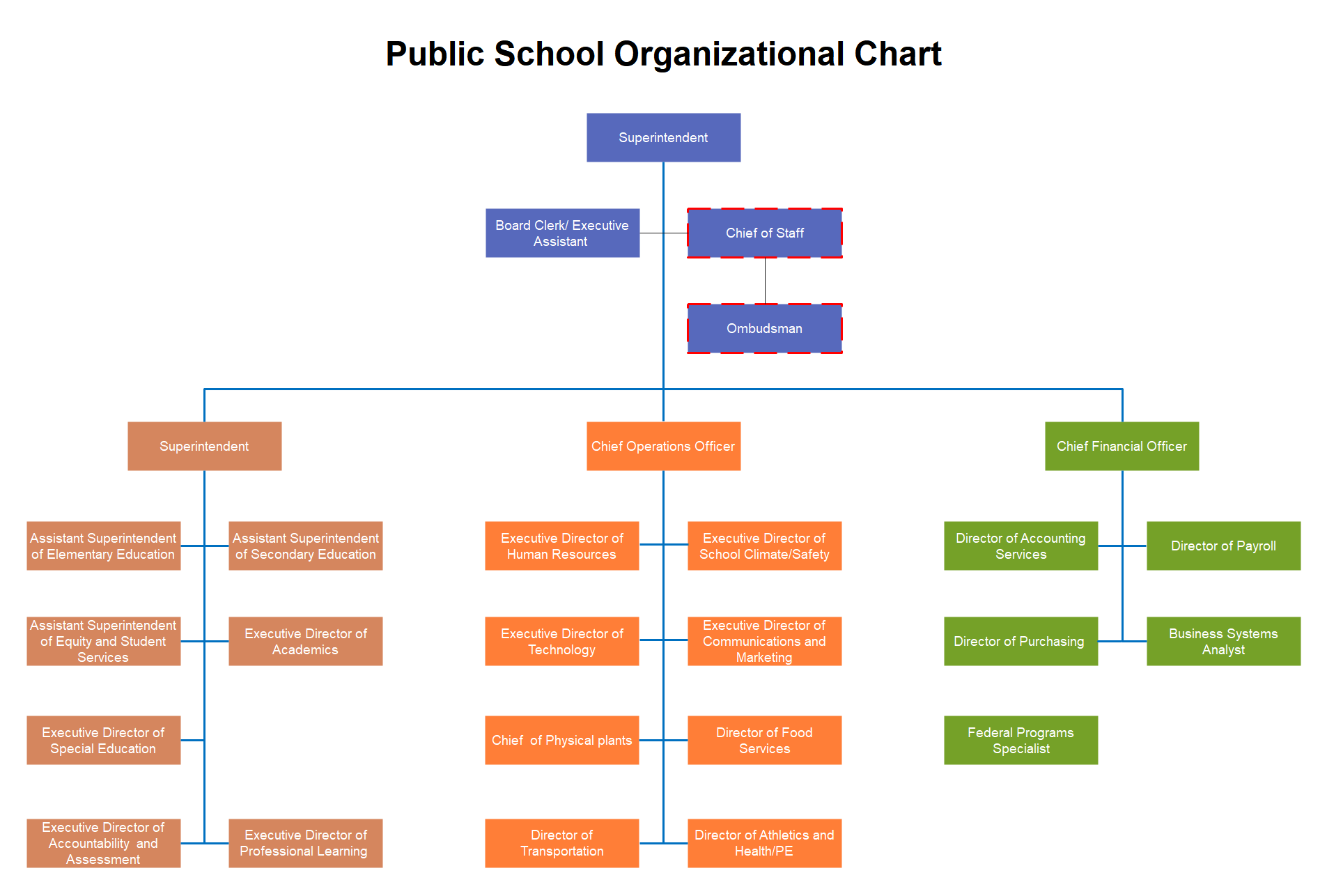
What an Organizational Chart Is
An organizational chart represents structure using boxes connected by lines. Each box represents a person, role, or unit, while the connecting lines show relationships such as supervision or collaboration.
Common elements include:
- A top-level role or leadership position
- Branching layers that represent hierarchy
- Titles, names, or departments within each node
- Lines indicating reporting relationships
The layout often flows from top to bottom, helping viewers understand levels of authority or responsibility.
When to Use an Organizational Chart
Use an organizational chart when clarity around roles and structure is essential.
This visual works especially well when the goal is to:
- Show reporting relationships
- Introduce team structures
- Clarify departmental organization
- Support onboarding or training materials
- Present governance or leadership structures
- Map project teams and responsibilities
An organizational chart works best when the purpose is to help viewers understand how people or roles fit together.
Types of Data Sets That Work Best for an Organizational Chart
Organizational charts work best with hierarchical relationship data rather than numerical values.
Strong candidates include:
- Company or department structures
- Project team roles
- Committee or governance frameworks
- Academic or institutional leadership structures
- Volunteer or nonprofit organization hierarchies
- Program or initiative leadership maps
Each node should have a clear relationship to the one above it, forming a logical chain of structure.
Real-World Examples of an Organizational Chart
Organizational charts appear in business, education, healthcare, government, and nonprofits whenever structure needs to be communicated clearly.
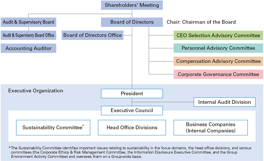
Company Leadership and Department Structure


Show leadership roles, reporting lines, and departmental relationships.
Project Teams or Task Forces

Clarify responsibilities and coordination across collaborative teams.
Academic or Institutional Structures
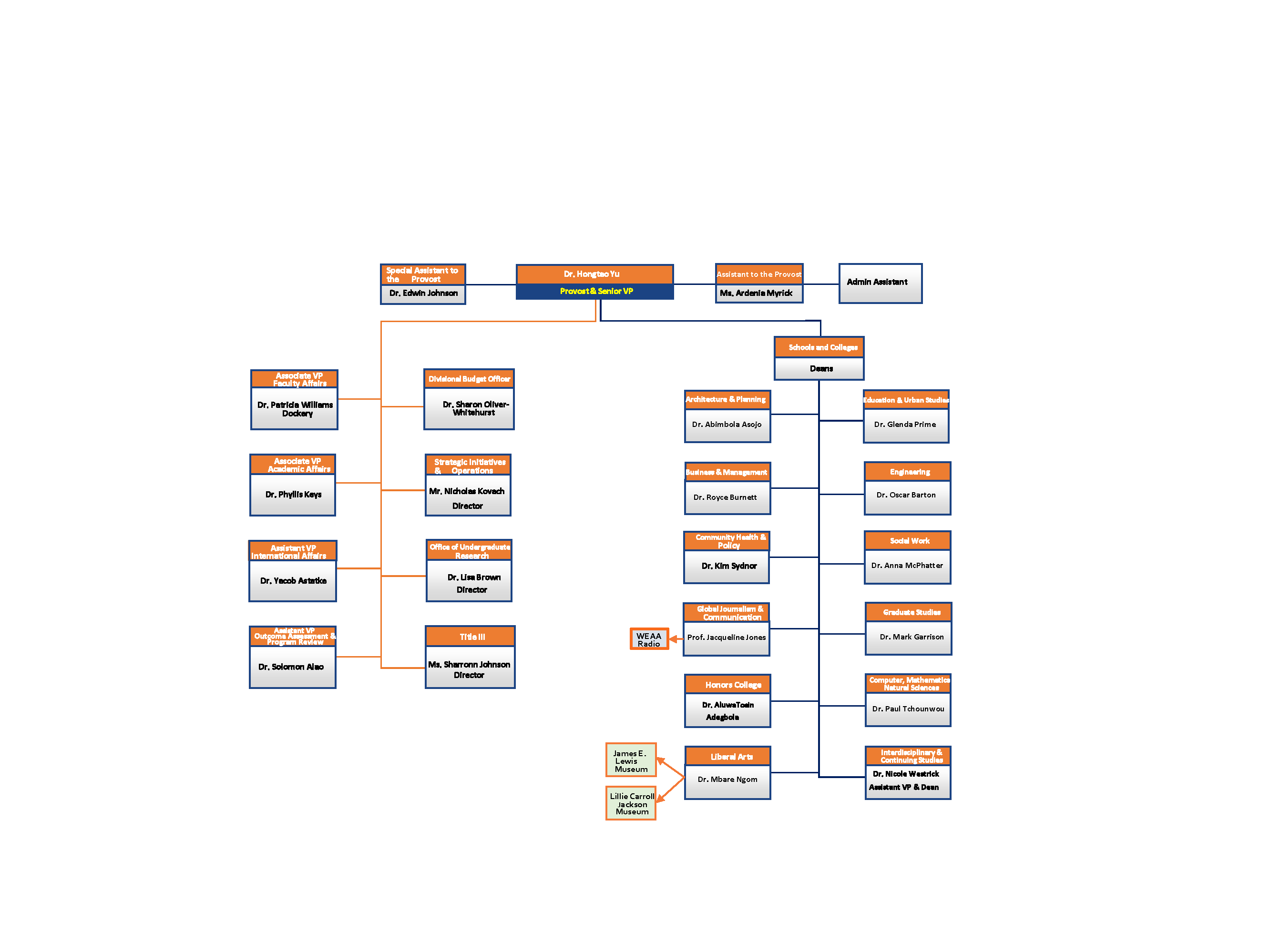
Display leadership roles across colleges, departments, or programs.
Healthcare or Clinical Teams
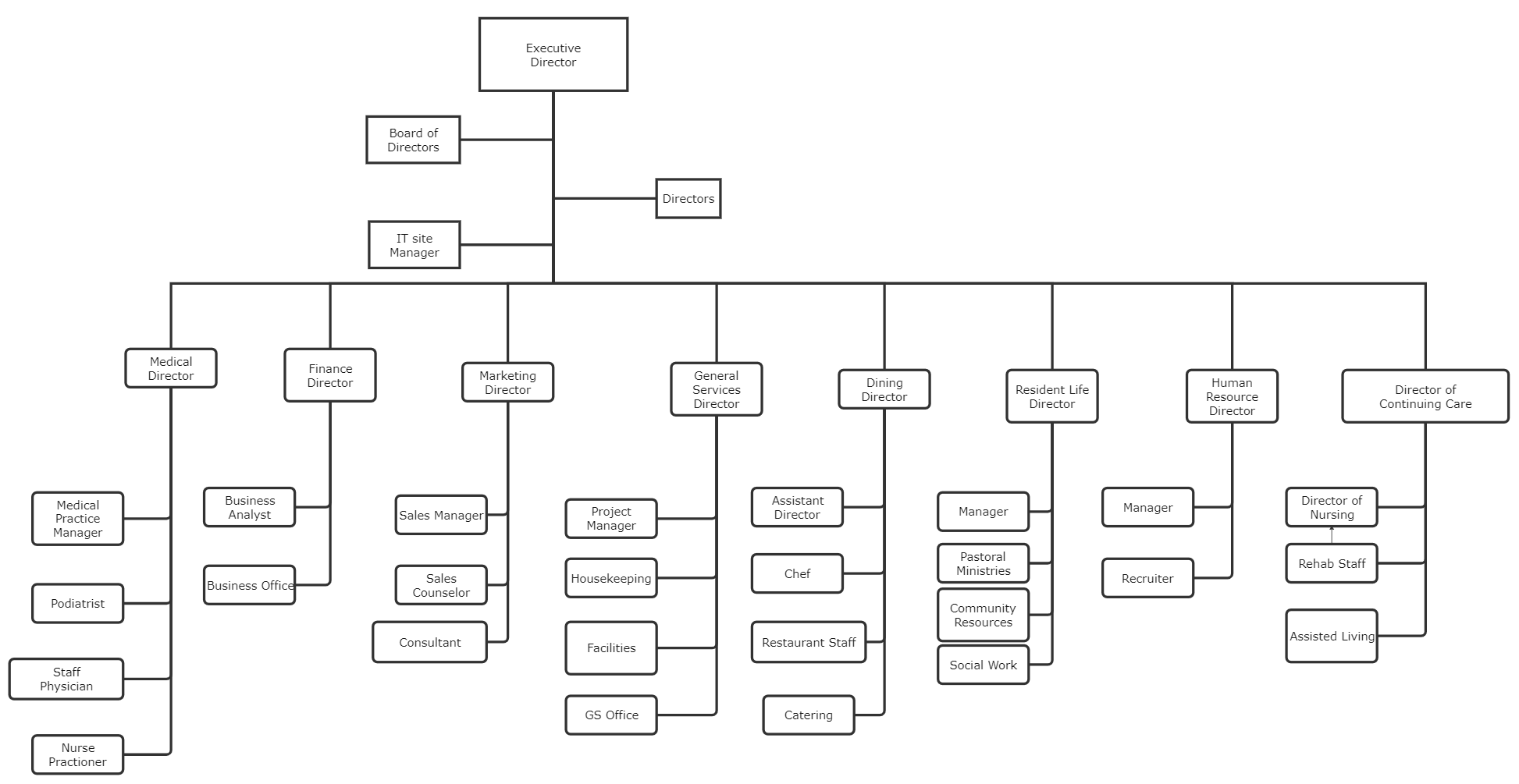

Show how clinical roles and administrative units coordinate within a facility.
Nonprofit or Governance Structures
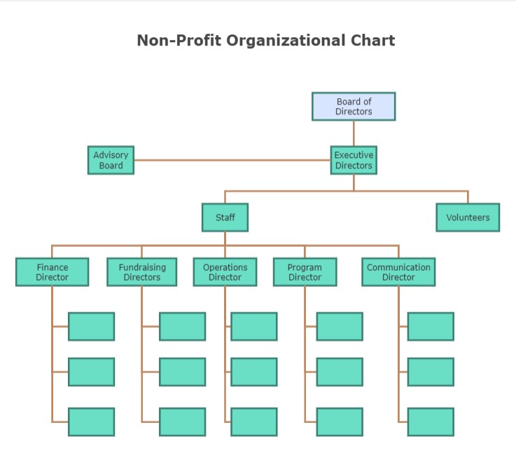

Outline boards, committees, and operational teams.
What to Avoid or Be Careful Of with an Organizational Chart
❌ Don’t overcrowd the chart
Too many nodes or layers make structure difficult to follow.
❌ Don’t ignore readability
Clear spacing and alignment help viewers understand relationships quickly.
❌ Don’t treat it as static
Organizational structures change, so charts should be updated regularly.
❌ Don’t confuse hierarchy with collaboration
Reporting lines don’t always represent how work actually flows.
❌ Don’t rely only on titles
Context about roles or responsibilities often improves understanding.
*Content on this page was curated and edited by expert humans with the creative assistance of AI.