
Multiline Chart: How to Compare Multiple Trends Over Time
A multiline chart helps show how several variables change across the same timeline. Use it to compare trends side by side while preserving the continuity of each series.
Turn to a multiline chart when the goal is to understand relationships between trends rather than focusing on a single line. The shared timeline makes it easier to see convergence, divergence, and parallel movement.
What a Multiline Chart Is
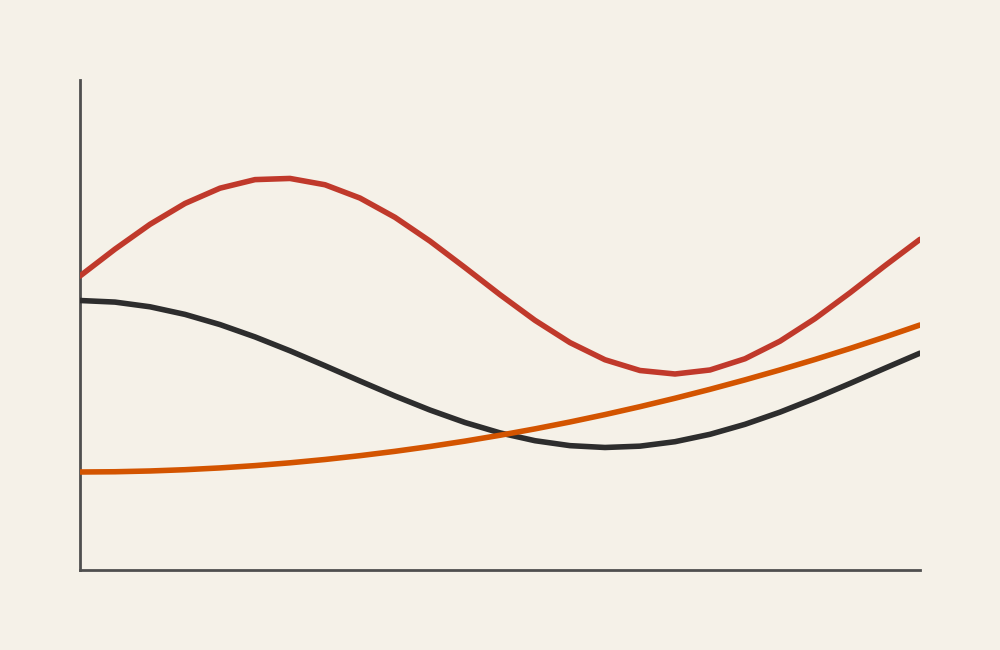
A multiline chart displays two or more lines on the same set of axes. Each line represents a separate category or series, allowing comparisons across time or another ordered sequence.
Common elements include:
- A shared horizontal axis, often representing time
- Multiple colored or styled lines
- A legend or direct labels identifying each series
- Consistent scaling for accurate comparison
The overlapping lines make patterns visible, showing how different groups move together or apart.
Related Charts and Graphs
Several visuals relate closely to multiline charts and may be better choices depending on the goal.
- Line graphs show a single trend and keep the focus on one variable at a time.
- Area charts emphasize magnitude and cumulative change, especially when showing totals.
- Stacked area charts highlight how parts contribute to a whole over time.
- Slope charts focus on change between two specific points rather than continuous trends.
- Connected scatter plots show relationships between variables instead of time-based progression.
Choosing between these options depends on whether the message centers on comparison, accumulation, or movement.
When to Use a Multiline Chart
Use a multiline chart when comparing trends across several groups is central to the message.
This visual works especially well when the goal is to:
- Compare performance across teams or regions
- Show changes in multiple metrics simultaneously
- Reveal seasonal or cyclical patterns
- Highlight divergence or convergence between variables
- Provide context by showing related trends together
A multiline chart works best when the purpose is to compare how multiple series evolve across the same timeline.
Types of Data Sets That Work Best for a Multiline Chart
Multiline charts work best with quantitative data measured across consistent intervals.
Strong candidates include:
- Sales or revenue by region over time
- Website traffic across channels
- Environmental measurements from multiple locations
- Stock or financial performance across companies
- Enrollment trends by program
- Experimental results across conditions
Each series should share the same units and scale to ensure meaningful comparison.
Real-World Examples of a Multiline Chart
Multiline charts appear in dashboards, research reports, and journalism whenever multiple trends need to be viewed together.
Sales or Revenue by Region
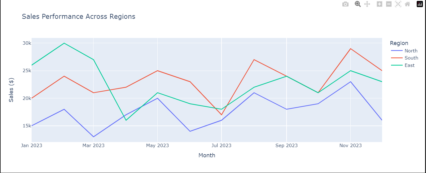
Compare performance across regions while tracking growth or decline over time.
Website Traffic by Channel
Show how traffic sources change relative to one another across months or campaigns.
Environmental or Climate Monitoring

Display measurements from multiple locations or variables on a shared timeline.
Financial Market Comparisons
Track how different assets perform relative to one another.
Academic or Research Measurements
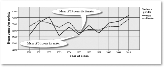

Compare multiple experimental conditions across stages or time.
What to Avoid or Be Careful Of with a Multiline Chart
❌ Don’t include too many lines
Too many series create visual clutter and make trends difficult to follow.
❌ Don’t rely solely on color
Line styles, direct labels, or annotations help maintain clarity and accessibility.
❌ Don’t mix different scales
All lines should share the same axis to avoid misleading comparisons.
❌ Don’t hide key moments
Annotations can help viewers understand important peaks, dips, or events.
❌ Don’t use it when categories are unrelated
If the series don’t share a common timeline or context, a grouped bar chart may communicate more clearly.
*Content on this page was curated and edited by expert humans with the creative assistance of AI.