Skip to content
The Comm Spot The Comm Spot

It's All About Communication

  • HOME
  • ABOUT
    • Meet the Creator: Curtis Newbold, PhD
    • Hire Curtis
    • Publish with Us
    • Contact
    • Privacy Notice
  • COMM-BASICS
    • Glossary
    • Citation & Style Guides
      • AP Style (Journalism)
        • AP Style Overview
        • AP Style Guidelines
        • Media Ethics – SPJ Code of Ethics
        • Elements of Newsworthiness
      • APA Style
        • APA Format – Overview
        • APA - References Guidelines
        • APA - In-text Citations
        • APA - Citing Authors
        • APA - Audiovisual Media
        • APA - Books
        • APA - Digital Sources
        • APA - Events & Interactions
        • APA - Periodicals
        • APA - Print Sources (other than books)
      • Chicago Style
        • Chicago – Overview
        • Chicago - Author-Date System
        • Chicago - Notes-Bibliography System
        • Chicago - In-text Citations
        • Chicago Style - Citing Authors
        • Chicago - Audiovisual Media
        • Chicago - Books
        • Chicago - Digital Sources
        • Chicago - Events and Interactions
        • Chicago - Citing Periodicals
        • Chicago - Print Sources (other than books)
      • MLA Style
        • MLA Overview
        • MLA Works Cited Pages
        • MLA In-text Citations
        • MLA – Authors
        • MLA – Audiovisual Media
        • MLA – Books
        • MLA – Digital Sources
        • MLA – Events & Interactions
        • MLA – Periodicals
        • MLA – Print Sources (other than books)
    • Rhetoric
      • Overview of Rhetoric
      • Rhetorical Appeals (Rhetorical Triangle)
      • Branches of Oratory
      • Canons of Rhetoric
      • Rhetorical Devices
      • Kairos
      • Topos
      • Key Figures in Rhetoric
    • Research Methods
      • Case Studies
      • Competitor Analysis
      • Content Analysis
      • Discourse Analysis
      • Ethnography
      • Focus Groups
      • Observation Research
      • S.W.O.T. Analysis
      • Secondary Research
      • Surveys
      • Target Market Analysis
      • Usability Testing
      • Visual Analysis
    • Theories
    • Thinkers
  • COMM-SUBJECTS
    • Interpersonal Communication
      • Active Listening
      • Body Language
      • Conflict Management
      • Emotional Intelligence
        • Emotional Intelligence Overview
        • Self-Awareness
        • Self-Regulation
        • Motivation
        • Empathy
        • Social Skills
        • Emotional Intelligence Resources
      • Feedback
      • Negotiation
        • Overview of Negotiation
        • Negotiation Skills
        • Negotiation Strategies & Techniques
        • Stages of Negotiation
        • Common Negotiation Scenarios
        • Negotiation Case Studies & Examples
        • Negotiation Tools & Resources
        • Negotiation FAQ
    • Journalism
    • Public Speaking
      • General Guidelines
      • Overcoming Fear
      • Speech Writing and Organization
      • Delivery Techniques
      • Body Language
      • Audience Engagement
      • Storytelling
      • Designing Slides
      • P.O.W.E.R.F.U.L. Presentation Method
    • Strategic Communication
      • Business & Org Comm
        • Definition & History
        • Org Comm Theories
        • Business Documents
        • Change Management
        • Employee Relations
        • Employment Communication
        • Group & Team Communication
        • Leadership Communication
        • Power, Identity, & Ethics at Work
        • Project Management
      • Integrated Marketing Comm
        • Definition of IMC
        • Core Principles of IMC
        • IMC Planning
        • Audience Segmentation
        • Marketing Channels
        • Message Strategies
        • Campaign Measurement & Evaluation
        • Trends & Innovations in IMC
        • Challenges & Pitfalls in IMC
        • Careers & Roles in IMC
      • Public Relations
        • Foundations in PR
        • Strategic Practice
        • Tools & Tactics
        • Research & Analysis
        • Professional Development
      • Case Studies in Strat Comm
    • Technical & Scientific Communication
    • Visual Communication
      • Data Visualization
      • Information Design
      • Photography
      • Web Design
    • Written Communication
      • Writing Process
      • Organizational Methods
        • Five Paragraph Essay
        • Hourglass Method of Writing
        • IMRaD Format (Science)
        • Indirect Method (Bad News)
        • Inverted Pyramid (Journalism)
        • Martini Glass
        • Narrative Format
        • Proposal Format
        • Rogerian Method
        • Toulmin Method
      • Plain Language
        • Audience (Plain Language)
        • Organization (Plain Language)
        • Conversation (Plain Language)
        • Simplicity (Plain Language)
        • Word Choice (Plain Language)
        • Sentence Structure (Plain Language)
        • Design (Plain Language)
      • Punctuation
        • Apostrophes
        • Brackets
        • Colons
        • Commas
        • Ellipses
        • Em Dashes
        • En Dashes
        • Exclamation Marks
        • Hyphens
        • Parentheses
        • Periods
        • Question Marks
        • Quotation Marks
        • Semicolons
      • Style
        • Clarity
        • Conciseness
        • Consistency
        • Editing
        • Flow
        • Rhetorical Devices
        • Sentence Structure
        • Storytelling
        • Tone
        • Voice
        • Word Choice
  • RESOURCES
    • Teaching Resources
      • Assignments & Activities
      • Instructional Design
      • Pedagogies
  • BLOGS
    • The Spotlight Blog
    • Comm Sparks
  • SHOP
    • Cart
    • Checkout
0
The Comm Spot
The Comm Spot

It's All About Communication

Histogram – Data Visualization

Home >COMM-Subjects >Visual Communication >Data Visualization >Types of Data Visualizations (Charts and Graphs) >Histogram – Data Visualization

Histogram: How to Show Distribution and Frequency

A histogram helps reveal how values are distributed across a range. Use it to show frequency, spread, and patterns within numerical data, making it easier to see clusters, gaps, and skew.

Turn to a histogram when understanding distribution matters more than comparing categories. Instead of listing individual values, the chart groups data into intervals so overall structure becomes visible.


What a Histogram Is

A histogram displays numerical data using adjacent bars that represent ranges, often called bins. Each bar shows how many observations fall within a specific interval.

Common elements include:

  • Continuous numeric axis divided into bins
  • Bars that touch to show continuity
  • Heights representing frequency or count
  • Consistent bin widths

Unlike a bar chart, a histogram represents continuous data rather than separate categories.


When to Use a Histogram

Use a histogram when the goal is to understand how data is distributed.

This visual works especially well when the aim is to:

  • Show frequency patterns
  • Reveal skewness or symmetry
  • Identify clusters or gaps
  • Detect outliers
  • Explore variability within a dataset
  • Introduce audiences to statistical distribution

A histogram works best when the purpose is to show how values spread across a range.


Types of Data Sets That Work Best for a Histogram

Histograms work best with continuous numerical data.

Strong candidates include:

  • Test scores or grades
  • Response times or durations
  • Prices or costs
  • Measurements such as height or weight
  • Performance metrics
  • Environmental readings

Larger datasets typically produce clearer and more meaningful distributions.


Real-World Examples of a Histogram

Histograms appear frequently in research, analytics, and education when distribution needs to be understood quickly.

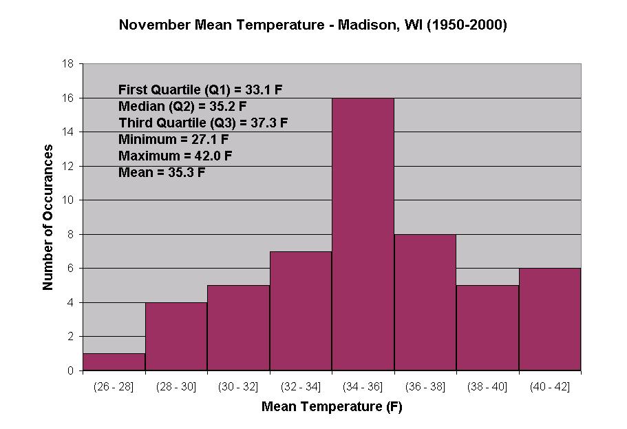
Test Scores or Assessment Results

https://www.researchgate.net/publication/338633570/figure/fig2/AS%3A848043972763648%401579200847353/Histogram-of-test-scores-showing-a-distribution-with-a-large-left-hand-tail-and-a-short.ppm
https://www.researchgate.net/publication/266945541/figure/fig1/AS%3A295590526242816%401447485681590/Distribution-of-test-scores-frequency-distribution-in-a-histogram-for-the-eight-item.png

Show how scores cluster around certain ranges and reveal whether results are balanced or skewed.


Income or Salary Distribution

https://www.researchgate.net/publication/357314606/figure/fig2/AS%3A11431281127369702%401679009808243/The-household-distribution-histogram-by-level-of-cash-income-according-to-the-results-of.png
https://www.researchgate.net/publication/2635183/figure/fig7/AS%3A669571396689937%401536649669835/A-histogram-for-annual-salary.png
https://www.researchgate.net/publication/343860187/figure/fig2/AS%3A962748368318468%401606548506047/Histogram-of-the-wage-distribution.png

Highlight spread, inequality, and concentration across income levels.


Website or System Performance

https://www.researchgate.net/publication/279733881/figure/fig3/AS%3A303114965012482%401449279647734/Histogram-of-response-times-Response-times-of-all-participants-of-the-first-green-and.png
https://www.brendangregg.com/HeatMaps/iosnoop_hist_2000.png
https://www.researchgate.net/publication/241113728/figure/fig8/AS%3A298551692283917%401448191678781/Histogram-of-the-Performance-Ratio-above-and-Performance-Index-below-of-the-PV.png

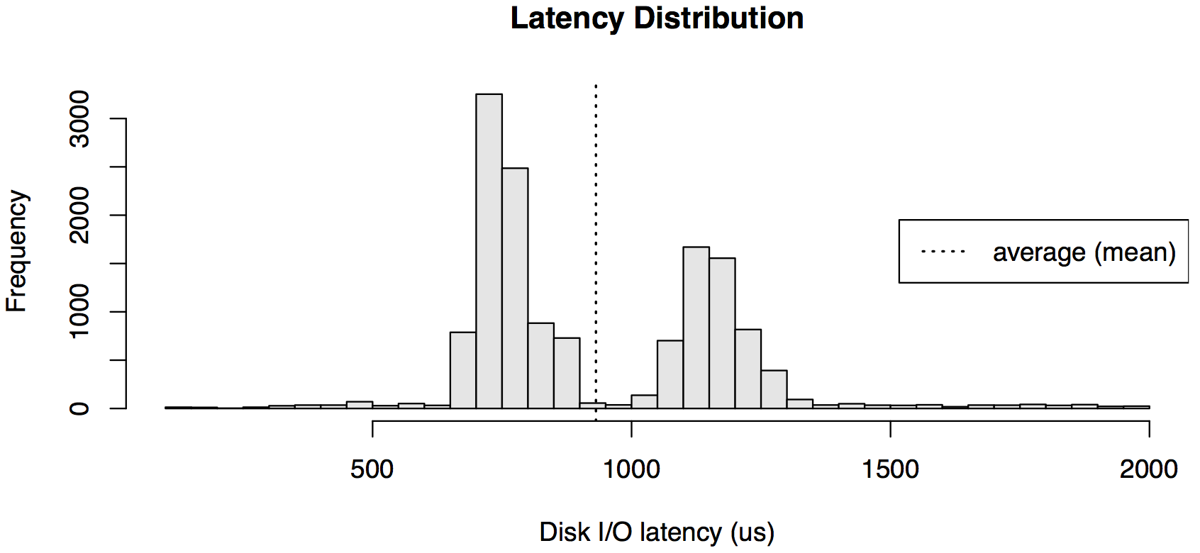
Reveal typical performance ranges and identify slow outliers.


Scientific or Experimental Data

https://api.www.labxchange.org/api/v1/xblocks/lb%3ALabXchange%3A10d3270e%3Ahtml%3A1/storage/15__histogram-11626365163042-726b352e4d0188b0a5238a3f1aa56e07.png
https://www.researchgate.net/publication/383864229/figure/fig4/AS%3A11431281276838759%401725854400108/Histogram-Experimental-results-for-number-of-photons-counted-on-each-pixel-during-1000.ppm
https://api.www.labxchange.org/api/v1/xblocks/lb%3ALabXchange%3A10d3270e%3Ahtml%3A1/storage/asp_data-images_nicole_5-data-viz-2-slide-51626858050199-9bcb4aa8177f5174984399a58cd3ea0b.png

Show how measurements distribute across ranges and whether patterns emerge.


Environmental or Climate Measurements

https://help.qlik.com/en-US/cloud-services/Subsystems/Hub/Content/Resources/Images/ex_gen_histogram_example.png
https://weatherstories.ssec.wisc.edu/stories/images/LessonHist.jpg

Display how readings vary over time or across locations.


What to Avoid or Be Careful Of with a Histogram

❌ Don’t confuse it with a bar chart
Histograms represent continuous ranges, not discrete categories.

❌ Don’t choose poor bin sizes
Bins that are too wide hide detail, while bins that are too narrow create noise.

❌ Don’t leave axes unlabeled
Viewers need to understand what ranges and counts represent.

❌ Don’t assume shape equals meaning
Distribution patterns require interpretation and context.

❌ Don’t use it when exact comparisons between groups are needed
Histograms emphasize distribution, not direct category comparison.


*Content on this page was curated and edited by expert humans with the creative assistance of AI.

  • facebook
  • instagram
  • linkedin

DON'T MISS ANY SPOT-ON TIPS!

We don't spam! You'll only get emails when we post something awesome.
You can unsubscribe at any time.

Check your inbox or spam folder to confirm your subscription.

©2025 | The Comm Spot | By Newbold Communication & Design