
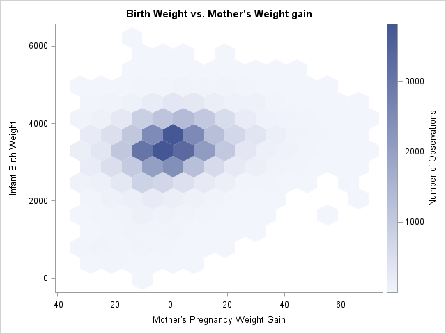
Hexbin Plot: How to Show Density and Distribution in Large Datasets
A hexbin plot helps reveal patterns when there are too many points for a traditional scatterplot to remain readable. Use it to show density, clustering, and distribution without overwhelming viewers with overlapping marks.
Turn to a hexbin plot when large datasets create visual clutter. Instead of plotting every individual point, the chart groups nearby values into hexagonal bins, making concentration and structure easier to see.
What a Hexbin Plot Is
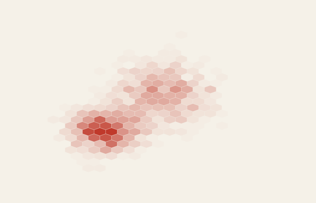
A hexbin plot divides a two-dimensional space into hexagonal cells. Each hexagon represents a region, and color intensity or shading indicates how many data points fall within that area.
Common elements include:
- Hexagonal grid covering the plotting space
- Color gradients representing density or frequency
- Two quantitative axes
- A legend that explains the color scale
Hexagonal shapes reduce visual bias and provide a balanced way to represent density compared to square grids.
When to Use a Hexbin Plot
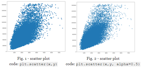
Use a hexbin plot when large numbers of data points overlap or obscure patterns in a standard scatterplot.
This visual works especially well when the goal is to:
- Reveal density and clustering
- Show distribution across two variables
- Reduce overplotting in large datasets
- Highlight hotspots or sparse areas
- Explore relationships without visual noise
A hexbin plot works best when the purpose is to show where values concentrate rather than focusing on individual observations.
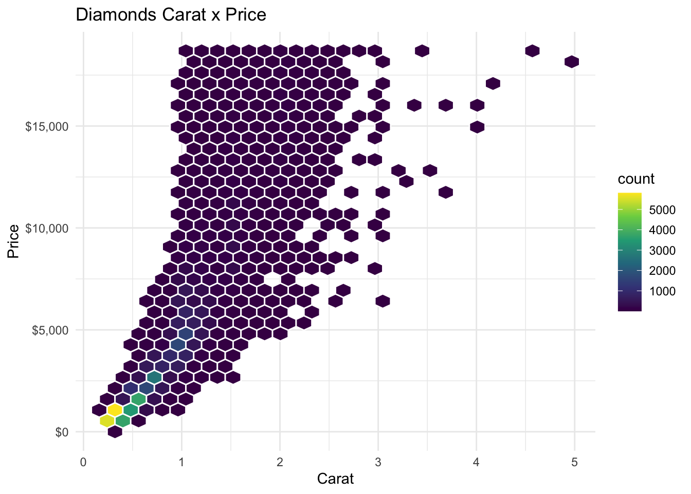
Types of Data Sets That Work Best for a Hexbin Plot
Hexbin plots work best with large sets of paired quantitative data.
Strong candidates include:
- User behavior or engagement metrics
- Environmental or climate measurements
- Sensor or tracking data
- Financial transaction patterns
- Scientific or experimental measurements
- Performance metrics with thousands of observations
The more data points involved, the more valuable this chart becomes.
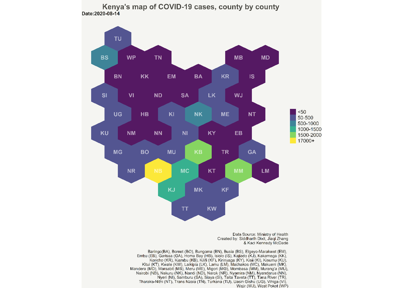
Real-World Examples of a Hexbin Plot
Hexbin plots appear frequently in data science, analytics, and research when datasets are too dense for traditional scatterplots.
Large-Scale User or Engagement Data
Reveal patterns in user activity where thousands of points would otherwise overlap.
Environmental and Climate Analysis

Show how environmental variables cluster across measurement ranges.
Financial or Transaction Data

Highlight areas where trading activity or values concentrate.
Scientific or Experimental Research
Summarize complex measurement datasets while preserving overall patterns.
Performance or System Monitoring

Reveal performance hotspots and unusual clusters within large operational datasets.
What to Avoid or Be Careful Of with a Hexbin Plot
❌ Don’t use it for small datasets
With only a few points, the hexagonal bins hide detail rather than clarify it.
❌ Don’t ignore the color scale
Color intensity carries the meaning. A clear legend is essential.
❌ Don’t assume viewers know what it represents
Hexbin plots are less familiar than scatterplots. Brief context or labeling improves understanding.
❌ Don’t choose bin sizes arbitrarily
Too large hides patterns; too small creates noise. Adjust bin size based on data density.
❌ Don’t treat it as a replacement for all scatterplots
When individual points matter, a standard scatterplot remains the better choice.
*Content on this page was curated and edited by expert humans with the creative assistance of AI.