
Heatmap Matrix: How to Show Patterns, Relationships, and Intensity in Tables
A heatmap matrix helps reveal patterns inside a grid of data. Use it to transform rows and columns of numbers into a visual field where color highlights trends, clusters, and outliers.
Turn to a heatmap matrix when comparisons across many categories become hard to read in a table. Instead of scanning numbers, the viewer can quickly spot where values are high, low, or changing.
What a Heatmap Matrix Is
A heatmap matrix displays values using a grid where each cell is colored based on magnitude. Rows and columns represent categories, while color intensity communicates the underlying data.
Common elements include:
- A grid layout similar to a table
- Color scales that represent value ranges
- Labels for rows and columns
- A legend explaining the color mapping
Heatmap matrices emphasize pattern recognition. They make it easier to see trends across large datasets without focusing on exact numbers.
When to Use a Heatmap Matrix
Use a heatmap matrix when relationships across two categorical dimensions matter.
This visual works especially well when the goal is to:
- Reveal correlations or relationships
- Highlight peaks, gaps, or clusters
- Compare performance across categories and time
- Show activity or frequency patterns
- Make dense tables easier to interpret
A heatmap matrix works best when the purpose is to help viewers scan for patterns rather than read individual values.
Types of Data Sets That Work Best for a Heatmap Matrix
Heatmap matrices work best with structured, grid-based data.
Strong candidates include:
- Correlation matrices
- Survey responses across multiple questions
- Activity by hour and day
- Performance metrics by category and period
- Website traffic by page and time
- Experimental results across variables
Each cell should represent a meaningful comparison between two dimensions.
Real-World Examples of a Heatmap Matrix
Heatmap matrices appear in analytics, research, and dashboards whenever large grids of values need to be understood quickly.
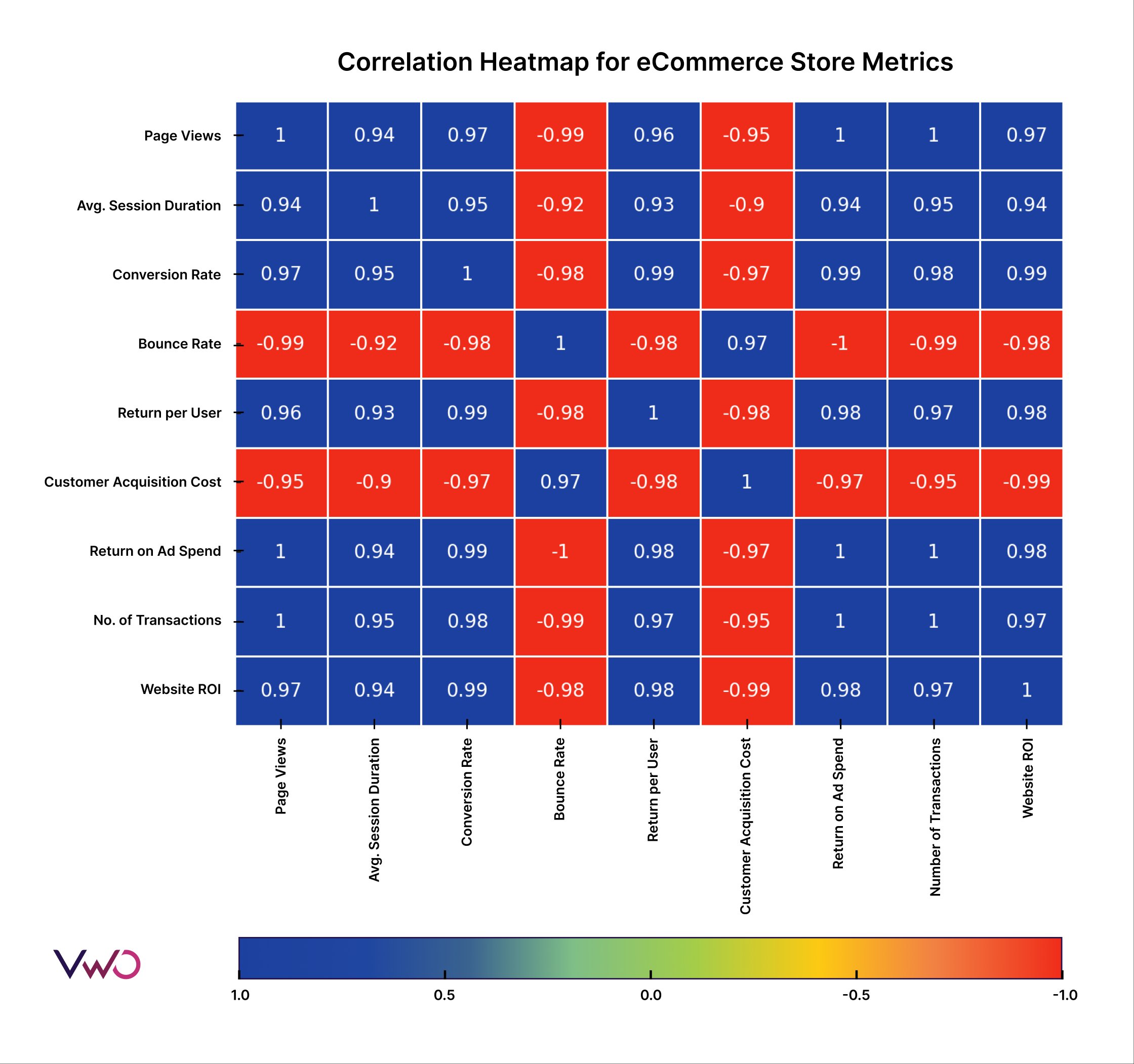
Correlation or Relationship Analysis
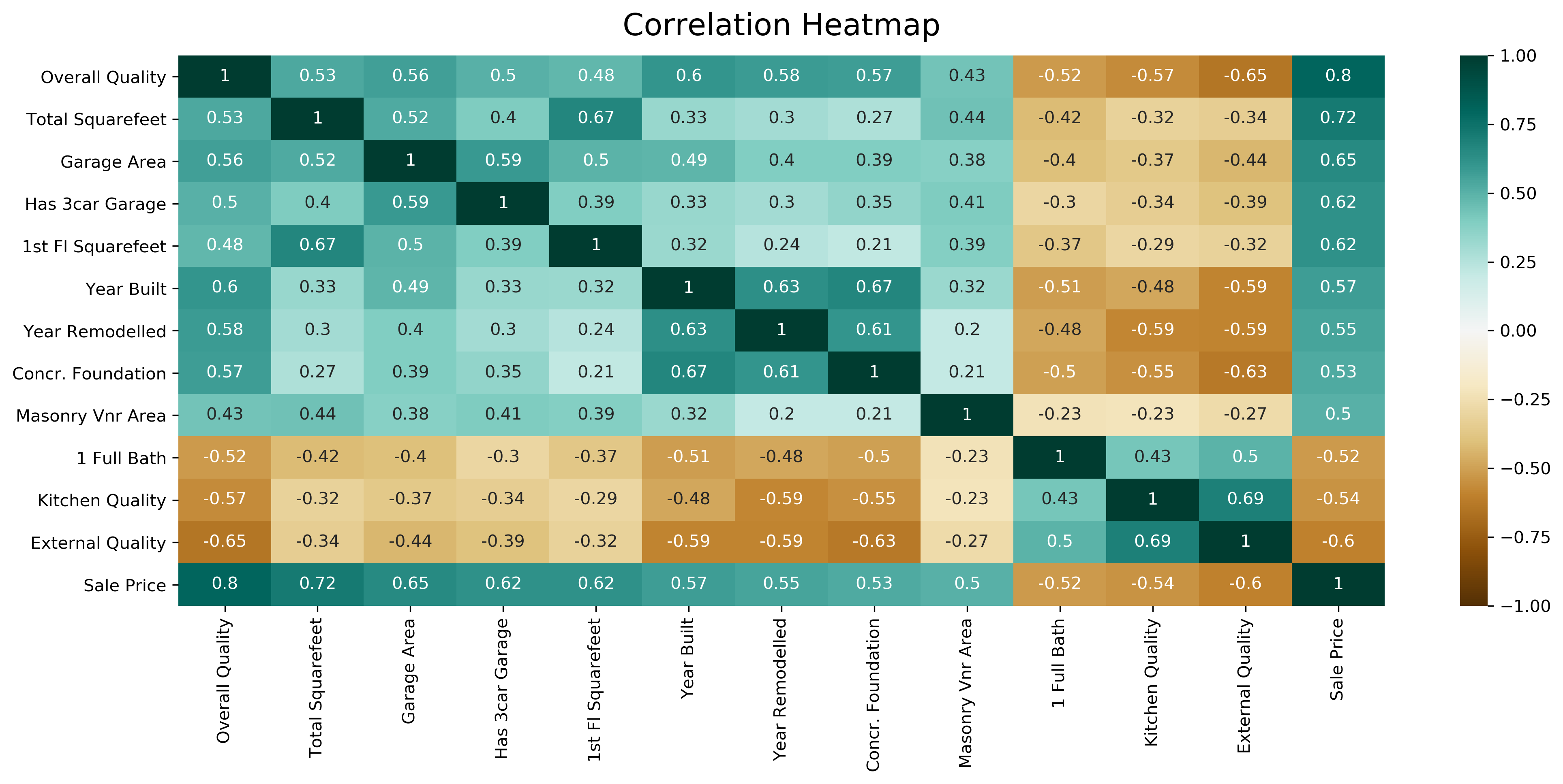

4
Highlight relationships between variables and reveal strong or weak associations at a glance.
Activity by Time and Day


Show when engagement or activity is highest across recurring time intervals.
Survey or Assessment Results

Compare responses across questions and participant groups without overwhelming viewers with numbers.
Experimental or Research Data

Display outcomes across multiple variables and conditions in a compact visual form.
What to Avoid or Be Careful Of with a Heatmap Matrix
❌ Don’t rely on color without a legend
Clear scales are essential so viewers understand what the colors represent.
❌ Don’t choose confusing color gradients
Color choices strongly affect interpretation. Use intuitive and accessible palettes.
❌ Don’t overload with too many categories
Large matrices can become difficult to read. Consider grouping or filtering when necessary.
❌ Don’t hide important values
Annotations or tooltips can help when exact numbers matter alongside patterns.
❌ Don’t use it when a simple chart would do
Heatmap matrices are best for dense comparisons. For small datasets, bars or lines may communicate more clearly.
*Content on this page was curated and edited by expert humans with the creative assistance of AI.