
Dot Plot: How to Show Values Clearly and Precisely
A dot plot is what you use when you want to compare values across categories without the visual weight of bars. It’s clean, efficient, and surprisingly powerful—especially when precision matters.
Instead of asking, “Which bar is taller?”
the question becomes, “Where does this value land?”
What a Dot Plot Is
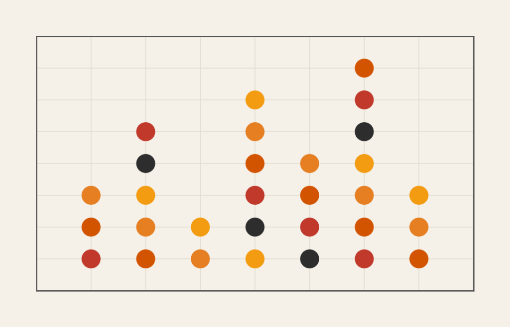
A dot plot displays data using dots positioned along a single quantitative axis. Each dot represents a value, and categories are usually listed along the opposite axis.
Unlike bar charts, dot plots rely on position rather than length. This makes small differences easier to see and comparisons easier to make.
Dot plots come in a few common forms:
- Single-value dot plots for category comparison
- Cleveland dot plots with paired values
- Strip plots showing individual observations
What they all share is an emphasis on accuracy and clarity.
When to Use a Dot Plot
Use a dot plot when the goal is to make comparisons clean and direct.
This chart works especially well when you want to:
- Compare values across categories
- Highlight small differences
- Reduce visual clutter
- Replace bars with a lighter alternative
- Show paired or before-and-after values
- Emphasize exact position over magnitude
A dot plot is a strong choice when the key question is:
“How do these values compare?”
Types of Data Sets That Work Best for a Dot Plot
Dot plots work best with categorical data paired with numeric values.
Strong candidates include:
- Survey results summarized by category
- Performance metrics across groups
- Before-and-after measurements
- Rankings with precise values
- Small to medium-sized datasets
- Situations where labels matter more than shape
They are especially effective when categories have long labels or when space is limited.
Real-World Examples of a Dot Plot
Dot plots show up frequently in journalism, research, and analytical reporting.
Survey or Polling Results
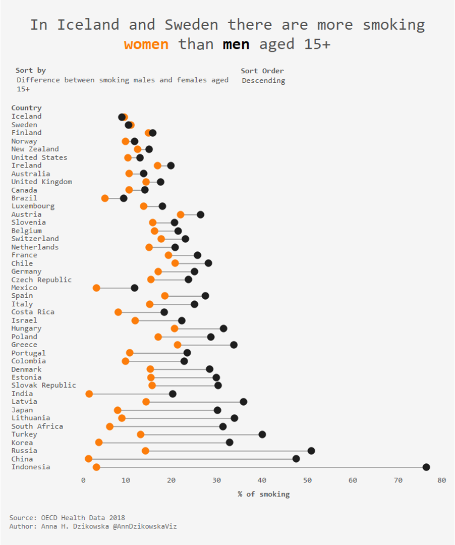
Compare response values across options with minimal visual noise.
Rankings and League Tables

Highlight differences in rank or score without resorting to heavy bars.
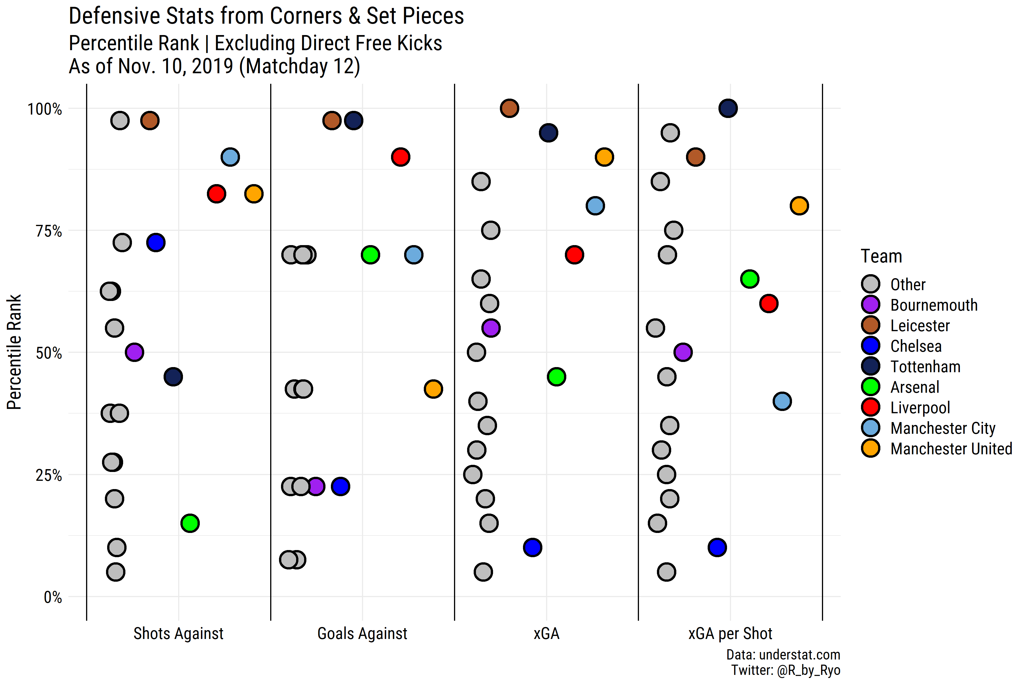
Performance or Benchmark Comparisons

Compare actual values to benchmarks or targets with precision.
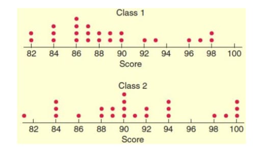
Small or Dense Data Sets

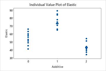
Show individual data points without aggregation, revealing spread and clustering.
What to Avoid or Be Careful Of with a Dot Plot
❌ Don’t use it for very large datasets
Too many dots quickly become cluttered and unreadable.
❌ Don’t hide the scale
Dot plots rely on axis precision. Clear tick marks and labels are essential.
❌ Don’t overdecorate
Gridlines, colors, and annotations should support the dots, not compete with them.
❌ Don’t confuse it with a scatterplot
Dot plots typically use one quantitative axis. If two quantitative variables are involved, use a scatterplot.
❌ Don’t assume familiarity
Some audiences expect bars. A short explanation can help viewers read the chart correctly.
*Content on this page was curated and edited by expert humans with the creative assistance of AI.