
Candlestick Chart: How to Show Price Movement, Volatility, and Trends
A candlestick chart is what you use when a single value isn’t enough to describe what happened. It shows opening value, closing value, highs, lows, and volatility all at once.
Instead of asking, “What was the value?”
the question becomes, “What happened within this interval?”
What a Candlestick Chart Is
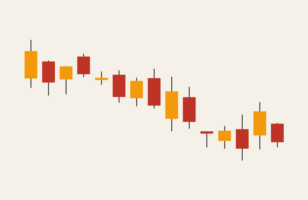
A candlestick chart visualizes change within a fixed interval (such as a day, hour, or minute) using a series of “candlesticks.” Each candlestick represents four key values:
- Opening value
- Closing value
- Highest value
- Lowest value
The rectangular body shows the range between open and close, while the thin lines (wicks or shadows) show the high and low. Color is typically used to indicate whether the value increased or decreased during the interval.
If a line chart shows trend, a candlestick chart shows behavior inside the trend.
When to Use a Candlestick Chart
Use a candlestick chart when volatility, direction, and momentum matter—not just endpoints.
A candlestick chart works best when the goal is to:
- Show intra-period variation
- Highlight volatility and stability
- Reveal momentum shifts
- Identify patterns in movement
- Analyze short- and long-term trends together
- Compare opening and closing behavior
This chart is the right choice when the key question is:
“What happened during each period, not just where it ended?”
Types of Data Sets That Work Best for a Candlestick Chart
Candlestick charts work best with ordered, interval-based quantitative data where multiple values exist per interval.
Strong candidates include:
- Financial price data (stocks, crypto, commodities)
- Trading or exchange metrics
- Any time-based measurement with open, close, high, and low values
- Performance metrics tracked continuously within intervals
- Simulated or modeled range data
If your dataset only has one value per time point, a candlestick chart adds unnecessary complexity.
Real-World Examples of a Candlestick Chart
Candlestick charts are most common in finance, but the logic applies anywhere range and volatility matter.
Financial Market Prices
Track daily or intraday price movement to reveal trends, reversals, and volatility.
Cryptocurrency or Commodity Trading
Analyze rapid fluctuations and momentum in highly volatile markets.
Simulated or Modeled Range Data
Show expected ranges and uncertainty within modeled outcomes.
What to Avoid or Be Careful Of with a Candlestick Chart
❌ Don’t use it for non-interval data
Candlestick charts require multiple values per interval. Single-point data belongs in line or bar charts.
❌ Don’t assume all audiences understand it
This chart is familiar in finance but confusing elsewhere. A short explanation often helps.
❌ Don’t overload with indicators
Too many overlays, markers, or annotations quickly overwhelm the chart.
❌ Don’t ignore scale and time consistency
Uneven time intervals or inconsistent scales distort interpretation.
❌ Don’t focus only on color
Color helps, but shape and labeling matter just as much—especially for accessibility.
*Content on this page was curated and edited by expert humans with the creative assistance of AI.