
Bullet Graph: How to Show Performance Against a Target
A bullet graph is what you use when a bar chart isn’t quite enough. It’s designed to show performance, targets, and context in a single, compact view.
Instead of asking, “How much do we have?”
you’re asking, “How are we doing compared to where we should be?”
What a Bullet Graph Is
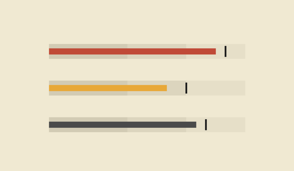
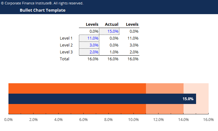
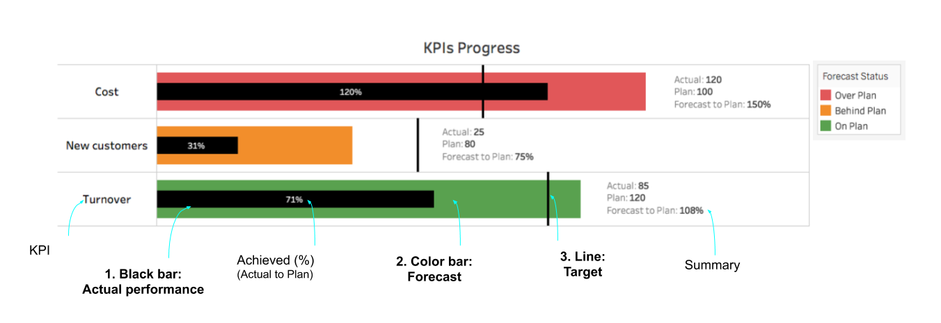
A bullet graph is a specialized bar-like chart that compares a primary measure to one or more reference points. It typically includes:
- A main bar showing the actual value
- A marker (often a line) showing a target or benchmark
- Background bands representing qualitative ranges such as poor, satisfactory, and good
All of this is displayed along a single axis, usually horizontal, making the chart dense but highly efficient.
If a standard bar chart shows quantity, a bullet graph shows performance in context.
When to Use a Bullet Graph
Use a bullet graph when you want to evaluate progress toward a goal clearly and efficiently.
A bullet graph works especially well when you want to:
- Compare actual performance to a target
- Show progress toward goals
- Display KPIs in dashboards
- Replace gauge or speedometer charts
- Present benchmarks without clutter
- Compare multiple measures side by side
You choose a bullet graph when the key question is:
“Are we meeting expectations?”
Types of Data Sets That Work Best for a Bullet Graph
Bullet graphs work best with single-measure performance data paired with clear targets or benchmarks.
Strong candidates include:
- Sales performance vs. quota
- Revenue vs. forecast
- Completion or progress toward goals
- Efficiency or productivity metrics
- Budget usage vs. limit
- Service-level or compliance metrics
They’re especially effective in dashboards where space is limited but clarity matters.
Real-World Examples of a Bullet Graph
Bullet graphs are widely used in performance reporting, analytics dashboards, and executive summaries.
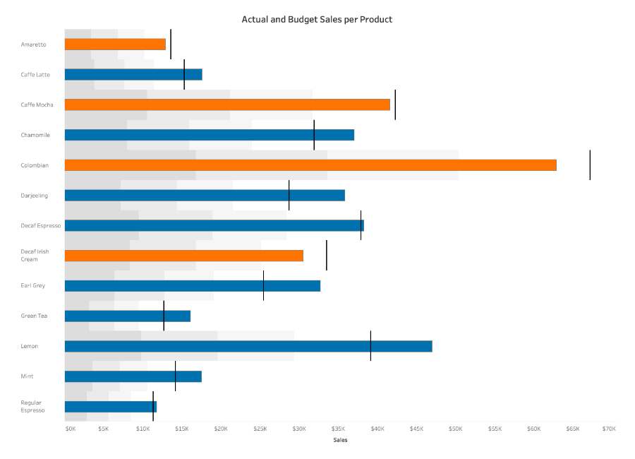
Sales or Revenue Performance
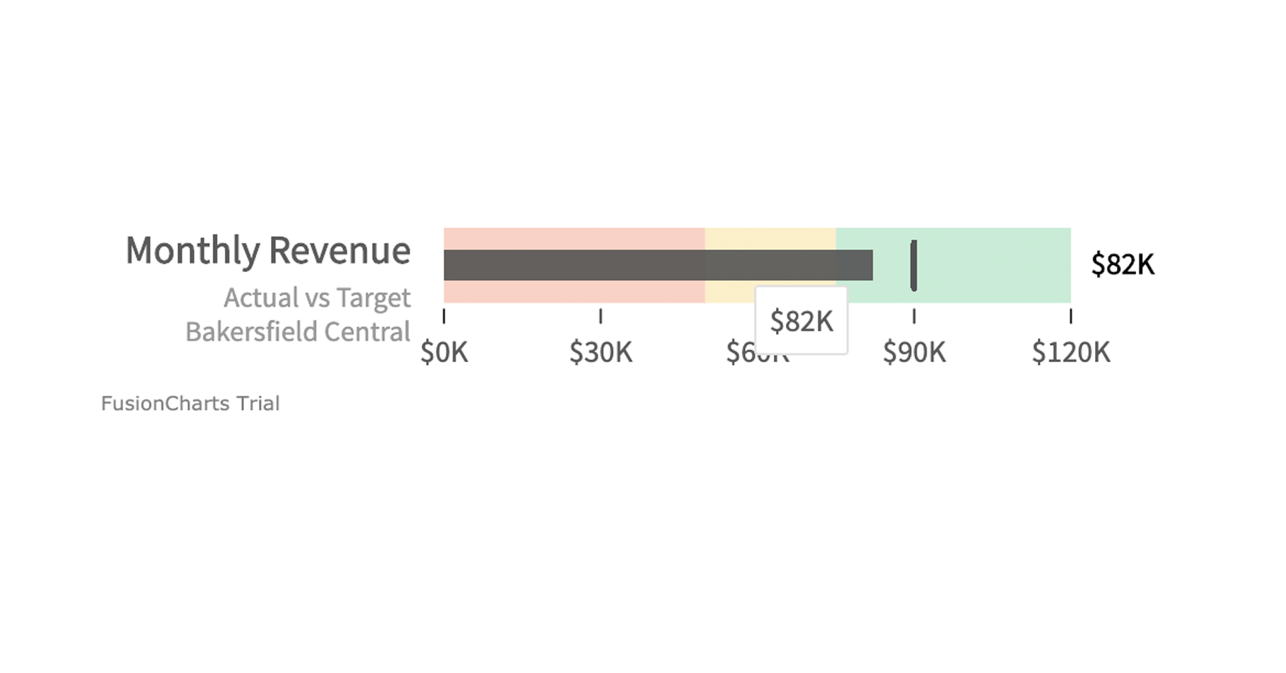
Show actual sales against quota, with background bands indicating acceptable and strong performance.
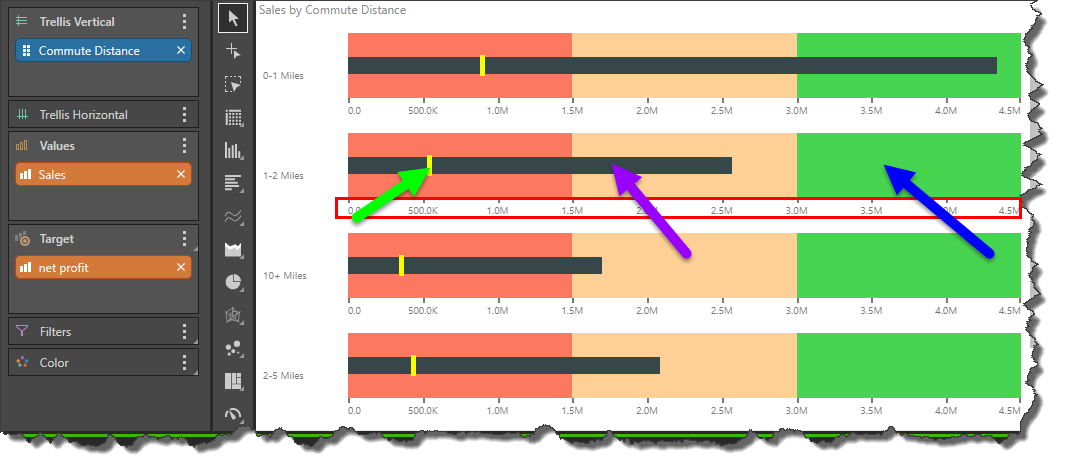
KPI Dashboards

Stack multiple bullet graphs vertically to compare performance across teams, products, or metrics.
Budget and Spending Tracking
Show how much of a budget has been used relative to limits or benchmarks.
Project Progress or Milestones
Communicate progress toward completion in a way that’s far clearer than a gauge.
Service and Operational Metrics
Show how well systems or teams are performing relative to required standards.
What to Avoid or Be Careful Of with a Bullet Graph
❌ Don’t use it without a clear target
Without a benchmark, the bullet graph loses its purpose.
❌ Don’t overload it with too many reference points
Too many bands or markers create confusion and dilute the message.
❌ Don’t assume audiences understand it
Bullet graphs are less familiar than bar charts. A brief explanation often helps.
❌ Don’t use decorative styling
Bullet graphs work best when they’re clean and minimal. Extra decoration reduces clarity.
❌ Don’t mix inconsistent scales
When comparing multiple bullet graphs, all should share the same scale for meaningful comparison.
*Content on this page was curated and edited by expert humans with the creative assistance of AI.