
Bubble Chart: How to Compare Relationships, Magnitude, and Scale at Once
A bubble chart is what you use when two variables aren’t enough. It lets you compare relationships across two axes while also encoding a third variable through size.
Instead of asking, “How do these categories compare?”
you’re asking, “How do these variables relate—and how big is the impact?”
What a Bubble Chart Is
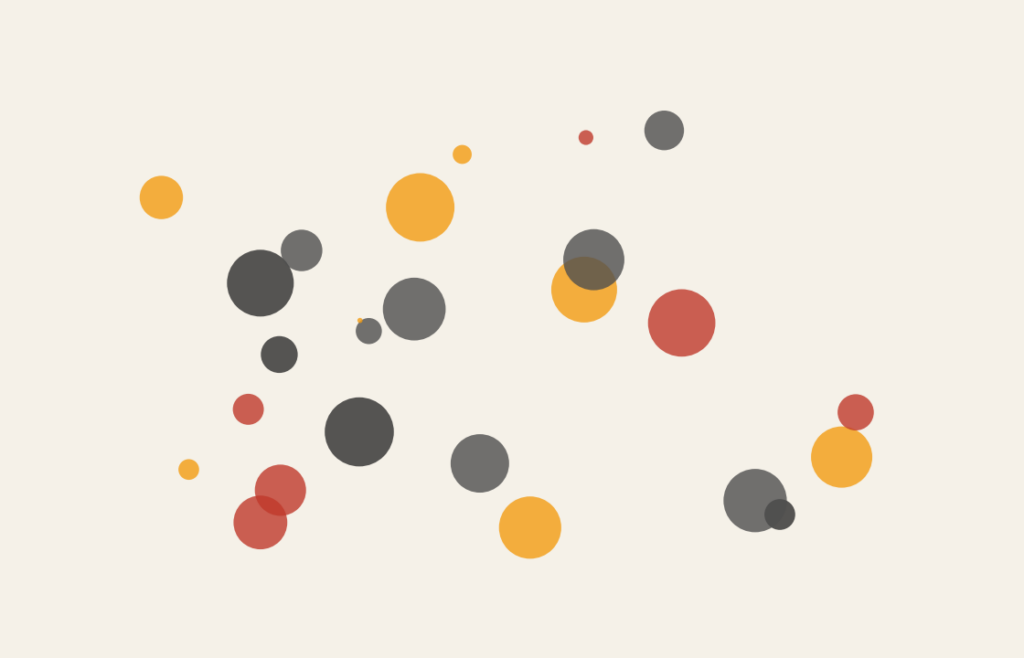
A bubble chart is a variation of a scatterplot. Each data point is plotted using an x-value and a y-value, just like a scatterplot—but instead of a dot, you use a circle (a bubble). The size of the bubble represents a third variable, usually magnitude or volume.
In some cases, color is used to represent a fourth variable, but size is the defining feature.
If a scatterplot shows relationship, a bubble chart shows relationship plus scale.
When to Use a Bubble Chart
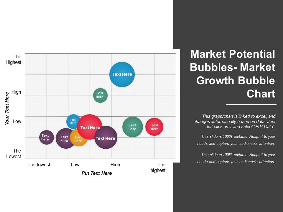
Use a bubble chart when you want to explore relationships while also emphasizing relative importance or weight.
A bubble chart works well when you want to:
- Compare three variables at once
- Show correlation with added context
- Highlight large vs. small contributors
- Explore patterns rather than precise values
- Visually prioritize dominant data points
You choose a bubble chart when the key question is:
“How do these variables relate, and which ones matter most?”
Types of Data Sets That Work Best for a Bubble Chart
Bubble charts work best with numerical data across multiple dimensions.
Strong candidates include:
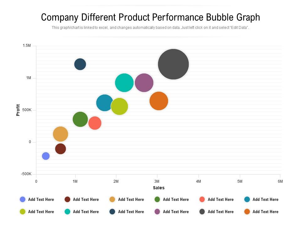
- Performance metrics with volume or scale
- Economic indicators (e.g., income, cost, population)
- Marketing metrics (reach, engagement, spend)
- Product comparisons with price, quality, and sales
- Risk analysis with likelihood, impact, and exposure
- Geographic or regional data paired with magnitude
The essential requirement is that bubble size represents something meaningful and comparable across all points.
Real-World Examples of a Bubble Chart
Bubble charts are especially common in analytics, economics, and strategic communication where comparison and emphasis matter.
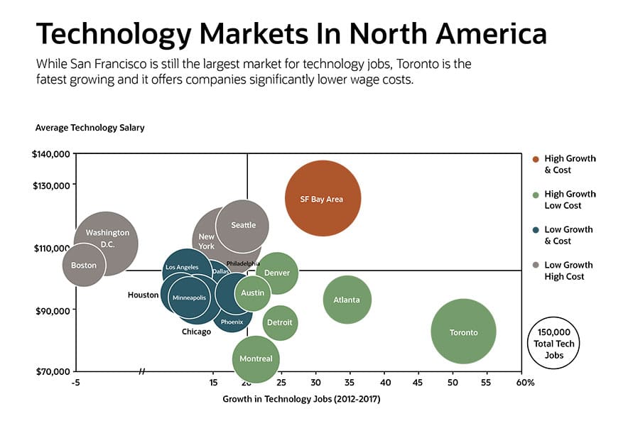
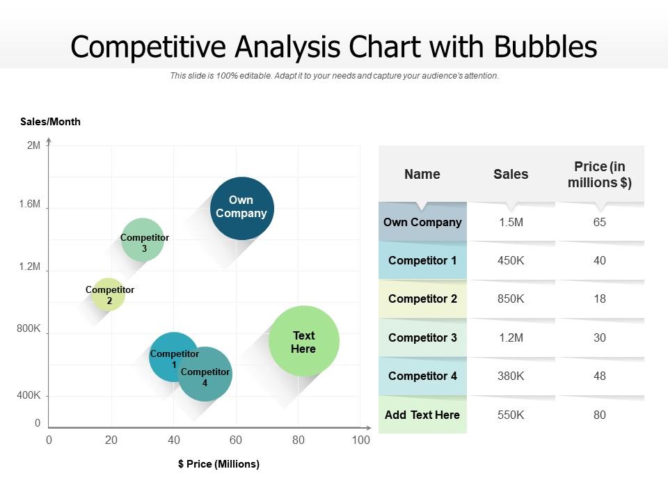
Market or Product Comparisons
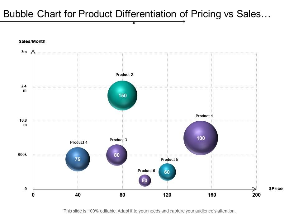
You compare products by price and satisfaction while using bubble size to represent sales volume or market share.
Economic or Financial Indicators

You compare countries or regions by income and growth, with population or GDP represented by bubble size.
Marketing and Campaign Performance

You show how campaigns perform across metrics like spend, engagement, and reach.
Risk and Impact Analysis
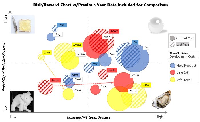
You plot likelihood vs. impact and use bubble size to show severity or exposure.
Demographic or Regional Comparisons
You compare regions or cities across two variables while highlighting population size or density.
What to Avoid or Be Careful Of with a Bubble Chart
❌ Don’t expect precise comparisons
People are bad at comparing areas. Bubble charts are for patterns and emphasis, not exact values.
❌ Don’t overload the chart
Too many bubbles create clutter and overlap. Limit the number of points or use transparency.
❌ Don’t use size inconsistently
Bubble size should be based on area, not radius or diameter. Inconsistent scaling misleads viewers.
❌ Don’t rely on size alone for meaning
Always label or explain what bubble size represents. Unlabeled size encoding confuses audiences.
❌ Don’t use bubble charts when a scatterplot would do
If the third variable isn’t meaningful, a bubble chart adds complexity without insight.
*Content on this page was curated and edited by expert humans with the creative assistance of AI.