
Area Graph: How to Show Change Over Time and Cumulative Trends
An area graph (often called an area chart) is what you use when you want to show change over time while also emphasizing magnitude or accumulation. It’s similar to a line chart—but with weight.
Instead of asking, “What’s the value at this point?”
you’re asking, “How much is happening over time?”
What Are Area Graphs?
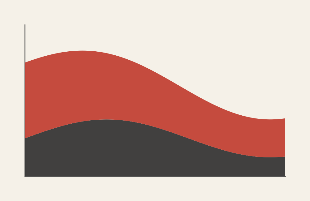
An area graph displays quantitative values across a continuous axis—most often time—using a filled area beneath a line. The height of the area represents value, and the filled space reinforces a sense of volume, scale, or total impact.
You can use area graphs in two main ways:
- Single-series area graphs to show growth or decline
- Stacked area graphs to show how multiple components contribute to a total over time
If a line chart emphasizes direction, an area graph emphasizes presence and accumulation.
When to Use Area Graphs
Use an area graph when you want to show trends over time and make magnitude feel tangible.
This chart works especially well when you want to:
- Show growth or decline over time
- Emphasize total volume or cumulative change
- Show how parts contribute to a whole across time
- Compare trends while keeping focus on overall scale
- Highlight peaks, dips, and long-term patterns
You choose an area graph when the key question is:
“How has this changed over time, and how much is there?”
Types of Data Sets That Work Best
Area graphs work best with continuous, time-based quantitative data.
Strong candidates include:
- Website traffic over time
- Sales or revenue by month or quarter
- Enrollment, population, or usage trends
- Energy production or consumption over time
- Budget spending across periods
- Cumulative counts or totals
Stacked area graphs are especially useful when individual categories collectively form a meaningful total at each time point.
Real-World Examples of Area Graphs
Area graphs are common in dashboards, reports, and storytelling contexts where trends matter just as much as totals.
Website Traffic or Engagement Over Time
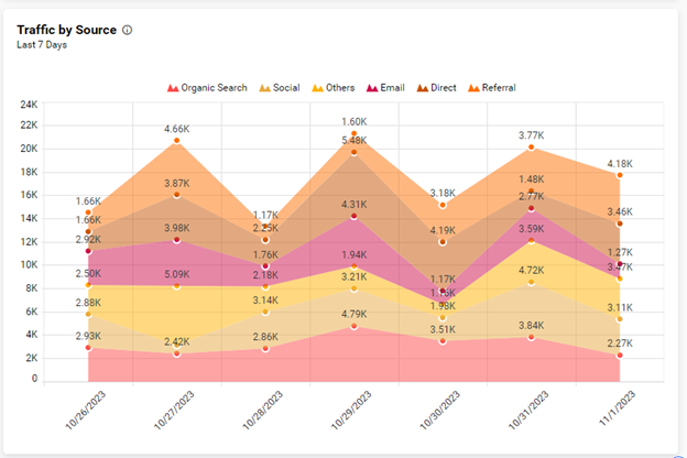
You track visits, sessions, or engagement over weeks or months, using the filled area to reinforce scale and growth.
Revenue, Sales, or Financial Trends
You show how revenue grows, dips, or stabilizes—and how different products or regions contribute to the total.
Population or Enrollment Changes
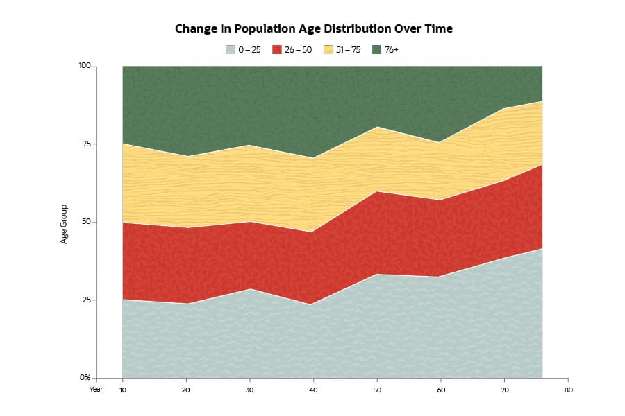

You visualize long-term growth and shifts in composition, making both change and scale visible at once.
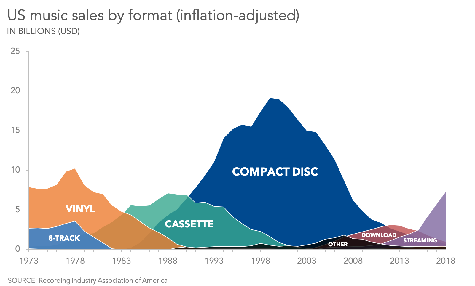
Energy Production or Consumption
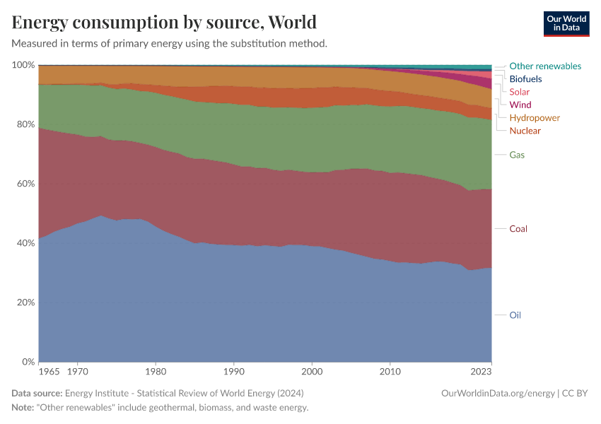

You show how different sources contribute to total energy usage over time, highlighting transitions and dominance.
Budget or Resource Use Over Time

You illustrate how spending accumulates and shifts across categories and years.
What to Avoid or Be Careful Of
❌ Don’t use area graphs when exact comparisons matter
Overlapping areas make precise comparisons difficult, especially between non-adjacent series.
❌ Don’t stack unrelated categories
Stacked area charts imply that categories add up to a meaningful whole. If they don’t, the chart misleads.
❌ Don’t use too many series
Too many layers create visual clutter and obscure patterns. Limit the number of categories.
❌ Don’t ignore baseline issues
Area charts depend on a consistent baseline. Starting axes above zero or shifting baselines can distort perception.
❌ Don’t use area graphs for non-time-based data
Area graphs rely on continuity. If your x-axis is purely categorical with no inherent order, choose a different chart.
*Content on this page was curated and edited by expert humans with the creative assistance of AI.